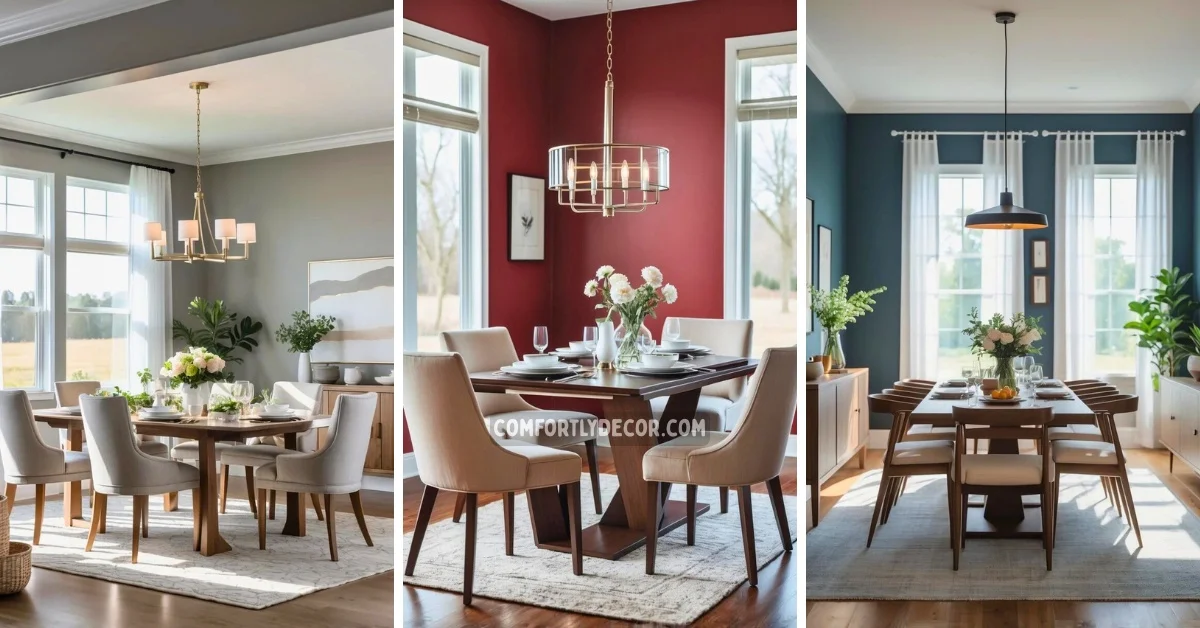
17 Best Dining Room Paint Color Ideas to Elevate Your Space with Style and Comfort
Choosing the right paint color for a dining room can transform the entire space’s atmosphere and set the tone for every meal and gathering. I’ve seen how the right hue can make a room feel inviting, lively, or calm, depending on what you want to create.
The best dining room paint colors balance style and mood, helping you create a space that suits your personality and enhances your daily experience. Picking a color is not just about decoration; it’s about shaping how you and your guests feel in the room.
17 Dining Room Paint Color Ideas
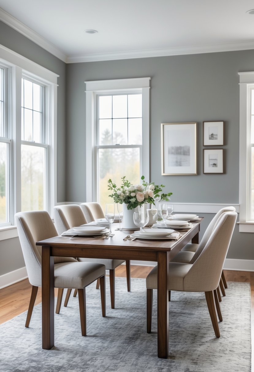
1. Benjamin Moore Revere Pewter
I consider Benjamin Moore Revere Pewter a versatile choice for dining rooms. It balances warm gray and beige tones, creating a soft, neutral backdrop that suits many styles.
In my experience, this color brings a cozy yet sophisticated feel without overwhelming the space. It pairs well with white trim or wood accents, enhancing both traditional and modern decor.
Revere Pewter adapts to different lighting, so it rarely feels flat or dull. It’s a reliable pick when I want a timeless, understated paint color.
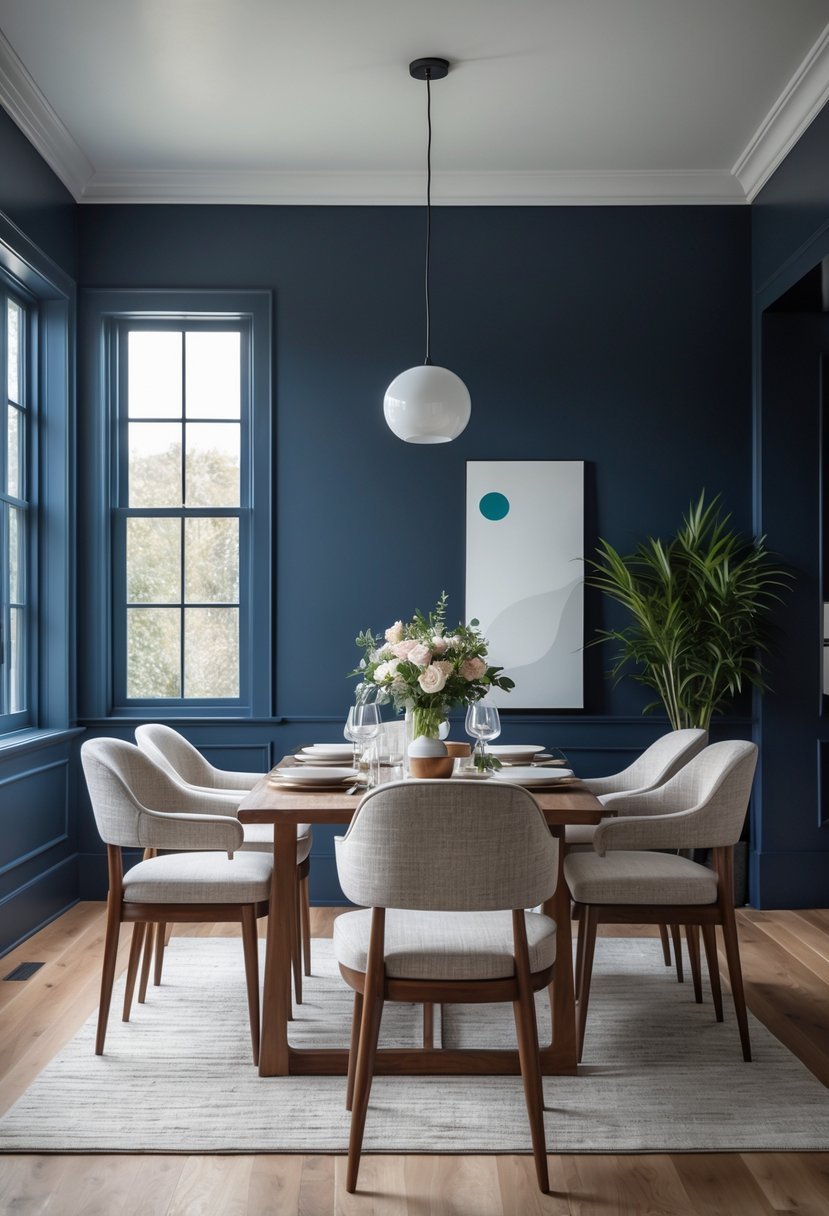
2. Sherwin-Williams Naval
I find Sherwin-Williams Naval to be a strong navy blue that adds depth without overwhelming a dining room. Its bold, deep tone works well as a backdrop, creating a rich atmosphere.
Naval pairs nicely with lighter neutrals and wood accents, balancing warmth and sophistication. I appreciate how it brings a modern yet timeless feel to the space. It is versatile enough for both formal and casual dining settings.
3. Benjamin Moore Hale Navy
I often recommend Benjamin Moore Hale Navy for dining rooms because it strikes a perfect balance between bold and classic. This deep navy adds depth without overwhelming the space.
In my experience, Hale Navy pairs well with lighter trims and warm lighting, creating a sophisticated yet inviting atmosphere. It works beautifully on walls or as an accent on cabinetry or built-ins.
Its versatility is a key benefit. Whether your style is traditional or modern, Hale Navy provides a timeless backdrop that enhances your dining experience.
4. Sherwin-Williams Agreeable Gray
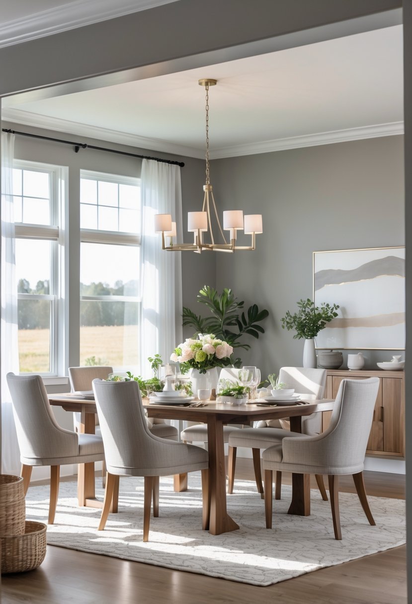
I often recommend Sherwin-Williams Agreeable Gray for dining rooms because it strikes a perfect balance between gray and beige. This “greige” tone offers warmth without leaning too far into either color.
Its versatility means it works well with various decor styles, from modern to traditional. I appreciate that it adapts to different lighting, shifting subtly from warm to cool.
Agreeable Gray creates a welcoming, neutral backdrop that lets furniture and accents stand out. In my experience, it’s a reliable choice for those seeking a sophisticated yet approachable dining space.
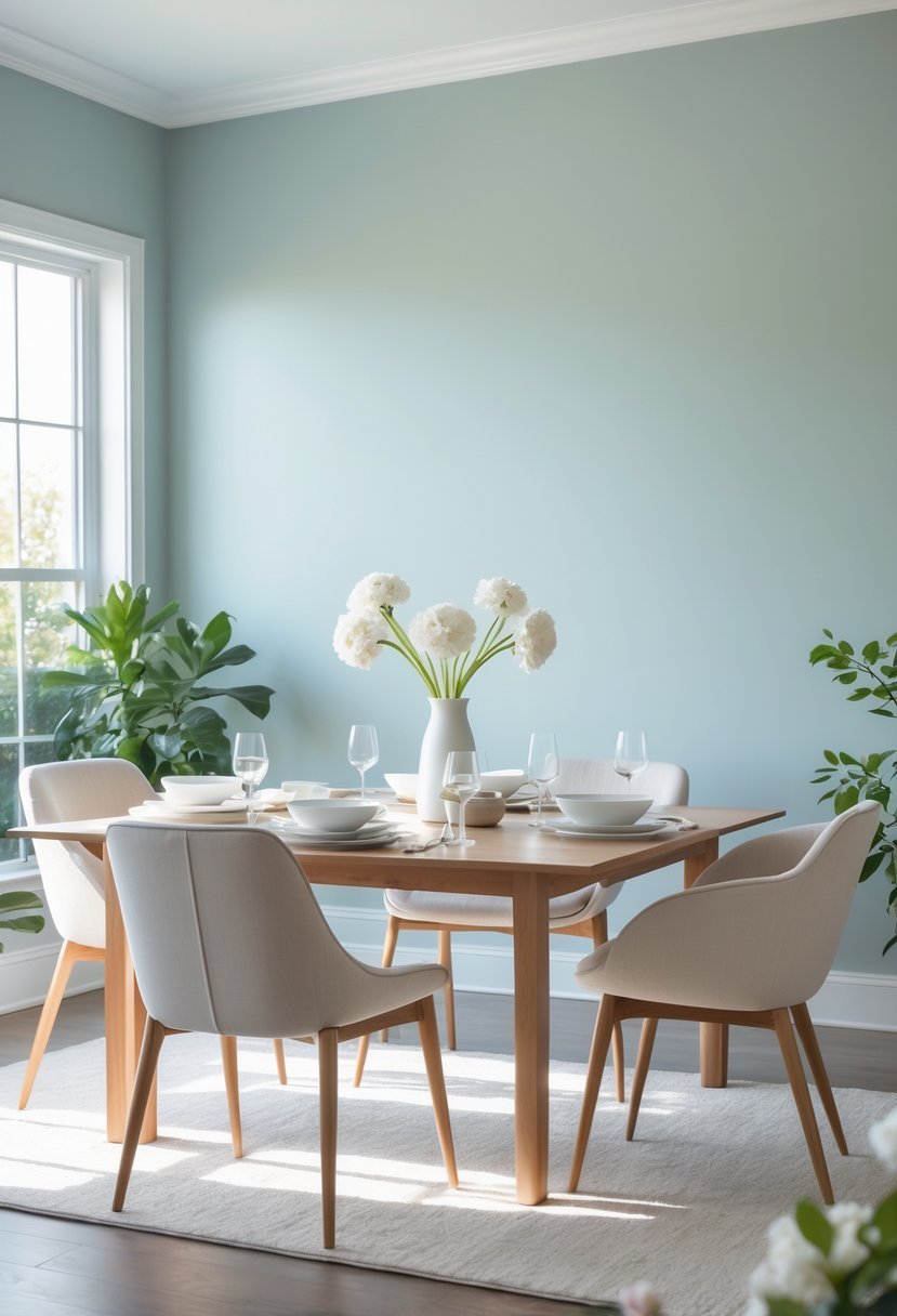
5. Benjamin Moore White Dove
I appreciate Benjamin Moore White Dove for its soft, warm undertones that create a welcoming dining room atmosphere. It’s a versatile off-white, neutral enough to work with both modern and traditional decor.
This color brightens the space without feeling cold or sterile. It pairs well with natural wood tones and stone, adding subtle warmth while keeping the room feeling open and airy. White Dove can serve as a clean canvas, allowing other design elements to stand out.
6. Sherwin-Williams Sea Salt
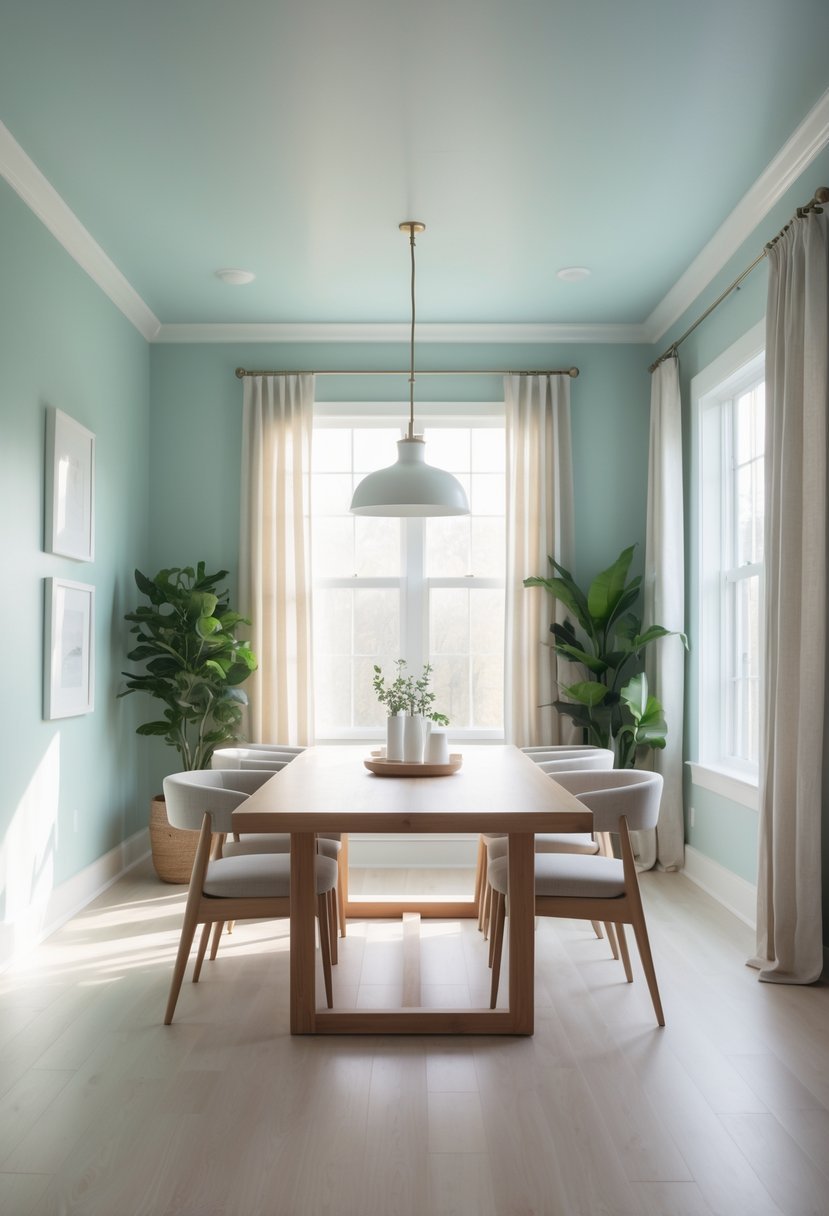
I often recommend Sherwin-Williams Sea Salt for dining rooms seeking a calm yet fresh atmosphere. This pale green blend offers subtle coastal vibes without overwhelming the space.
Its versatility stands out. Sea Salt pairs well with whites and soft grays, creating a balanced backdrop. It supports various decor styles, from modern to cottage-inspired.
In my experience, the color adapts to lighting, sometimes appearing more blue or green. This makes it dynamic throughout the day, adding interest without distraction.
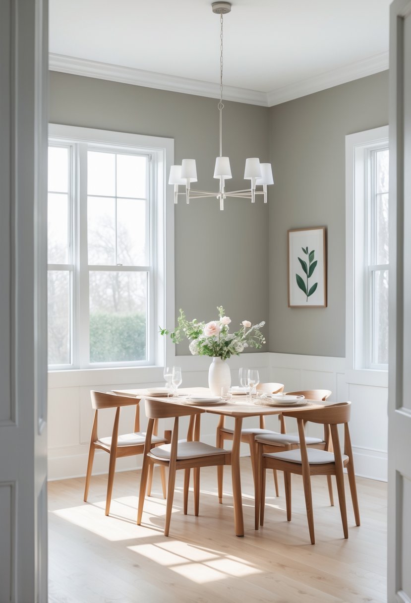
7. Benjamin Moore Stonington Gray
I find Benjamin Moore Stonington Gray to be a versatile choice for dining rooms. It’s a mid-toned gray with subtle blue undertones that keep the space feeling calm and balanced.
This color works well in a variety of lighting conditions, which is important for a room where natural and artificial light mix. It creates a neutral backdrop without feeling cold or dull.
In my experience, Stonington Gray complements both traditional and modern furniture styles. It allows other decor elements to stand out while maintaining a cohesive look.
8. Sherwin-Williams Urbane Bronze
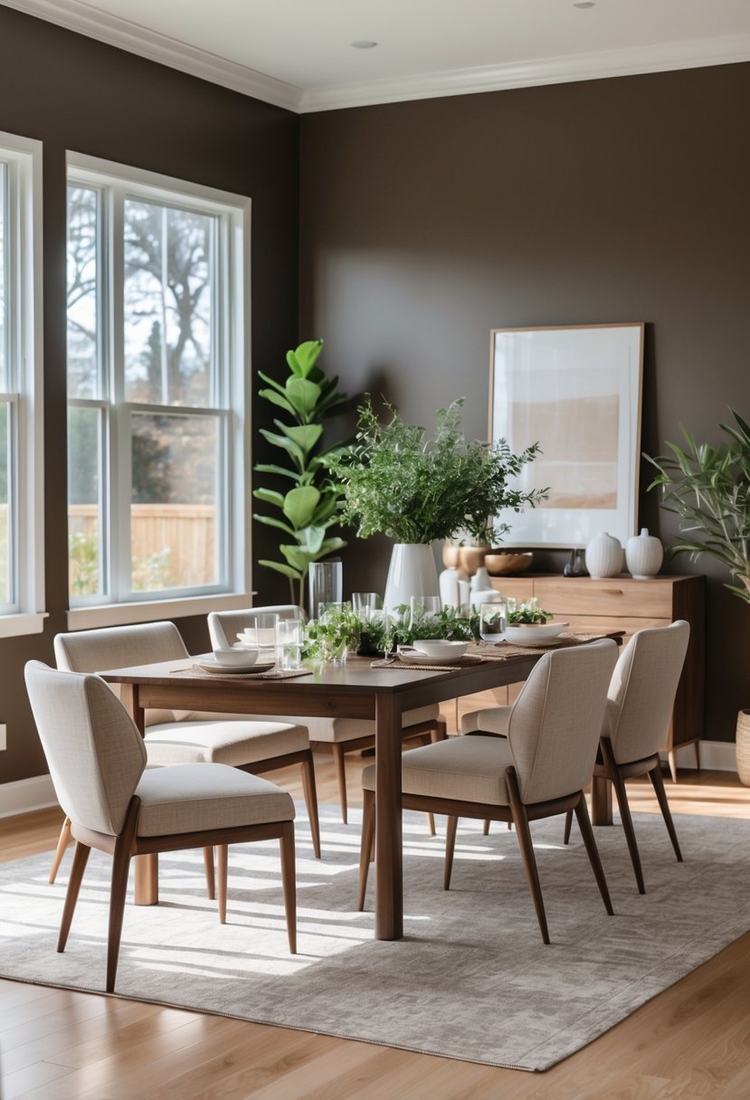
I find Sherwin-Williams Urbane Bronze to be a versatile choice for dining rooms. Its rich gray-brown tone adds depth without feeling overpowering.
This color pairs well with natural materials like wood and marble, creating a balanced, sophisticated look.
Urbane Bronze also works well with lighter shades such as creamy whites, providing contrast while maintaining warmth. It’s a solid option if you want a modern yet timeless feel in your space.
9. Benjamin Moore Soft Fern
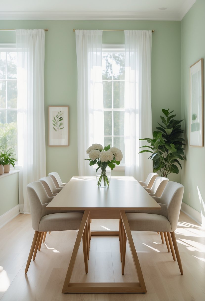
I appreciate Benjamin Moore Soft Fern for its subtle, calming green with gray undertones. It adds a gentle natural touch without overwhelming the space.
This color works well in dining rooms with natural light, creating a fresh and inviting atmosphere. I find it pairs nicely with neutral tones or warm woods to balance its coolness.
Soft Fern is versatile enough to complement various decorating styles, from modern to traditional. It’s a dependable choice for anyone seeking a soft, understated green in their dining area.
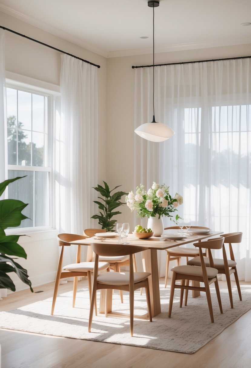
10. Sherwin-Williams Alabaster
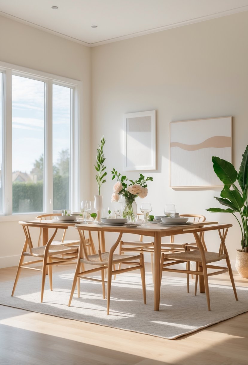
I find Sherwin-Williams Alabaster to be a versatile warm white that works well in dining rooms. It offers a soft, inviting feel without appearing too stark or cold.
This color pairs nicely with both modern and traditional decor. I often recommend it when you want a timeless, elegant backdrop that enhances natural light.
Alabaster also complements wood tones and a variety of fabrics, making it easy to coordinate your dining space with existing furnishings.
11. Benjamin Moore Hunter Green
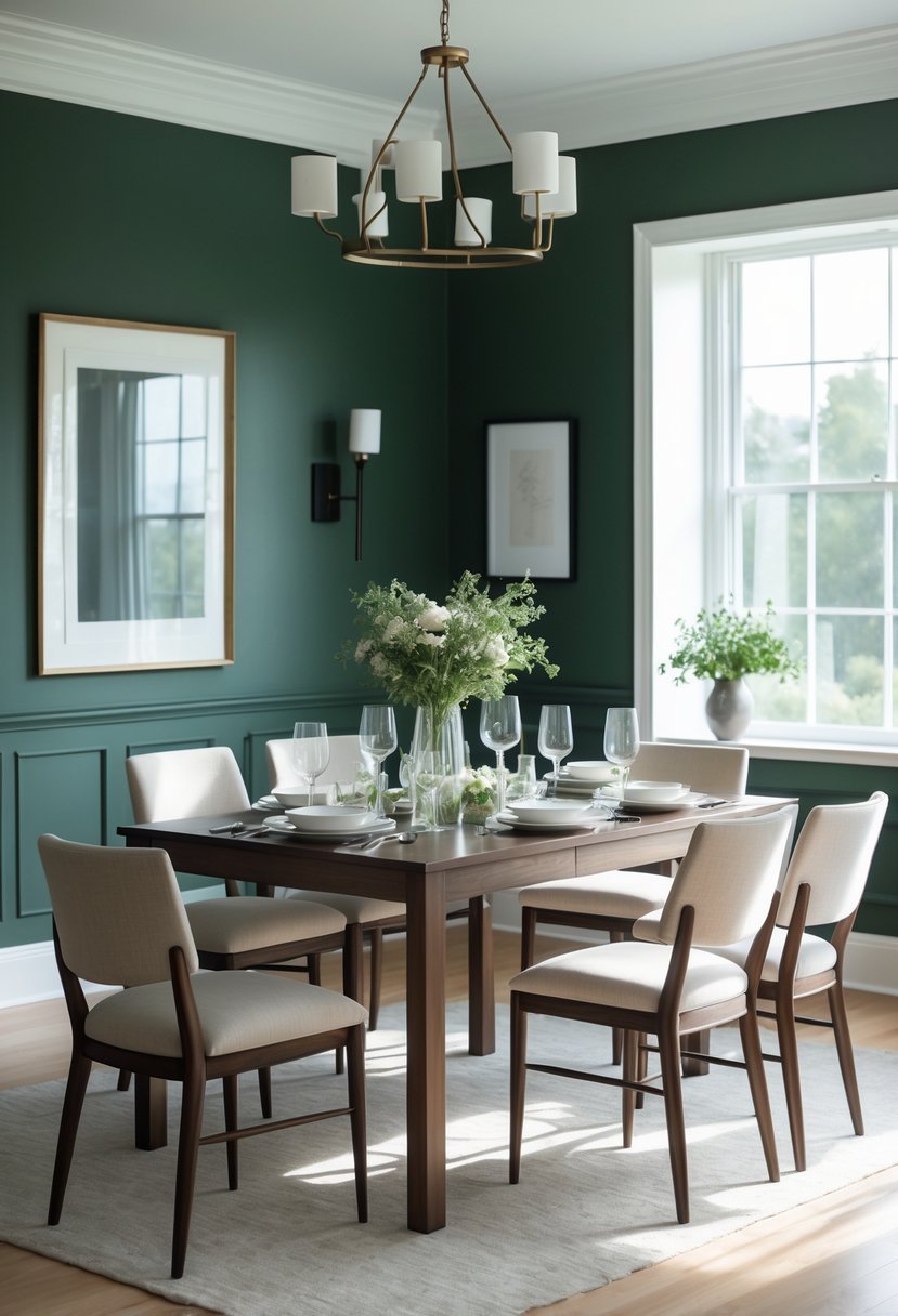
I find Benjamin Moore Hunter Green to be a rich, sophisticated choice for dining rooms. Its deep tone creates a calming atmosphere without feeling too dark.
Hunter Green works well with both modern and traditional styles, offering versatility in decor options. I appreciate how it adds subtle drama while maintaining an elegant, timeless look.
Pairing this color with brass accents or natural wood enhances its warmth. It’s a shade that invites comfort and a touch of luxury in any dining space.
12. Sherwin-Williams Rainwashed
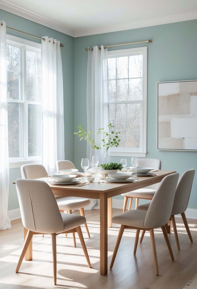
I find Sherwin-Williams Rainwashed to be a fresh and versatile color. Its soft blend of green and blue creates a calming atmosphere without overpowering the room.
This shade works well in dining rooms that benefit from a subtle coastal or airy feel. Pairing it with natural wood or white accents enhances its soothing effect.
In my experience, Rainwashed adapts nicely to various lighting conditions, making it a reliable choice for both bright and dim spaces.
13. Benjamin Moore Kendall Charcoal
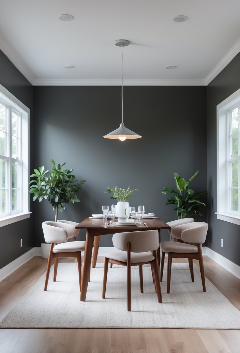
I find Benjamin Moore Kendall Charcoal to be a sophisticated choice for dining rooms. Its deep, moody gray adds depth without overwhelming the space.
Pairing it with crisp white accents creates a clean, modern look. Warmer earth tones bring a cozy, inviting feel. This versatile shade works well for both dramatic and subtle styles.
14. Sherwin-Williams Tricorn Black
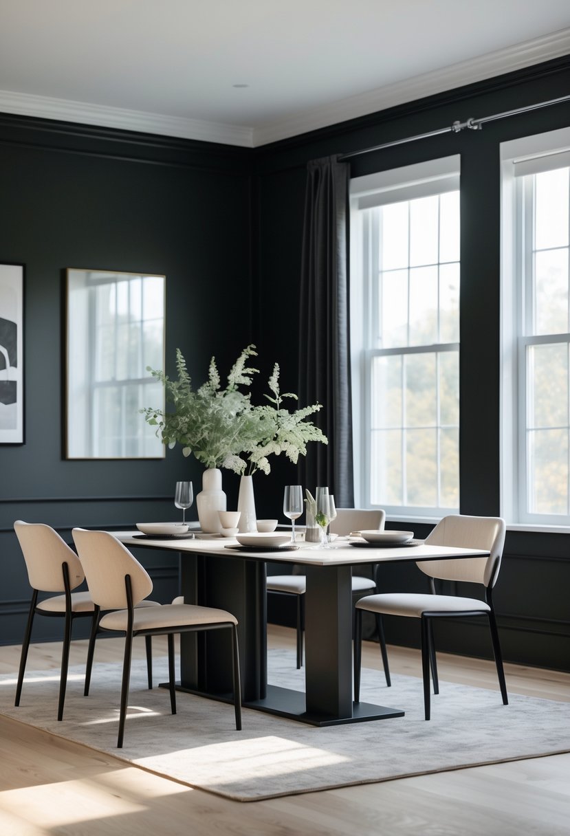
I find Sherwin-Williams Tricorn Black is a strong choice for dining rooms seeking a bold yet timeless look. This true black has no strong undertones, which gives it versatility across modern and traditional styles.
Its deep saturation adds depth and contrast, making other decor elements stand out. I recommend pairing it with crisp whites or soft off-whites to balance the intensity. Tricorn Black works well on walls or accent pieces, creating a sophisticated atmosphere without overwhelming the space.
15. Benjamin Moore Summer Shower
I appreciate Benjamin Moore Summer Shower for its calm and soft blue-gray tone. It brings a serene atmosphere without feeling cold or stark.
This color pairs well with crisp whites and gentle greens, creating a balanced and soothing dining space. I find it versatile enough for both modern and traditional décor styles. It’s an excellent choice if you want a subtle, tranquil backdrop in your dining room.
16. Sherwin-Williams Rookwood Red
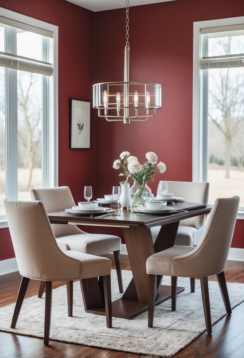
I find Sherwin-Williams Rookwood Red to be a rich, deep hue that adds warmth without overwhelming a dining room. It brings a classic yet cozy feel, perfect for spaces meant for gathering and relaxation.
The color works well as an accent wall or throughout the room. It complements both traditional and modern styles, balancing energy with sophistication. This red is timeless and versatile in my experience.
17. Benjamin Moore Edgecomb Gray
I often recommend Benjamin Moore Edgecomb Gray for dining rooms because it strikes a perfect balance between gray and beige. This soft greige offers warmth without feeling too dark or cool.
Its subtle undertones make it incredibly versatile, easily pairing with both modern and traditional furnishings. I find it creates a calm and inviting atmosphere, ideal for gathering spaces. Edgecomb Gray’s adaptability means it works well with many accent colors, giving you plenty of styling options.
How to Apply Dining Room Paint Color Ideas the Right Way
1. Start With the Lighting
Before choosing any color, I always study the natural and artificial light in my dining room. Light changes how every shade appears.
- Bright rooms allow me to use deep navy, charcoal, bronze, and hunter green
- Low light spaces work better with warm white, greige, soft green, or pale blue
- Evening lighting matters because dining rooms are used most at night
2. Match the Mood With the Color
Every dining room creates a mood whether we plan it or not. I always decide how I want the room to feel before locking in a shade.
- Calm and relaxed with soft blue, light green, and subtle gray
- Bold and dramatic with black, navy, and deep red
- Warm and welcoming with beige, greige, and creamy white
3. Coordinate With Furniture and Decor
Paint should support what already exists in the room instead of fighting it.
- Warm wood pairs best with greige and soft white
- Dark furniture looks balanced against lighter wall shades
- Brass and gold accents shine with deep green and charcoal
4. Always Test the Color Before Committing
I never rely on a paint sample card alone. Wall testing helps me avoid costly mistakes.
- Paint small sections on multiple walls
- Observe the color during morning, afternoon, and night
- Choose based on how the room feels not just how it looks
5. Keep the Layout in Mind
Color placement impacts how spacious the dining room feels.
- Dark shades work best on large walls
- Accent walls add depth without crowding the space
- Light colors make compact dining rooms feel open
FAQs
Why Dining Room Paint Color Ideas Shape the Entire Mood
Dining room paint color ideas do far more than decorate a space. I see them as the foundation that shapes how people feel when they gather, eat, and connect.
When the color supports the lighting, furniture, and layout, the room automatically feels welcoming and balanced. With the right tone, even the simplest dining room can feel polished and intentional.

I am Mindy Medford, a home décor, paint, and design specialist with over a decade of hands-on experience transforming ordinary spaces into cozy, personality-packed havens. Since 2013, I have been helping homeowners discover the art of beautiful yet practical design. I share my love for color, texture, and layout—making stylish interiors & exteriors feel achievable for everyone. Whether it’s picking the perfect paint shade or reimagining a small space, I’m here to guide and inspire.