13 Best Kitchen Colors to Pair with Cherry Cabinets
You’ve got those gorgeous cherry cabinets, but now you’re staring at blank walls wondering what the heck to paint them. Cherry wood’s rich, warm tones are stunning, but they can be a bit tricky to work with. Get it wrong and your kitchen ends up looking like a dated 90s time capsule—not exactly the vibe you’re going for!
The good news? There are tons of amazing color combinations that’ll make your cherry cabinets shine without overwhelming your space. Whether you want to highlight those beautiful red undertones or tone them down for a more modern look, I’ve got you covered with 13 tested color schemes that actually work.
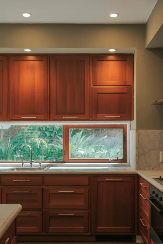
Understanding Cherry Wood’s Personality
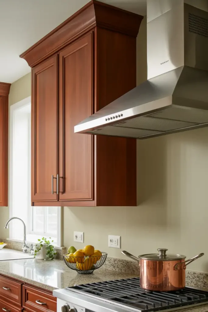
Before we jump into colors, let’s talk about what makes cherry wood so special (and sometimes challenging). Cherry cabinets come with natural red and reddish-brown undertones that get richer over time. They’re warm, inviting, and naturally elegant—but they can also dominate a space if you’re not careful with your color choices.
The key is understanding color theory. Colors opposite each other on the color wheel (like red and green) create contrast and make each other pop. Colors next to each other create harmony and blend seamlessly. Knowing this helps you decide whether you want your cabinets to be the star of the show or part of a cohesive, balanced look.
Colors That Make Cherry Cabinets Pop
#1. Soft Seafoam Green
Want to make those red tones really sing? Seafoam green creates gorgeous contrast without being too bold. It’s like having a breath of fresh air in your kitchen while keeping things sophisticated. This color works especially well if you have good natural light streaming in.
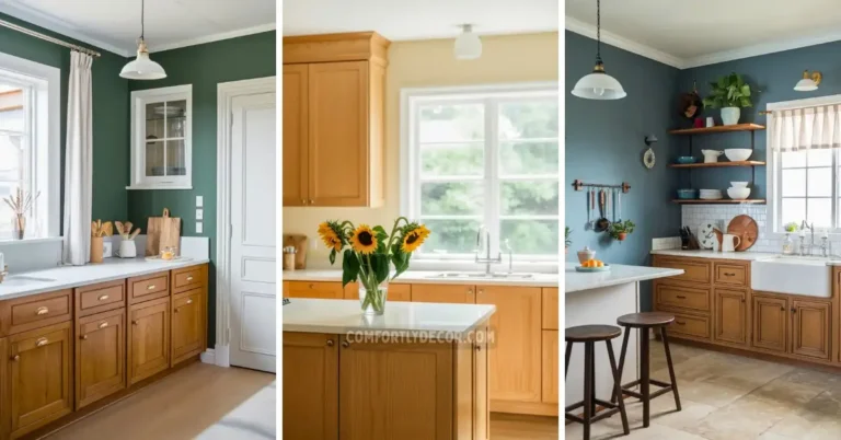
#2. Deep Navy Blue
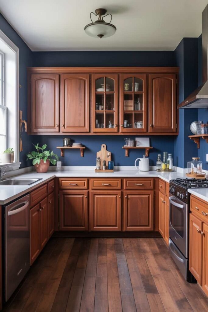
Bold choice alert! Navy blue creates serious drama and makes cherry cabinets look absolutely luxurious. This combo works best in larger kitchens with plenty of light. Add some brass hardware and you’ve got yourself a showstopper.
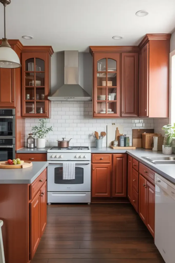
#3. Warm Terracotta
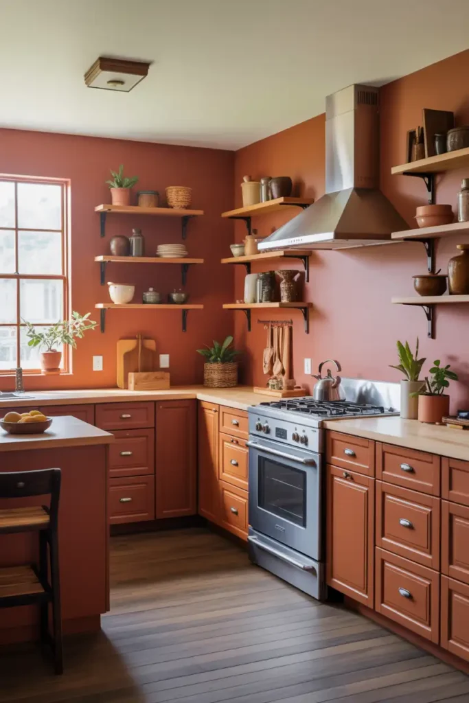
Terracotta echoes cherry’s warm undertones while adding depth and richness. This earthy color creates a cohesive, Mediterranean-inspired look that’s both cozy and sophisticated. It’s like wrapping your kitchen in a warm hug.
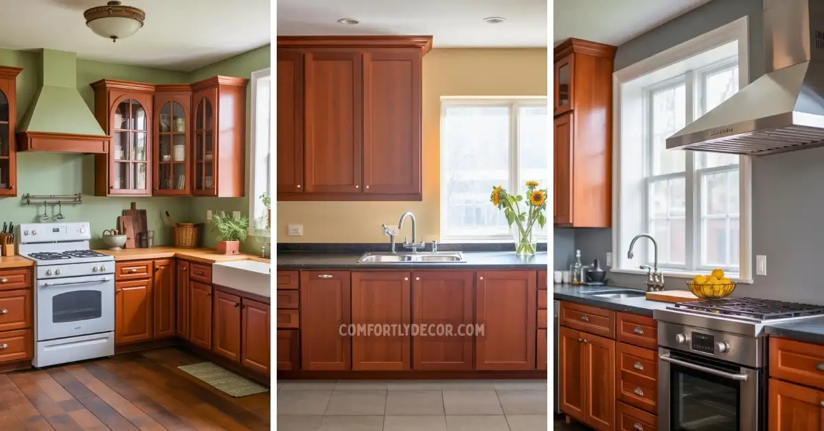
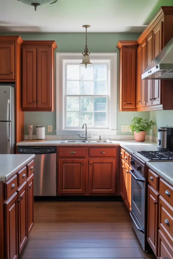
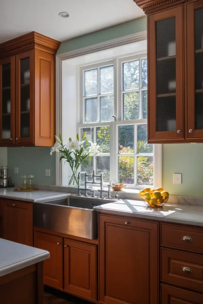
#4. Muted Sage Green
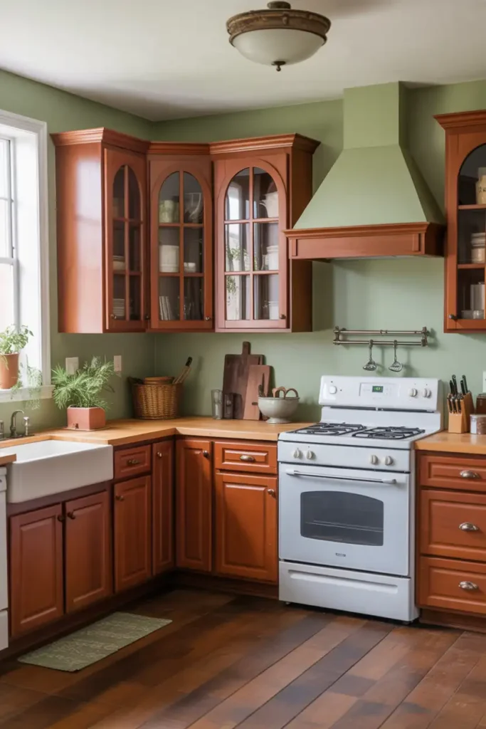
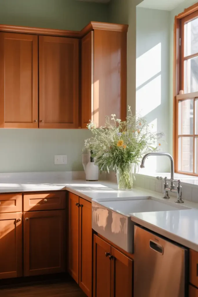
Sage green brings out cherry’s natural warmth while adding an earthy, organic feel. It’s more subtle than seafoam but still provides that complementary contrast. Perfect for creating a cozy, farmhouse-inspired kitchen that doesn’t feel too rustic.
Colors That Tone Down Cherry Cabinets
#5. Benjamin Moore Classic Gray
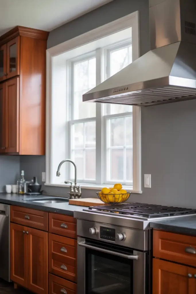
Classic Gray is your best friend if you want to modernize cherry cabinets without painting over them. This soft greige (gray + beige) has subtle undertones that gently mute cherry’s red tones, creating a balanced, contemporary look.
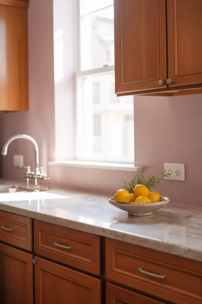
#6. Sherwin Williams Accessible Beige
Accessible Beige’s pink-taupe undertones work magic with cherry wood. It softens the intensity while maintaining warmth, making your kitchen feel fresh and updated. This color is practically foolproof—it works in almost any lighting condition.
#7. Benjamin Moore Pale Oak
Pale Oak brings subtle sophistication to cherry cabinets. This warm beige-gray creates a calming backdrop that lets the wood’s natural beauty shine without competing for attention. It’s like the perfect supporting actor in your kitchen’s design story.
#8. Sherwin Williams Alpaca
Alpaca offers just enough contrast while keeping things harmonious. This warm greige provides a modern neutral backdrop that makes cherry cabinets feel current rather than dated. It’s particularly great for smaller kitchens where you want to maximize light.
Classic Neutrals That Never Fail
#9. Creamy White
Rich, creamy whites with yellow undertones complement cherry’s warmth beautifully. Think Benjamin Moore Navajo White or Sherwin Williams Creamy. These aren’t stark whites—they’re soft, inviting, and create a timeless kitchen that’ll never go out of style.
#10. Warm Stone Gray
Stone-inspired grays add sophistication without the coldness of pure gray. Look for colors with subtle brown or beige undertones that echo natural stone. This creates a high-end, spa-like atmosphere that’s both relaxing and elegant.
#11. Soft Mushroom
Mushroom tones blend seamlessly with cherry wood, creating a cohesive, earthy palette. This color family includes warm taupes and soft browns that make your kitchen feel like a natural retreat. It’s cozy without being overwhelming.
Bold Choices for the Adventurous
#12. Charcoal Gray
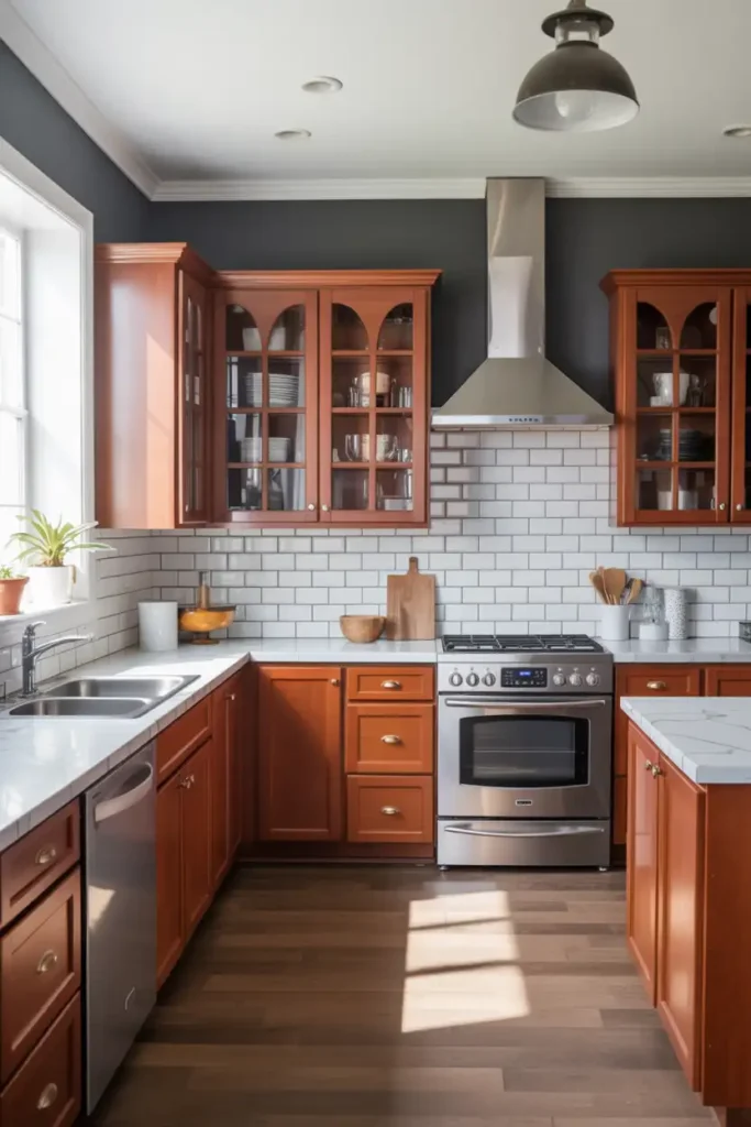
Ready to make a statement? Charcoal gray creates stunning contrast and gives cherry cabinets a modern, high-end feel. This works especially well if you mix in some lighter elements like white subway tile or marble countertops to balance the drama.
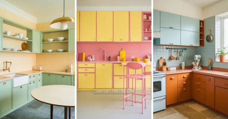
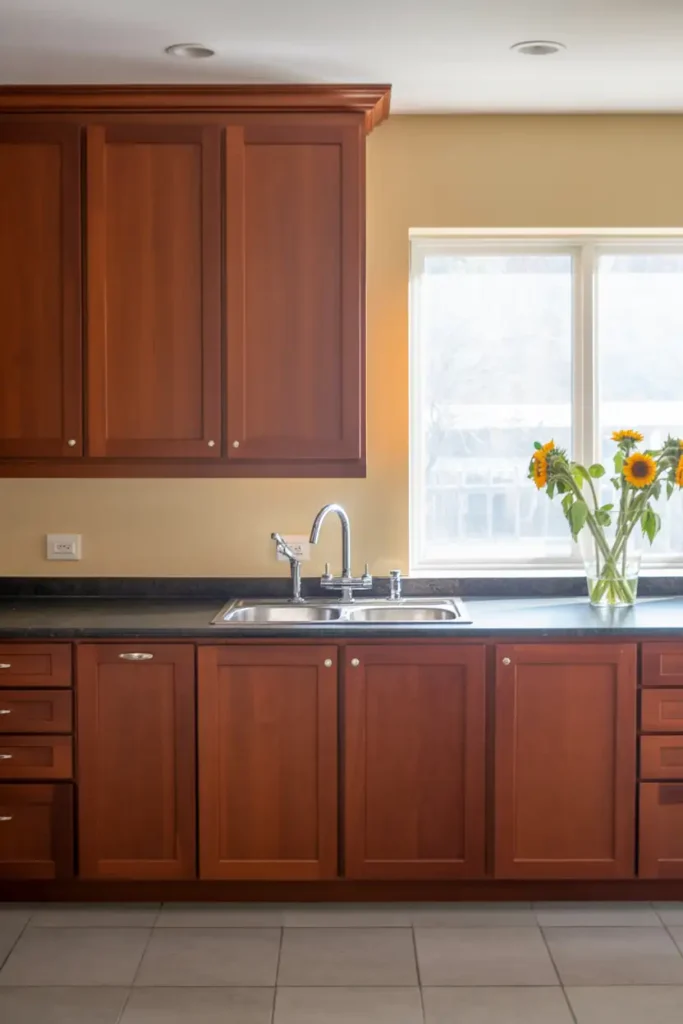
#13. Soft Butter Yellow
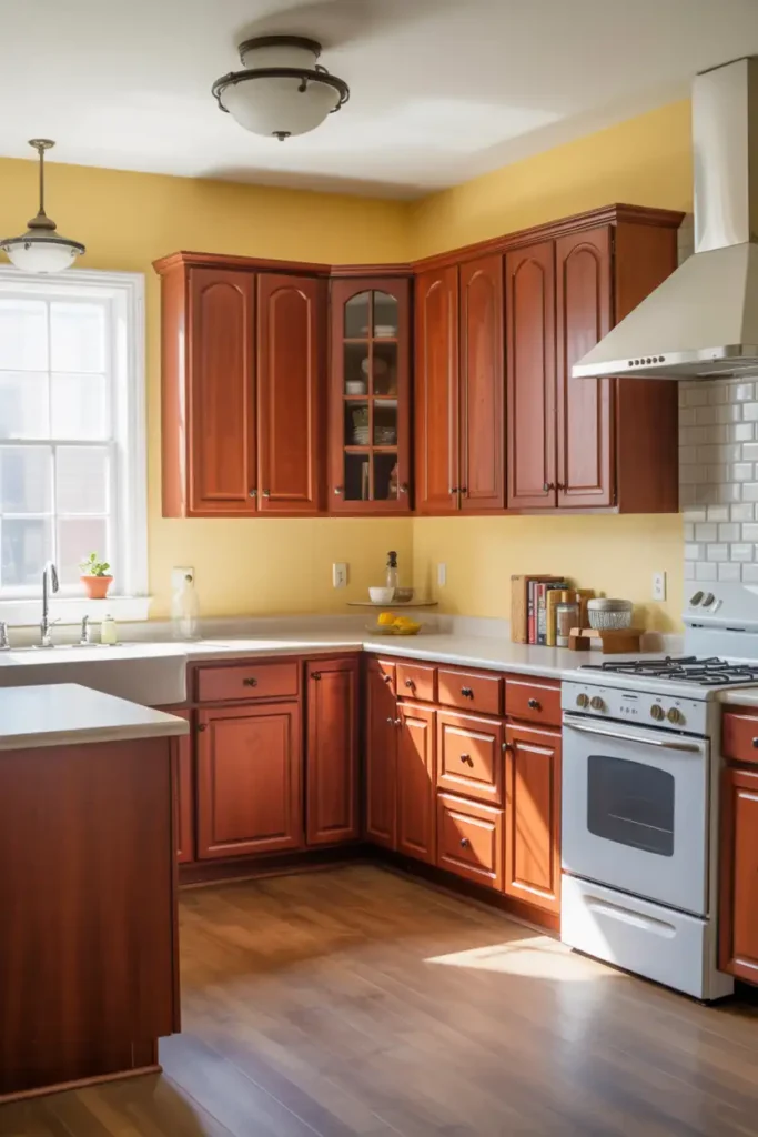
Butter yellow brings sunshine to cherry cabinets while complementing their warm undertones. It’s cheerful without being overwhelming, perfect for creating a happy, welcoming kitchen. This color works particularly well in kitchens that don’t get tons of natural light.
Colors to Avoid (Trust Me on This)
Not every color plays nicely with cherry cabinets. Cool grays with green undertones can make your kitchen feel blah and uninspired. Bright white creates too much contrast and can make cherry look dated. Bright blues often clash with red undertones, creating a jarring effect that’s tough on the eyes.
Choosing Complementary Colors
Color Theory Basics
Understanding color theory is essential when selecting hues that complement cherry cabinets. The rich, warm tones of cherry wood pair beautifully with colors on the opposite side of the color wheel, such as soft greens or muted blues.
Neutral shades with warm undertones like beige, taupe, or cream can also enhance the depth of cherry cabinets without overpowering the room.
Assessing Room Lighting
Lighting plays a significant role in how colors interact with cherry cabinets. Kitchens with ample natural light can handle bolder choices, while dimly lit spaces benefit from lighter, warm hues that brighten the room.
Experiment with swatches under different lighting conditions to ensure the colors maintain their intended effect throughout the day.
Styling Tips for Different Aesthetics
For a modern aesthetic, pair cherry cabinets with sleek grays or greiges, incorporating metallic accents for added sophistication. If you love a rustic or traditional look, consider earthy tones like olive green or wheat yellow.
For a contemporary farmhouse vibe, balance cherry wood with creamy whites and light beige shades for a cozy, inviting feel. Remember, accessories, backsplash tiles, and countertops can also tie the look together seamlessly.
FAQs
Conclusion
Choosing the right paint color to pair with cherry cabinets can transform your kitchen into a cohesive and inviting space. By understanding the undertones of your cabinets and testing colors in natural lighting, you can find a harmonious balance that enhances the warmth and elegance of the wood.
Remember, the ultimate goal is to create a space that reflects your personal style while showcasing the timeless beauty of cherry cabinets.
Vibe Up Your Space With Comfort & Color — your go-to destination for stylish home decor that blends comfort with color. Create cozy corners and vibrant vibes in every room and space at your home!