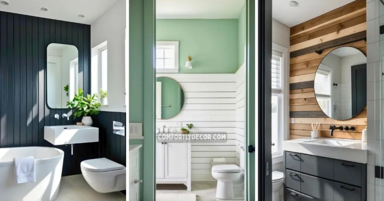
17 Powder Room Paint Colors Ideas to Transform Small Spaces with Style
Choosing the right paint color for a powder room can transform this small space into a stylish and inviting part of your home. I have gathered a variety of paint colors that balance timeless appeal with current trends, helping you find a shade that suits your style and enhances the room’s atmosphere.
The paint color you select for your powder room has the power to make the space feel larger, cozier, or more vibrant depending on your choice. Whether you prefer subtle neutrals or bold hues, the right color can create a unique personality for this often overlooked area.
17 Powder Room Paint Colors
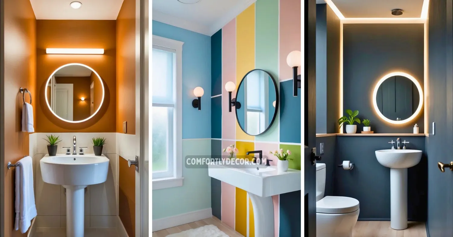
1. Classic Navy Blue
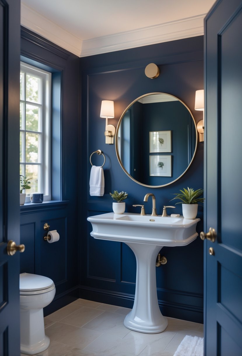
I find navy blue to be a timeless choice that adds depth to any powder room. It works well on walls or wainscoting, creating a rich, sophisticated atmosphere without overwhelming the space.
Pairing navy with lighter shades like cream or soft gray balances the boldness. Adding brass fixtures or subtle navy accents brings warmth and elegance, making the room feel welcoming yet refined. Navy blue offers both style and practicality, especially in small spaces.
2. Soft Pale Gray
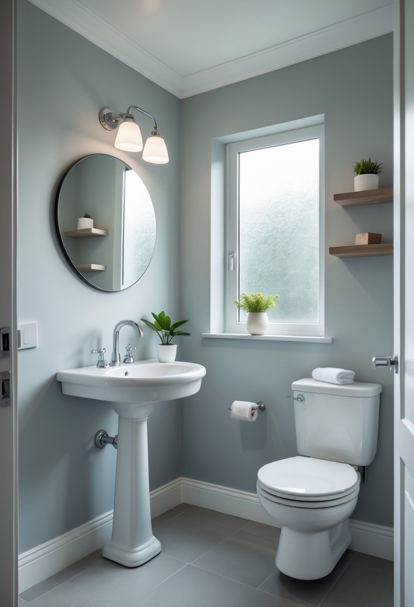
I find soft pale gray to be a versatile choice for a powder room. It offers a calm, neutral backdrop that complements most decorating styles without overwhelming the space.
This shade works well with white trim or natural wood accents, adding subtle contrast. It also reflects light effectively, which can help small rooms feel more open and airy.
For me, pale gray strikes the right balance between modern and classic. It keeps the powder room feeling fresh and polished without being too bold.
3. Rich Emerald Green
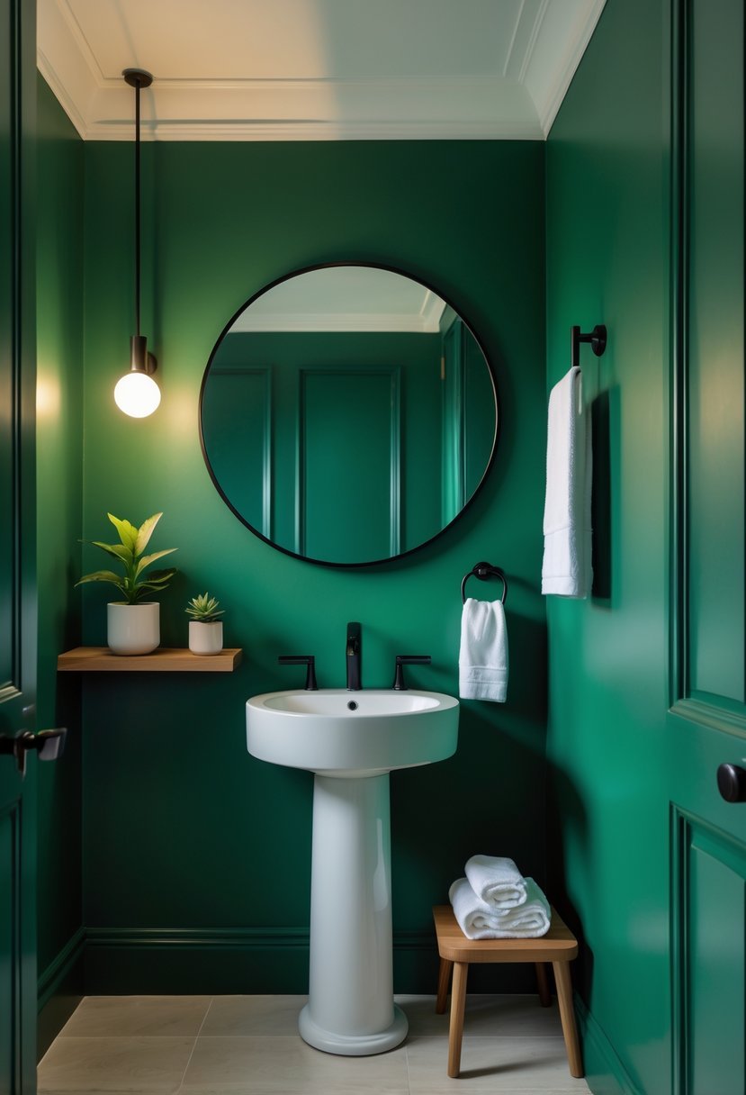
I find rich emerald green to be a compelling choice for a powder room. Its deep, vibrant tone adds sophistication without overwhelming the space.
This color creates a moody yet elegant atmosphere, making the room feel both cozy and refined. Pairing it with gold or black accents enhances the luxurious effect.
Emerald green works well on walls, providing a bold backdrop that can elevate simple fixtures. It’s a versatile shade that suits modern and classic designs alike.
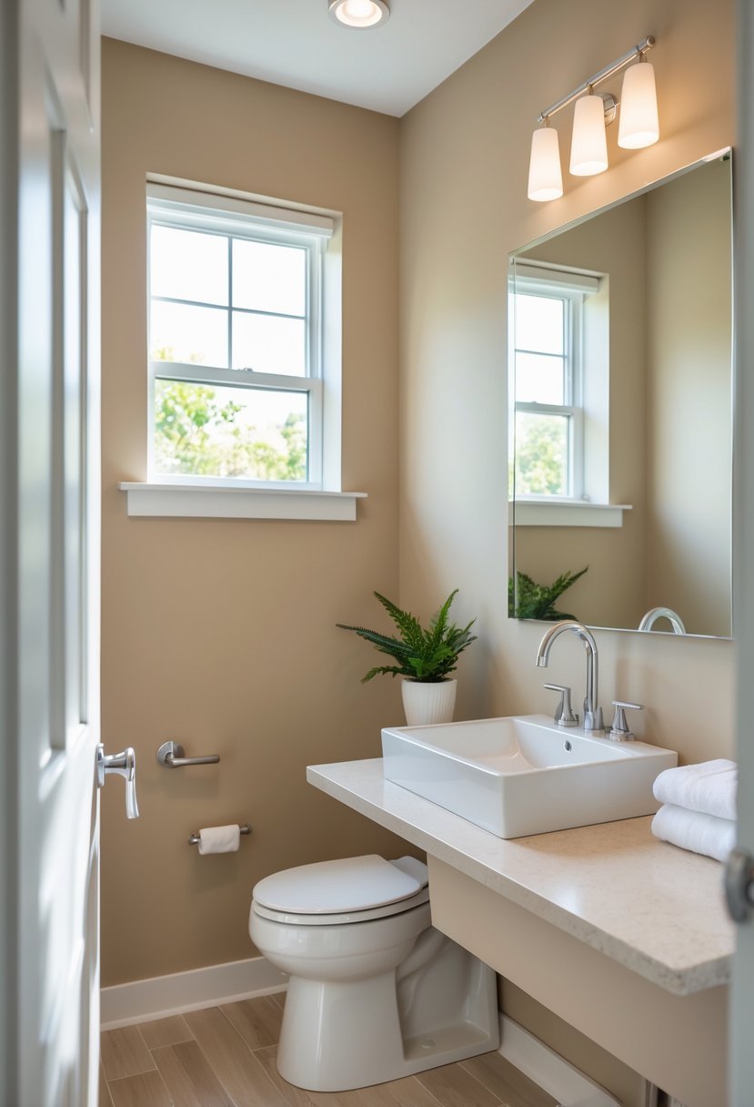
4. Warm Taupe
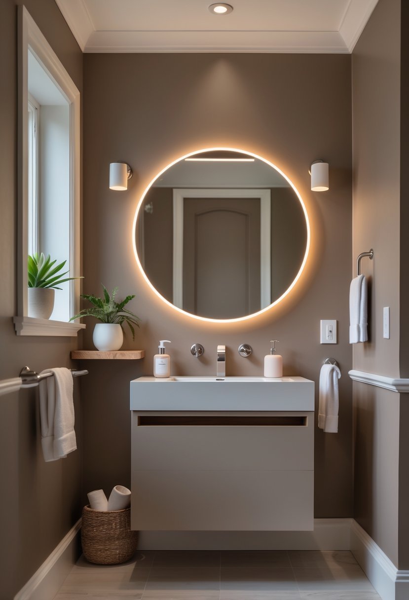
I find warm taupe to be an excellent choice for powder rooms. Its blend of brown and gray tones offers a cozy yet sophisticated feel.
This color works well with various decor styles, from traditional to modern. It adds depth to small spaces without overwhelming them.
Warm taupe also pairs nicely with white trim and vintage fixtures, creating a welcoming atmosphere. It’s versatile enough to adapt to different lighting conditions, making it a reliable option.
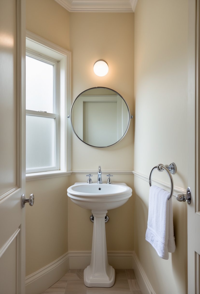
5. Bright Crisp White
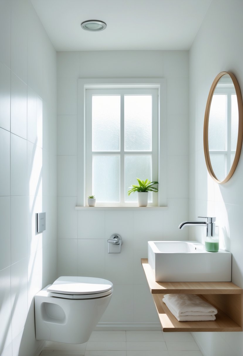
I often recommend bright crisp white for powder rooms because it instantly creates a clean, fresh atmosphere. This color makes small spaces feel more open and inviting without overwhelming the senses.
Pairing white walls with contrasting trim or brass accents adds subtle interest while maintaining elegance. For those who want simplicity with a touch of sophistication, crisp white is a safe, classic choice that never goes out of style.
6. Deep Charcoal
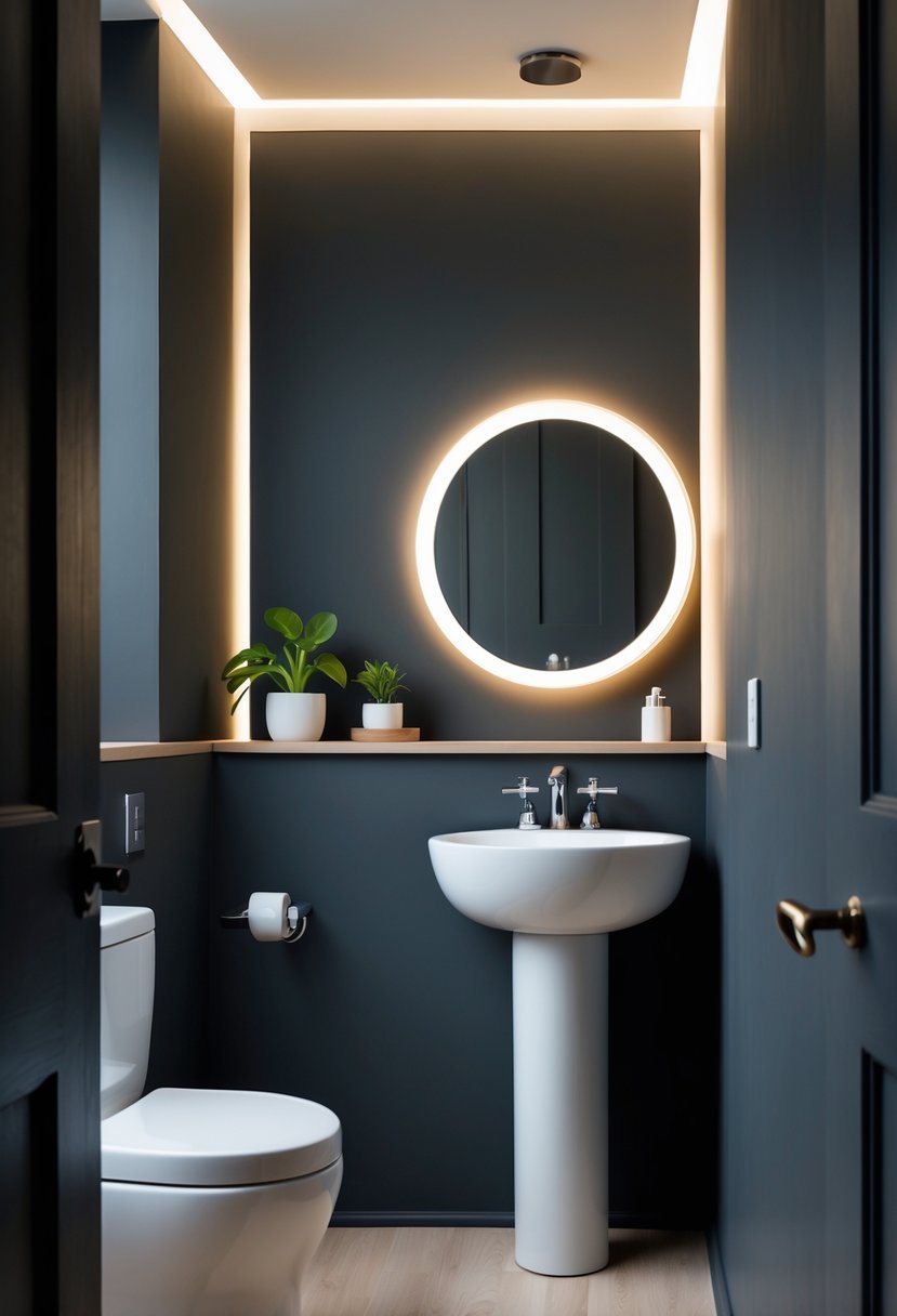
I find deep charcoal to be a powerful choice for powder rooms. It adds a rich, dramatic feel without overwhelming the small space. Using matte or eggshell finishes helps keep the look soft and modern.
Deep charcoal creates an intimate atmosphere that feels polished and sophisticated. Pairing it with brass or gold fixtures enhances the elegance. It’s a versatile color that works well with both contemporary and classic styles.
7. Moody Teal
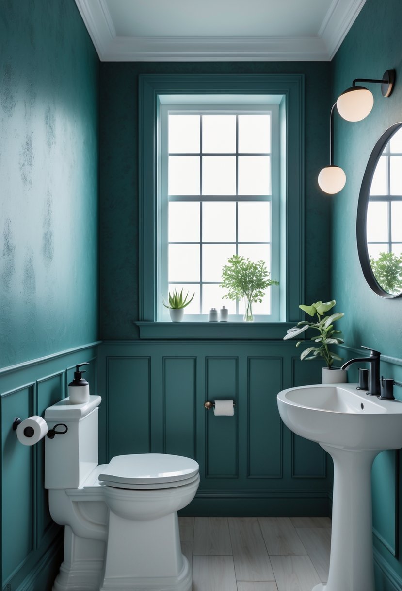
I find moody teal to be a striking choice for powder rooms. It creates depth without feeling too dark or heavy.
This shade balances blue and green tones, providing a rich, calming effect. It works well with warm lighting, which softens the space.
Pairing moody teal with polished chrome fixtures or ornate mirrors adds a refined touch. In my experience, this color brings both elegance and intimacy to small spaces.
8. Blush Pink
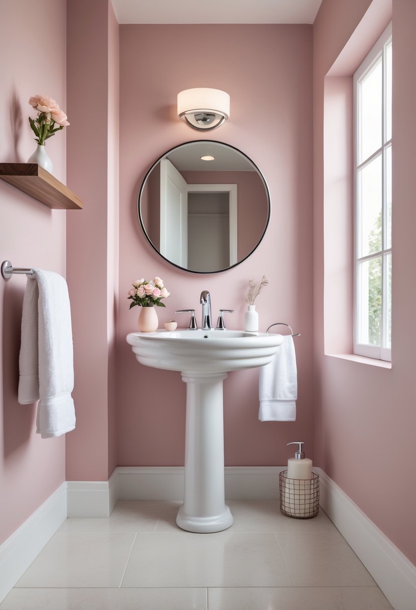
I find blush pink to be a versatile and elegant choice for powder rooms. It adds warmth without overpowering the space, creating a soft, inviting atmosphere.
This shade works well with metallic accents like brushed gold or chrome, enhancing its subtle sophistication. For me, it strikes the perfect balance between playful charm and understated luxury.
Using blush pink can transform a small powder room into a stylish, cozy retreat. Its gentle hue pairs smoothly with both modern and classic decor styles.
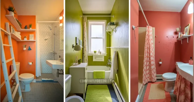
9. Muted Sage
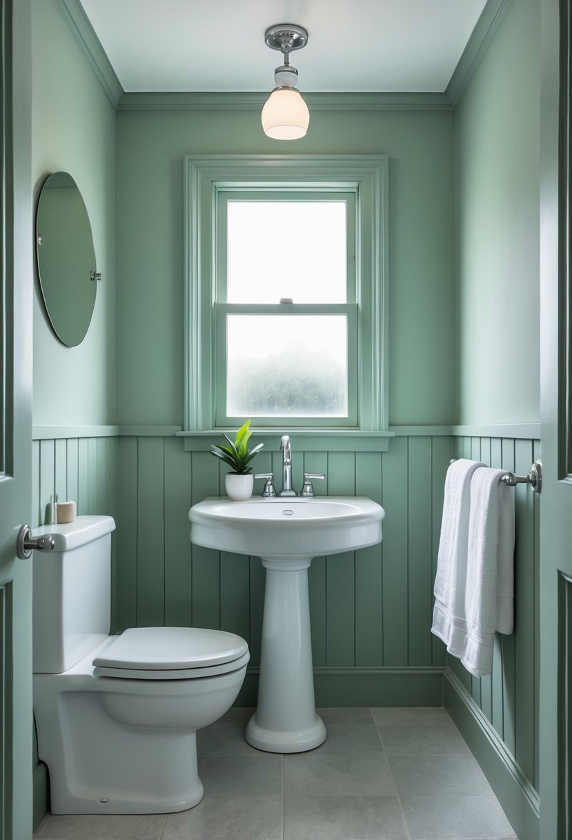
I often recommend muted sage for powder rooms because it brings a subtle, calming vibe without feeling dull. This shade balances green and gray tones, making it versatile and timeless.
Muted sage works well with various fixtures and styles, from modern gold accents to classic white porcelain. It adapts to lighting, appearing fresh in daylight and cozy in the evening. This makes it a reliable choice for small spaces.
10. Bold Burgundy
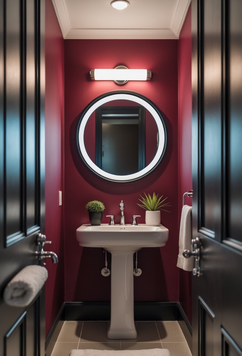
I find bold burgundy to be a powerful choice for a powder room. Its rich, deep tone adds sophistication without overwhelming the small space.
This color works well on walls or as an accent, giving the room a moody yet inviting atmosphere. Paired with lighter fixtures, burgundy creates contrast and depth.
In my experience, it’s both timeless and trendy, making the powder room feel intentional and stylish. Burgundy also complements metals like brass or gold for a polished look.
11. Sunshine Yellow
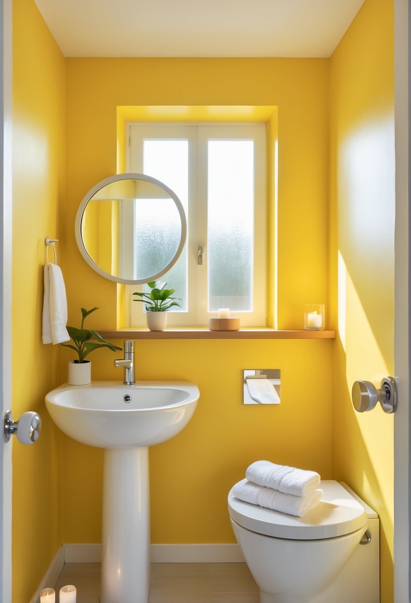
I find sunshine yellow to be an excellent choice for a powder room. It brings warmth and brightness without overwhelming the small space.
This color creates a cheerful atmosphere, making the room feel inviting and lively. It also works well to offset darker fixtures, such as wood vanities or mirrors.
If you choose yellow, I recommend testing several shades to find the right tone. Different lighting can change how the color appears throughout the day.
12. Matte Black
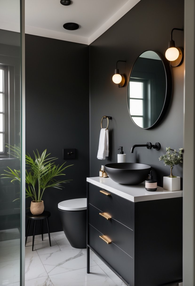
I find matte black paint adds a modern, sophisticated edge to any powder room. It creates depth without overwhelming the space, especially when used as an accent wall.
Matte black pairs well with metallic hardware like gold or brass, adding a sleek contrast. It also hides imperfections better than glossy finishes, making it practical.
Choosing the right quality matte paint ensures smooth coverage and durability. For me, it strikes the perfect balance between boldness and subtlety in a small space.
13. Dusty Lavender
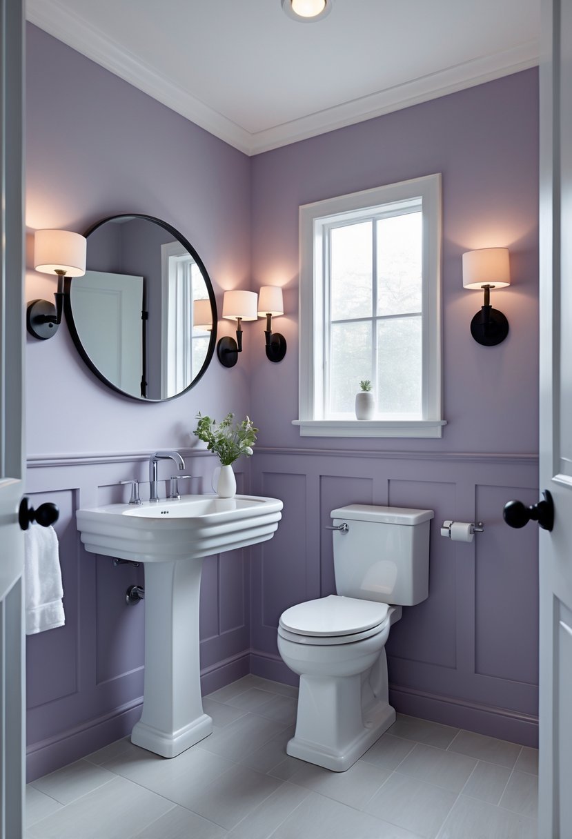
I find dusty lavender to be a subtle yet sophisticated choice for a powder room. Its muted purple tone creates a calming atmosphere without feeling overwhelming.
Pairing this color with white wainscoting adds a clean contrast and enhances the room’s elegance.
In my experience, dusty lavender works well with modern fixtures like sleek pedestal sinks. It brings just enough color to make the space inviting and stylish.
14. Creamy Beige
I value creamy beige for its timeless and versatile quality. This color adds warmth without overwhelming a small space like a powder room.
In my experience, it pairs well with elegant wainscoting or subtle gold fixtures to elevate the room’s look.
Creamy beige creates a calm and inviting atmosphere, making it a practical choice if you prefer a classic style that won’t easily go out of fashion.
15. Steel Blue
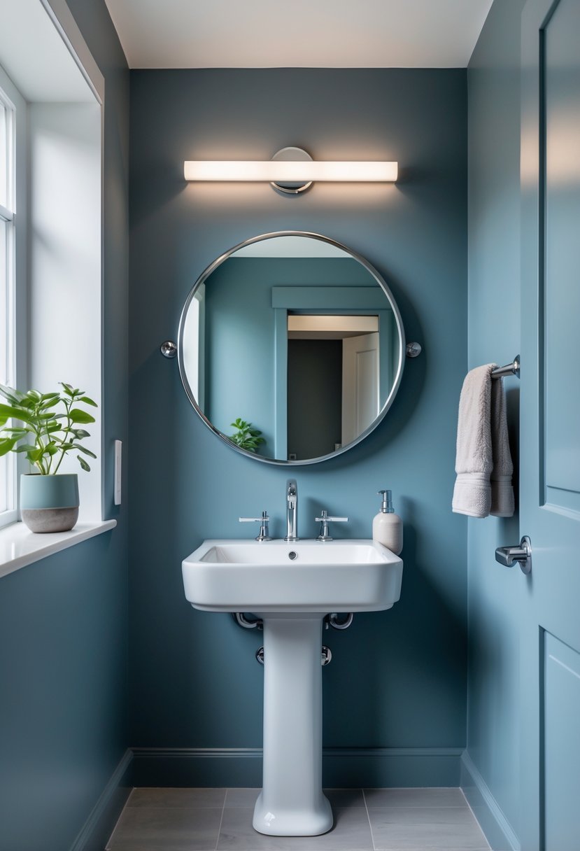
I find steel blue to be a sophisticated choice for a powder room. It strikes a balance between bold and subdued, giving the space a modern edge without feeling overwhelming.
This color works well with white fixtures, which highlight its cool undertones and keep the room feeling clean. Sometimes, I like adding subtle gold or gray tints to soften the look and add depth.
Steel blue can also work beautifully as wallpaper, offering texture while maintaining a sleek appearance. It’s a versatile option for a small, stylish powder room.
16. Burnt Orange
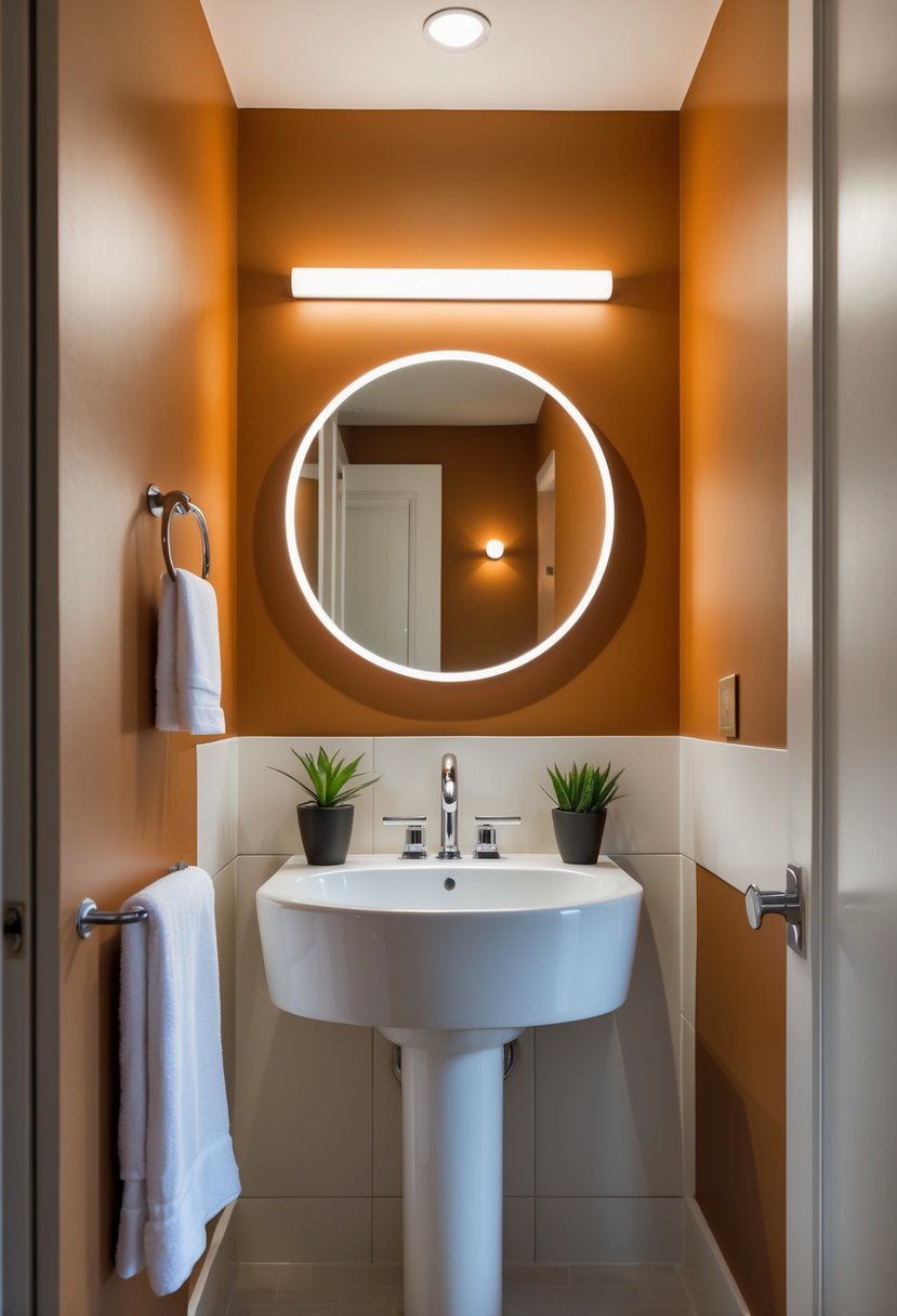
I find burnt orange to be a warm, sophisticated choice for a powder room. It adds depth and energy without overwhelming the small space.
Pairing burnt orange with soft neutrals like ivory or sand helps balance its richness. You can also introduce deep greens for a grounded contrast.
This color works well whether I want a bold statement or a subtle accent. It brings a cozy yet vibrant feel that can transform the powder room effectively.
17. Sandy Beige
I find sandy beige to be an excellent choice for a powder room because it creates a warm, inviting atmosphere without overwhelming the space. This color works well with a variety of fixture finishes, especially gold or brass, adding subtle elegance.
The neutral tone reflects light softly, making small rooms feel more open and calm. It also pairs easily with textured walls or classic wainscoting, giving the room timeless appeal. For me, sandy beige strikes the right balance between understated and stylish.
Choosing Powder Room Paint Colors for Small Spaces
#1. Consider Room Size and Lighting
When I select powder room paint colors I always evaluate lighting first. Small spaces react strongly to light so paint can look very different throughout the day.
- Natural light supports deeper and moodier shades
- Low light benefits from lighter or warmer tones
- Artificial lighting can soften bold colors
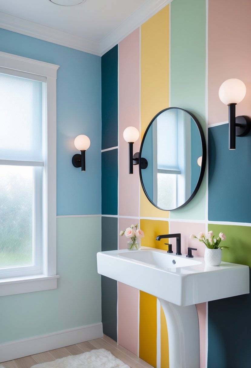
#2. Decide the Mood I Want to Create
I choose colors based on how I want the powder room to feel since this space allows more creativity than other rooms.
- Dark shades create drama and sophistication
- Soft neutrals feel calm and timeless
- Bold colors add personality and charm
#3. Balance Color with Fixtures
I always consider sinks mirrors and hardware before committing to paint. Balance keeps the room from feeling heavy.
- Light fixtures pair well with deep wall colors
- Metallic finishes elevate darker paint
- White elements prevent visual overload
#4. Use Bold Shades Strategically
When I choose strong powder room paint colors I control placement to keep the space stylish rather than overwhelming.
- Full walls work best with matte finishes
- Accent walls add interest without crowding
- Simple decor allows color to stand out
#5. Keep the Design Timeless
I focus on classic combinations so the powder room stays appealing long term.
- Neutral foundations with updated accents
- Minimal patterns for lasting appeal
- Lighting and mirrors for visual balance
FAQs
Making Small Spaces Feel Intentional and Stylish
I believe powder room paint colors offer an opportunity to be bold while staying elegant. With thoughtful lighting balanced fixtures and intentional color choices I can transform even the smallest powder room into a space that feels stylish welcoming and memorable.

I am Mindy Medford, a home décor, paint, and design specialist with over a decade of hands-on experience transforming ordinary spaces into cozy, personality-packed havens. Since 2013, I have been helping homeowners discover the art of beautiful yet practical design. I share my love for color, texture, and layout—making stylish interiors & exteriors feel achievable for everyone. Whether it’s picking the perfect paint shade or reimagining a small space, I’m here to guide and inspire.