22 Interior Paint Colors That Make You Happier
Choosing the right paint colors can significantly impact how you feel in your home. I’ve learned that certain shades have the power to lift your mood, create calm, or bring a sense of comfort without overwhelming your space.
Understanding which colors promote happiness helps you create an environment that supports your well-being every day.
22 Paint Colors that Make You Happier
Here I will highlight 22 interior paint colors known to enhance mood, making it easier to pick hues that work for you.
1. Rustic Terracotta
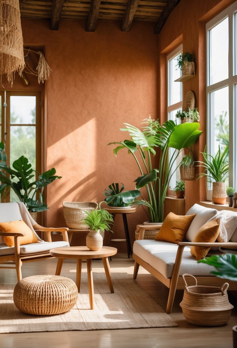
I find Rustic Terracotta to be a grounded, warm color that adds depth to any room. Its earthy red and orange tones create a cozy atmosphere without feeling overwhelming.
This shade works well on accent walls or in spaces where you want a natural, inviting vibe. I often pair it with neutral colors or muted greens to balance its richness while maintaining comfort.
Using Rustic Terracotta can connect your interior to nature, fostering a calm and welcoming environment.
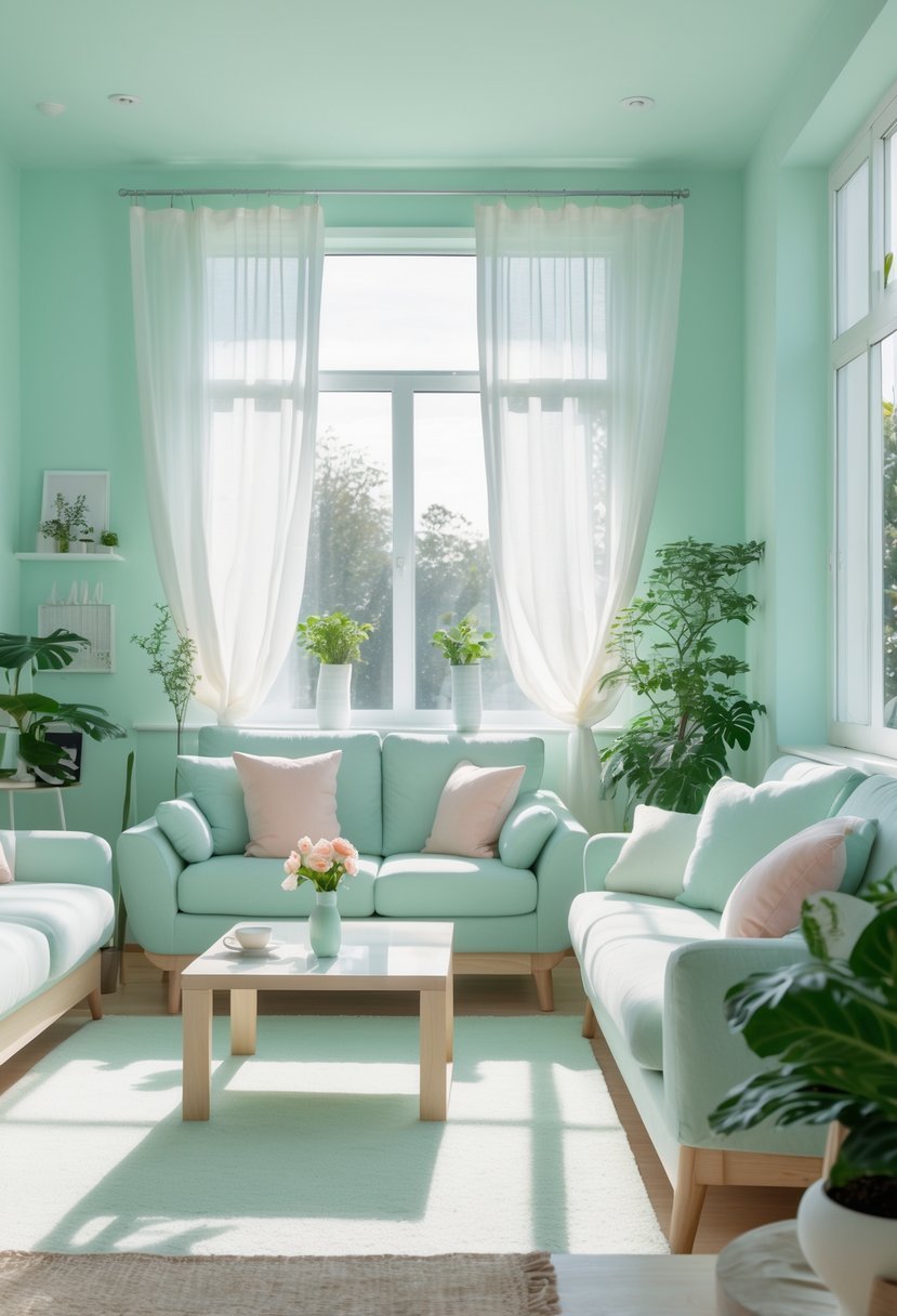
2. Muted Sage Green
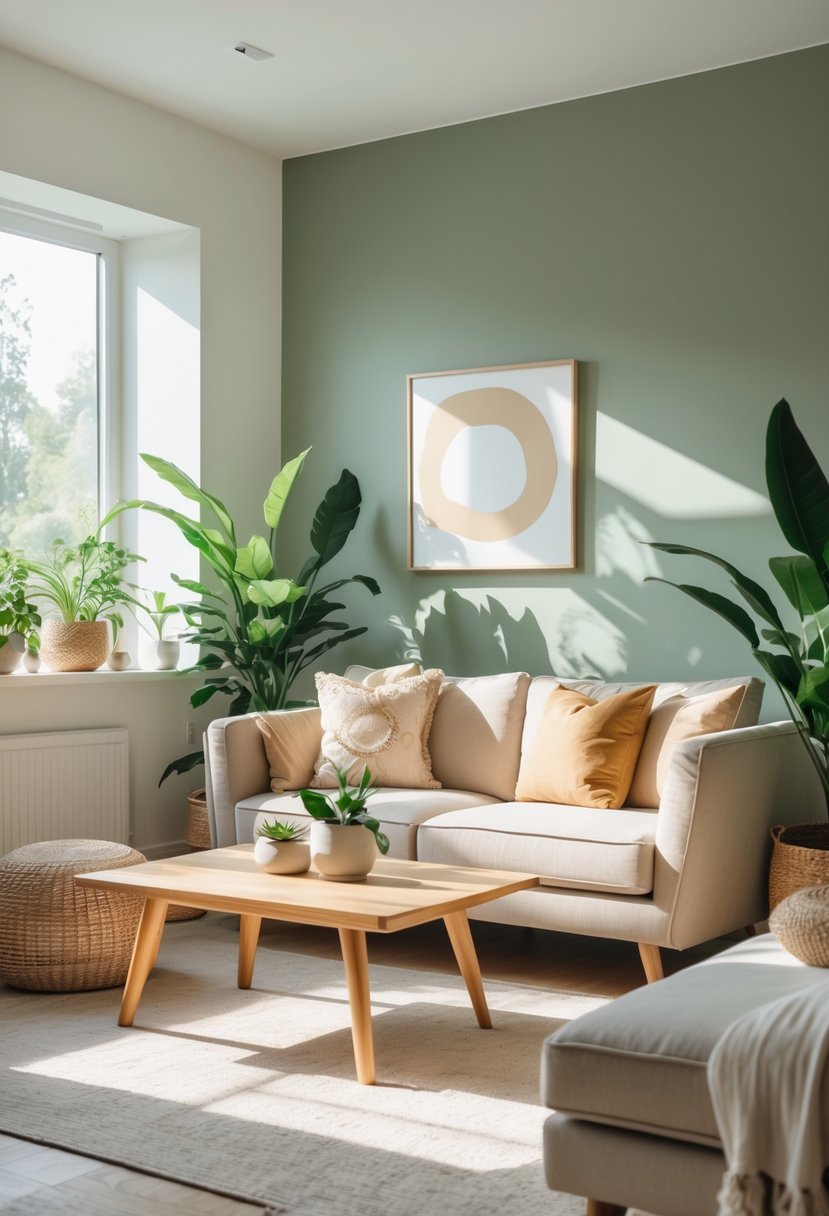
I find muted sage green to be one of the most calming and versatile paint colors. Its soft green tone, blended with subtle gray or brown undertones, creates a grounded and earthy atmosphere.
This shade works well in many rooms because it brings a quiet sophistication without feeling too bold. It pairs easily with natural materials and neutral palettes, making it a reliable choice for steady comfort at home.
3. Misty Lavender
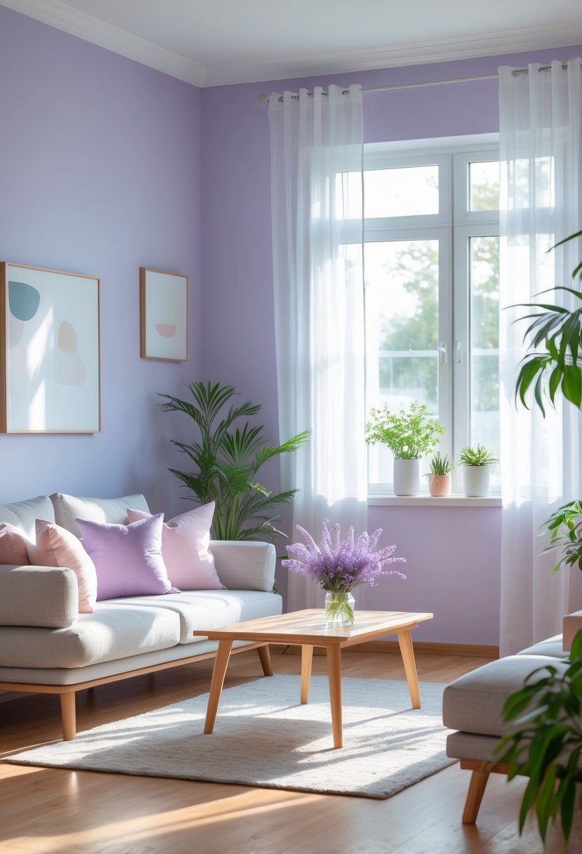
I find Misty Lavender to be a calming yet sophisticated paint choice. Its soft purple undertones offer versatility, making it easy to pair with many colors.
This shade works well in spaces meant for relaxation or focus. I appreciate how it adds a subtle touch of elegance without overwhelming a room.
For me, Misty Lavender brings a gentle, soothing atmosphere. It’s a color that feels both fresh and timeless in interior design.
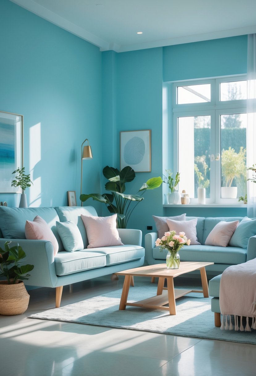
4. Soft Sky Blue
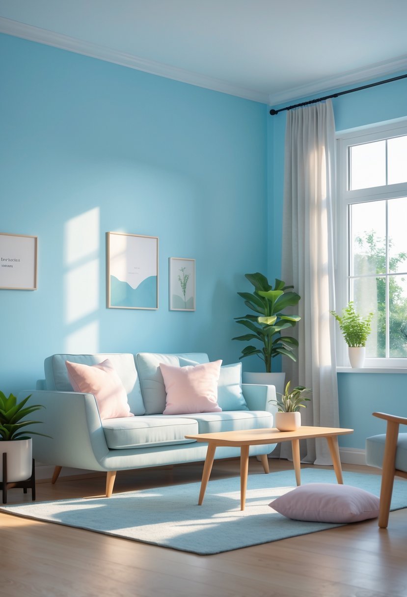
I find soft sky blue to be one of the most calming paint colors for interior spaces. It creates a serene atmosphere without feeling cold or sterile. The shade brings a natural sense of lightness, reminiscent of clear skies.
Using soft sky blue in a room can make the space feel more open and airy. I’ve seen how it brightens areas while maintaining a peaceful backdrop. It pairs well with neutrals and subtle whites, adding freshness without overwhelming.
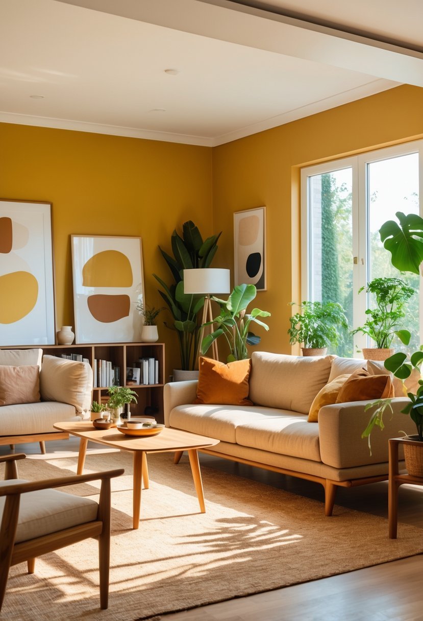
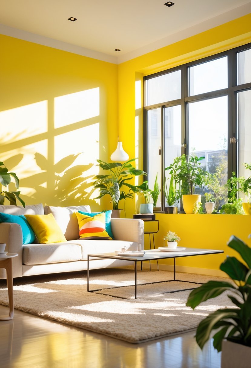
5. Cheerful Marigold
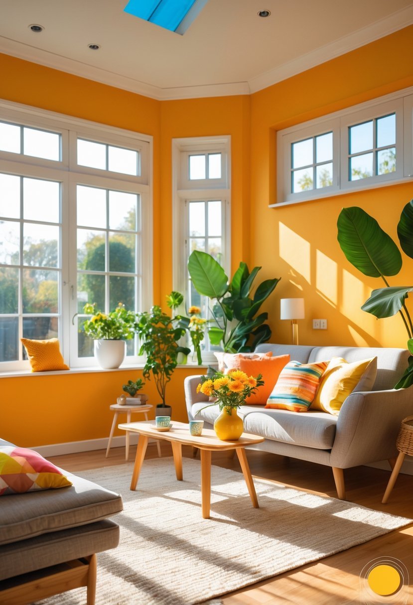
I find marigold to be a uniquely warm and vibrant color. It blends sunny yellows with subtle orange tones, creating a lively yet balanced hue.
Marigold brightens any room without overwhelming the space. I’ve seen it work well as both a statement wall and an accent, adding energy and warmth.
This color suits various design styles, from modern to traditional. Using marigold can make a room feel inviting and cheerful, perfect for spaces where you want positivity.
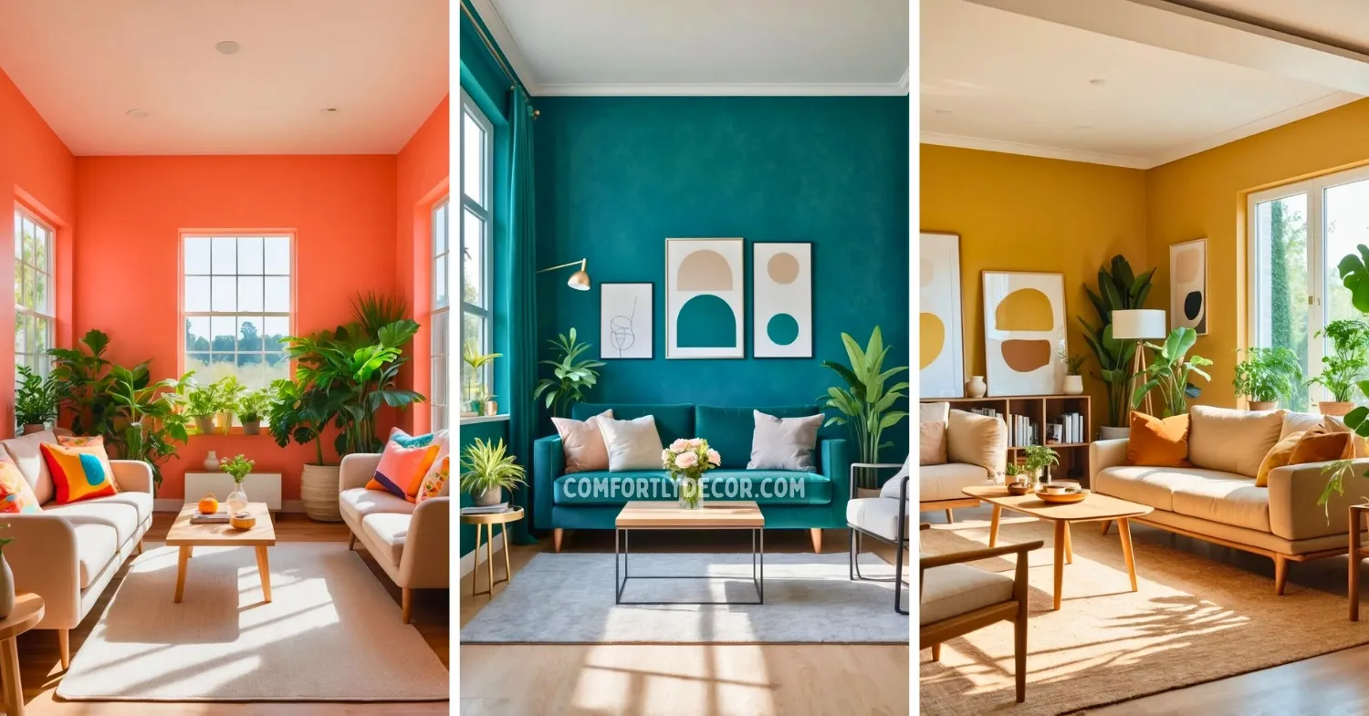
6. Velvet Teal
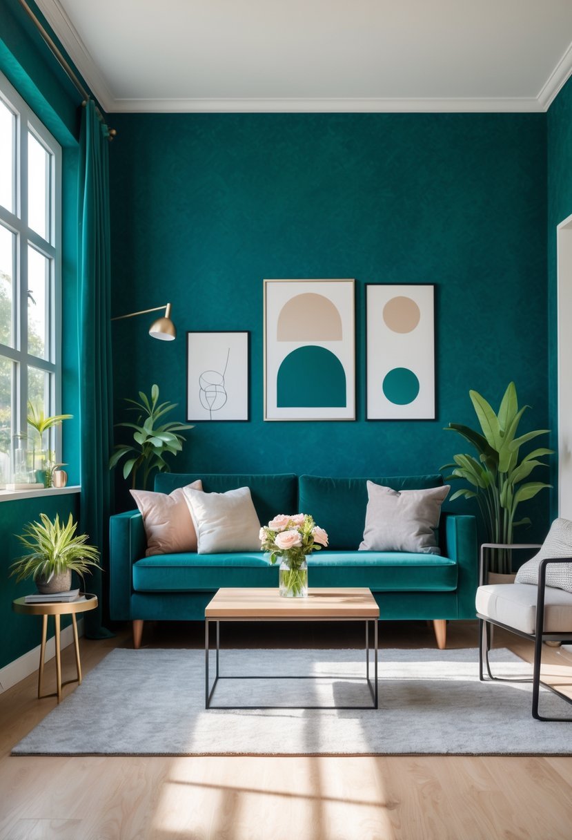
Velvet Teal offers a balanced mix of blue and green that feels both calming and sophisticated. I find it works well in living spaces where you want a touch of color without overwhelming the room.
This shade adds depth, especially in rooms with natural light. It pairs nicely with warm neutrals and metallic accents, creating a rich yet inviting atmosphere.
For me, Velvet Teal is versatile—it can be a dramatic statement or a subtle backdrop depending on the lighting and furnishings. It’s a reliable choice for anyone wanting color that remains timeless.
7. Warm Mustard Yellow
I find warm mustard yellow to be a bold, inviting color that adds personality to any room. It strikes a balance between earthy and vibrant tones, which makes it versatile for different styles.
When used thoughtfully, mustard yellow creates a cozy, uplifting atmosphere without feeling overwhelming. It pairs well with natural wood and darker accents, giving a space a refined yet comfortable look.
8. Dusty Rose
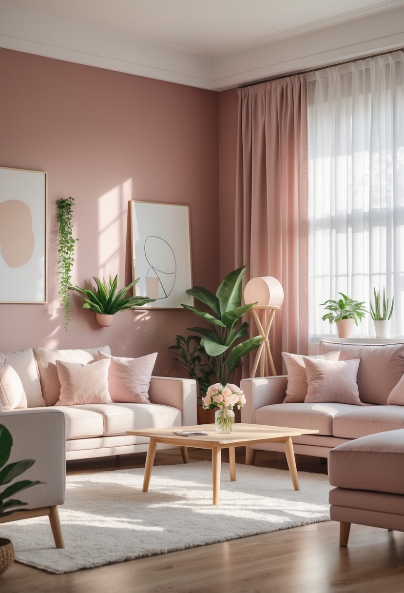
I find dusty rose to be a versatile color that adds subtle warmth without overwhelming a space. Its muted pink tones bring a sense of calm and softness, making it perfect for bedrooms or living areas.
In my experience, pairing dusty rose with warm neutrals like beige or cream enhances its inviting feel. It strikes a balance between romantic and modern, creating an elegant atmosphere that doesn’t feel trendy or short-lived.
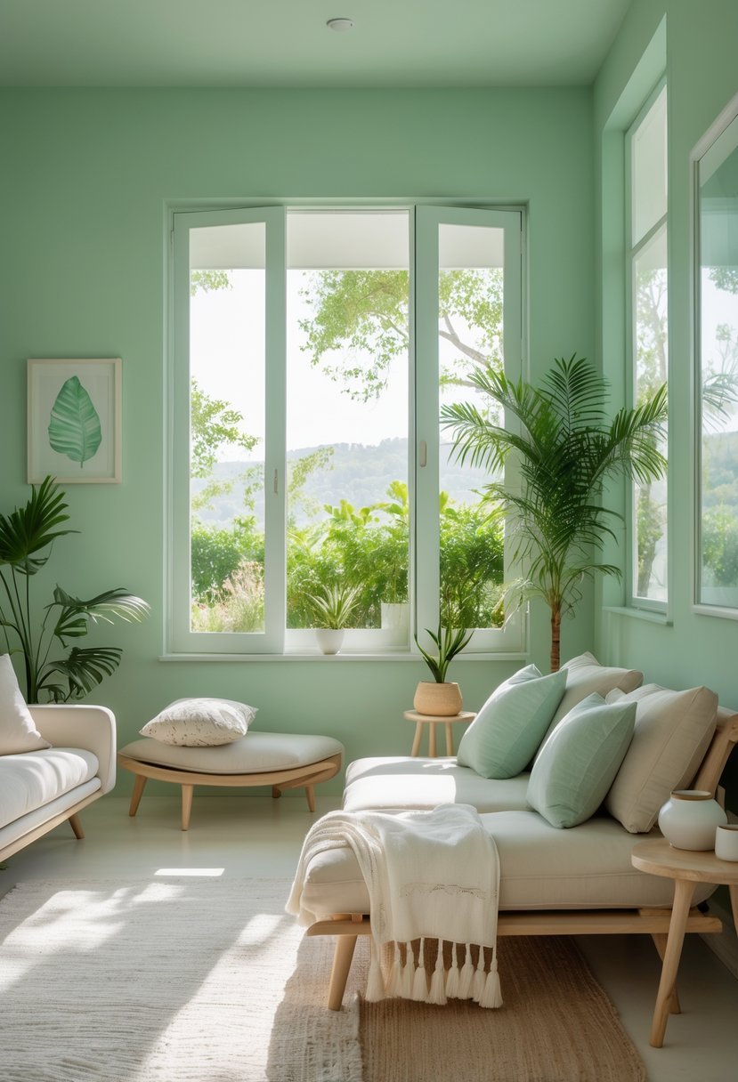
9. Lush Fern Green
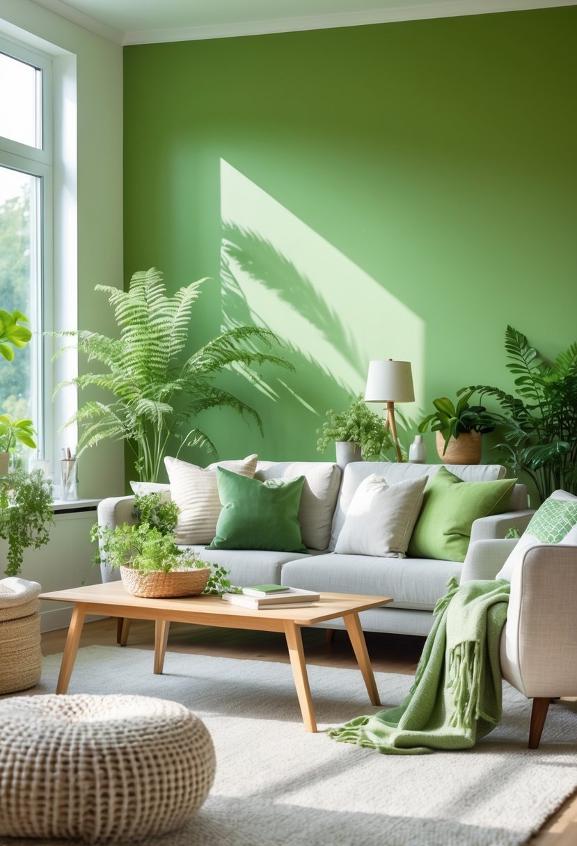
I find Lush Fern Green to be a rich, natural shade that brings a calming vibe to any room. It’s deep enough to add character without overwhelming the space.
This color works well in living areas or bedrooms where you want a touch of nature indoors. It complements wood tones and neutral accents perfectly, creating a balanced and grounded atmosphere.
10. Calming Aqua
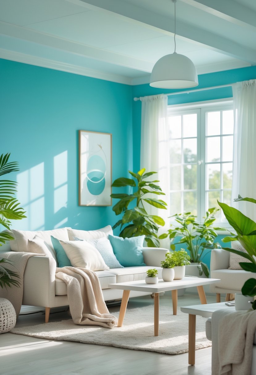
I find calming aqua to be a perfect blend of blue and green, balancing serenity with a refreshing vibe. This color reminds me of water and open skies, which naturally helps me feel relaxed.
Using aqua in a room creates a peaceful atmosphere without feeling dull. It works well in bedrooms, bathrooms, or even living spaces where I want to unwind or feel renewed. The subtle brightness also adds a gentle pop of color.
11. Jewel-Toned Amethyst
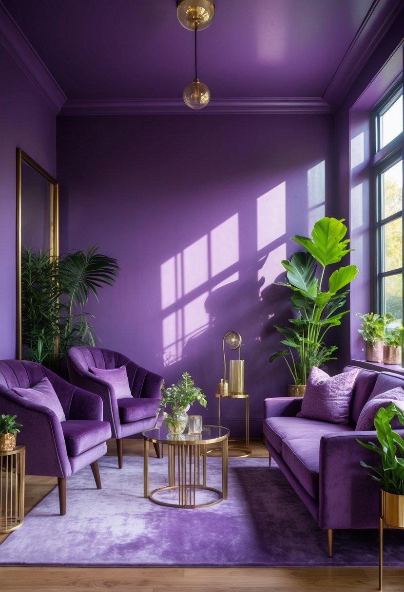
I find jewel-toned amethyst to be a balanced choice for interiors. Its rich purple hue brings depth without overwhelming a space.
The color has a slight gray undertone, which softens its impact. This makes it versatile for various rooms—from living areas to bedrooms.
Using amethyst paint can add a subtle elegance. It’s a great way to introduce a luxurious feel while keeping the mood calm and inviting.
12. Sun-Kissed Coral
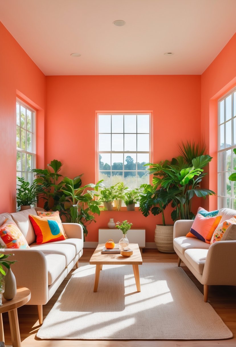
I find Sun-Kissed Coral to be a warm and inviting color that adds subtle energy to any room. It balances the brightness of orange with a gentle pink undertone, making it perfect for spaces where I want a cheerful but not overwhelming atmosphere.
This shade works well as an accent wall or throughout smaller rooms. Pairing it with neutral tones or soft coastal colors enhances its warmth without overpowering the space. I appreciate how it brings a fresh yet cozy feel, ideal for living areas or bedrooms.
13. Gentle Peach
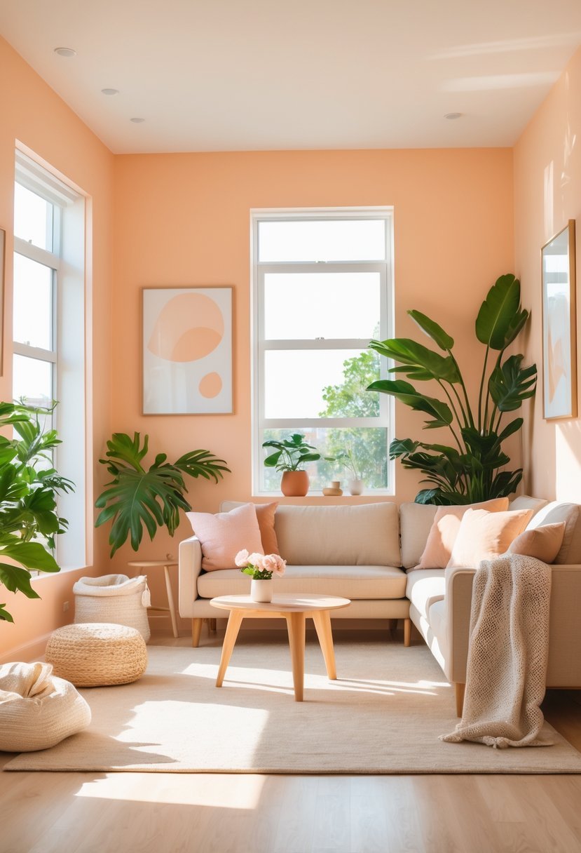
I find gentle peach to be a versatile and inviting color that adds warmth without overwhelming a space. It strikes a balance between soft pink and light orange, creating a calm and cozy atmosphere in any room.
This shade can brighten a living area or bedroom, offering subtle elegance and a touch of natural warmth. I appreciate how it pairs well with neutral tones and soft greens, making it easy to integrate with various décor styles.
14. Earthy Clay
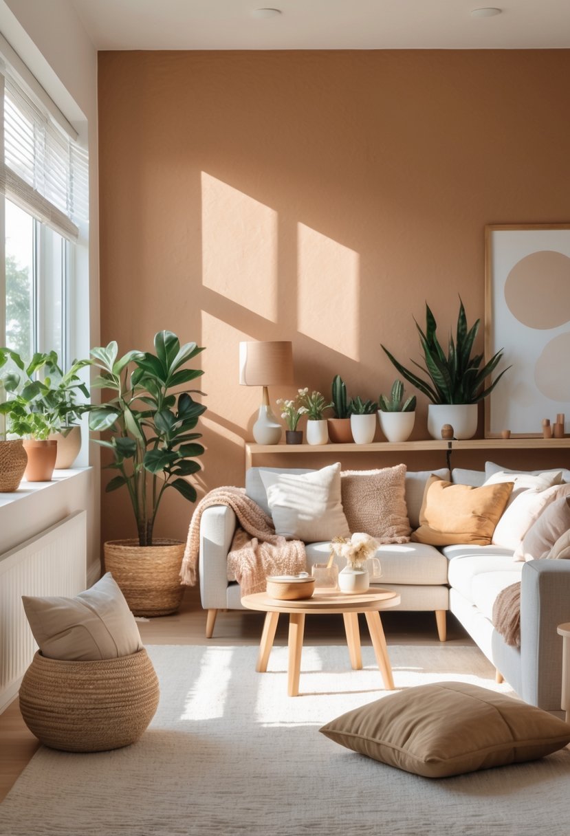
I find earthy clay tones bring a grounded and warm atmosphere to any space. These colors, inspired by natural clay and terracotta, blend well with greens and off-whites, creating a balanced, calm environment.
In my experience, clay hues offer versatility. They work in living rooms, kitchens, or cozy bedrooms without feeling overwhelming. This makes them a solid choice for anyone wanting a natural, welcoming feel in their home.
15. Powdery Mint
I find powdery mint to be a calm, refreshing choice for interior walls. Its subtle green-blue tone brings a sense of serenity without overwhelming a space.
This color works well in bedrooms or living areas where relaxation is key. It also pairs nicely with natural wood and soft neutrals, making it versatile.
Using powdery mint can brighten a room gently and create a peaceful atmosphere that helps me feel more grounded and clear-headed.
16. Tranquil Seafoam
I find Tranquil Seafoam to be a perfect blend of soft green with a hint of blue. This color creates a calm and airy atmosphere wherever I use it.
It works well in bedrooms, bathrooms, or even a cozy reading nook. The subtle tone helps me feel relaxed and focused.
Using Seafoam on walls or trim brings a refreshing yet gentle energy to any room. It’s an elegant choice that doesn’t overwhelm the space.
17. Bright Citron
I find Bright Citron to be a vibrant and refreshing choice that instantly energizes a space. Its lively yellow-green tone adds a burst of positivity without feeling overwhelming.
This color works well paired with soft neutrals like warm whites and light grays, creating a balanced and harmonious look. I like how it brings life into a room while maintaining a modern, clean aesthetic. Bright Citron is a smart option if you want a cheerful, bold accent that lifts your mood daily.
18. Warm Taupe
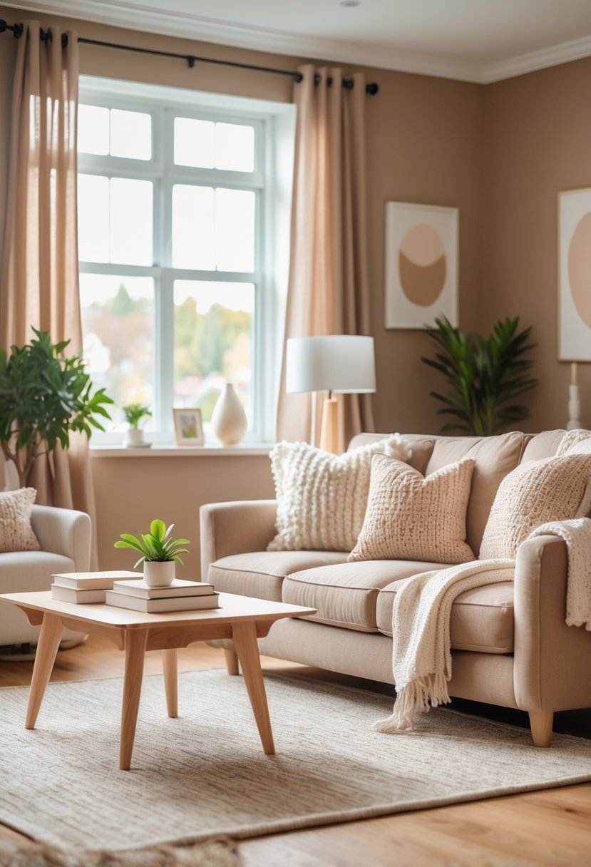
I find warm taupe to be a perfect neutral that adds both coziness and sophistication to any space. Its blend of brown and gray creates a balanced tone that feels inviting without overwhelming.
This color works well in living rooms, bedrooms, and even kitchens, offering a subtle warmth that enhances natural light. I appreciate how versatile warm taupe is—it pairs easily with many other colors and styles, making it a reliable choice for a timeless look.
19. Serene Periwinkle
I find periwinkle to be a unique blend of blue and violet that brings calmness without feeling cold. Its soft, balanced tone adds a subtle vibrancy to any room while maintaining a peaceful atmosphere.
Using periwinkle on walls can transform a space, making it feel both fresh and inviting. I appreciate how versatile it is, working well with both bold contrasts and gentle color palettes.
20. Classic Cream
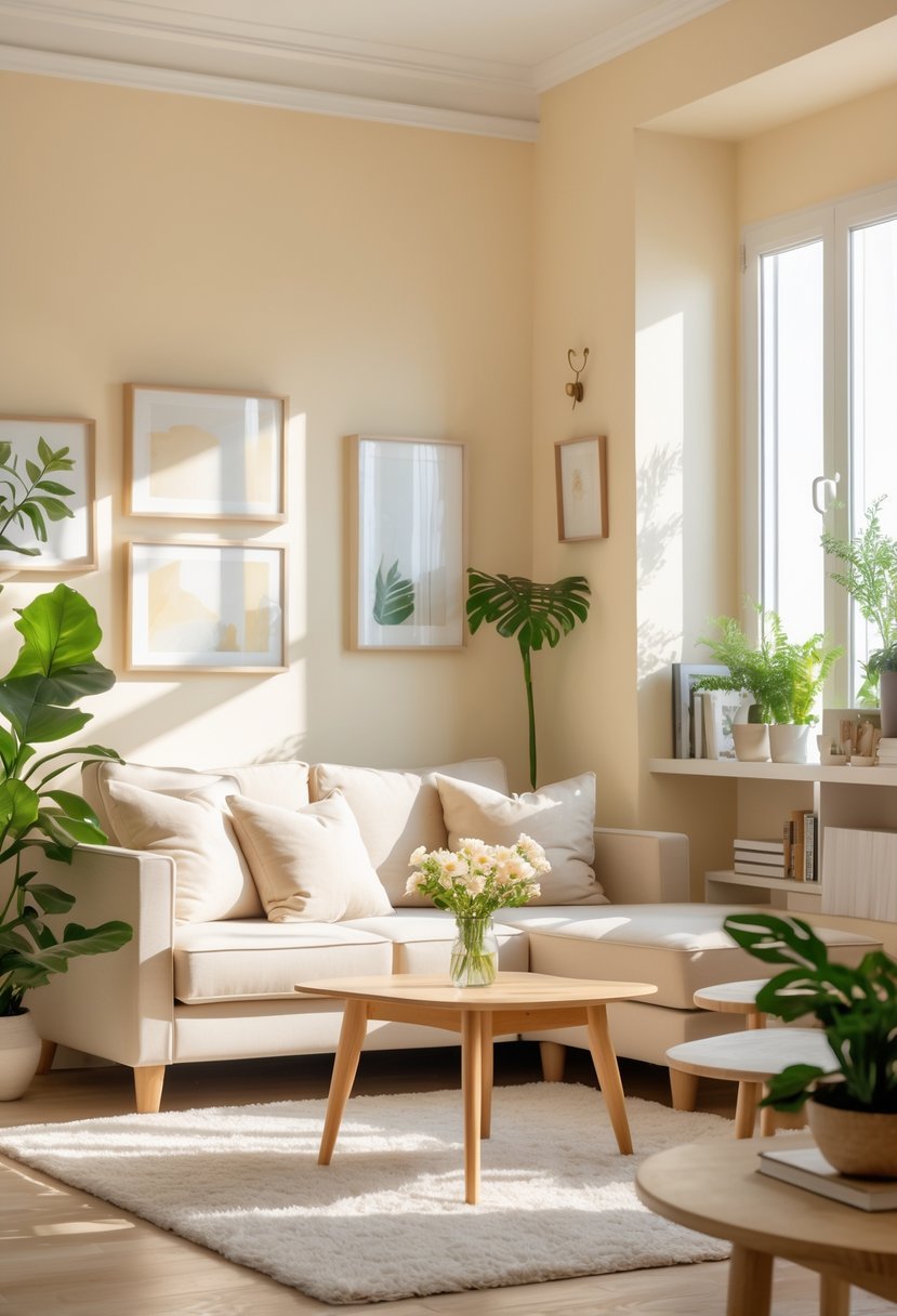
I find classic cream to be one of the most reliable interior paint colors. It offers warmth without overwhelming a space, making it versatile for almost any room.
This shade strikes a balance between bright and cozy. It creates a soft, inviting atmosphere while maintaining a clean, elegant look.
In my experience, cream pairs well with both bold accents and subtle neutrals. It’s a timeless choice that doesn’t compete with other design elements but enhances them.
21. Bold Cobalt Blue
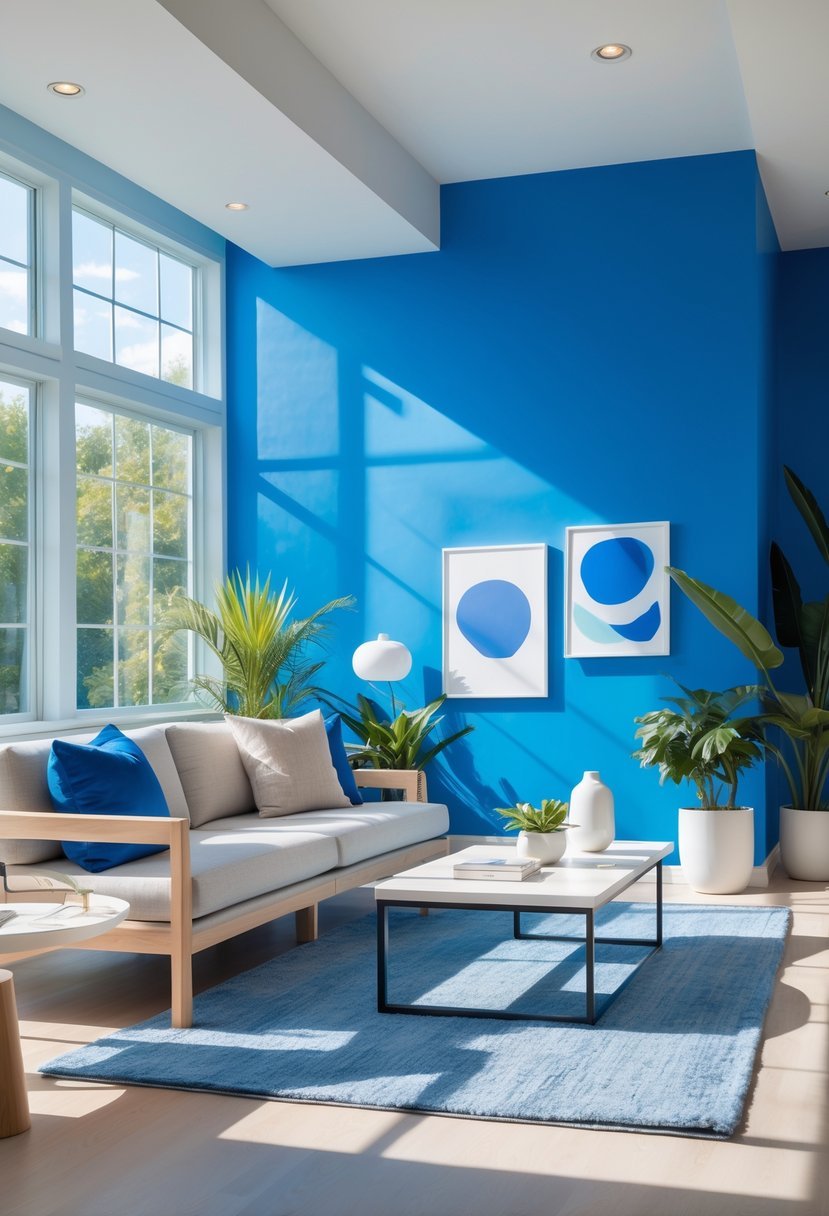
I find bold cobalt blue is a striking choice that adds energy without overwhelming a space. It’s a deep, rich hue that can brighten rooms and create a modern, sophisticated feel.
Using cobalt blue as an accent or on a feature wall works well to balance its intensity. Pairing it with neutrals like soft grays or crisp whites helps maintain harmony. This color also pairs nicely with natural wood tones or metallic accents for added warmth.
22. Cozy Burnt Orange
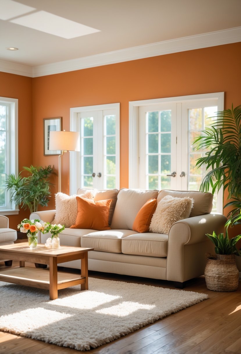
I find burnt orange to be a perfect color for adding warmth without overwhelming a space. It brings a grounded, earthy feel that can make any room feel inviting and comfortable.
Using burnt orange on an accent wall creates a strong focal point while balancing well with neutral tones like gray or beige. The color’s mix of brown and orange highlights adds depth and sophistication.
In my experience, this hue works especially well in living rooms or bedrooms, where a cozy atmosphere is key. It’s a versatile choice that blends rustic charm with modern style.
How to Choose Paint Colors That Truly Boost Happiness at Home
Understand How Color Affects Mood
When I choose paint colors that make me happier I start by thinking about how I want each room to feel emotionally.
- Warm colors create comfort and energy
- Cool colors support calm and balance
- Soft tones reduce stress and visual noise
Match Color With Room Purpose
I always connect color choices to how the space is used every day.
- Living rooms benefit from welcoming shades
- Bedrooms feel best with calming colors
- Creative spaces handle brighter hues
Balance Boldness With Softness
I aim for colors that lift my mood without overwhelming the room.
- Muted versions feel more relaxing
- Accent walls prevent overload
- Neutrals help brighter colors shine
Consider Light and Space
Lighting changes how happy a color feels in real life.
- Natural light enhances warm tones
- Dim rooms need lighter shades
- Larger spaces handle deeper colors
Create a Cohesive Palette
I make sure happiness flows from room to room.
- Related tones create harmony
- Too many bold colors cause tension
- Repeating shades builds comfort
FAQs
Creating a Home That Supports Everyday Joy
I believe paint colors that make you happier can change how a home feels emotionally and mentally. When I choose colors intentionally based on mood light and balance my space becomes more welcoming and comforting. The right shades support wellbeing without overpowering daily life and help create a home that feels good to live in every single day.

I am Mindy Medford, a home décor, paint, and design specialist with over a decade of hands-on experience transforming ordinary spaces into cozy, personality-packed havens. Since 2013, I have been helping homeowners discover the art of beautiful yet practical design. I share my love for color, texture, and layout—making stylish interiors & exteriors feel achievable for everyone. Whether it’s picking the perfect paint shade or reimagining a small space, I’m here to guide and inspire.