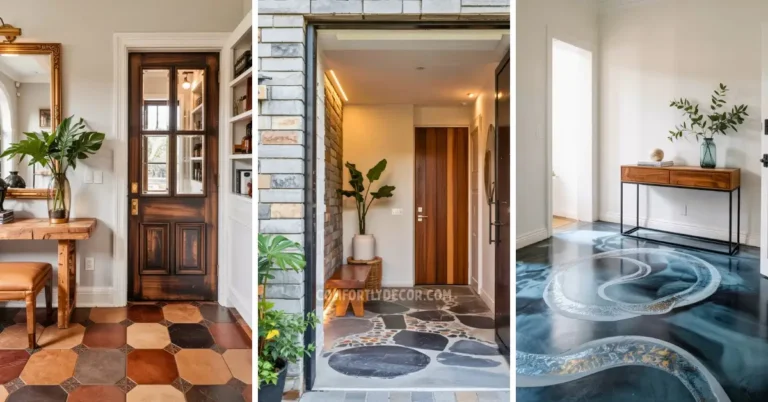
15 Paint Colors That Go with Dark Wood for Stylish and Timeless Interiors
Disclosure: This article may contain affiliate links. If you click through and make a purchase, I may earn a small commission at no extra cost to you.
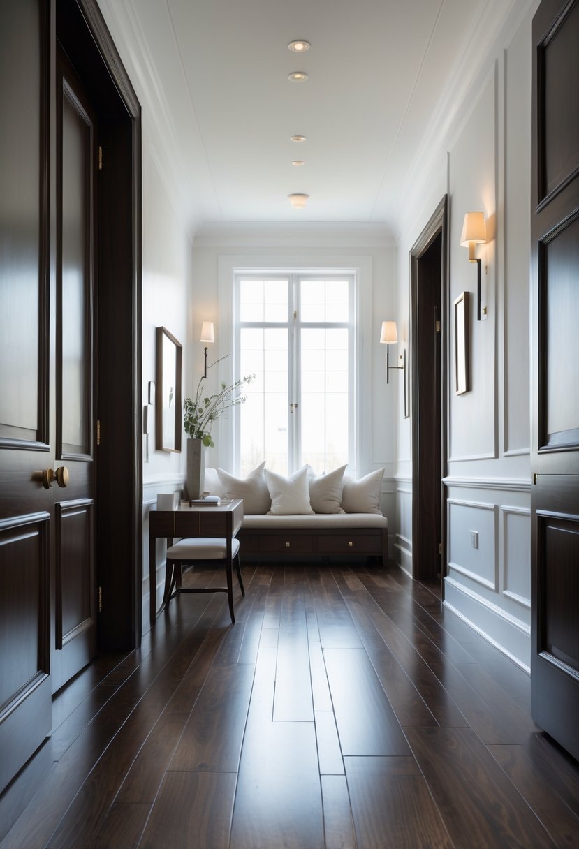
Choosing the right paint color to complement dark wood can be a challenge, but it’s essential for creating a balanced and cohesive space. Dark wood adds richness and depth, so pairing it with the right shade on your walls can enhance the overall atmosphere of a room.
I’ve gathered 15 paint colors that work well with dark wood to help you find the perfect match for your home.
These colors offer a range of options that can either contrast or blend smoothly with dark wood elements, making it easier to achieve the look you want without overpowering the natural beauty of the wood.
15 Paint Colors that Go with Dark Wood
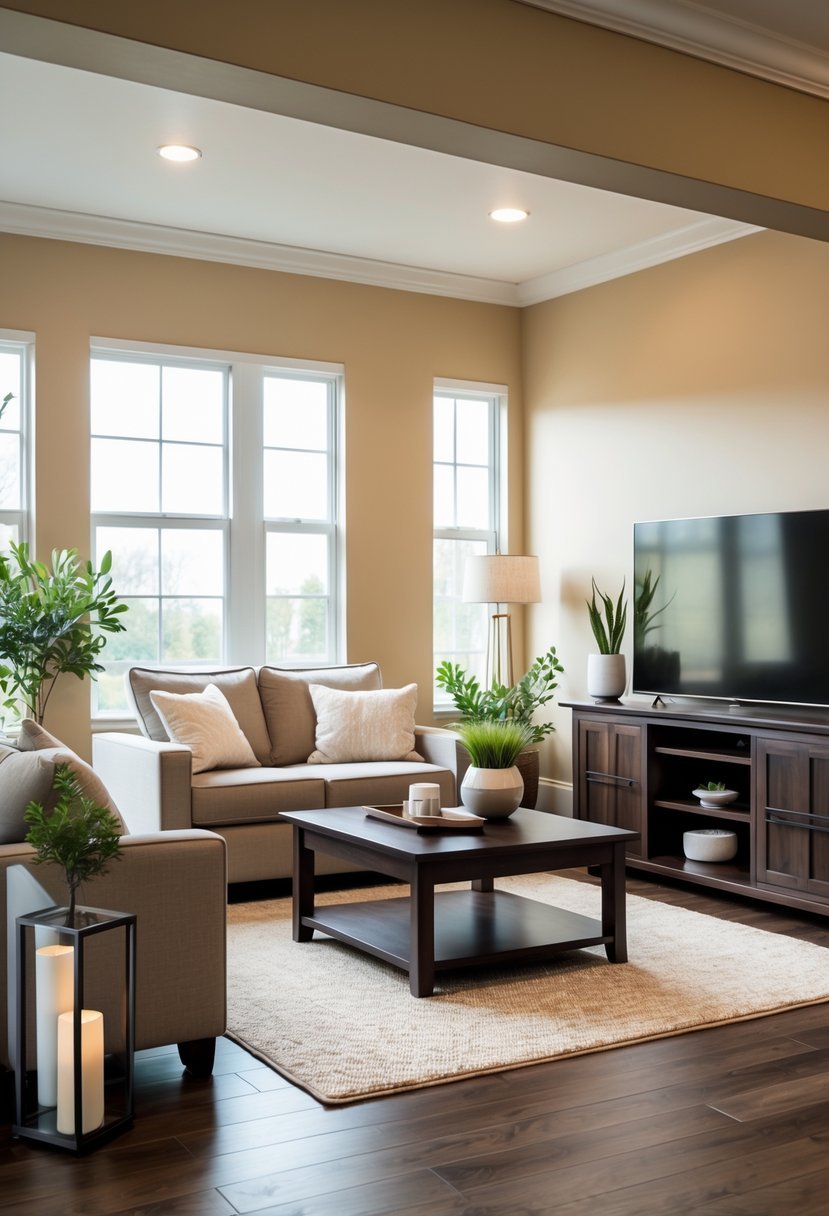
1. Warm Greige
I find warm greige to be one of the most versatile choices when pairing with dark wood. Its balance of gray and beige tones provides a subtle backdrop that complements the richness of the wood without overpowering it.
This color adds warmth to a room while maintaining a neutral palette, making it easy to coordinate with various décor styles. In my experience, warm greige enhances the natural depth of dark wood, creating a harmonious and inviting atmosphere.
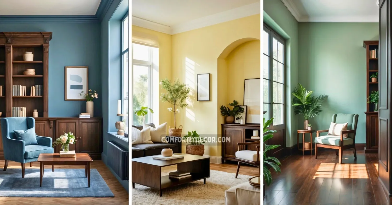
2. Soft Sage Green
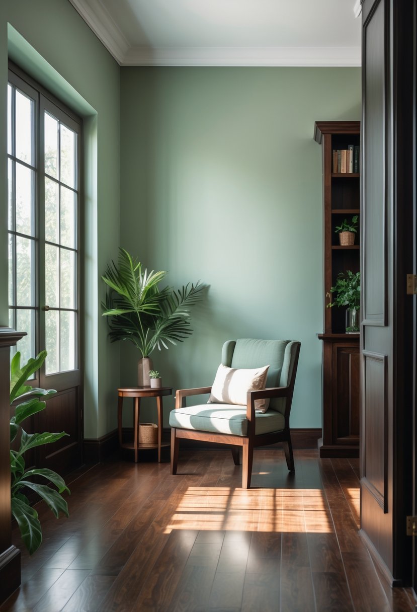
I find soft sage green works well with dark wood, offering a subtle contrast without clashing. Its muted tone brings warmth and balance to a room dominated by rich, deep wood hues.
This color feels natural and calming, making it a versatile choice for walls or accents. It pairs nicely with other neutrals and can lift a space without overwhelming the dark wood elements.
3. Creamy Off-White
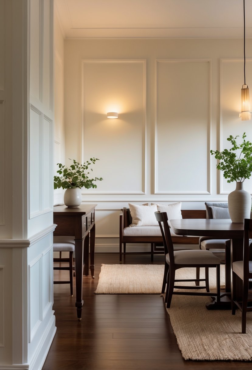
I find creamy off-white to be a reliable choice when working with dark wood. It offers warmth without overwhelming the richness of the wood. This shade creates a soft contrast that brightens the space but keeps an inviting tone.
Creamy off-white often has subtle undertones of greige or tan, which helps it blend smoothly with dark wood accents. It maintains elegance while avoiding starkness, making it ideal for rooms with heavy wood elements.
Products That Might Help:
Dark wood deserves the right backdrop—these paint shades are proven to balance richness without overpowering it.
4. Muted Olive
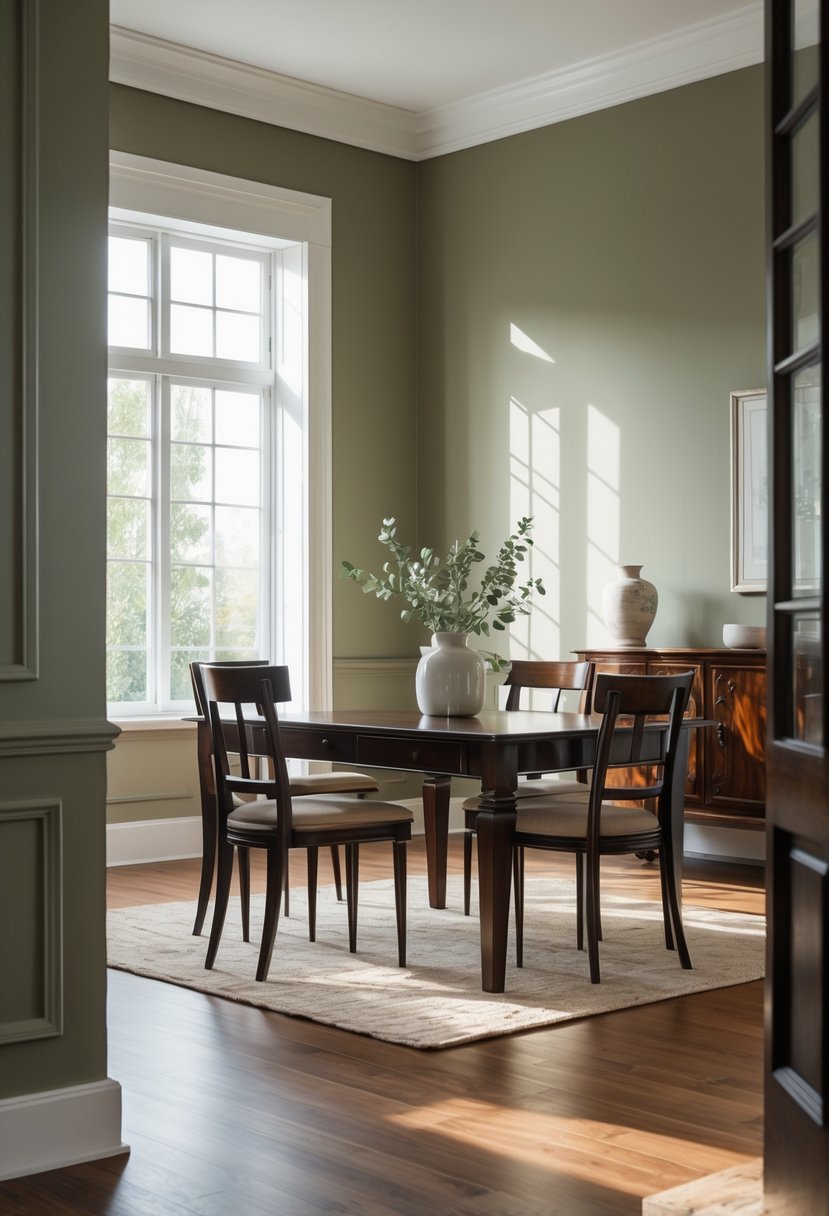
I find muted olive to be a strong choice when pairing paint with dark wood. Its earthy and subdued tone complements the warmth in the wood without overpowering it.
This color brings a natural, grounded feel to a room, balancing rich wood tones while adding subtle depth. It’s neither too bright nor too dull, making it versatile for various interior styles.
Muted olive works well with both traditional and modern spaces, especially where a calm and stable atmosphere is desired. I often recommend it to those seeking a refined, organic look.
5. Dusty Blue
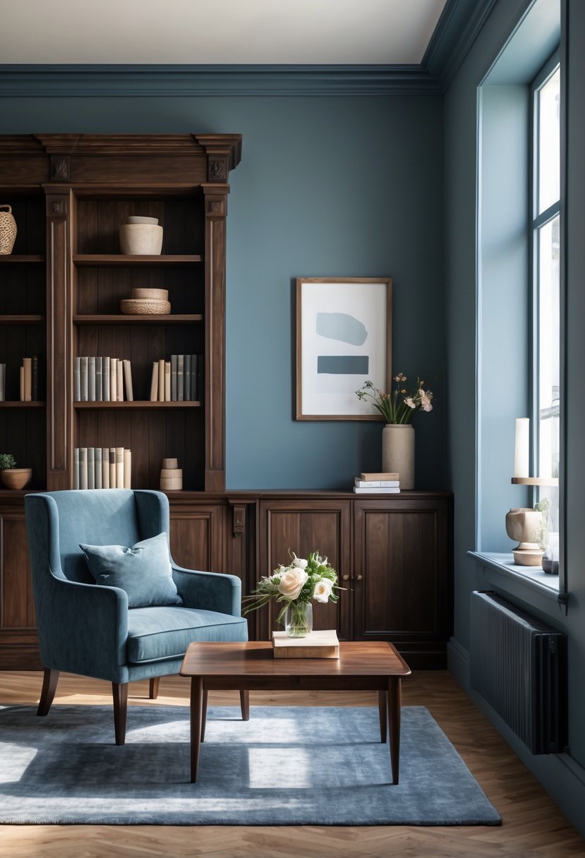
I find dusty blue to be an excellent choice with dark wood. Its muted tone provides a subtle contrast that enhances the richness of the wood without overpowering it.
This color adds a calm, sophisticated feel to the room. It works well in living spaces and bedrooms where you want a balanced, elegant look.
Dusty blue also pairs nicely with warm or neutral accents. For me, it creates a harmonious, timeless atmosphere alongside dark wood finishes.
Products That Might Help:
The right lighting can make dark wood glow—or make it feel heavy. These fixtures get it right.
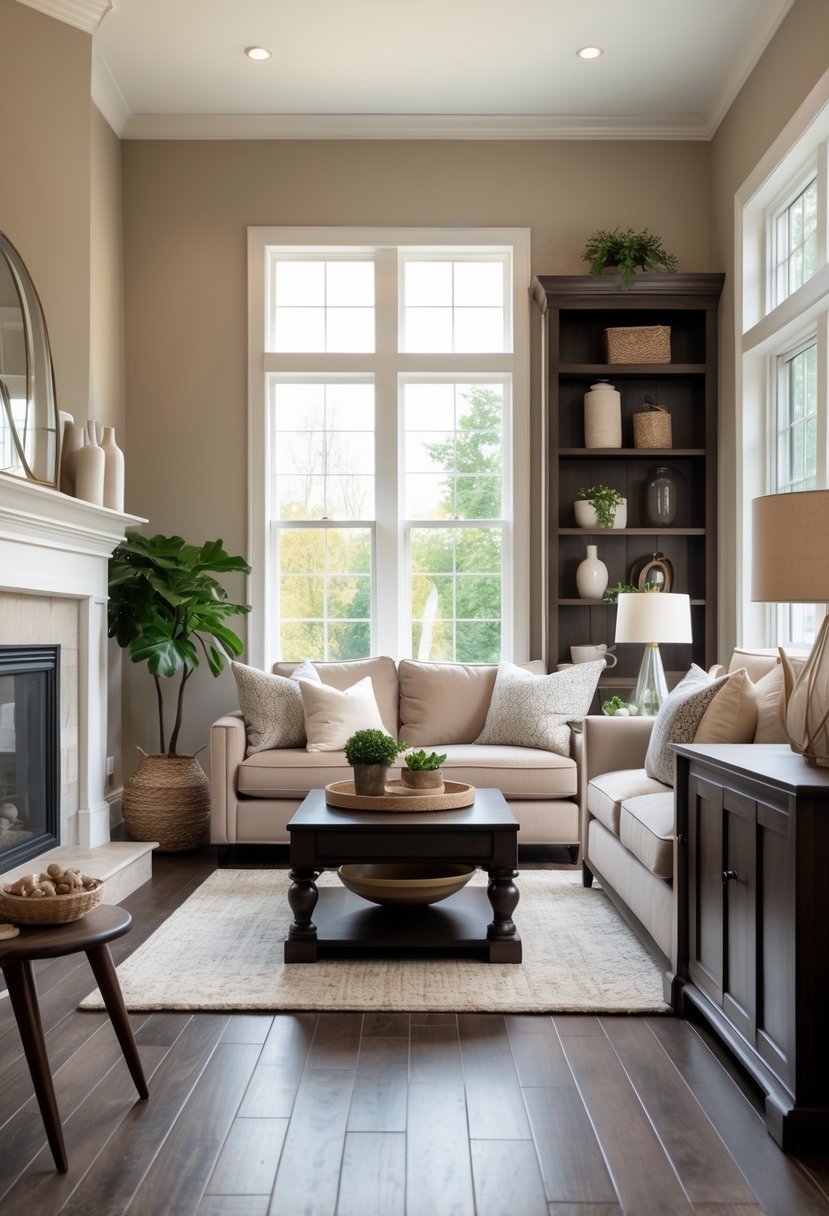
6. Pale Taupe
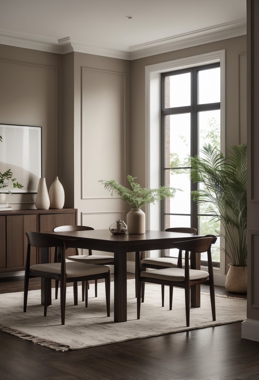
I find pale taupe to be a subtle yet effective choice with dark wood. Its blend of gray and brown tones creates a neutral backdrop that highlights the richness of the wood without overpowering it.
Pale taupe offers warmth and elegance that suits both traditional and modern interiors. It balances the darkness of wood floors or trim, allowing natural light to enhance the space. This color works well when I want a calm, inviting atmosphere.
7. Warm Beige
I find warm beige to be an excellent choice with dark wood. Its golden and yellow undertones add a soft, inviting feel without overpowering the richness of the wood.
This color creates a cozy, grounded atmosphere, balancing the depth of dark trims or floors. Warm beige works well in spaces where I want a subtle contrast that still feels natural and warm.
8. Charcoal Gray
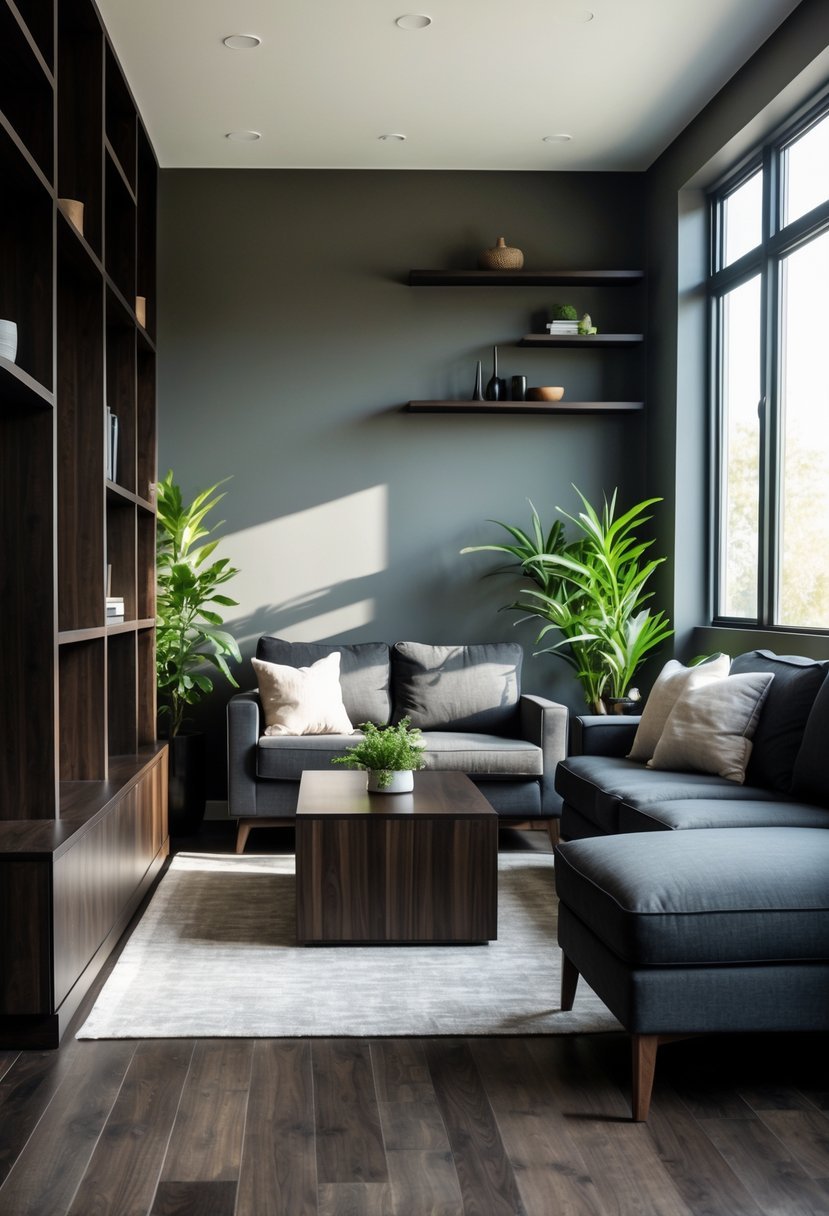
I find charcoal gray to be a strong choice when paired with dark wood. Its deep tone complements wood’s natural richness without overwhelming it.
Charcoal gray creates a balanced, sophisticated atmosphere. It works especially well in larger rooms where natural light softens the darkness.
This color provides a solid neutral base, making it easy to add accents and textures. I recommend trying it for a timeless, versatile look.
9. Soft Blush Pink
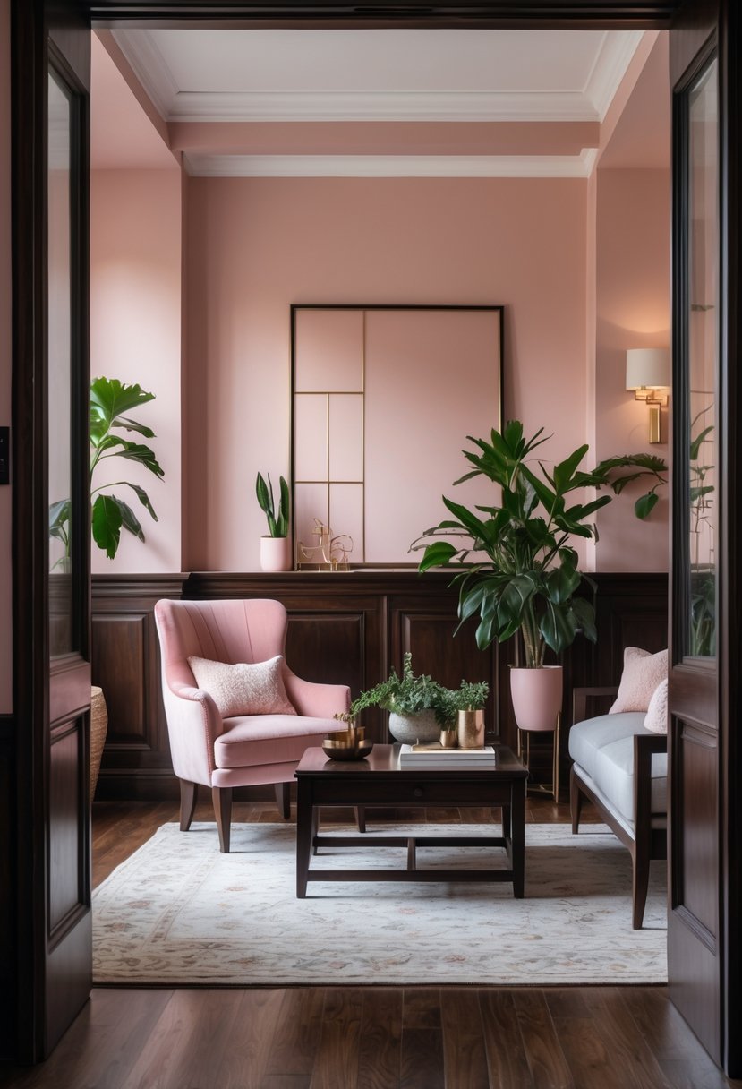
I find soft blush pink to be an excellent choice with dark wood. It adds a subtle warmth that balances the richness of the wood without overwhelming the space.
This shade works well in bedrooms and living areas, creating a gentle, inviting atmosphere. Its versatility lets it pair smoothly with blues, grays, and creams too.
Using soft blush pink can brighten a room while maintaining sophistication. It’s a timeless option that complements dark wood trim and floors effectively.
10. Navy Blue
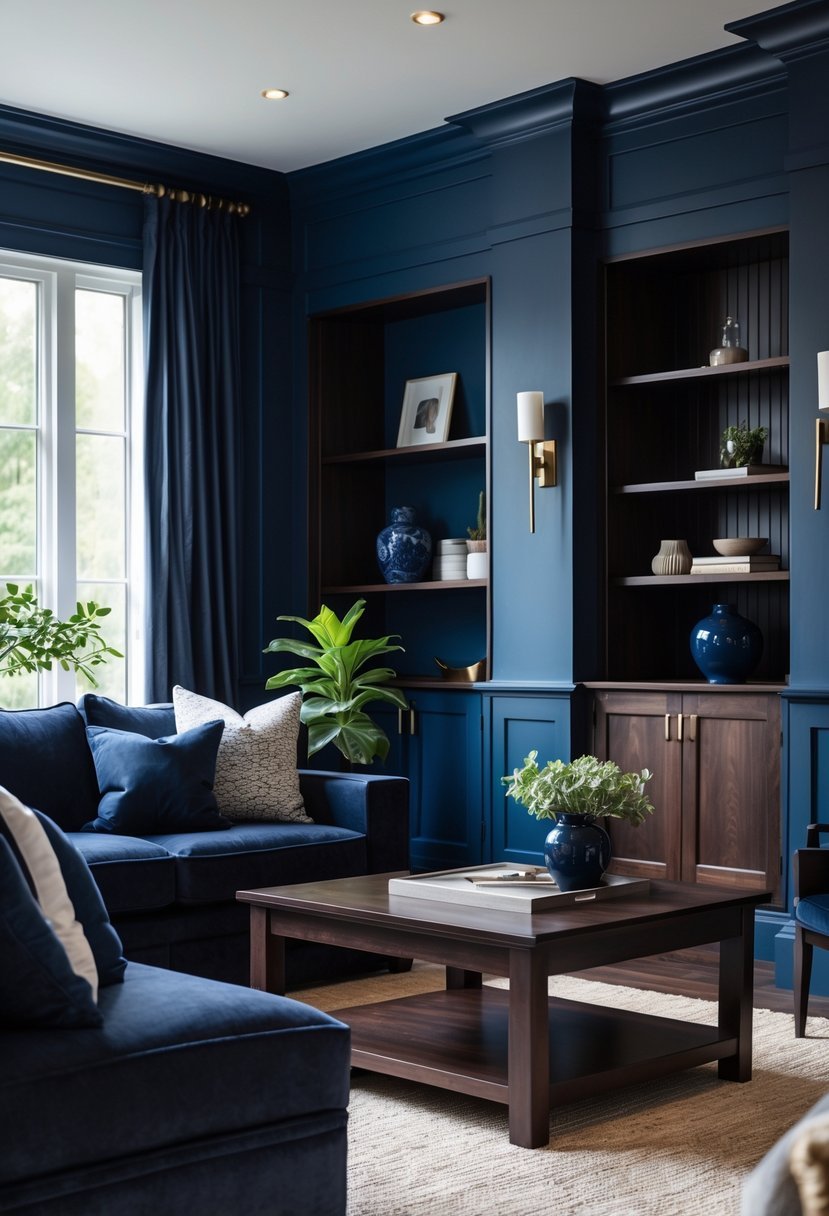
I find navy blue pairs exceptionally well with dark wood. The deep, rich tone complements the wood’s warmth without overpowering it. Navy adds a sophisticated yet calming feel to any room.
When I use navy blue walls or accents, the contrast highlights the texture and grain of dark wood trims or furniture. It’s a versatile choice that works in both traditional and modern spaces. Matching undertones between navy and the wood helps create a harmonious look.
Products That Might Help:
If you’re going bold with dark wood, the right tools and finish make all the difference.
11. Rich Mustard
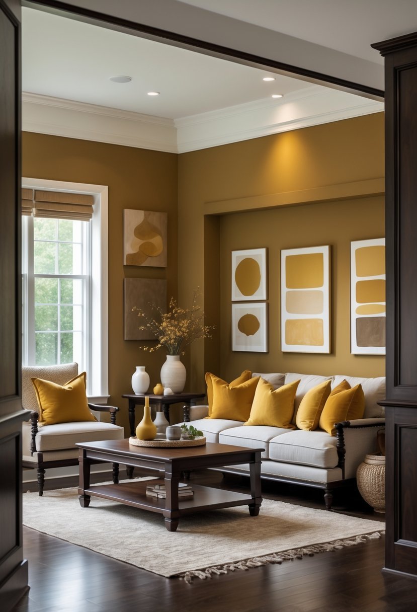
I find rich mustard to be an excellent choice with dark wood. It offers warmth and depth without overpowering the natural tones of the wood.
This color creates a subtle contrast that feels inviting and grounded. It works well in spaces where you want both vibrancy and a classic touch.
Mustard complements dark wood flooring, cabinets, or trim by bringing a hint of brightness while maintaining an earthy, sophisticated vibe.
12. Buttercream Yellow
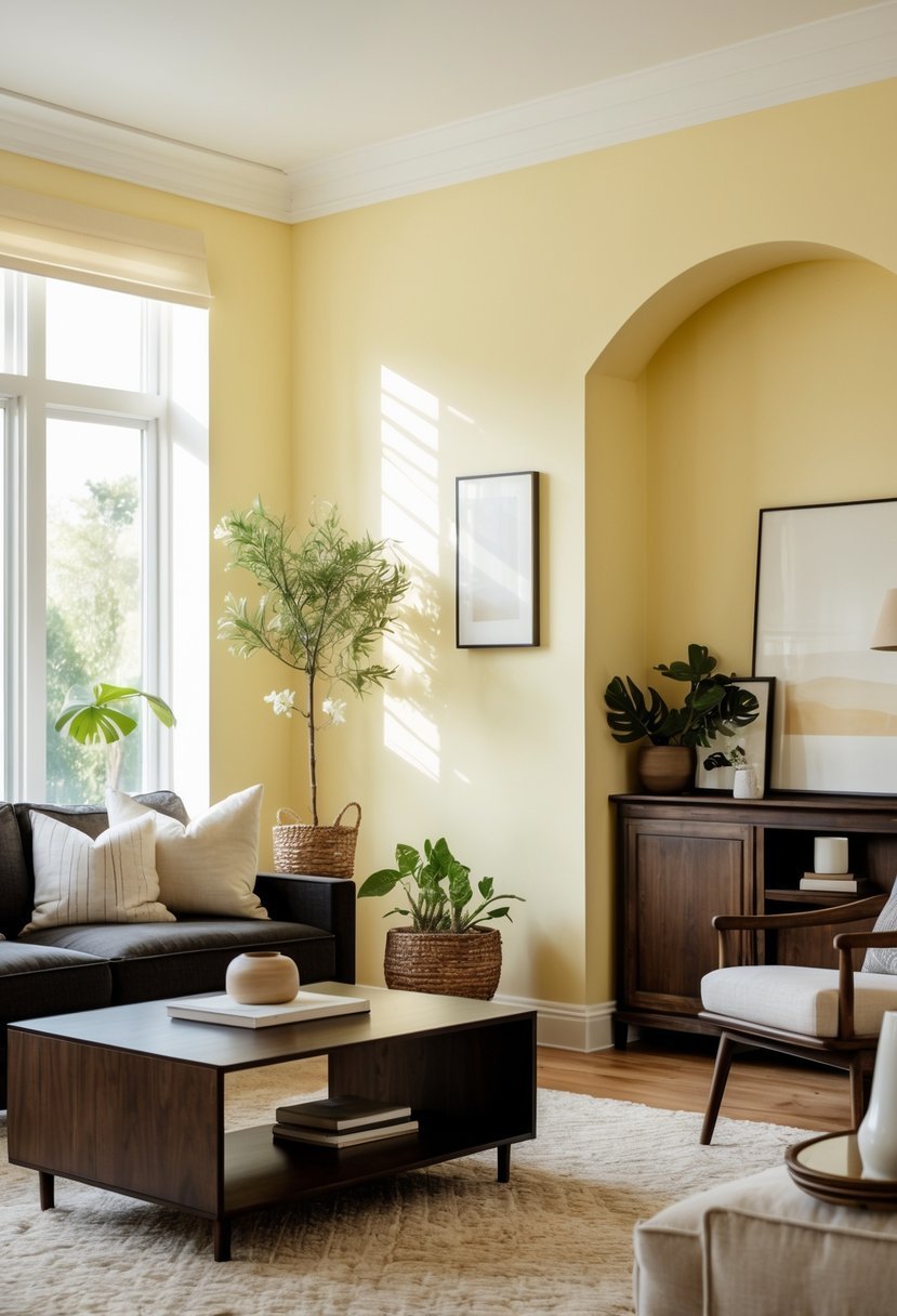
I find buttercream yellow pairs exceptionally well with dark wood. Its soft warmth offers a gentle contrast without overpowering the richness of the wood.
This shade adds a subtle brightness to a room while maintaining a cozy, inviting atmosphere. It works best in spaces where natural light enhances the paint’s creamy undertones.
Using buttercream yellow can bring a vintage-inspired elegance that complements both traditional and modern interiors. It’s a reliable choice I often recommend for balancing dark wood tones.
13. Deep Teal
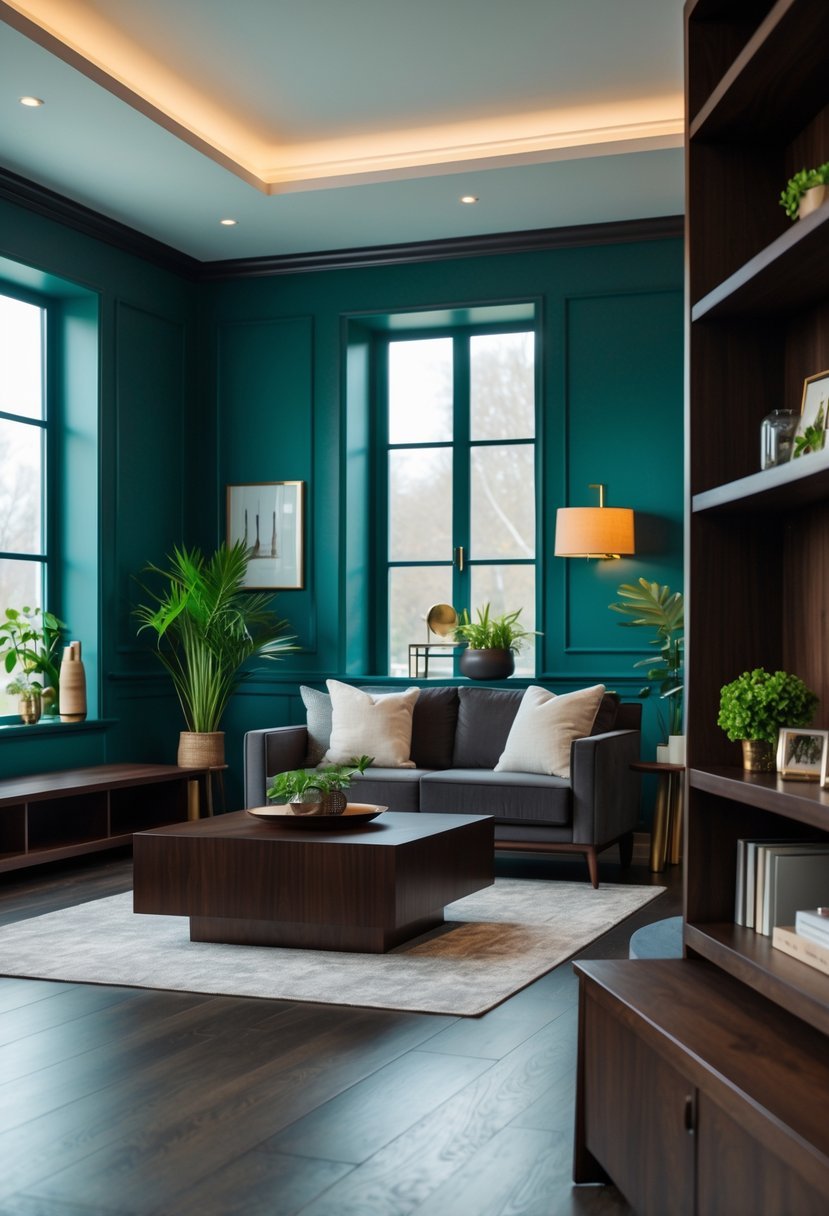
I find deep teal to be a strong choice when pairing with dark wood. Its green-tinged blue tones add depth without overpowering the richness of the wood.
This color works well both as a main wall shade or as an accent. It creates a balanced contrast that feels sophisticated and refreshing.
In my experience, deep teal fits easily into various palettes, making it versatile for different styles and room functions. It’s a confident yet timeless option.
14. Warm Terracotta
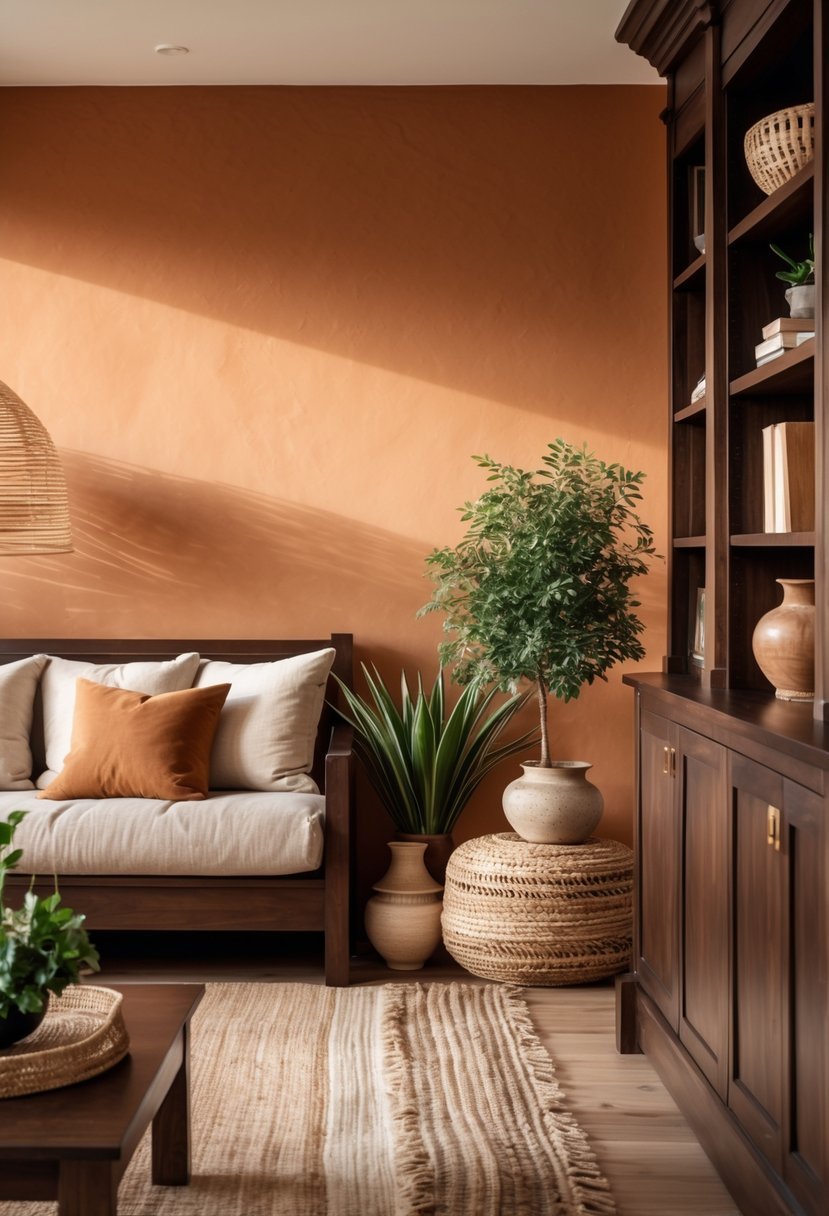
I find warm terracotta to be an excellent choice when pairing with dark wood. Its reddish-brown tones naturally complement the rich hues without overpowering them.
This color adds an inviting, earthy feel that enhances the wood’s warmth. The organic quality of terracotta creates balance, making the space feel grounded yet lively.
Using warm terracotta on walls or accent areas can soften the room’s overall look. It works well in both traditional and modern settings where dark wood is a key feature.
Products That Might Help:
Warm paint colors shine even more when layered with soft textures that balance dark wood.
15. Classic White
I find classic white to be one of the most reliable choices with dark wood. It creates a clean contrast that highlights the richness of the wood without competing with it.
White brightens a space and keeps the overall look timeless. It works well in various styles, from traditional to modern.
The simplicity of white lets the dark wood stand out as the room’s focal point. I often recommend it for walls, trim, or ceilings paired with dark wood floors or furniture.
Pairing Paint Colors with Dark Wood Interiors
#1. Understand the Wood Undertone
Before choosing any paint I always study the undertone of the dark wood. Most dark wood has warm brown red or golden notes. Knowing this helps me avoid colors that clash or feel too cold.
- Warm undertones pair well with beige greige cream and terracotta
- Neutral undertones work with taupe sage and dusty blue
- Very dark wood benefits from lighter wall shades for balance
Products That Might Help:
These finishing touches keep dark wood interiors feeling fresh—not heavy or dated.
#2. Choose Contrast Without Overpowering
I focus on contrast that highlights the wood instead of competing with it. Strong contrast adds depth while still keeping the space comfortable.
- Light walls brighten rooms with dark floors or trim
- Muted colors soften bold wood finishes
- Deep shades work best in rooms with good natural light
#3. Balance Light Throughout the Space
Lighting plays a major role in how paint looks next to dark wood. I always test paint samples at different times of day.
- Natural light makes warm colors feel brighter
- Artificial light can deepen cool tones
- Lighter ceilings help prevent heaviness
#4. Use Bold Colors Strategically
When I want drama I use bold paint in a controlled way so the room stays timeless.
- Accent walls instead of full rooms
- Rich tones paired with neutral furniture
- Simple decor to let color and wood stand out
#5. Keep the Look Timeless
To avoid trends fading quickly I stick with classic combinations and layer style through accessories.
- Neutral walls with dark wood for longevity
- Updated lighting and textiles for freshness
- Minimal patterns to maintain balance
FAQs
Creating A Timeless Balance with Dark Wood
I believe dark wood interiors shine when paired with thoughtful paint choices. By focusing on undertones lighting and balance I can create spaces that feel warm elegant and lasting. Whether I choose soft neutrals or rich statement colors the key is letting the wood remain the anchor while paint supports the overall design.

I am Mindy Medford, a home décor, paint, and design specialist with over a decade of hands-on experience transforming ordinary spaces into cozy, personality-packed havens. Since 2013, I have been helping homeowners discover the art of beautiful yet practical design. I share my love for color, texture, and layout—making stylish interiors & exteriors feel achievable for everyone. Whether it’s picking the perfect paint shade or reimagining a small space, I’m here to guide and inspire.