20 Paint Colors for Wooden Furniture That Transform Your Space Effortlessly
Choosing the right paint color for wooden furniture can be challenging, especially when you want to enhance the natural beauty of the wood while matching your decor. I’ve found that the right choice balances both aesthetics and function, creating a refreshed look without overpowering the room.
The key to selecting paint colors for wood furniture is understanding how different shades complement various wood tones and styles.
20 Paint Colors for Wooden Furniture
Let us shed light on best 20 paint colors that work well on wood, offering options that suit a range of tastes and design goals.
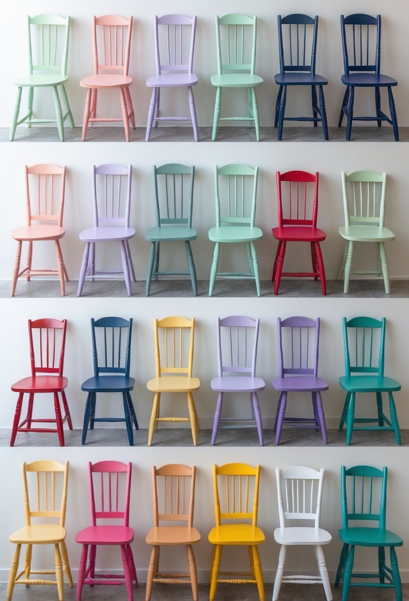
1. Classic Navy Blue
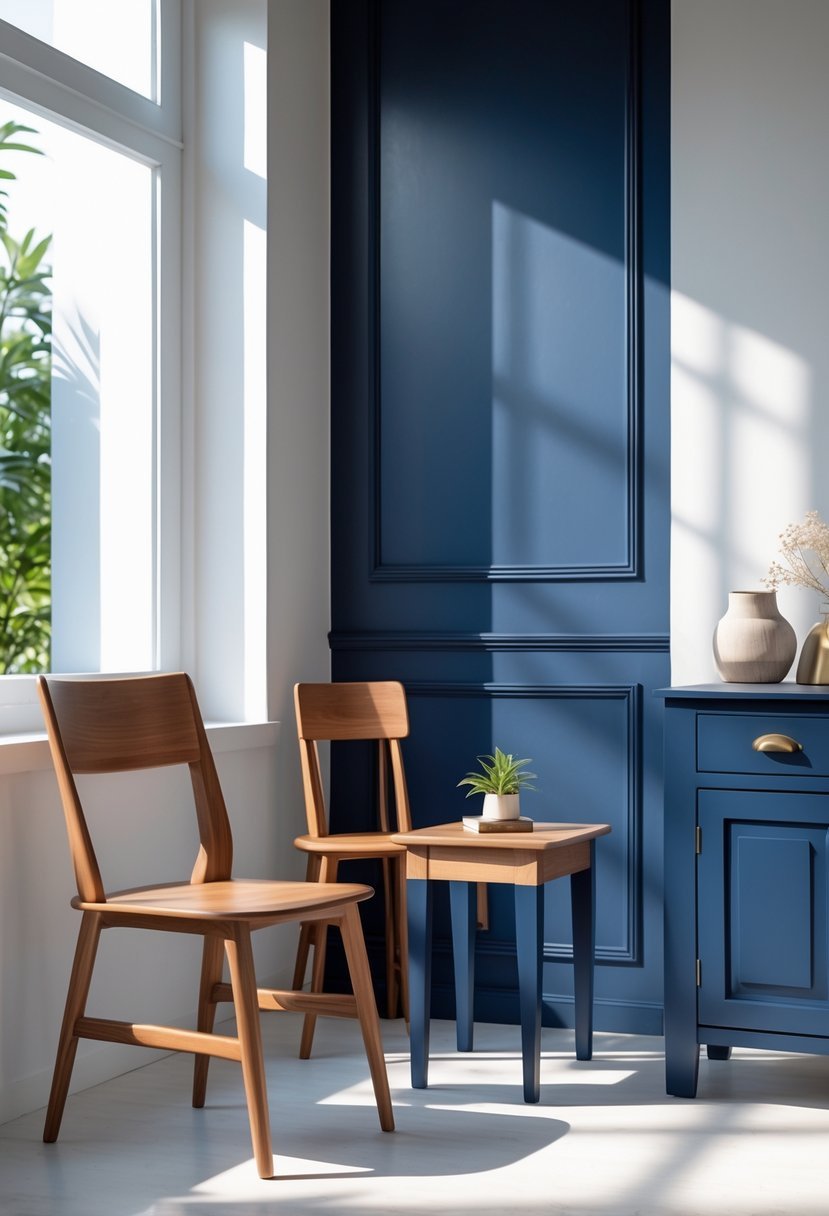
I find classic navy blue to be one of the most versatile paint colors for wooden furniture. It balances boldness with a timeless neutrality that suits both traditional and modern spaces.
Navy blue adds depth and sophistication without appearing overpowering. It works well on dressers, cabinets, and accent pieces, creating an elegant look that feels both calm and refined.
Choosing the right navy requires attention to saturation and undertones to avoid a flat or dull finish. When applied carefully, navy blue can transform ordinary wood into a striking feature.
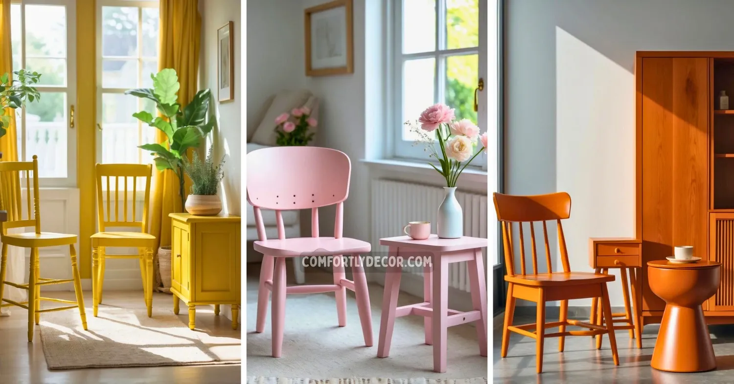
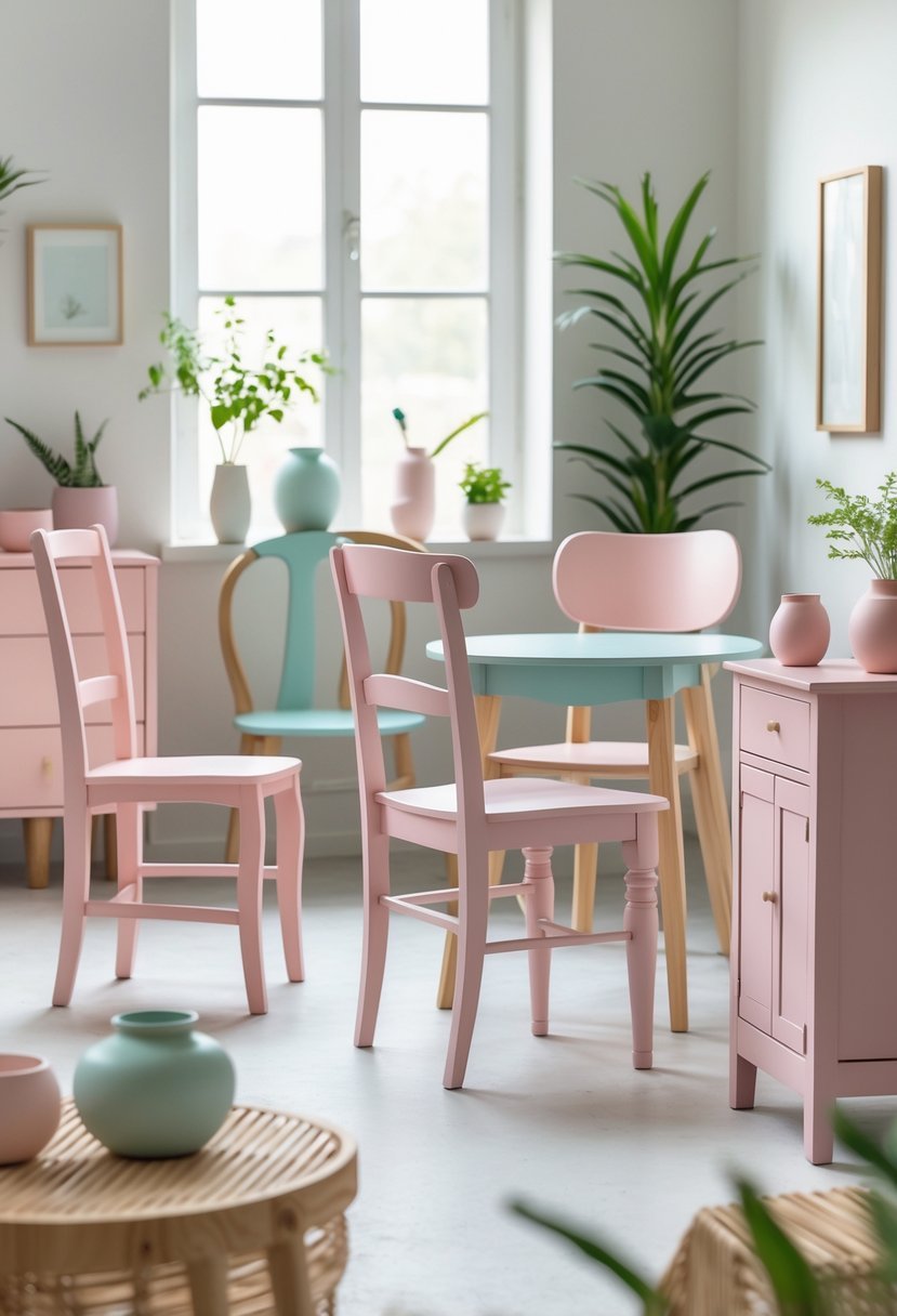
2. Soft Pastel Pink
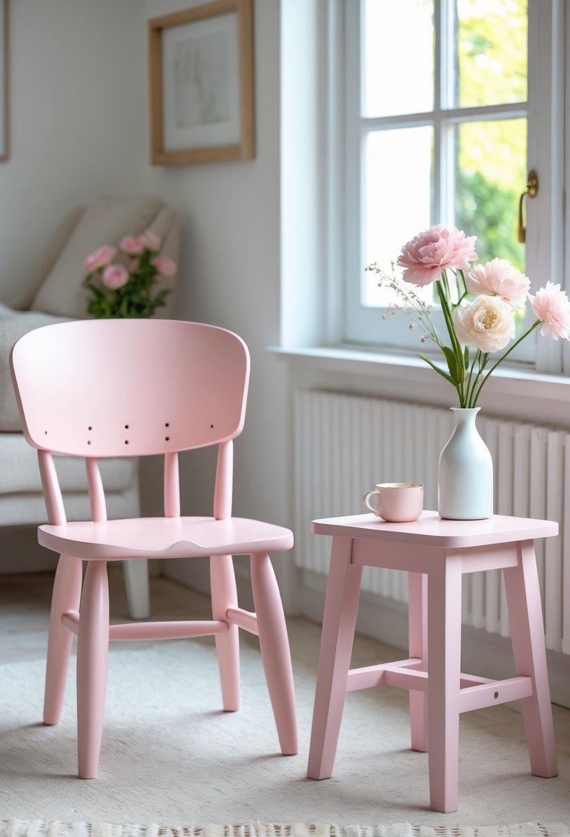
I find soft pastel pink to be a versatile choice for wooden furniture. It adds a subtle warmth without overwhelming a space. This shade works well in bedrooms, nurseries, or any room needing a gentle touch.
Pastel pink pairs nicely with whites, beiges, and light grays, creating a calm and inviting atmosphere. It can soften the look of wood while maintaining elegance. I often recommend it for those wanting a fresh yet understated color.
3. Warm Cocoa Brown
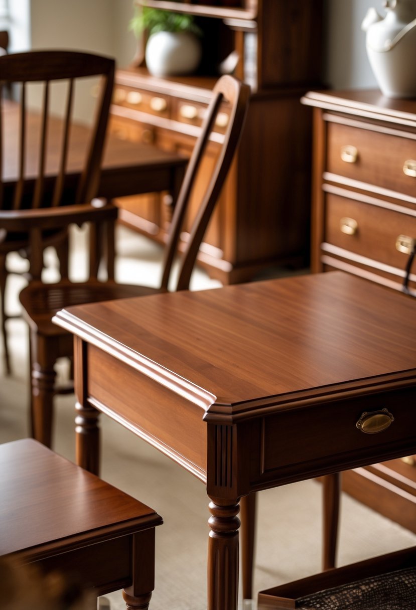
I find warm cocoa brown to be a versatile choice for pairing with wooden furniture. Its deep reddish-brown undertones create a cozy and inviting atmosphere without overwhelming the space.
This color works well with both traditional and modern settings. It complements rich wood tones and highlights natural textures in the furniture.
Choosing warm cocoa brown helps me add depth to a room while maintaining a neutral base that pairs easily with other colors.
4. Elegant Barn Red
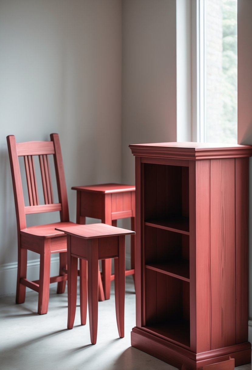
I find Barn Red to be a timeless choice for wooden furniture. Its deep, warm tones create a rustic yet refined feel that works well in both traditional and modern spaces.
This color carries a subtle durability, often linked to iron oxide pigments, which helps maintain its rich appearance over time. I appreciate how Barn Red can add character without overwhelming the natural beauty of wood grain. It pairs well with neutrals and earth tones, enhancing a room’s warmth and inviting atmosphere.
5. Granny Smith Green
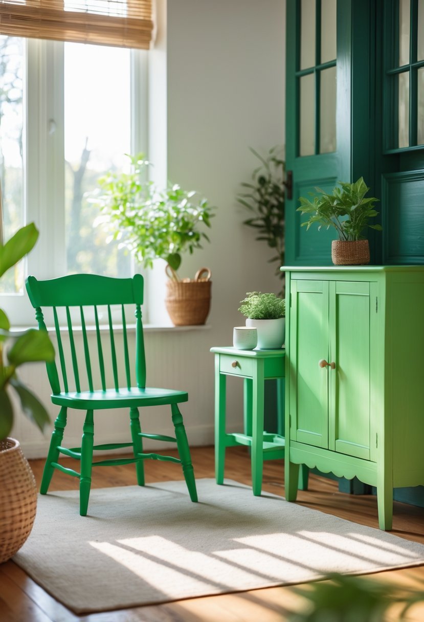
I choose Granny Smith Green for its crisp and refreshing look. This shade is vibrant yet natural, similar to the color of a tart green apple. It adds a lively touch to wooden furniture without overwhelming the space.
The color pairs well with deeper greens, navy blue, or even metallic accents. I often combine it with natural textures like wood or woven fabrics to create a balanced, inviting feel. Its organic tone fits well in kitchens and living areas where I want to introduce subtle energy.
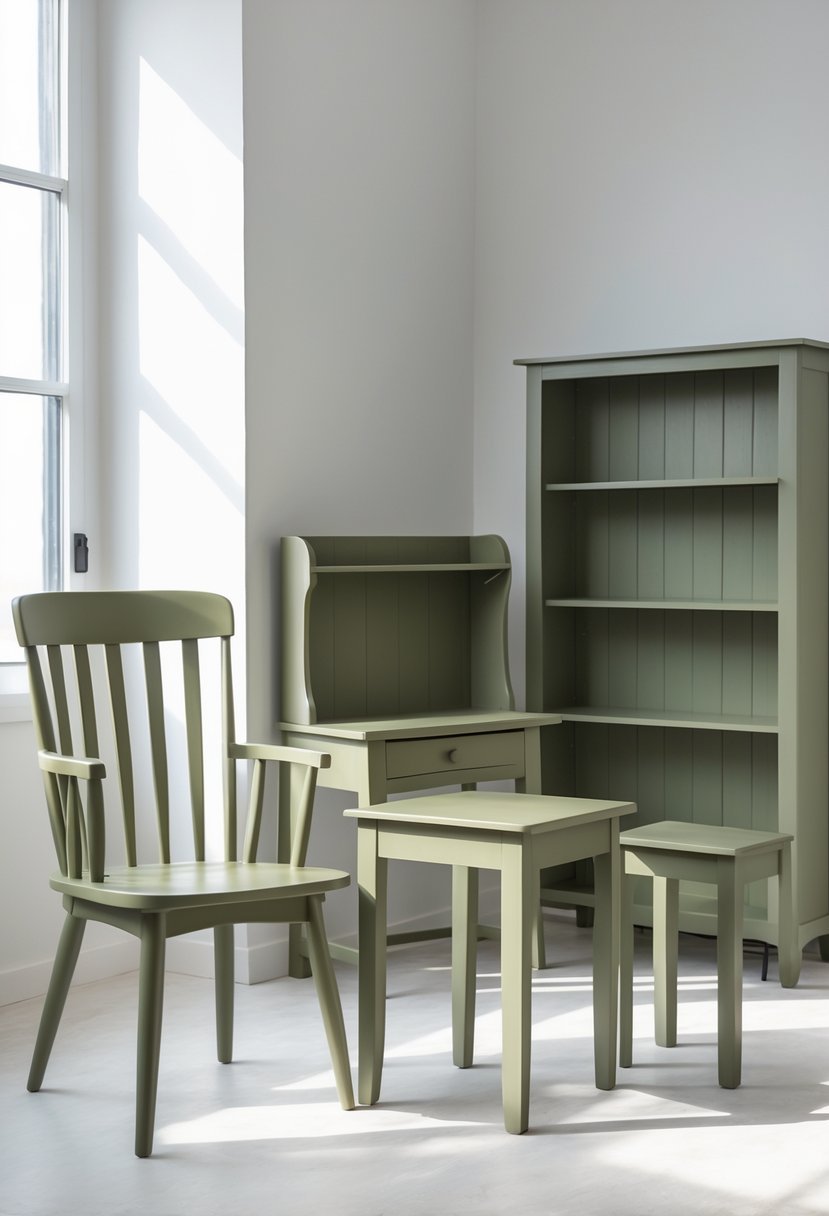
6. Muted Sage
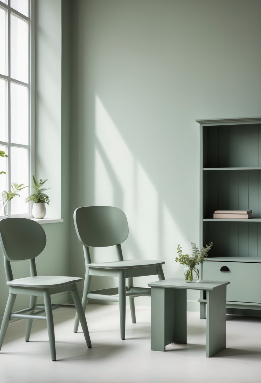
I find muted sage to be an excellent choice for wooden furniture. Its soft, natural green tone has subtle gray undertones that create a calm and grounded look.
This color pairs well with various wood finishes, especially darker tones like walnut or mahogany. It adds a touch of tranquility without overpowering the natural grain of the wood.
I appreciate how muted sage adapts to different lighting, often looking fresh and airy. It works equally well in both modern and traditional settings, making it a versatile option.
7. Deep Forest Green
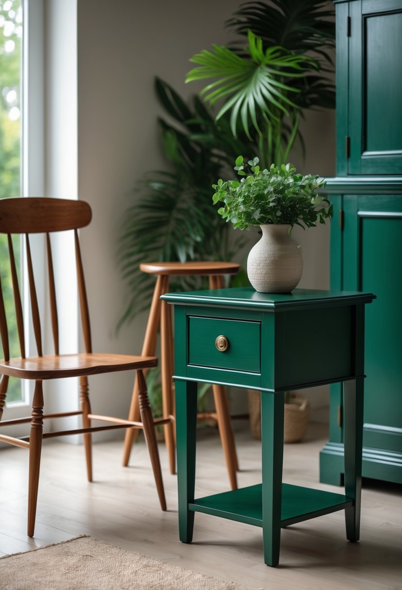
I find deep forest green a versatile choice for wooden furniture. Its rich, earthy tone adds depth and a natural vibe without overwhelming a space.
Pairing it with lighter woods or neutral tones creates balance and highlights the green’s complexity. It works well in both modern and rustic settings, providing warmth and subtle sophistication.
I also like combining it with metallic accents or cream shades to add a polished contrast that elevates the overall look. This color offers timeless appeal while grounding any room with a calming presence.
8. Rich Mahogany Red
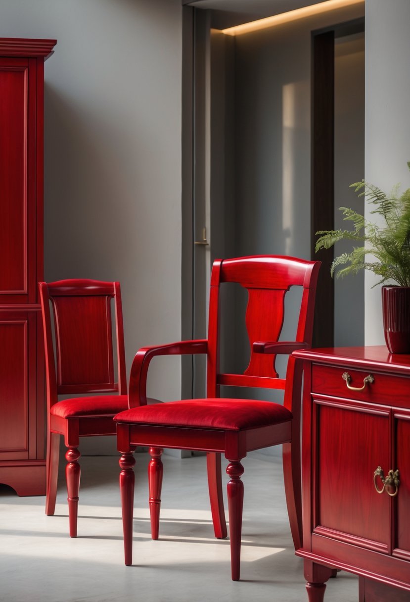
I find rich mahogany red a striking choice for wooden furniture. Its deep, warm tones highlight the natural beauty of wood while adding a classic, elegant touch.
This shade works well with neutral walls like beige or gray, which balance the intensity without overpowering it. It can also complement softer pink or red-friendly hues to create a cohesive look.
Using rich mahogany red brings warmth and sophistication to any room, enhancing the wood’s natural depth and richness without competing against other colors.
9. Sunny Mustard Yellow
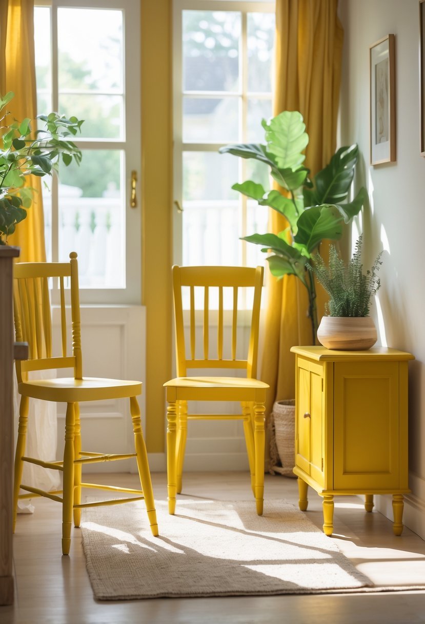
I find sunny mustard yellow a versatile and warm choice for wooden furniture. It adds a cozy yet vibrant feel without overwhelming a space.
This shade pairs well with natural wood tones and neutral backgrounds, creating a balanced and inviting look. Mustard yellow works especially well on accent pieces, giving them a subtle pop.
Using mustard yellow on furniture can brighten a room while maintaining a sophisticated atmosphere. It’s a color I often recommend for adding character with a timeless touch.
10. Cool Slate Gray
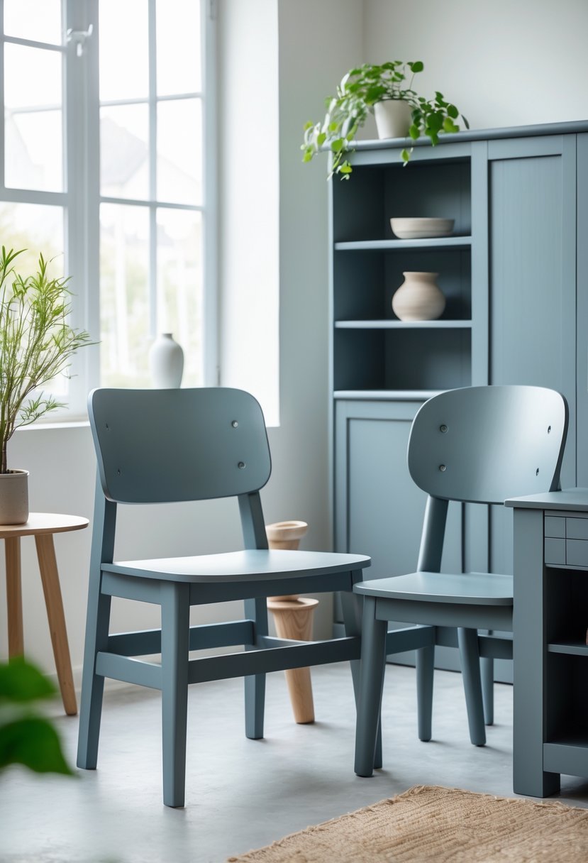
I find Cool Slate Gray to be an excellent choice for wooden furniture. It offers a soft, warm tone with a subtle amethyst undertone that feels modern yet timeless.
This color provides a calm and neutral backdrop that works well in various settings. I often pair it with darker accents like navy or black for added depth.
Using Cool Slate Gray can update old pieces without overwhelming the natural wood grain. It balances sophistication with subtlety, making it versatile for many design styles.
11. Creamy Off-White
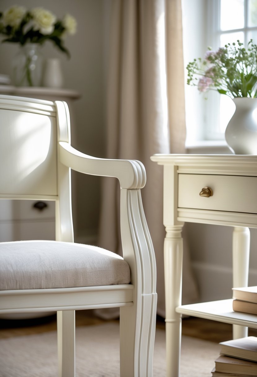
I find creamy off-white to be a versatile choice for wooden furniture. Its warm, neutral undertones complement a range of wood tones, especially those with natural warm hues.
This color adds softness without overpowering the texture or grain of the wood. It works well in various lighting conditions, although testing it in your space is important to see how it interacts with natural light.
Creamy off-white offers a timeless look, balancing warmth and brightness, making it suitable for both traditional and modern interiors.
12. Charcoal Black
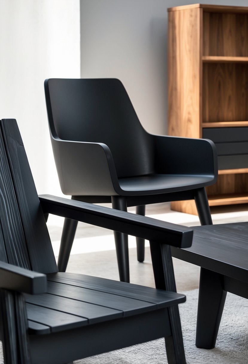
I often choose charcoal black for wooden furniture when I want a deep, versatile color that isn’t as harsh as pure black. It adds subtle sophistication and works well in both modern and traditional settings.
Charcoal black creates a strong yet softer look, making it ideal for accent pieces or larger furniture. Its matte or chalky finishes often demand minimal prep, saving time while delivering good coverage.
For me, charcoal black balances style and practicality, enhancing wood grain without overwhelming it. It’s a reliable choice when I need elegant, timeless color.
13. Bright Turquoise
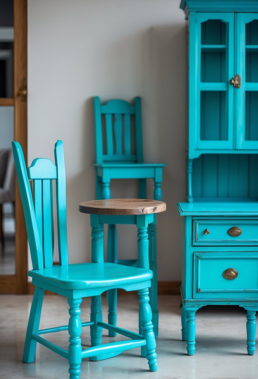
I find bright turquoise to be a striking choice for wooden furniture. It adds a fresh and lively touch to any space without overwhelming it.
This color pairs well with neutral tones like white or beige, creating a balanced look. You can also combine it with darker blues or metallic accents for more depth.
Using bright turquoise can transform plain furniture into a standout piece. It’s perfect when you want a bold yet inviting vibe in your room.
14. Dusty Lavender
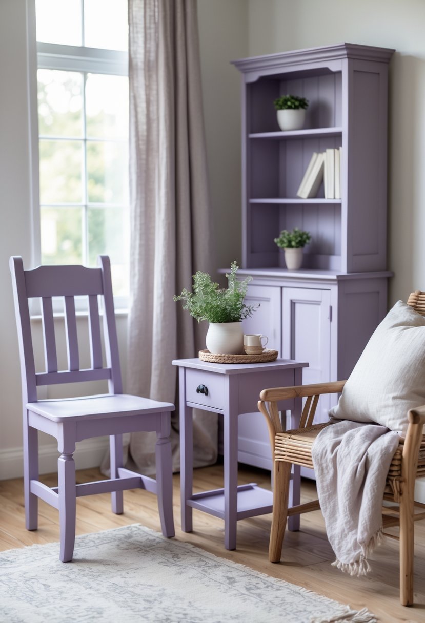
I find dusty lavender to be a versatile and sophisticated choice for wooden furniture. Its soft blend of muted purple and gray creates a calm, timeless look without overwhelming a space.
This color works well in both modern and classic settings. It pairs nicely with brass fixtures, cream accents, and dark wood elements, adding subtle elegance to the room.
15. Blush Peach
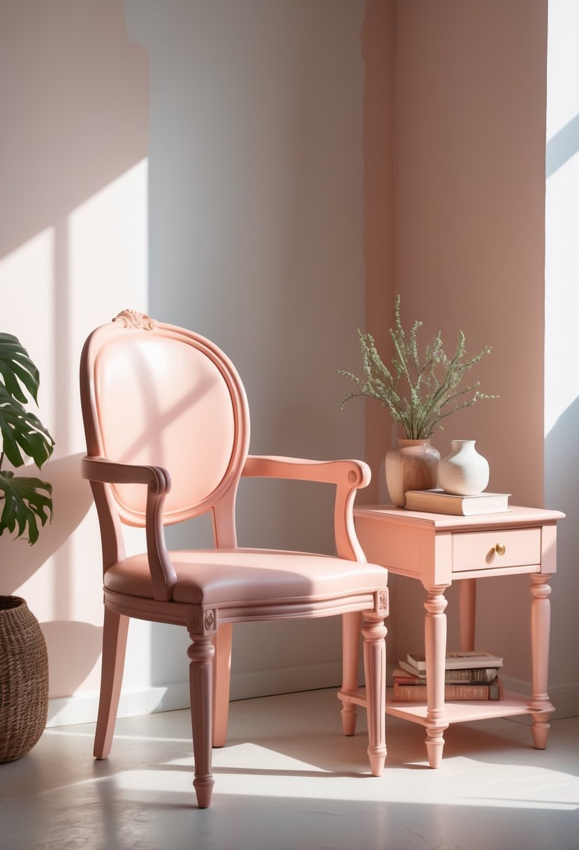
I find blush peach to be an elegant choice that softly enhances wooden furniture. Its warm undertones complement natural wood grains without overpowering them.
This color adds a subtle glow to any room, creating a calm and inviting atmosphere. Whether on walls or accents, blush peach balances warmth and freshness well.
Blush peach works with a variety of design styles, from modern to vintage. It pairs beautifully with both light and dark wood finishes, making it a versatile option for many spaces.
16. Bold Teal
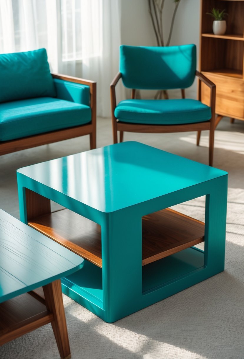
I find bold teal to be a striking choice for wooden furniture. Its rich, jewel-toned quality adds energy and depth to any piece.
When I use bold teal, it often becomes the focal point in a room. It pairs well with warm wood floors and colorful accents, creating a balanced look.
This shade works particularly well on smaller furniture items like side tables or chairs, where it can make a strong statement without overwhelming the space.
17. Muted Olive
I appreciate muted olive for its balance between earthiness and sophistication. This color blends green, brown, and yellow tones, creating a soft, natural look that works well on wooden furniture.
Muted olive suits both modern and rustic styles. I often pair it with distressed wood or subtle gold accents to enhance its organic feel. It brings calmness without overwhelming the space, making it a versatile choice.
18. Pure White
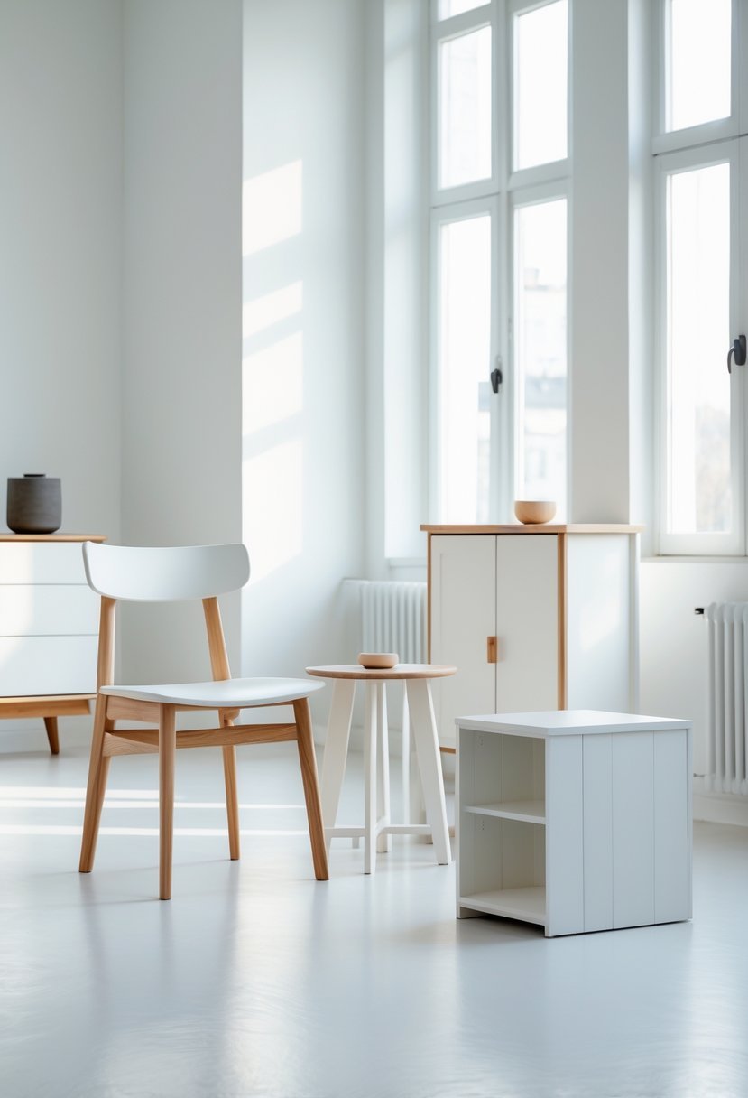
I often recommend Pure White for wooden furniture because of its clean, crisp appearance. It works well on both interior and exterior pieces, providing a timeless, versatile base.
Pure White offers a bright finish without being too stark. It pairs nicely with natural wood tones, creating a balanced look that complements various styles.
This color also performs well on different wood types and holds up under multiple finishes. It’s a reliable choice when you want a fresh, neutral look that won’t overpower your furniture’s design.
19. Burnt Orange
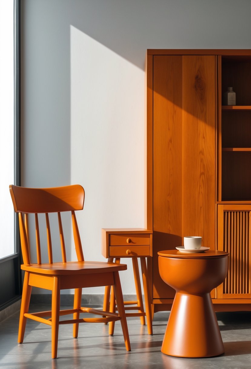
I appreciate burnt orange for wooden furniture because it adds warmth without overwhelming a space. This rich, earthy tone pairs well with natural wood grains, enhancing their texture.
When I use burnt orange, I often combine it with neutral or wooden elements to create balance. It works well on accent pieces, bringing both vibrancy and depth. The color suits various styles, from rustic to modern.
20. Rose Quartz
I find Rose Quartz a versatile choice for wooden furniture. It sits between hot pink and coral, offering a warm pink tone with subtle gray undertones.
This color works well in both modern and traditional settings. It adds a gentle pop without overwhelming the space.
For me, it’s an excellent option when you want warmth and softness in your decor. Rose Quartz also pairs nicely with neutral or muted shades.
How to Choose Paint Colors for Wooden Furniture
Identify the Wood Tone and Style
When I choose paint colors for wooden furniture I always start by understanding the wood tone and overall style of the piece.
- Dark woods pair well with lighter or muted colors
- Light woods handle deeper or richer shades
- Simple furniture supports bolder colors
Decide the Role of the Furniture
I think about whether the furniture should blend in or stand out in the room.
- Accent pieces allow bold color choices
- Large furniture works best with softer tones
- Neutral colors support long term flexibility
Balance Color with the Room Palette
I make sure the paint color works with walls floors and decor so the room feels cohesive.
- Warm colors pair well with wood floors
- Cool colors add contrast in warm rooms
- Neutral shades keep the space balanced
Choose the Right Finish
Finish plays a big role in how painted wood looks and performs.
- Matte finishes feel modern and soft
- Satin finishes clean easily
- Gloss finishes highlight details
Keep the Look Timeless
I aim for colors that feel fresh now and still appealing later.
- Muted tones age better than bright ones
- Classic colors reduce repainting
- Simple palettes feel intentional
FAQs
Creating Balanced and Stylish Interiors
I believe paint colors for wooden furniture can completely transform a space when chosen thoughtfully. By considering wood tone room balance and finish I can refresh furniture without losing its character. The right color enhances the beauty of the wood while helping the piece feel intentional and timeless within the room.

I am Mindy Medford, a home décor, paint, and design specialist with over a decade of hands-on experience transforming ordinary spaces into cozy, personality-packed havens. Since 2013, I have been helping homeowners discover the art of beautiful yet practical design. I share my love for color, texture, and layout—making stylish interiors & exteriors feel achievable for everyone. Whether it’s picking the perfect paint shade or reimagining a small space, I’m here to guide and inspire.