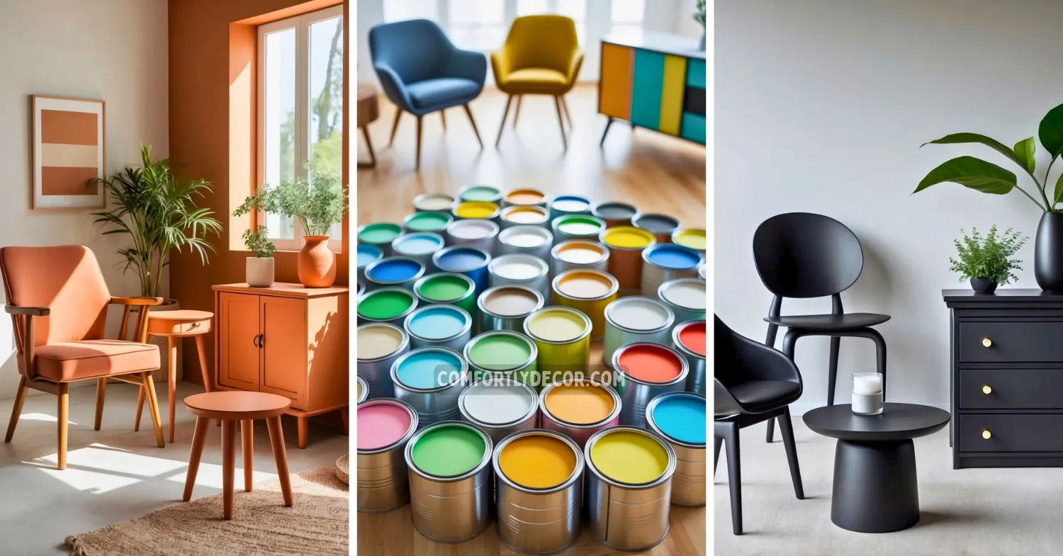
20 Paint Colors for Furniture That Transform Your Space Effortlessly
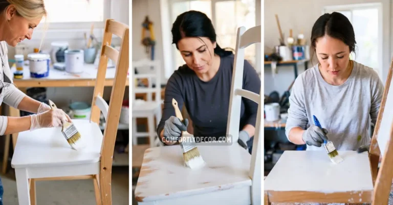
Choosing the right paint color for furniture can completely change the look and feel of a room. Whether you’re updating an old piece or adding a fresh touch to a new one, the color you pick plays a major role in defining your space’s style and mood. The purpose of this article is to help you find 20 paint colors that work well on furniture, balancing aesthetics and versatility.
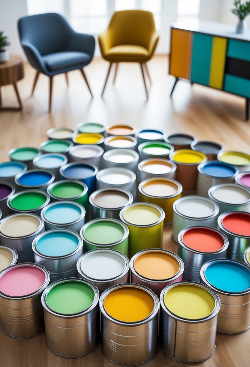
I understand that selecting colors can feel overwhelming with so many options available today. This guide aims to offer straightforward choices that suit a range of tastes, from subtle neutrals to more vibrant shades, making it easier for you to decide what fits your personal style and home decor.
20 Paint Colors for Furniture
1. Navy Blue
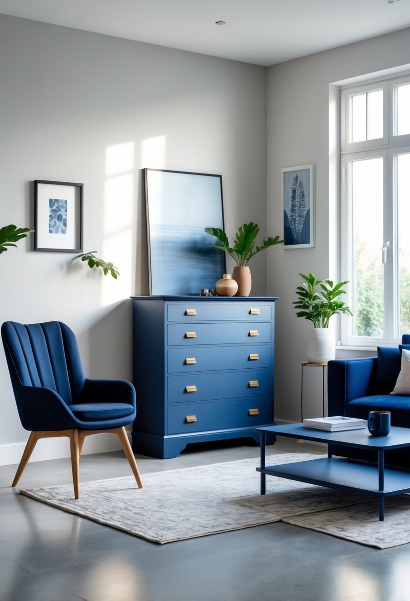
I choose navy blue for furniture when I want a color that balances boldness with classic neutrality. It works well on a variety of pieces, from cabinets to chairs, offering a rich yet calming presence.
Navy can suit both modern and traditional styles, making it versatile. Its depth adds elegance without overpowering a room, creating a refined focal point that complements many other colors.
2. Soft Light Pink
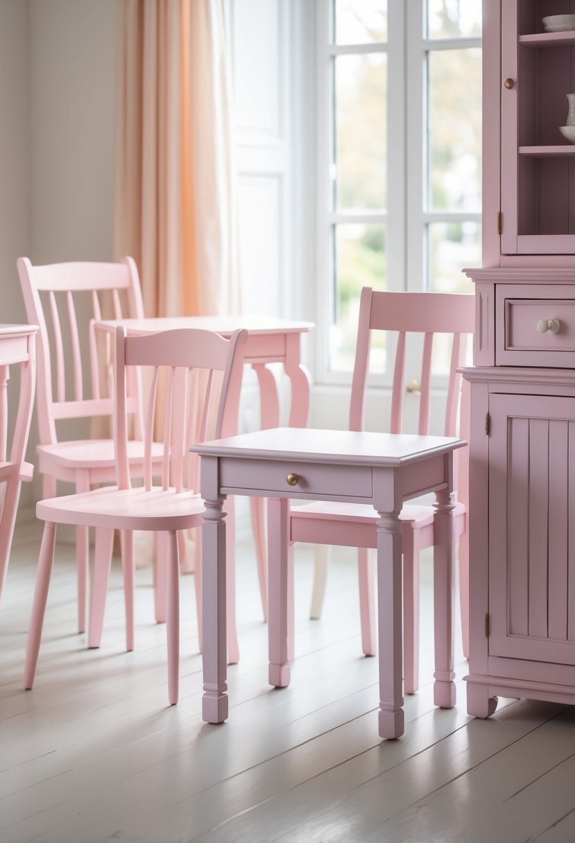
I find soft light pink to be a versatile choice for furniture. It adds a subtle touch of warmth without being overwhelming or too sweet.
This shade works well in various spaces, from bedrooms to living rooms. It pairs easily with darker accents, which helps prevent the look from feeling flat or washed out.
Using soft light pink can brighten a piece while keeping a calm, modern atmosphere. It’s a color I often recommend for creating gentle contrast in a room.
3. Classic White
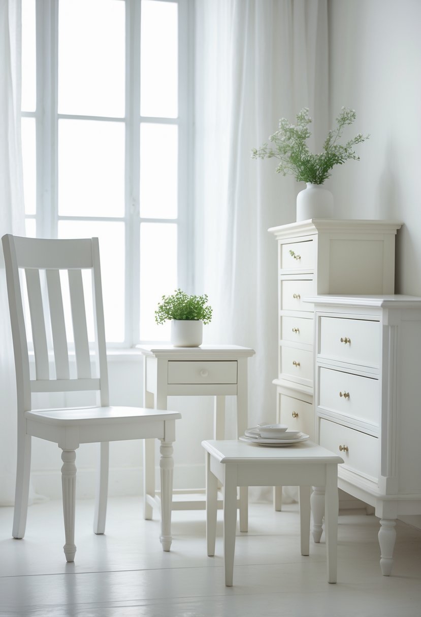
I often recommend Classic White for furniture because it strikes a balance between bright and warm. It’s not as stark as pure white, making it easier to match with other colors in a room.
This shade feels clean and fresh without overwhelming the space. I find it works well on cabinets, dressers, and tables, providing a timeless look that suits various styles.
Classic White also pairs nicely with both modern and traditional decor, making it a versatile choice for many furniture pieces.
4. Warm Beige
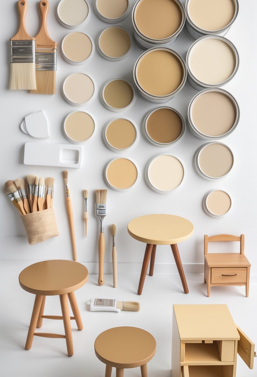
I find warm beige a versatile choice for furniture, as it adds subtle warmth without overpowering a room. The color can carry undertones like pink, peach, or yellow, which change depending on lighting and surrounding decor.
When using warm beige, I always test it in the space first to see how it interacts with flooring and other colors. It suits both modern and traditional styles, offering a neutral base that complements various textures and finishes.
5. Charcoal Gray
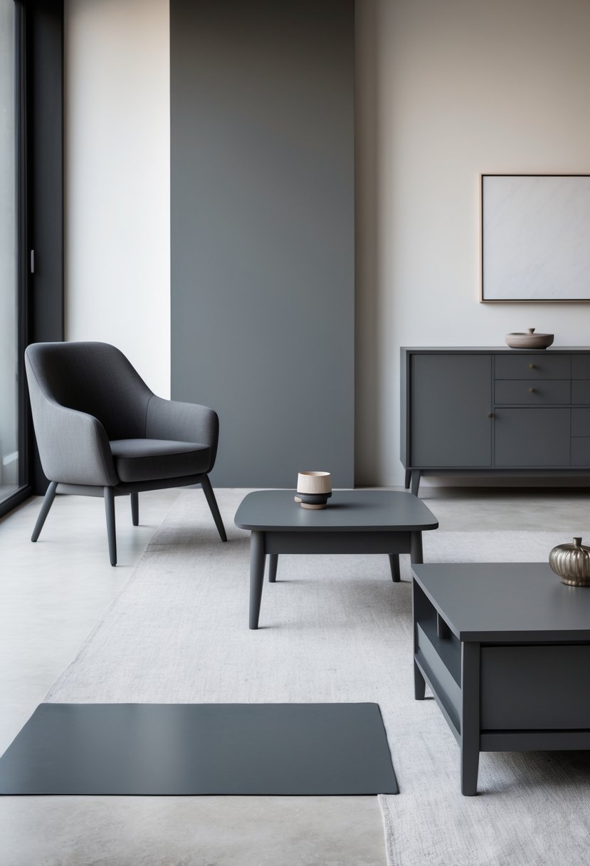
I find charcoal gray to be a versatile choice for furniture. Its deep, neutral tone brings sophistication without overwhelming a space.
Pairing charcoal gray with bright colors like tangerine orange adds energy, while soft pastels create a calm, balanced look. I often use white or natural creams alongside it to lighten and modernize the overall feel.
Charcoal gray works well in almost any room, easily complementing various styles. This adaptability makes it one of my preferred colors when selecting paint for furniture.
6. Sage Green
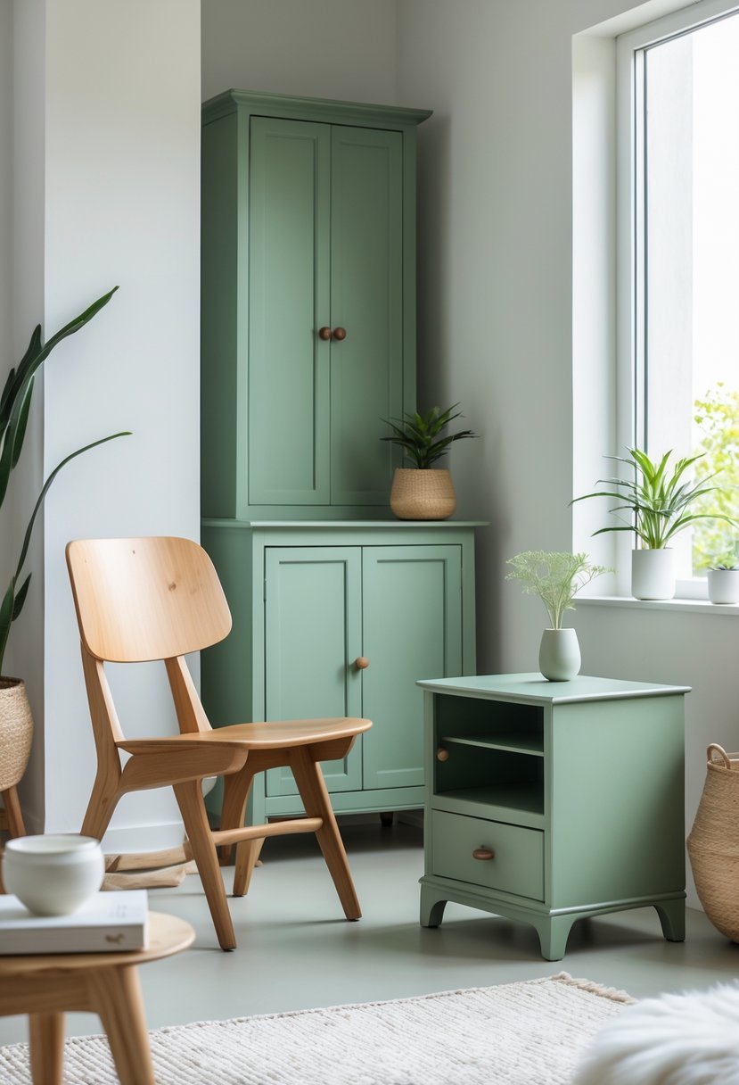
I often choose sage green for furniture because it offers a calm, muted green tone that feels both fresh and timeless. Its subtle gray undertones make it versatile enough to pair with various styles, from modern to cottagecore.
In my experience, sage green works well as a neutral, blending smoothly with natural textures like wood or wicker. It adds warmth without overwhelming a space, making it ideal for living rooms or bedrooms.
7. Dusty Blue
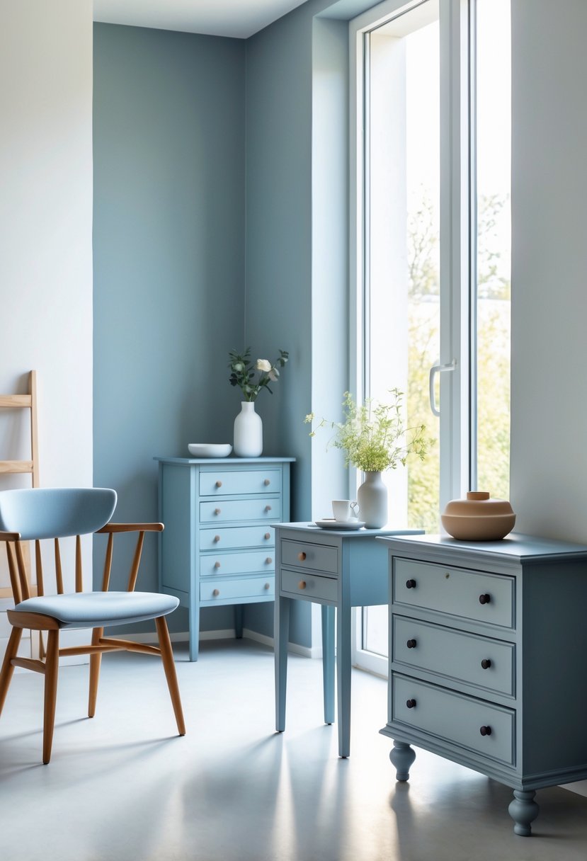
I choose dusty blue for furniture when I want a color that balances calmness with subtle sophistication. This shade blends blue with gray, creating a soft, weathered look that feels timeless.
Dusty blue works well in many styles, from vintage to modern farmhouse. It adds depth without overwhelming a space. For me, it’s perfect when I want gentle color that complements both bold and neutral surroundings.
8. Bold Red
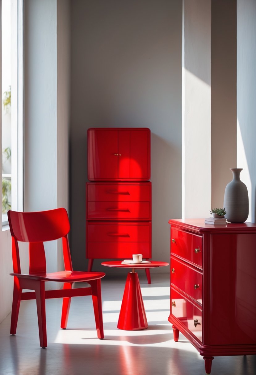
I find bold red to be a powerful choice for furniture. It instantly draws attention and creates a strong focal point in any room.
Red works well on sofas, chairs, and dressers. It can add energy without overwhelming the space when balanced with neutral tones.
In my experience, using deep reds like Tuscan Red delivers richness and warmth. It’s versatile enough for both modern and traditional styles.
9. Matte Black
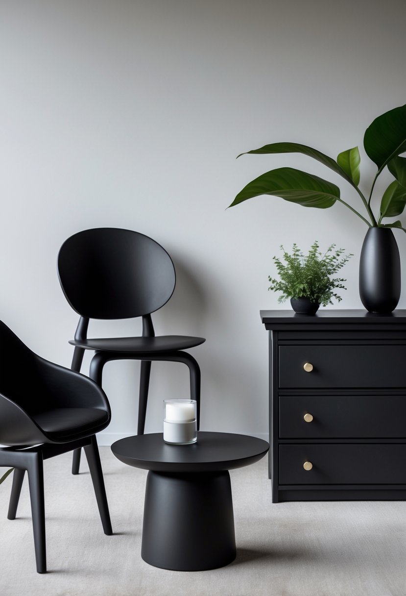
Matte black is a versatile choice for furniture that adds a modern, timeless touch. I appreciate how it creates a sleek, understated look without the shine of gloss or satin finishes.
Using matte black paint on wood or metal furniture can completely refresh a piece while providing good coverage and durability. It works well in a variety of styles, from contemporary to classic.
When I paint furniture in matte black, I look for options that offer smooth application and lasting protection. This color is ideal when you want subtle elegance without drawing too much attention.
10. Creamy Yellow
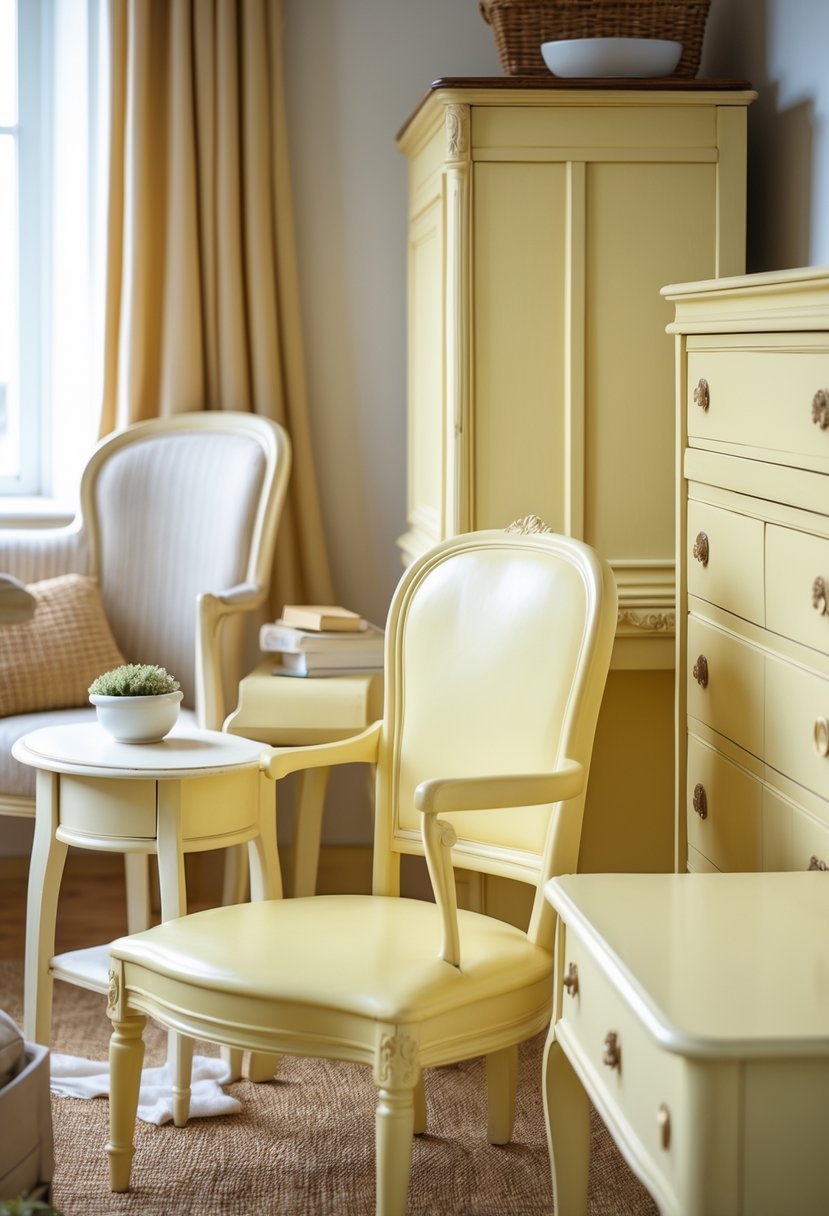
I find creamy yellow to be a versatile choice for furniture. It adds warmth without overwhelming a space. This shade brings a soft, cozy feel that can make any room more inviting.
Creamy yellow works well with natural wood tones and neutral backgrounds. It brightens a piece while maintaining subtlety. For me, it’s perfect when I want color that feels cheerful but not too bold.
11. Muted Olive
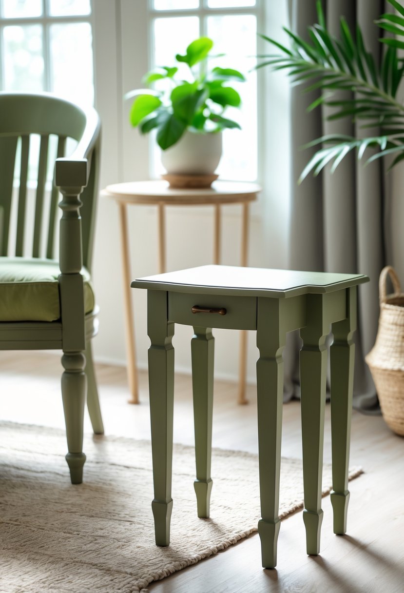
I find muted olive to be a versatile choice for furniture. It balances green with subtle brown and gray tones, giving it a natural, earthy feel. This color works well when I want something calm but still rich in character.
Muted olive doesn’t overpower a room. Instead, it blends easily with neutral shades like beige, cream, or soft browns. When I use it, my pieces have warmth without overwhelming other decor elements.
12. Lavender Gray
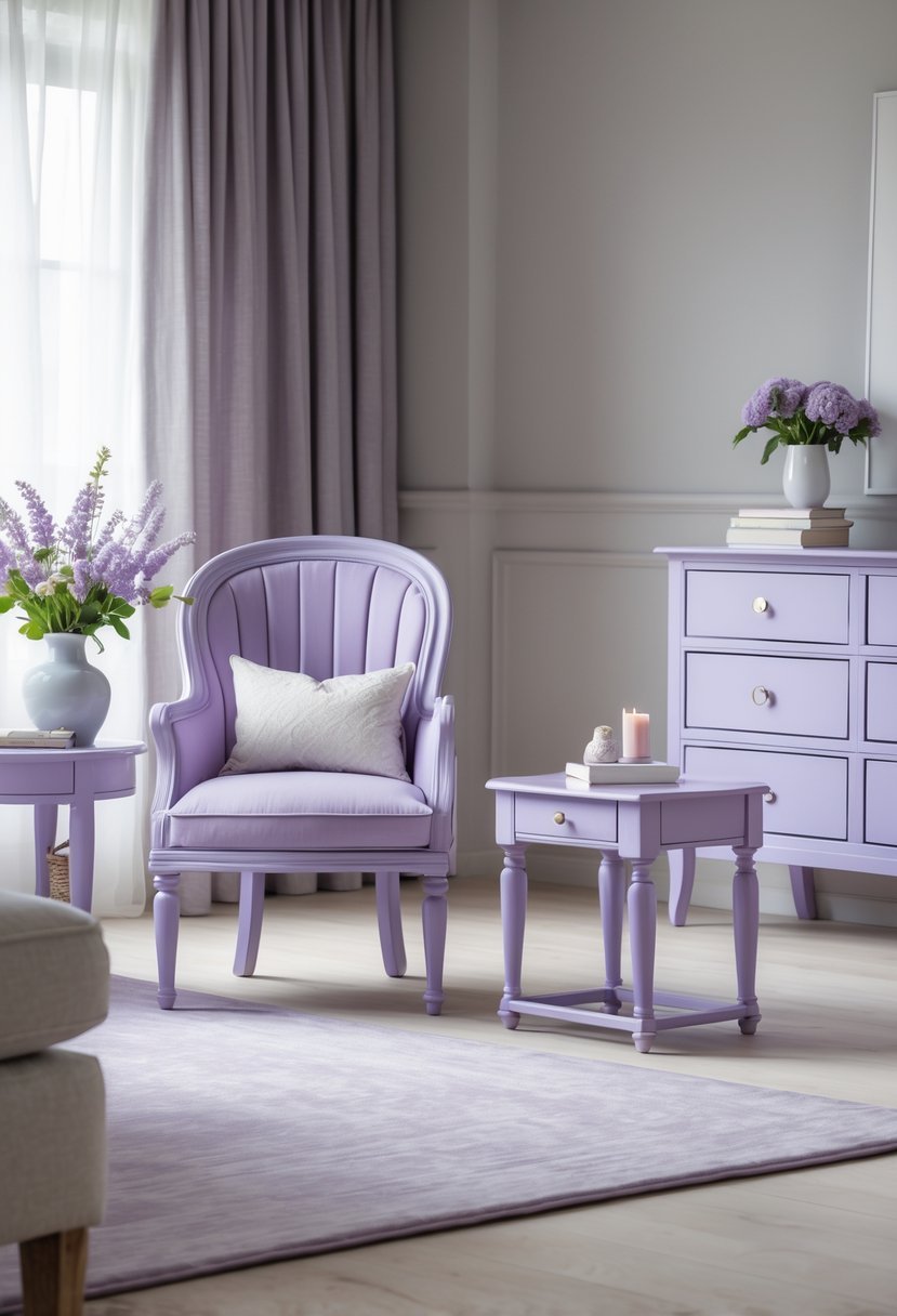
I often choose lavender gray for furniture when I want a soft, calming touch without overwhelming the space. This color blends gentle lavender tones with muted gray, offering a balanced and sophisticated look.
Lavender gray works especially well in bedrooms and living areas where I want to create a relaxing atmosphere. It pairs easily with other neutrals or pastel shades, making it versatile for various styles.
When painted on wood or metal furniture, the color adds subtle elegance without feeling too bold or too dull. It’s a reliable choice if you want understated charm.
13. Coral Peach
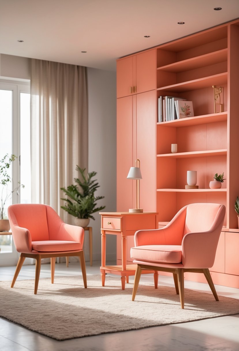
I find coral peach to be an excellent choice for furniture because it balances warmth and softness. This color blends pink and orange tones, creating a look that is both inviting and stylish.
Using coral peach on cabinets or accent pieces can brighten a room without overwhelming it. It works well with neutrals and adds a subtle pop in both modern and vintage settings.
14. Rich Burgundy
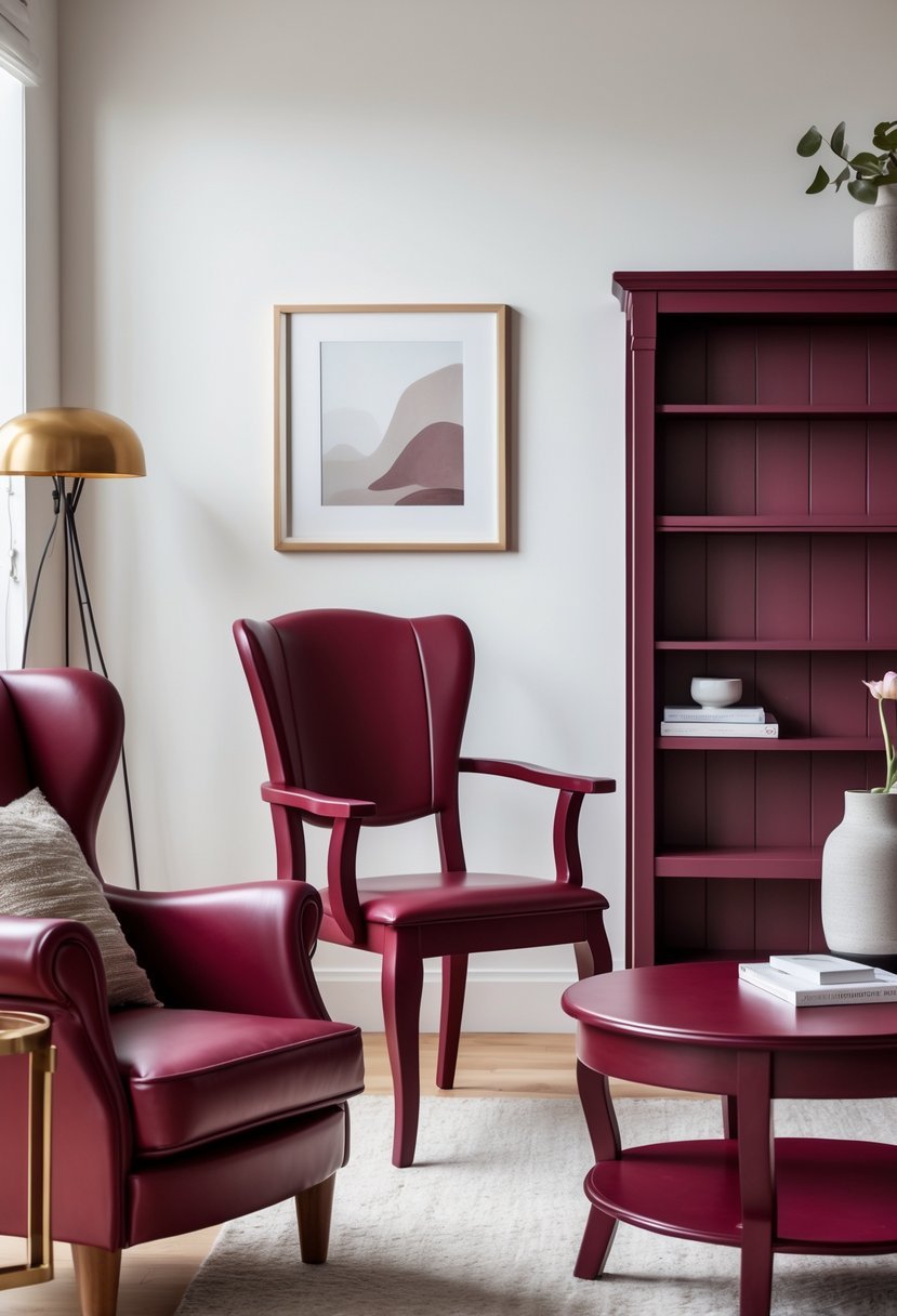
I find rich burgundy to be a powerful choice for furniture. Its deep, wine-inspired tones bring warmth without overwhelming a space.
Using burgundy on pieces like cabinets or chairs adds sophistication and a timeless feel. It pairs well with neutrals and natural wood finishes.
This color works well in living rooms and dining areas where I want a bold yet inviting touch. Rich burgundy creates a cozy atmosphere without feeling heavy.
15. Powder Blue
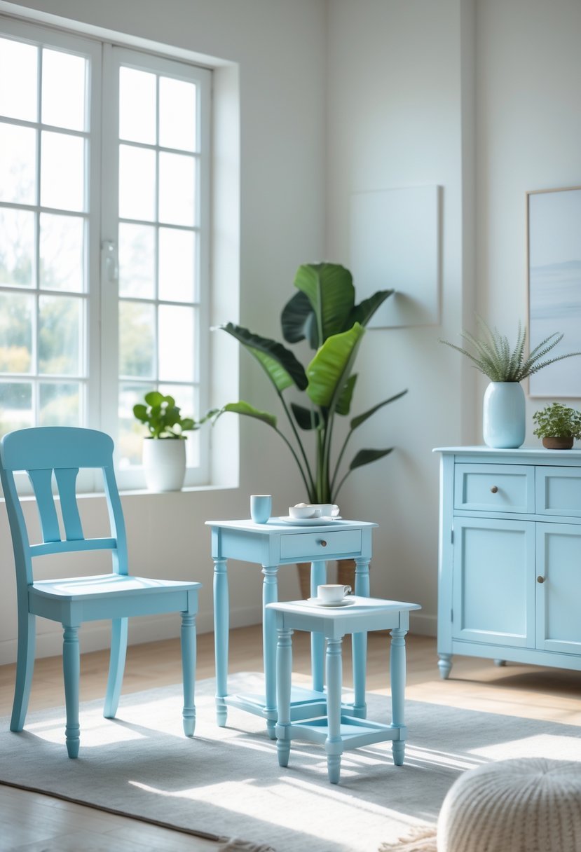
I find powder blue to be a versatile choice for furniture. It offers a soft, calming tone that works well in many styles.
This color brings a fresh, airy feel to any piece, making it ideal for creating a relaxed atmosphere. It pairs nicely with neutral shades and natural materials.
Using powder blue can add subtle elegance without overpowering a room. I often recommend it when a gentle, understated color is needed.
16. Pale Mint
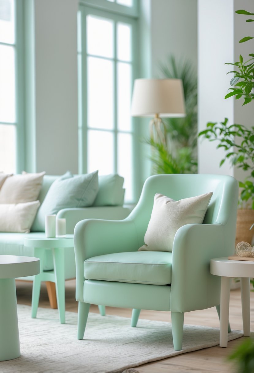
I find pale mint to be a versatile choice for furniture. Its soft green tone with subtle hints of blue brings a calm, fresh vibe without overwhelming the space.
This shade works well in various rooms, from bedrooms to living areas. It pairs easily with neutral colors and adds a gentle, soothing character to any piece. Pale mint offers a modern yet timeless appeal that can complement both classic and contemporary styles.
17. Taupe
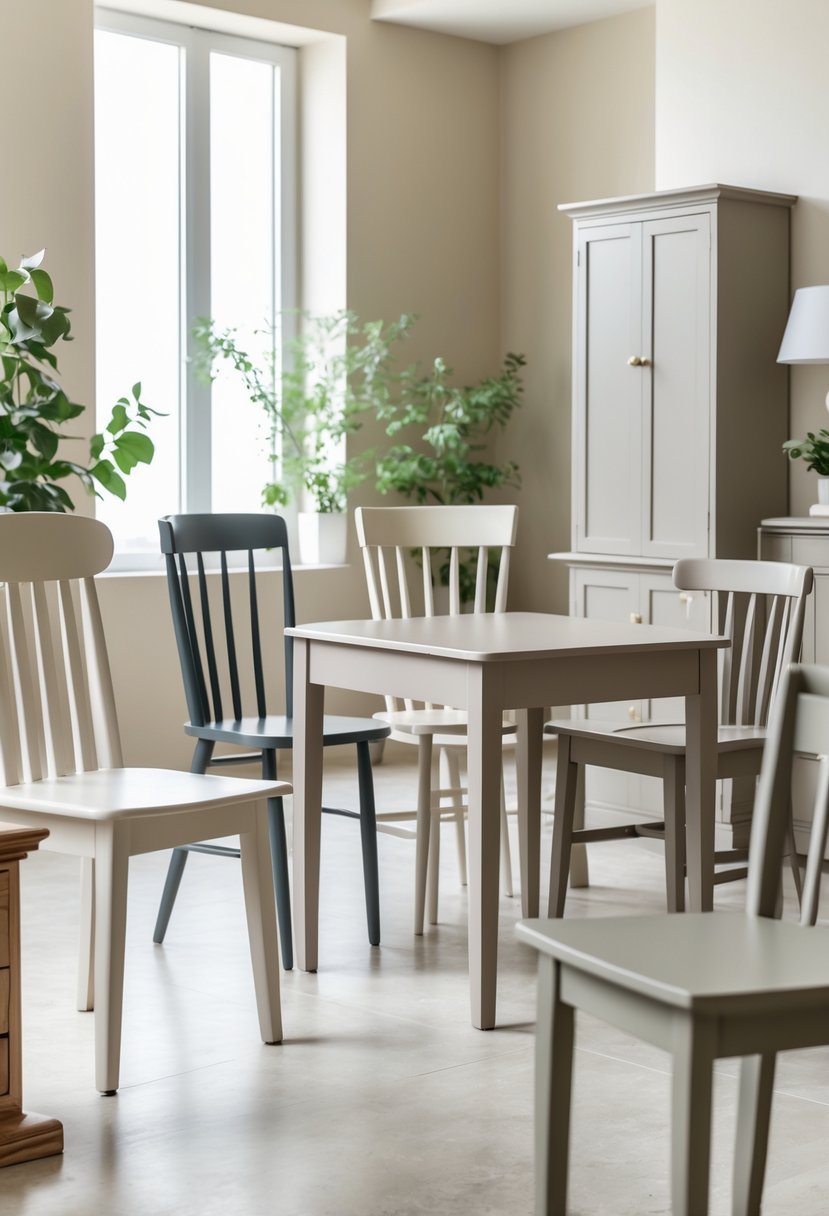
I find taupe to be one of the most versatile colors for furniture. It blends brown and gray tones, offering a neutral yet warm appearance that works well in many settings.
Taupe can shift from lighter, airy shades to deeper, more moody hues. This adaptability makes it easy to pair with both cool and warm color palettes.
Using taupe furniture helps create a calm, sophisticated atmosphere without overwhelming the space. It’s a reliable choice when you want subtle elegance.
18. Terracotta
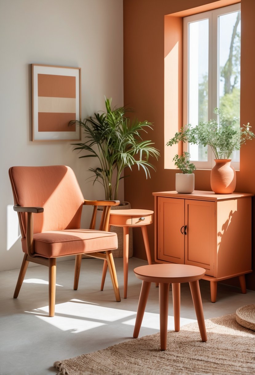
I find terracotta to be a versatile choice for furniture. Its warm, earthy tones bring a grounded yet inviting feel to any piece.
This color ranges from soft clay shades to deeper rustic hues, providing options for different moods and styles.
Terracotta pairs well with neutrals like creamy whites and warm grays, which keep the look balanced and fresh. It suits Mediterranean or rustic interiors nicely, adding subtle warmth without overwhelming the space.
19. Deep Teal
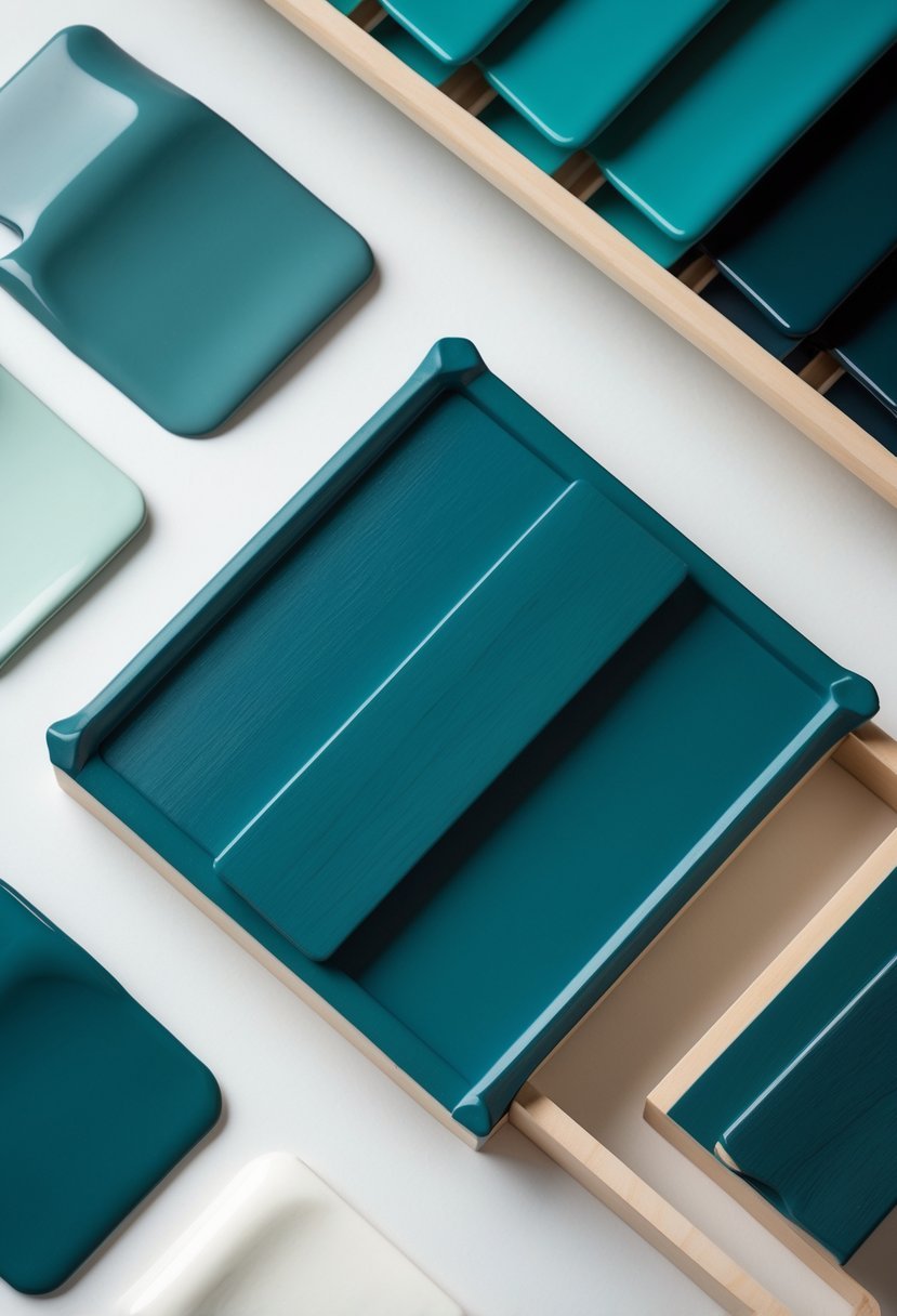
I find deep teal to be a versatile choice for furniture, blending blue and green tones in a way that adds depth without overwhelming a space. It works well on cabinets, dressers, or accent pieces, creating a sophisticated look.
This shade pairs nicely with neutrals like gray and beige, but it can also stand out against metallic accents. Deep teal brings a calm yet bold presence that can anchor a room’s design quietly and confidently.
20. Blush Pink
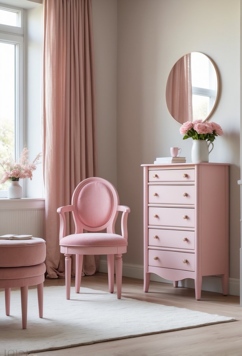
I find blush pink to be a versatile choice for furniture paint. It adds a soft, warm touch without dominating the room.
This shade works well on accent chairs, cabinets, or small tables, creating a subtle yet stylish presence. It pairs nicely with greens and neutrals, balancing warmth and sophistication.
Using blush pink in furniture allows me to introduce color gently, perfect for spaces needing a calm and inviting atmosphere.
Choosing Paint Colors for Furniture That Truly Transform a Space
Decide the Purpose of the Furniture
I always begin by deciding what role the furniture plays in the room.
- Statement pieces can handle bold colors
- Everyday furniture works best with softer shades
- Accent items allow playful experimentation
Match Color With Room Style
I make sure the paint color supports the overall design direction of the space.
- Modern rooms suit clean neutrals and deep tones
- Traditional spaces work well with warm and classic colors
- Eclectic rooms allow brighter and layered shades
Balance With Surrounding Elements
I consider walls flooring textiles and decor before choosing a final color.
- Dark furniture balances light walls
- Light furniture brightens darker rooms
- Neutral colors help unify mixed decor
Select the Right Finish
The finish changes how furniture looks and performs over time.
• Matte creates a soft modern feel
• Satin offers durability and easy cleaning
• Gloss highlights details and edges
Step Five Think Long Term
I aim for colors that feel fresh now and still appealing years later.
- Muted tones age better than trendy brights
- Timeless colors reduce repainting
- Balanced palettes feel intentional
FAQs
Creating Style Balance and Personality
I believe paint colors for furniture have the power to reshape a space without major renovations. When I choose colors thoughtfully and consider finish balance and placement furniture becomes intentional rather than accidental. The right color adds personality while keeping the room comfortable and timeless.

I am Mindy Medford, a home décor, paint, and design specialist with over a decade of hands-on experience transforming ordinary spaces into cozy, personality-packed havens. Since 2013, I have been helping homeowners discover the art of beautiful yet practical design. I share my love for color, texture, and layout—making stylish interiors & exteriors feel achievable for everyone. Whether it’s picking the perfect paint shade or reimagining a small space, I’m here to guide and inspire.