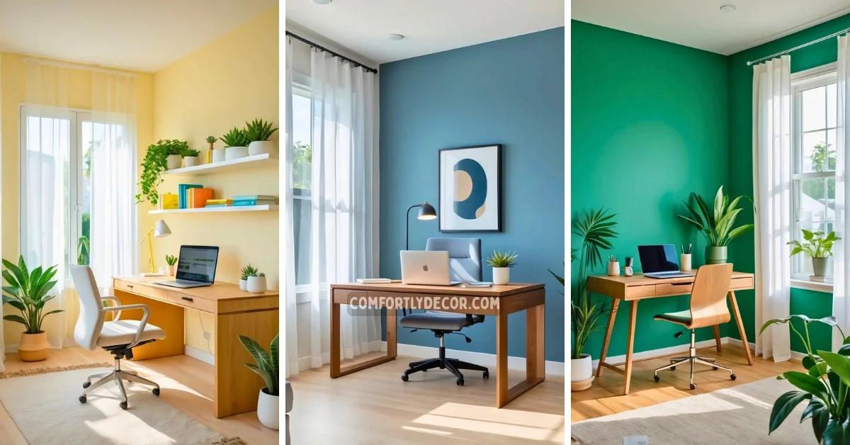
15 Home Office Paint Colors Ideas to Boost Productivity and Style
Choosing the right paint color for a home office is more important than many realize. Colors can influence mood, focus, and productivity, shaping how effectively you work each day. Whether you want to create a calm space or one that sparks creativity, the color you select plays a key role.
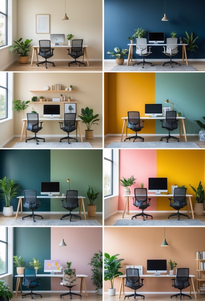
15 Home Office Paint Colors
I have put together a list of 15 paint color ideas that can enhance your home office environment. These options cover a range of moods and styles to help you find what best suits your work habits and personal taste.
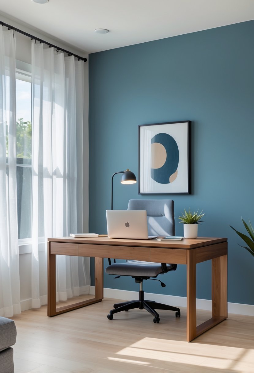
1. Calm Blue Gray to enhance focus and reduce stress
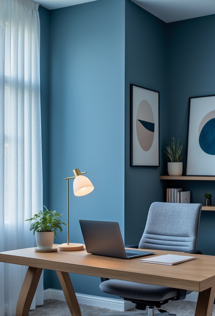
I find calm blue gray to be a reliable choice for my home office. This color blends the tranquility of blue with the neutrality of gray, creating a balanced environment. It helps me stay focused while keeping stress levels low.
The soft hue doesn’t distract and works well with different lighting conditions. It also pairs easily with other colors, allowing me flexibility in decorating. For me, calm blue gray promotes a steady, productive mindset.
2. Soft Sage Green for a refreshing, natural vibe
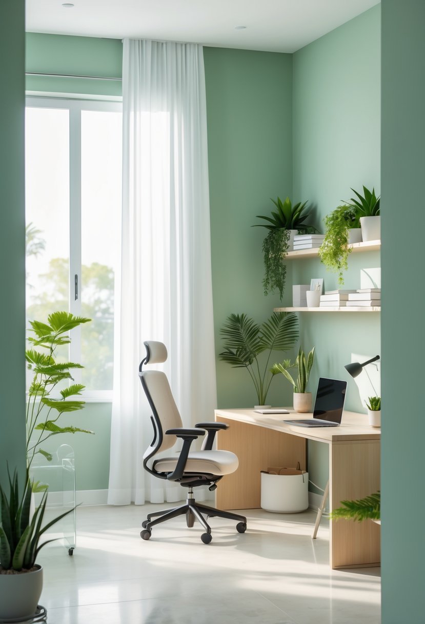
I find soft sage green to be an excellent choice for a home office. It brings a calm, natural feel without being overpowering. This muted green works well with wood or marble accents, adding subtle warmth.
Using sage green on walls or furniture creates a soothing backdrop that helps me focus. It blends easily with other colors, making the space feel balanced and inviting. I appreciate how it promotes both relaxation and productivity in my work environment.
3. Warm Cocoa Brown to promote stability and concentration
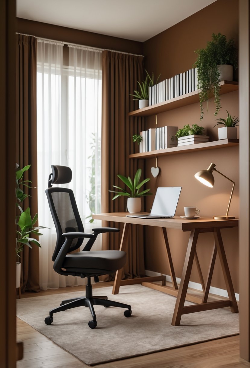
I find warm cocoa brown to be an excellent choice for a home office. Its rich, earthy tone creates a grounded atmosphere that helps me stay focused. The color feels comforting, reducing distractions without overwhelming the space.
This shade balances warmth and depth, lending a cozy yet professional look. When paired with natural materials like wood or leather, cocoa brown enhances a stable work environment. It’s a subtle way to promote concentration while adding visual interest.
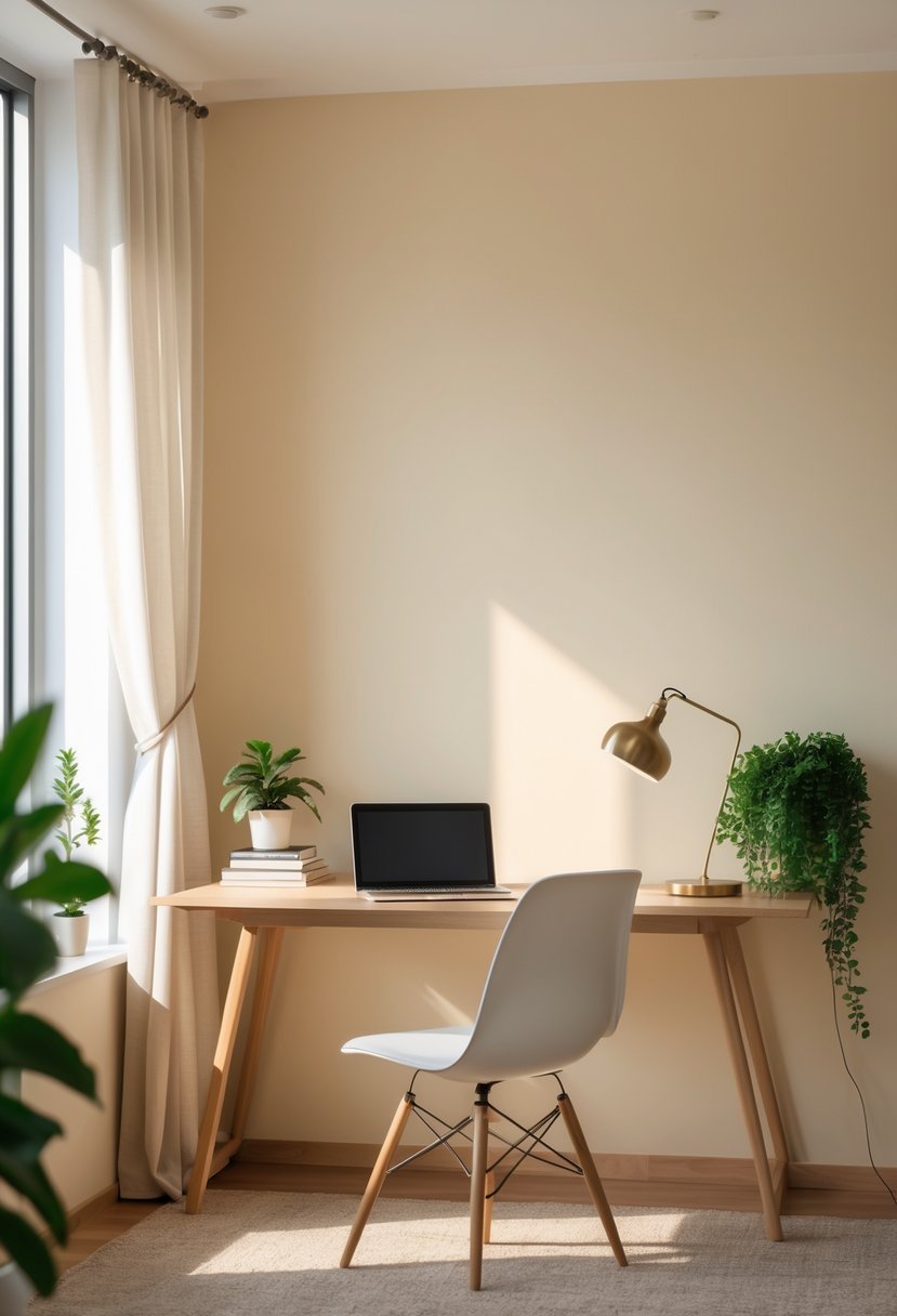
4. Bright White for a clean, distraction-free space
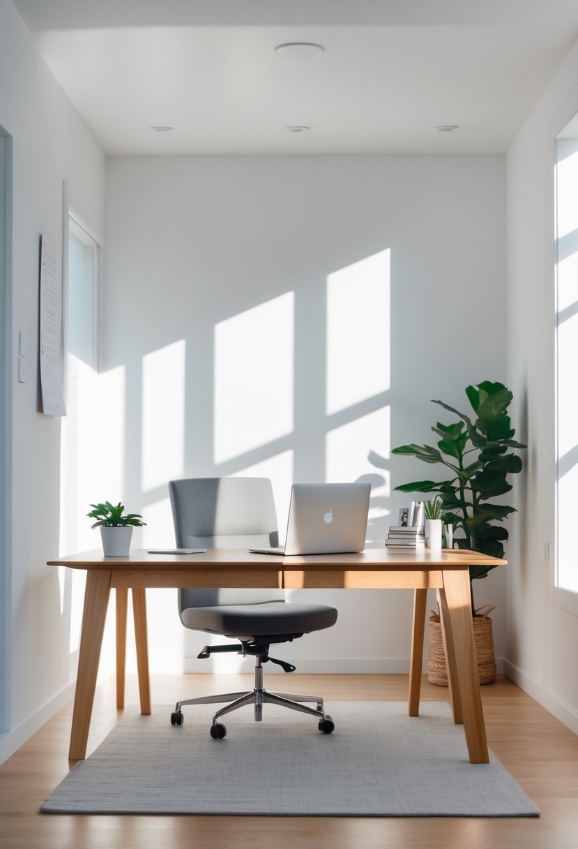
I find bright white paint is an excellent choice for a home office because it creates a clean and distraction-free environment. It reflects natural light well, making the space feel larger and more open. This brightness helps me stay focused by limiting visual clutter.
Using pure white walls provides a neutral backdrop that suits any style or décor I want to add later. It supports productivity without overwhelming the senses. For me, bright white is a practical, timeless option that keeps my workspace clear and professional.
5. Dusty Rose for a subtle, inspiring warmth
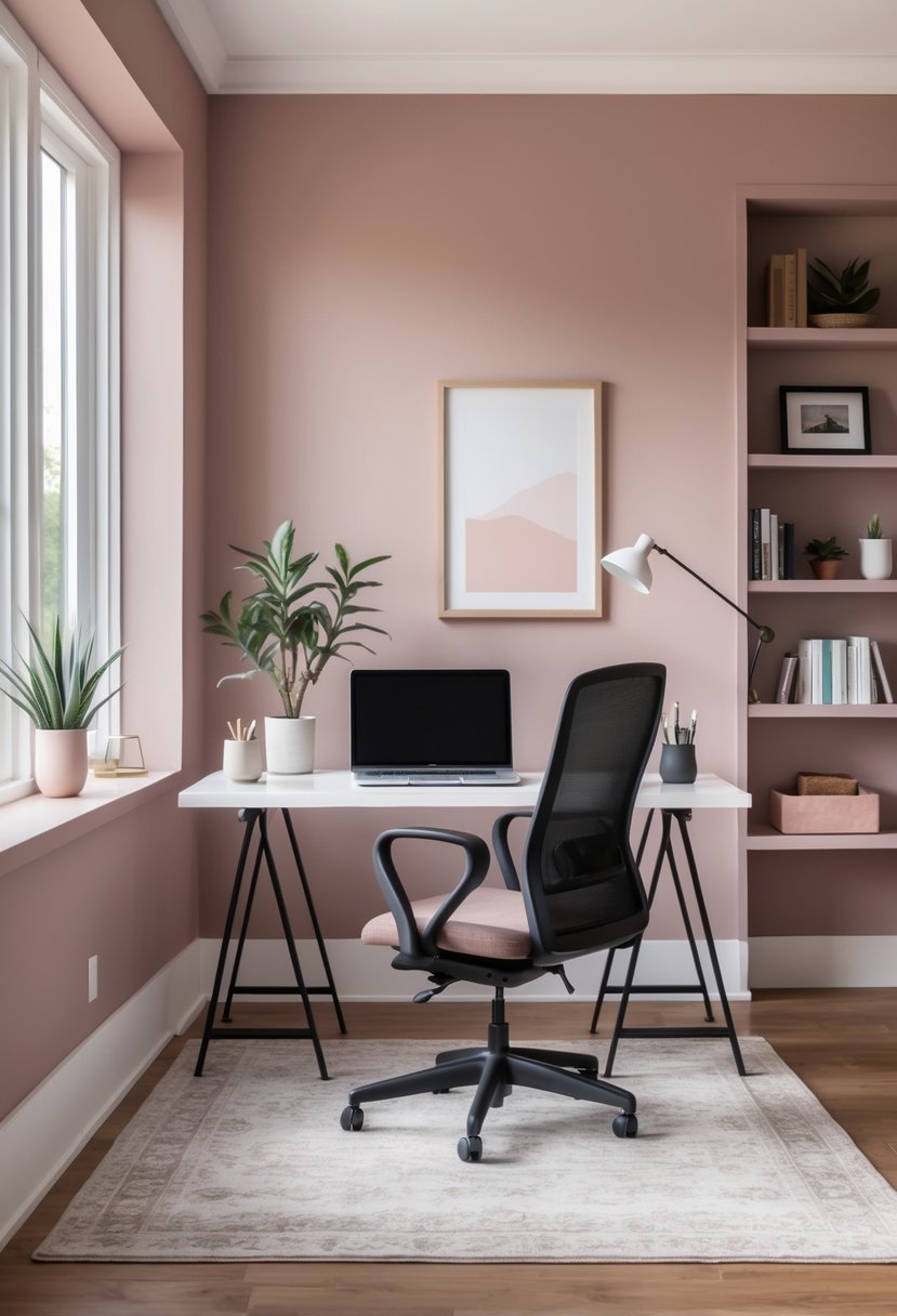
I find dusty rose to be a perfect choice when I want a subtle, warm tone in my home office. It adds a gentle warmth without overwhelming the space or feeling too bold.
This muted pink creates a calm and inviting atmosphere that helps me stay focused. Pairing dusty rose with white or neutral furniture keeps the room feeling fresh and open.
For me, it strikes a balance between professionalism and comfort, making the work environment more pleasant without distracting from tasks.
6. Charcoal Gray to create a modern, professional atmosphere
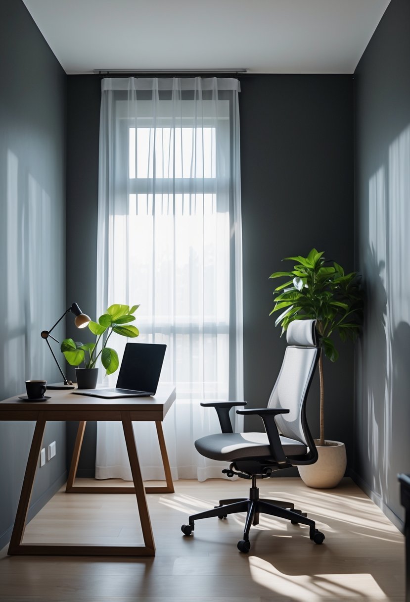
I find charcoal gray to be an excellent choice for a home office when aiming for a modern, professional look. Its deep tone adds sophistication without feeling overwhelming.
Using charcoal gray walls can anchor the space, creating a strong and focused environment. I like pairing this shade with lighter furniture to create contrast and keep the room balanced.
This color works well with metal or wood accents, giving the office a polished, intentional feel while supporting productivity.
7. Pale Yellow to stimulate creativity and optimism
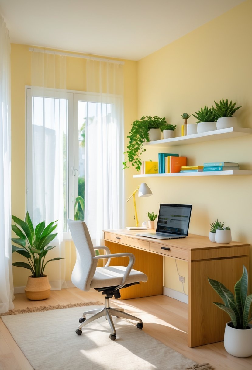
I find pale yellow to be an excellent choice for a home office. It brings a soft warmth that can gently boost creativity without feeling overwhelming.
The color stimulates a positive mood and optimism, which helps me stay motivated during work. I pair pale yellow with white accents to balance its brightness.
Using natural light alongside this shade diffuses its intensity nicely. For me, pale yellow creates an inviting and uplifting space to focus and generate new ideas.
8. Muted Navy Blue for a serious, scholarly feel
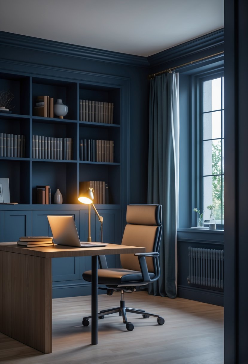
I find muted navy blue creates a grounded and focused atmosphere ideal for a home office. The color conveys stability and professionalism without overwhelming the space.
Using this shade brings a subtle depth that enhances concentration and supports long hours of work. It pairs well with neutral furniture and soft lighting, reinforcing a calm yet serious environment.
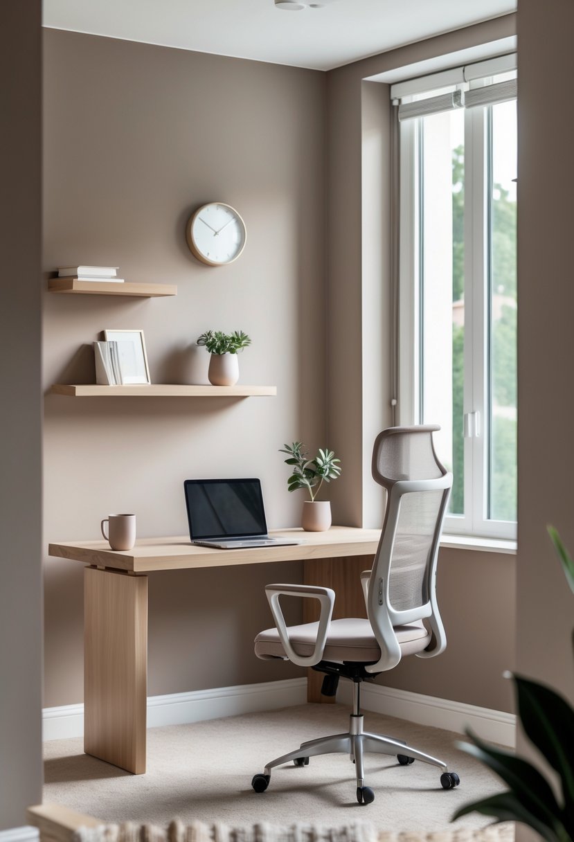
9. Creamy Beige for a cozy, neutral backdrop
I find creamy beige an excellent choice for a home office. It offers warmth without overwhelming the space, creating a calm and inviting environment.
This shade provides a neutral base that pairs well with different furniture and decor styles. It reflects light softly, keeping the room bright yet cozy.
For me, creamy beige strikes the right balance between subtle color and comfort. It supports focus by minimizing distractions while adding a touch of warmth to the workspace.
10. Rich Emerald Green to boost energy and balance
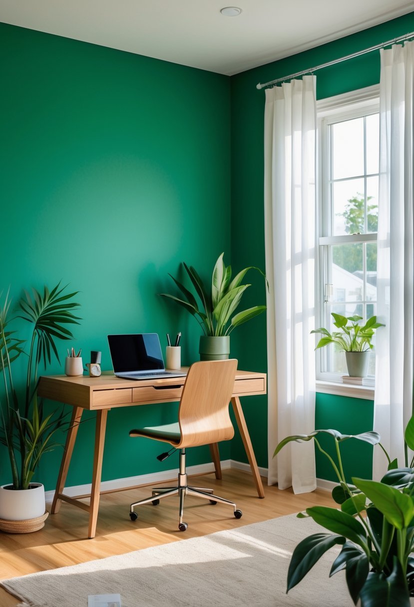
I find rich emerald green an excellent choice for a home office. It brings both energy and a sense of balance to the space. The color’s depth creates an atmosphere that feels lively but grounded.
Emerald green also reduces eye strain, which helps during long work sessions. Its connection to nature adds calm without dulling focus. For me, this shade blends creativity and tranquility effectively.
11. Terracotta Orange for a warm, inviting environment
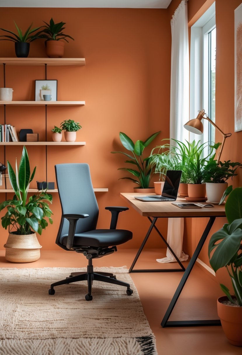
I often choose terracotta orange when I want a home office that feels both warm and inviting. Its earthy, orangey-red tones add natural depth without overwhelming the space.
This color blends well with warm hues like mustard yellow or olive green, creating a balanced atmosphere. It’s versatile enough to brighten my workspace while maintaining a grounded, calm vibe.
Using soft lighting enhances terracotta’s rich texture, making the room feel cozy. I find it perfect for fostering focus and comfort in my home office.
12. Lavender Purple to calm the mind and encourage creativity
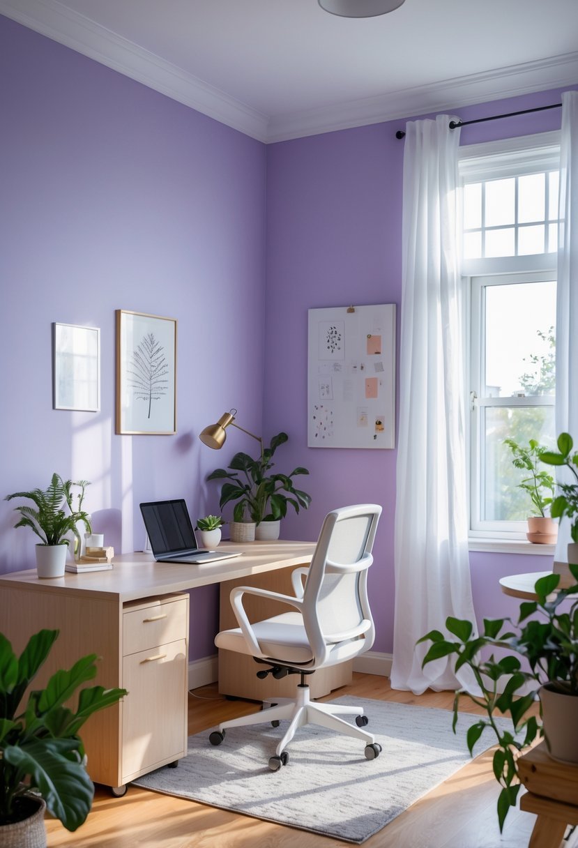
I find lavender purple to be an excellent choice for a home office. Its soft tones help create a calm atmosphere, reducing distractions and easing stress.
This color also sparks creativity without overwhelming the senses. It’s subtle enough to maintain focus but still adds a touch of inspiration.
Using lavender purple on walls or accents can brighten the space with a soothing yet sophisticated feel. It suits many lighting conditions, but I always test it first to see how it shifts throughout the day.
13. Slate Blue to foster deep concentration
I find slate blue a reliable choice for creating a focused workspace. This color blends blue and gray, producing a calm yet warm atmosphere. It’s subtle but not dull, which helps me stay attentive without feeling overstimulated.
Slate blue works well with neutral tones or even bold accents, adding versatility. When I paint my office walls this color, the room feels cozy and sophisticated, which supports long hours of deep work.
14. Soft Taupe for understated elegance and calm
I find soft taupe to be a perfect choice for a home office when you want quiet sophistication. The color balances brown and gray tones, creating a neutral backdrop that feels warm without overwhelming the space.
This shade also supports focus by minimizing visual distraction. It pairs well with natural wood or white trim, adding subtle contrast that enhances the room’s calm atmosphere.
Soft taupe’s versatility allows it to blend with various décor styles, from modern to traditional. It’s a practical, stylish option when you want a peaceful yet refined work environment.
15. Bold Teal to invigorate and energize the space
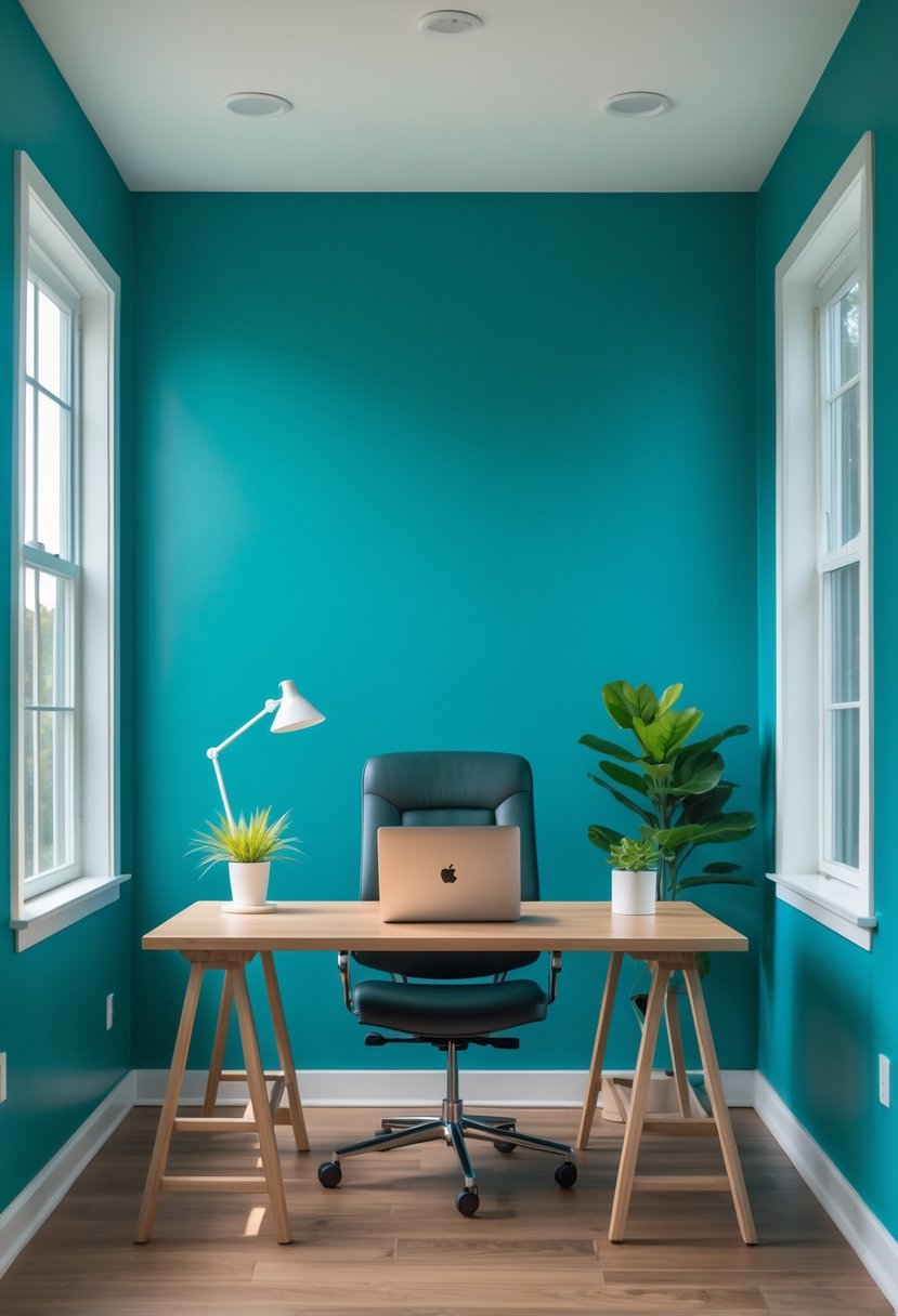
I find bold teal to be a perfect balance between vibrancy and calm. It injects energy without overwhelming the senses. This color works well in a home office, helping me stay focused and motivated.
Teal blends blue’s tranquility with green’s freshness. It creates a stimulating yet soothing environment, ideal for long work hours. I recommend pairing it with neutral furniture to let the color stand out without clashing.
How to Choose Home Office Paint Colors for Focus
When I select home office paint colors, I always begin by studying how much light the room receives. Bright rooms allow richer shades like teal, emerald, and navy. Low light rooms feel better with creamy beige, soft taupe, and light gray. Light controls how energized or calm the workspace feels during long work hours.
How I Match Paint With My Work Style
My daily tasks guide how bold or soft I go with color.
- Deep shades help me focus on analytical work
- Soft tones support calm planning sessions
- Warm colors keep energy steady during creative tasks
How I Balance Productivity and Comfort
I never want my office to feel sterile or overwhelming. Home office paint colors must support focus without draining energy.
- Cool tones help reduce mental fatigue
- Warm neutrals prevent the room from feeling cold
- Balanced shades create steady motivation
How I Test Home Office Paint Colors Correctly
I never commit without testing the wall first.
- I paint samples on multiple walls
- I observe the color in daylight and evening light
- I select the shade that feels calm and focused
How I Keep Small Home Offices From Feeling Tight
Compact offices need extra care with color planning.
- Lighter shades create visual space
- Vertical light tones help lift the ceiling feel
- Bold colors work best on one controlled wall
FAQs
Why Home Office Paint Colors Shape Productivity and Mood
Home office paint colors directly influence how focused, calm, and motivated I feel while working. The right color balance supports long hours of concentration without causing stress or fatigue. When lighting, furniture, and color work together, the office becomes a space where productivity feels natural rather than forced.

I am Mindy Medford, a home décor, paint, and design specialist with over a decade of hands-on experience transforming ordinary spaces into cozy, personality-packed havens. Since 2013, I have been helping homeowners discover the art of beautiful yet practical design. I share my love for color, texture, and layout—making stylish interiors & exteriors feel achievable for everyone. Whether it’s picking the perfect paint shade or reimagining a small space, I’m here to guide and inspire.