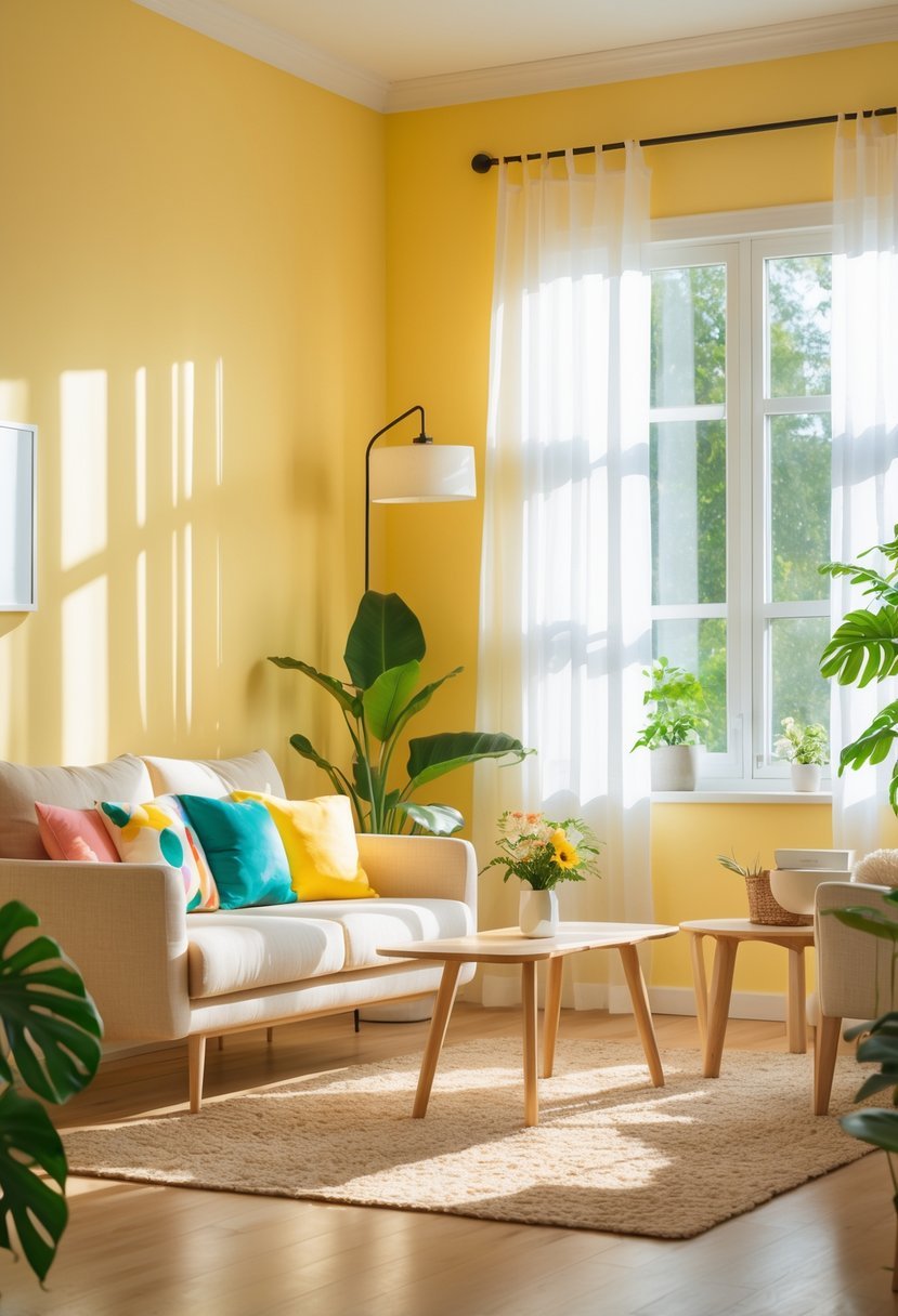
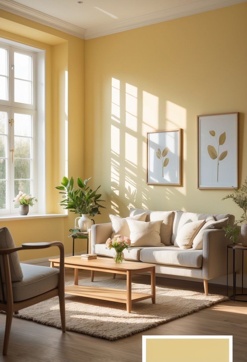
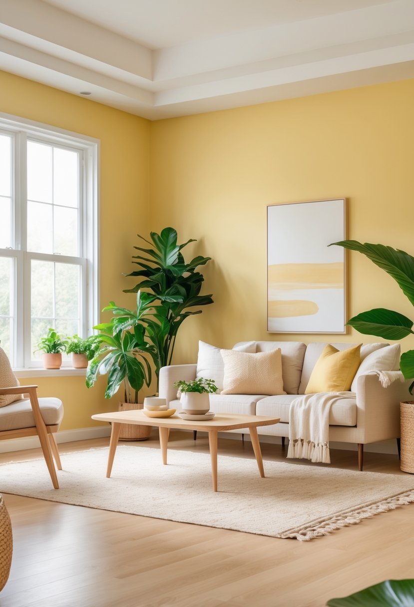
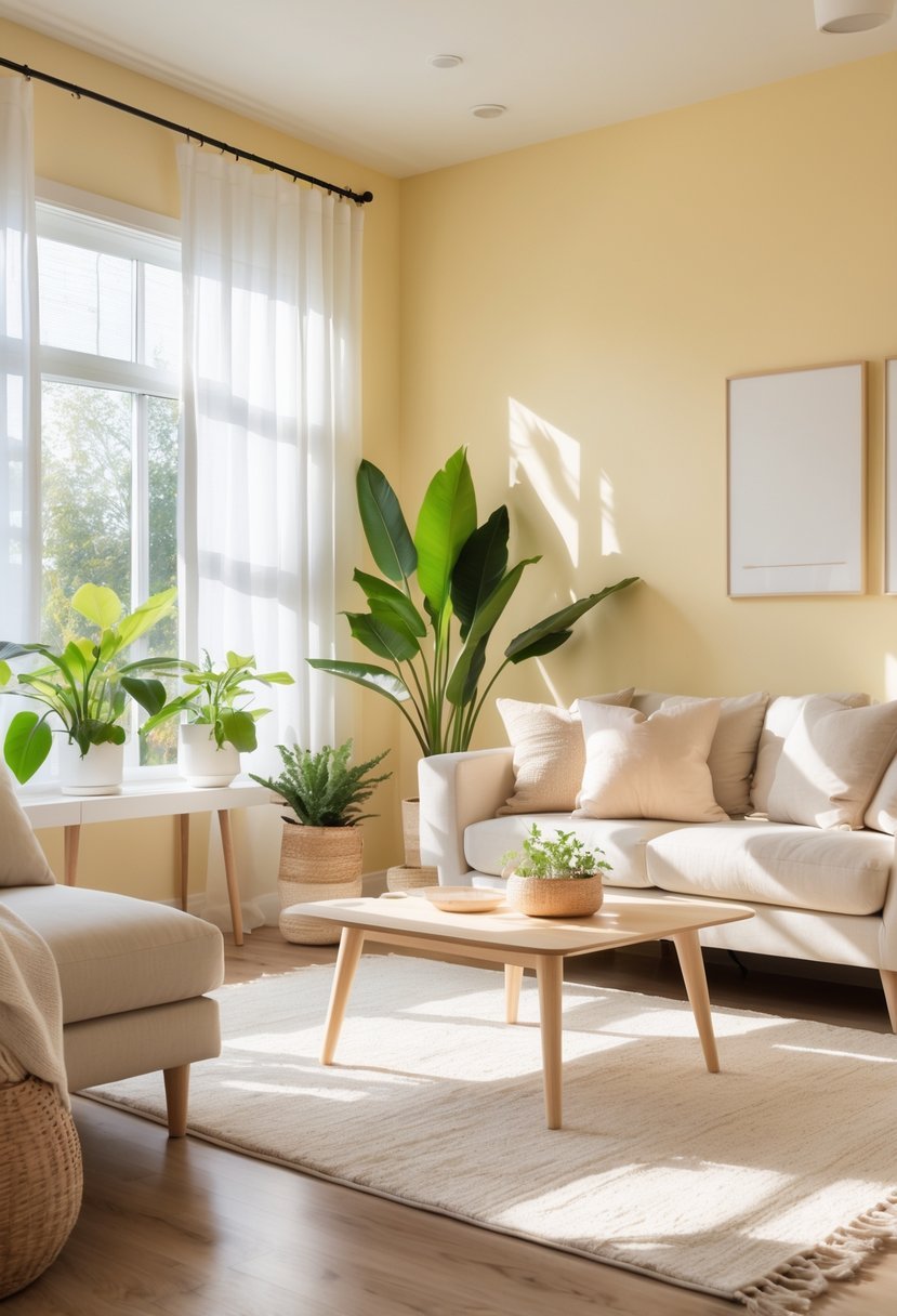
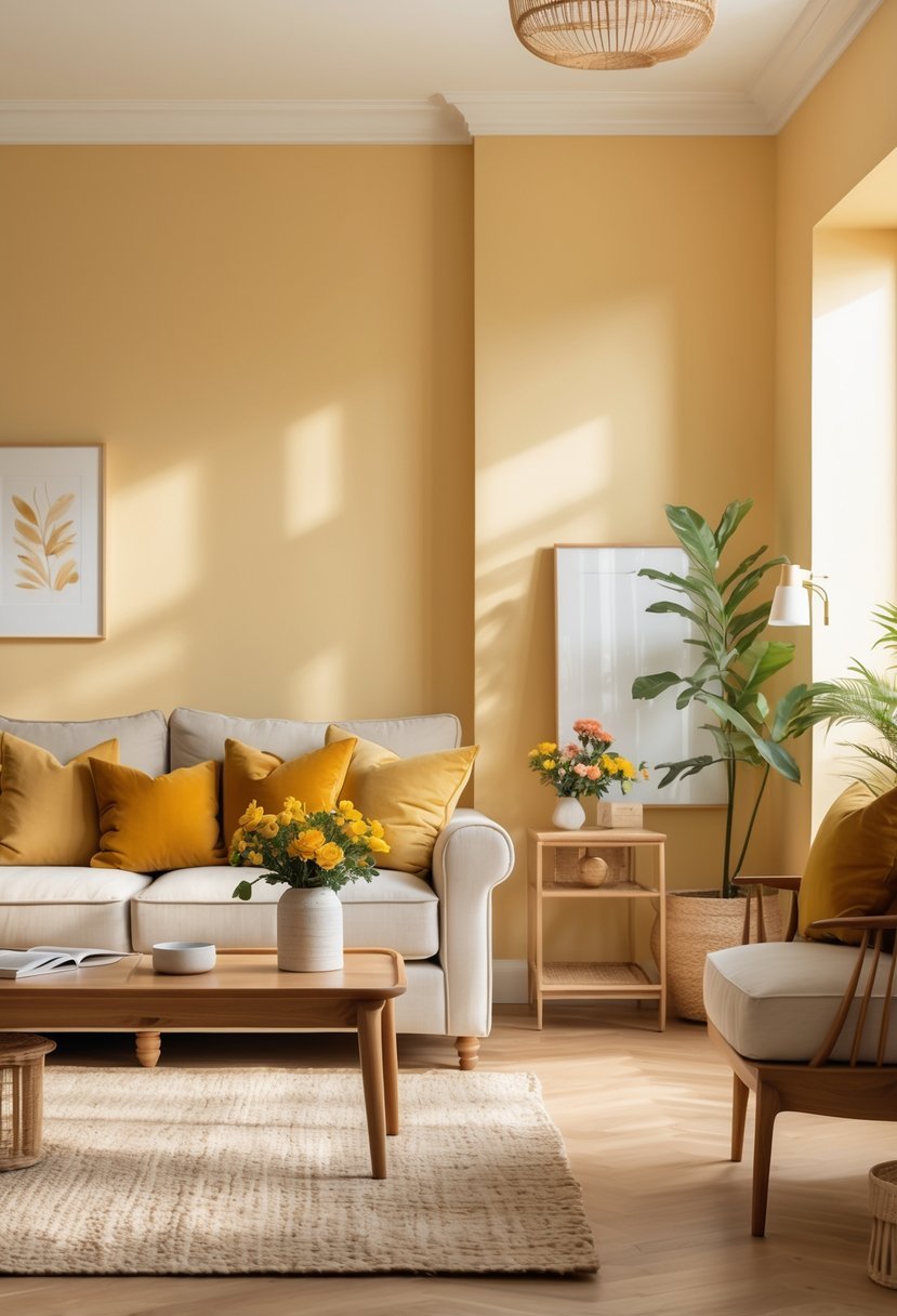
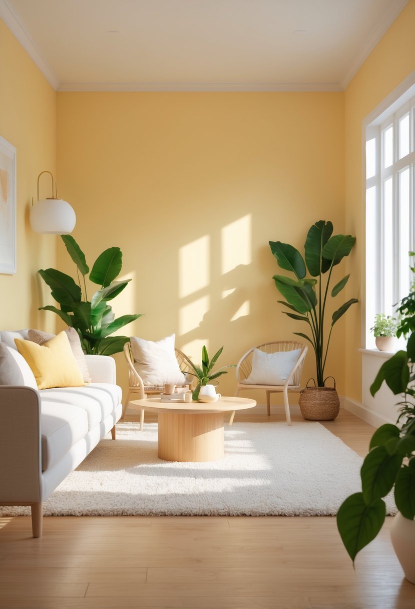
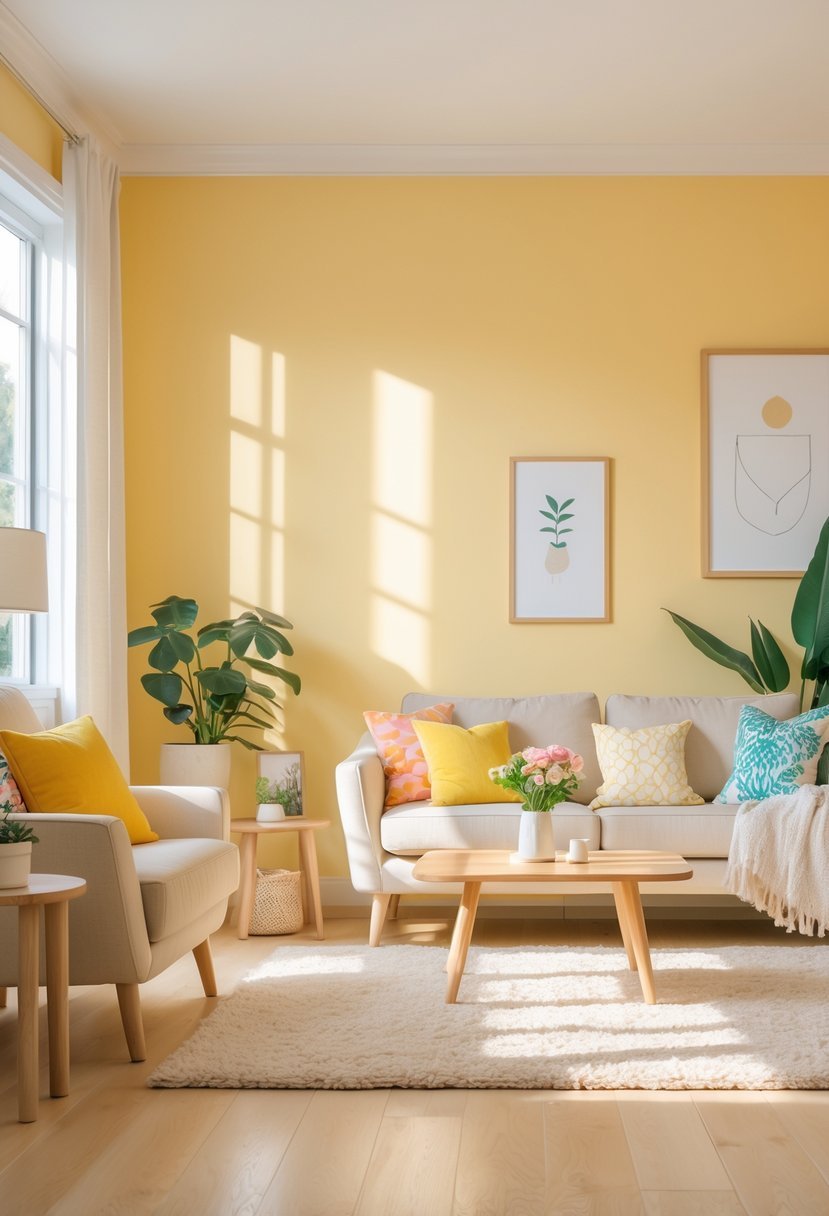
15 Butter Yellow Paint Colors for Interior That Brighten and Warm Your Space
Choosing the right paint color can significantly impact the mood and feel of any interior space. Butter yellow is a popular choice for those wanting a warm, soft, and inviting atmosphere without overwhelming brightness.
Now, I will share 15 butter yellow paint colors that work well in various rooms, helping you find a shade that suits your style and enhances your home’s warmth and charm. These colors offer a balance of gentle brightness and a cozy, timeless appeal.
15 Butter Yellow Paint Colors for Interior
1. Sherwin Williams Gambol Gold
I appreciate Sherwin Williams Gambol Gold for its warm, golden undertones that bring energy to any room. It’s a vibrant yellow that strikes a balance between brightness and depth, thanks to its medium Light Reflectance Value.
This color works well with soft neutrals like whites and beiges, which I find creates a welcoming and elegant atmosphere. Gambol Gold fits spaces where warmth and optimism are the goal without overwhelming the senses.
2. Benjamin Moore Hawthorne Yellow
I consider Benjamin Moore Hawthorne Yellow a well-balanced butter yellow. It’s bright enough to bring warmth but soft enough to avoid looking overpowering.
This shade works especially well in rooms with little natural light, adding a subtle sunlit feel. I find it complements cool grays and natural wood tones nicely, making it versatile.
Hawthorne Yellow doesn’t lean too green or orange, which keeps it clean and timeless. It’s a solid choice if you want a cheerful yet understated yellow for your interior.
3. Farrow & Ball Babouche
I find Farrow & Ball Babouche to be a rich, warm yellow with golden undertones. It has a high light reflectance value, which means it brightens a room without feeling harsh.
This color balances cheerfulness with depth, making it versatile for both light and darker furnishings. I’ve seen it work well on walls, trims, and even kitchen cabinets, providing a lively but comfortable atmosphere.
4. Behr Buttercup
Behr Buttercup is a soft, warm yellow that brings subtle brightness without overwhelming a space. I appreciate its creamy undertone, which adds a cozy feel to interiors.
This color works well in kitchens and living areas where a gentle warmth is desired. Its versatility also allows me to pair it easily with both light neutrals and richer tones.
I find Buttercup to be a reliable choice when aiming for a welcoming and balanced yellow that remains elegant.
5. Valspar Buttercream
I find Valspar Buttercream to be a soft, warm yellow that brings subtle brightness without overwhelming a room. Its creamy tone leans toward a neutral shade, making it versatile for many styles.
This color works well in spaces where I want warmth but prefer a calm, gentle atmosphere. It pairs nicely with natural woods and warm metals, enhancing the inviting feel.
6. PPG Buttered Rum
I appreciate PPG Buttered Rum for its warm, muted tone that brings a cozy feel to any interior. It’s a softer take on yellow, with subtle brown undertones that add depth without overwhelming a space.
This color works well in living rooms and kitchens where I want a welcoming atmosphere. It pairs nicely with neutral shades or crisp whites to balance its warmth.
7. Dunn-Edwards Dawn Mist
I find Dunn-Edwards Dawn Mist to be a balanced butter yellow with a soft, muted quality. It offers warmth without overwhelming a space, making it ideal for kitchens or living rooms.
The subtle golden undertones create a gentle ambiance, enhancing natural light while maintaining a cozy feel. I recommend it for those who want a calm yet cheerful yellow.
8. Benjamin Moore Lemon Ice
I find Benjamin Moore Lemon Ice to be a subtle, nearly white yellow that adds a light, airy feel to interiors. Its cool undertones bring a refreshing brightness without overwhelming a space.
The high Light Reflectance Value (88.37) helps maximize natural light, making it ideal for kitchens and sunrooms. This color works well when you want a soft touch of warmth that remains understated. It’s a versatile choice if you prefer a pale butter yellow with a modern edge.
9. Sherwin Williams Sunny Side
I find Sherwin Williams Sunny Side to be a versatile yellow that works well in many interior spaces. It’s a soft yet vibrant shade that leans toward a warm, buttery yellow.
This color adds brightness without overwhelming a room. I appreciate how Sunny Side can complement both modern and traditional decor styles.
Using it on walls or accent pieces offers a cheerful but subtle warmth. It’s a dependable choice when you want a yellow that feels inviting without being too bold.
10. Behr Golden Strand
I find Behr Golden Strand to be a warm, inviting butter yellow that adds a subtle glow to any room. It has a rich, golden undertone that feels both cozy and elegant.
This color works well in living areas and kitchens where you want a soft brightness without overwhelming the space. Its balance of warmth and light makes it versatile for various interior styles.
11. Farrow & Ball Dayroom Yellow
I appreciate Farrow & Ball Dayroom Yellow for its pale, refreshing tone that brightens any room. It reflects light well, giving spaces a clear, airy feel without overwhelming.
This yellow has a subtle warmth that works best in naturally lit rooms. It pairs nicely with white or other neutrals to enhance its calming effect.
For me, Dayroom Yellow offers a simple, elegant way to add cheer without boldness. It suits kitchens, dining areas, or living rooms where a gentle lift is needed.
12. C2 Paint Butter
I appreciate C2 Paint Butter for its balanced, nuanced color that adapts well to various lighting conditions. This shade has a soft warmth without being overwhelming, making it suitable for entryways and living areas.
The paint is durable and washable, which is practical for high-traffic spaces or homes with kids. It offers a subtle, inviting glow that enhances a room without dominating it.
13. Benjamin Moore Plymouth Yellow
I appreciate Benjamin Moore Plymouth Yellow for its balanced warmth. It provides a soft, buttery glow without overwhelming a space.
This shade works well in rooms where natural light is limited, adding subtle brightness. I often recommend it for kitchens or living areas seeking a cozy but fresh atmosphere.
Plymouth Yellow pairs nicely with neutral tones and natural woods. Its versatility makes it a reliable choice for a vintage-inspired yet modern look.
14. Sherwin Williams Butter Up
I find Sherwin Williams Butter Up to be a warm, inviting yellow that adds subtle brightness without overwhelming a room. Its soft, buttery tone works well in living rooms, kitchens, and bedrooms, creating a cozy atmosphere.
This paint color pairs nicely with creamy whites and muted blues, offering balanced contrast and warmth. I appreciate its versatility for both interior and exterior projects, making it a reliable choice when I want a gentle pop of color that feels timeless.
15. Valspar Soft Butter
I find Valspar Soft Butter to be a balanced choice for those wanting a gentle yellow. It has a creamy warmth without being overpowering.
This color works well in spaces where you want light and comfort, such as living rooms or bedrooms. It offers a subtle glow, maintaining a soft and inviting atmosphere.
Soft Butter’s muted undertones allow it to pair well with both neutral and bold accents. It’s versatile and easy to live with over time.
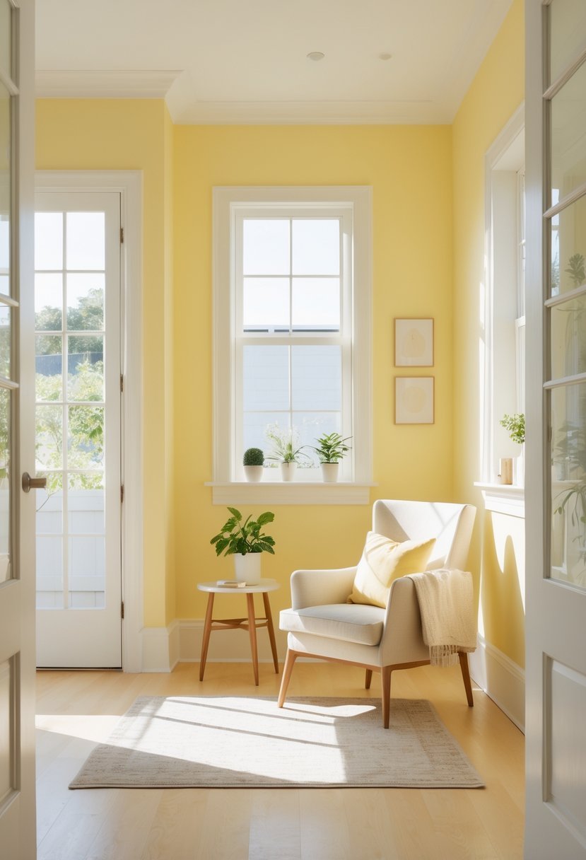
How I Use Butter Yellow Paint Colors for Interior Spaces
Understand the Role of Light
When I choose butter yellow paint colors for interior rooms I always start by observing light. Yellow reacts strongly to both natural and artificial lighting.
- Bright rooms can handle richer butter yellow shades
- Low light rooms benefit from softer creamy tones
- Lighting changes how warm the color feels
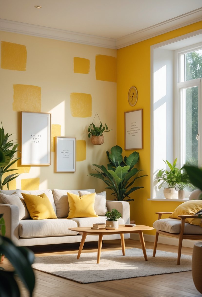
Decide the Level of Warmth
Butter yellow comes in many variations so I decide how much warmth the room needs.
- Pale butter yellow feels airy and subtle
- Medium butter yellow adds cozy brightness
- Deeper butter tones create a grounded feel
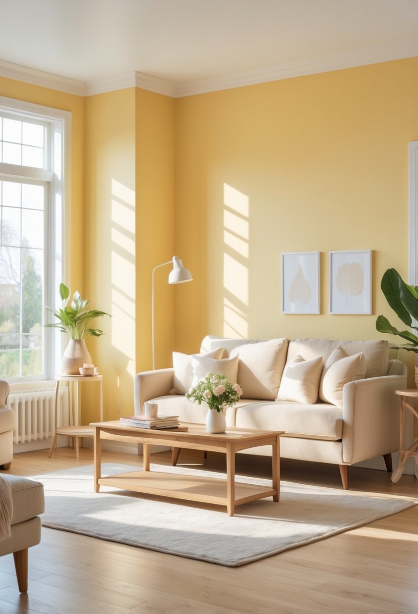
Balance with Neutrals
I always pair butter yellow with calming neutrals to keep the space from feeling overwhelming.
- White and cream soften the color
- Beige and taupe add warmth
- Gray tones add balance
Use Butter Yellow Strategically
I think carefully about where to apply yellow so it enhances the room rather than dominates it.
- Full walls work best in shared spaces
- Accent walls add cheer without excess
- Cabinets and trim offer subtle color
Keep the Look Timeless
I aim for combinations that feel welcoming now and still appealing years later.
- Soft shades age better over time
- Simple decor lets color shine
- Classic palettes prevent trend fatigue
FAQs
Creating Warm and Inviting Interior Spaces
I believe butter yellow paint colors for interior spaces offer a perfect balance of warmth and softness. When chosen carefully and paired with calming neutrals they create rooms that feel cheerful comfortable and timeless. With thoughtful placement and lighting awareness butter yellow becomes a welcoming backdrop rather than a bold statement.

I am Mindy Medford, a home décor, paint, and design specialist with over a decade of hands-on experience transforming ordinary spaces into cozy, personality-packed havens. Since 2013, I have been helping homeowners discover the art of beautiful yet practical design. I share my love for color, texture, and layout—making stylish interiors & exteriors feel achievable for everyone. Whether it’s picking the perfect paint shade or reimagining a small space, I’m here to guide and inspire.