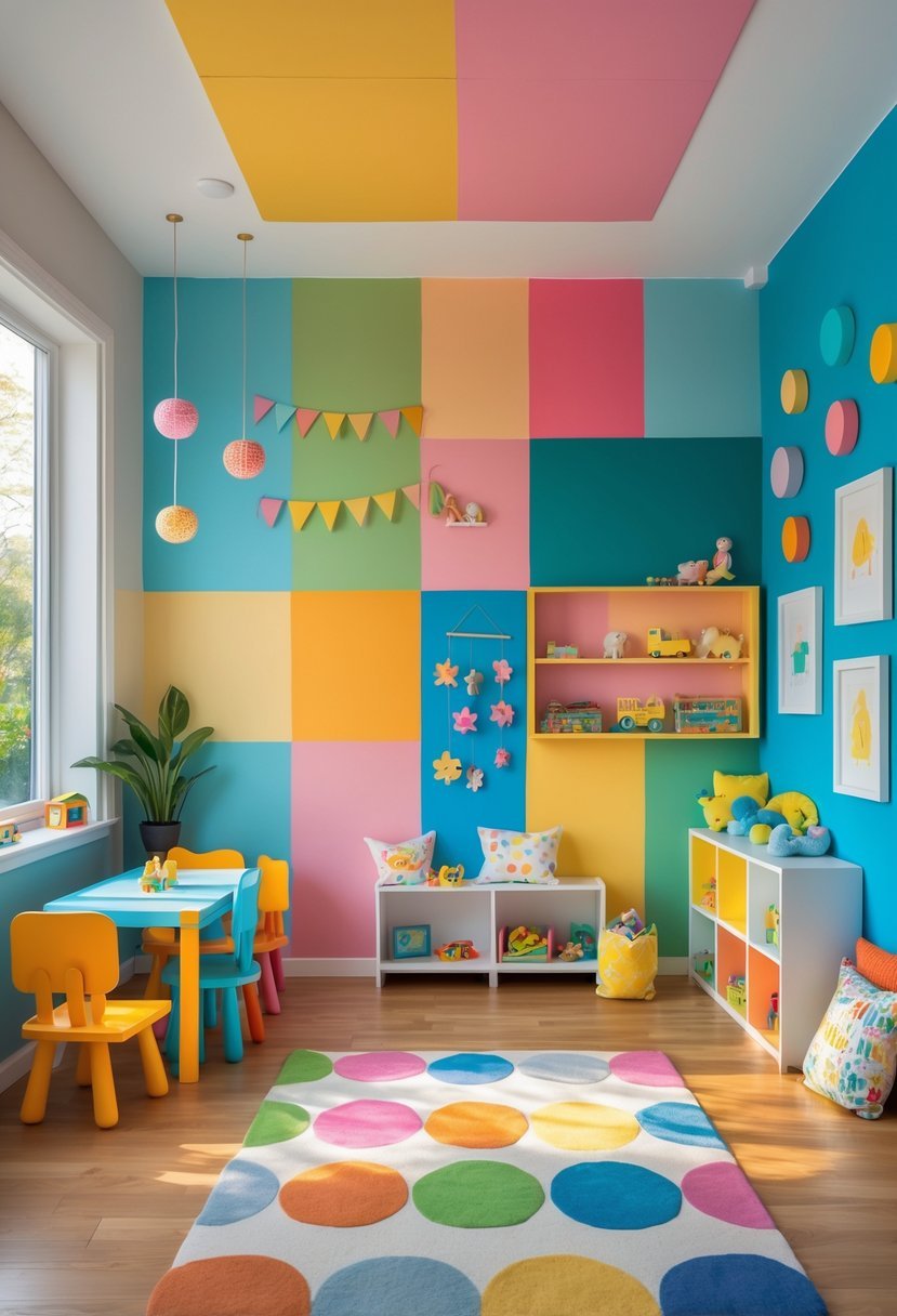
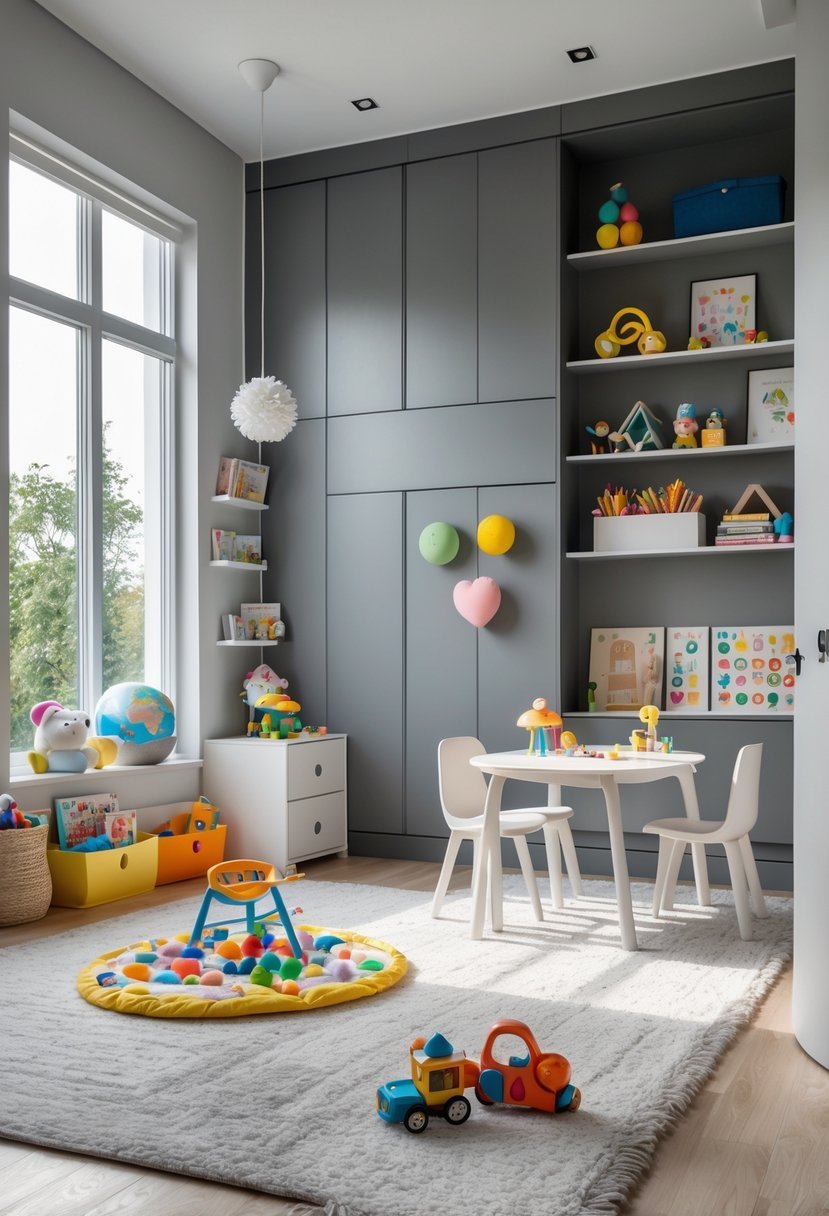
17 Playroom Paint Colors for Creating Fun and Inviting Spaces
Choosing the right paint colors for a playroom can significantly impact how children feel and interact with the space. It is not just about picking bright shades; the colors set the tone for creativity, calm, and energy. I have compiled 17 playroom paint colors that balance fun with function to help you create an inviting and stimulating environment for kids.
Colors influence mood and behavior, so selecting the right palette affects how children play, learn, and relax.
17 Playroom Paint Colors
Whether designing a new playroom or refreshing an existing one, understanding the effects of different colors can guide you toward a space that supports your child’s personality and activities.
I will walk you through a variety of color choices to inspire your next project.
1. Sunny Yellow for Energy and Cheer
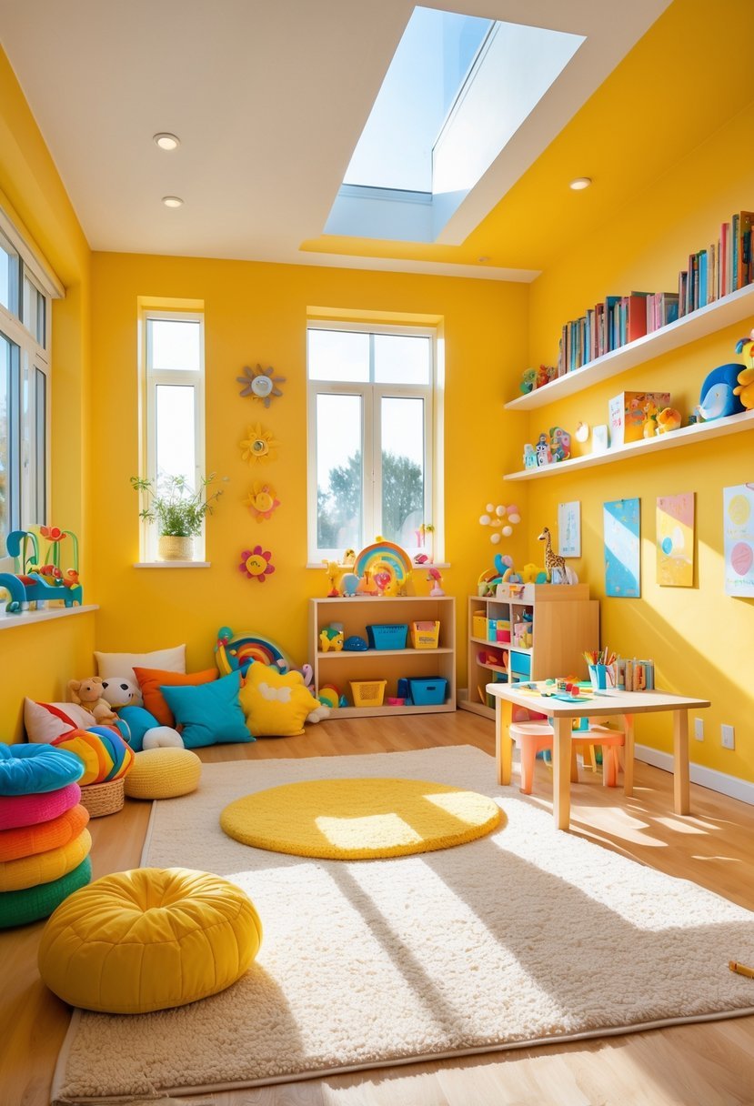
I find sunny yellow to be an excellent choice for playrooms. It brightens the space and naturally uplifts the mood without overwhelming the senses.
This color adds energy and cheer, making the room feel inviting and lively. I appreciate how yellow can stimulate creativity while keeping the atmosphere fun.
Pairing it with white or soft greens balances the vibrancy. It offers a fresh, positive environment where kids can play and learn comfortably.
2. Cerulean Blue to Boost Calm and Focus
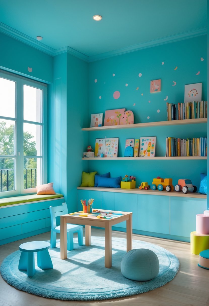
I find Cerulean Blue to be a reliable choice for creating a calm atmosphere in a playroom. Its medium shade balances brightness with serenity, making it easier for kids to focus during their activities.
Cerulean is neither too bold nor too muted, which helps maintain a peaceful environment without feeling dull. It encourages relaxation and mental clarity, which can benefit both playtime and quiet moments.
I often recommend pairing Cerulean Blue with soft whites or gentle greens to sustain a soothing but inviting space. It supports a balanced mood without overwhelming the senses.
3. Lime Green for Creativity and Balance
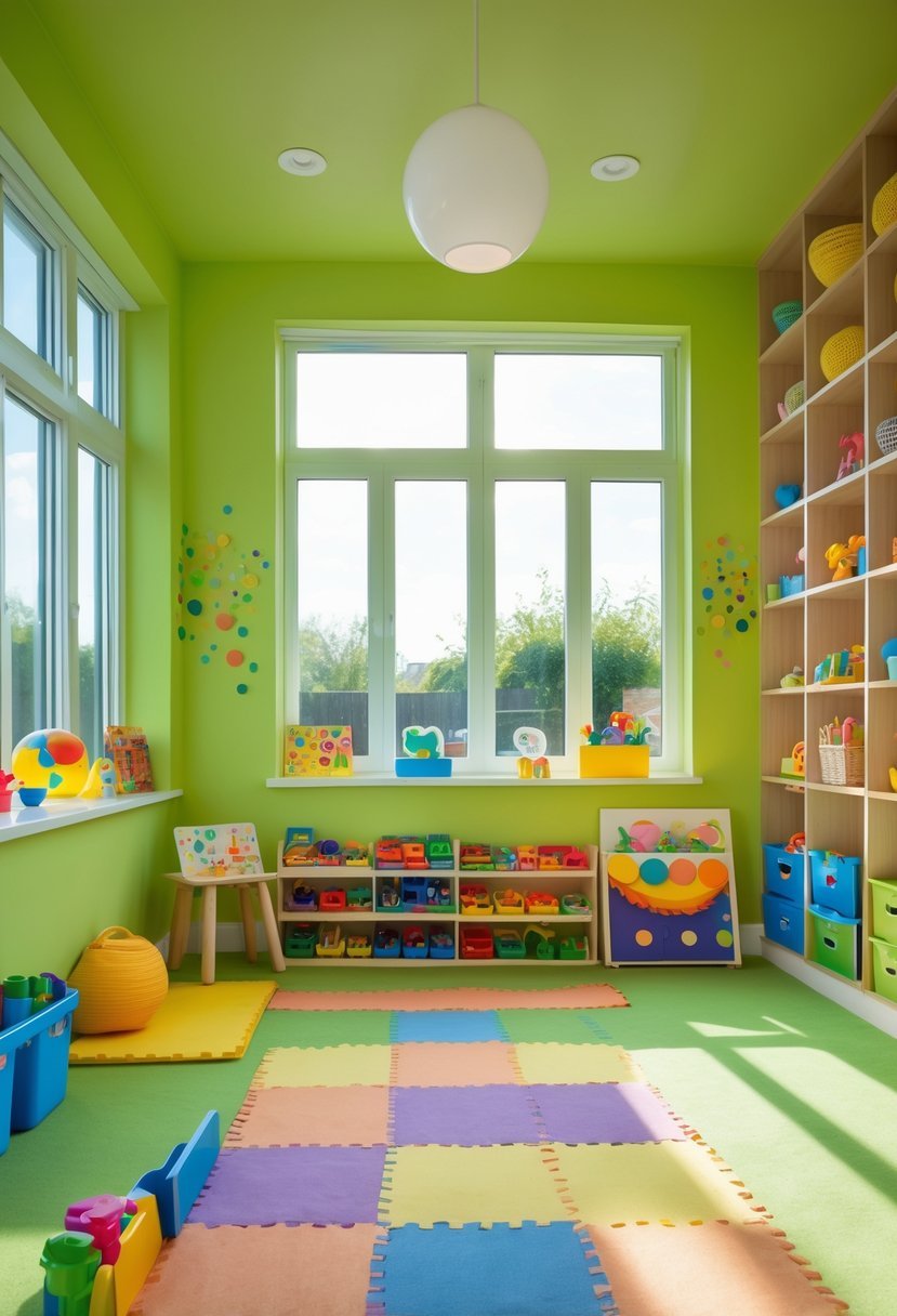
I find lime green is a bold choice that brings energy to a playroom without overwhelming the space. Its mix of yellow and green hues creates a fresh, lively feel that encourages creativity.
Using an eggshell finish can soften lime green’s brightness, providing a balanced look with reduced shine. This makes it suitable for both accent walls and full-room coverage.
I also recommend pairing lime green with neutral tones to keep the room visually appealing. It adds vibrancy while maintaining harmony in the play area.
4. Pastel Orange to Warm and Invite Play
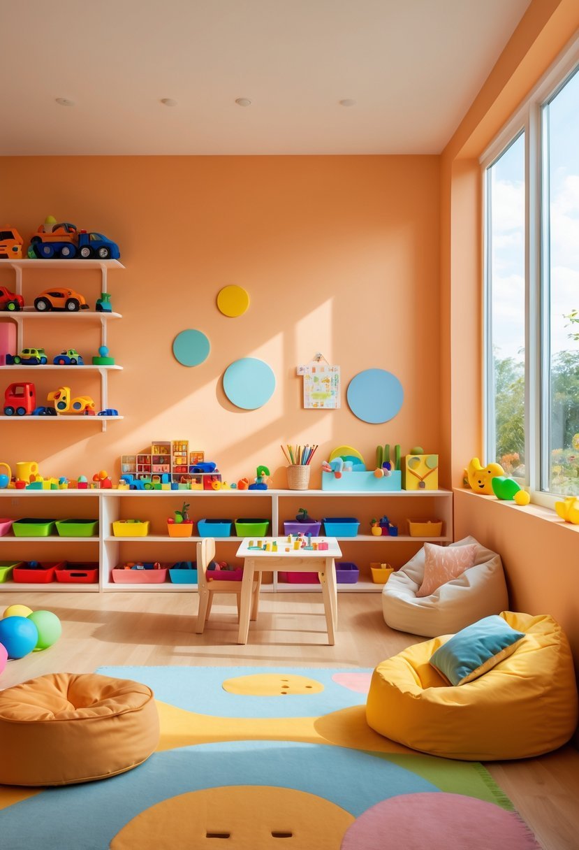
I chose pastel orange for its ability to create a warm and welcoming atmosphere. It’s soft enough to avoid overwhelming a space but still adds energy and cheerfulness.
This color encourages a cozy feeling while sparking creativity in children’s play. I find pastel orange ideal when you want to balance vibrancy with calm. It blends well with other pastels or neutral tones to keep the room inviting.
5. Deep Navy as a Grounding Accent
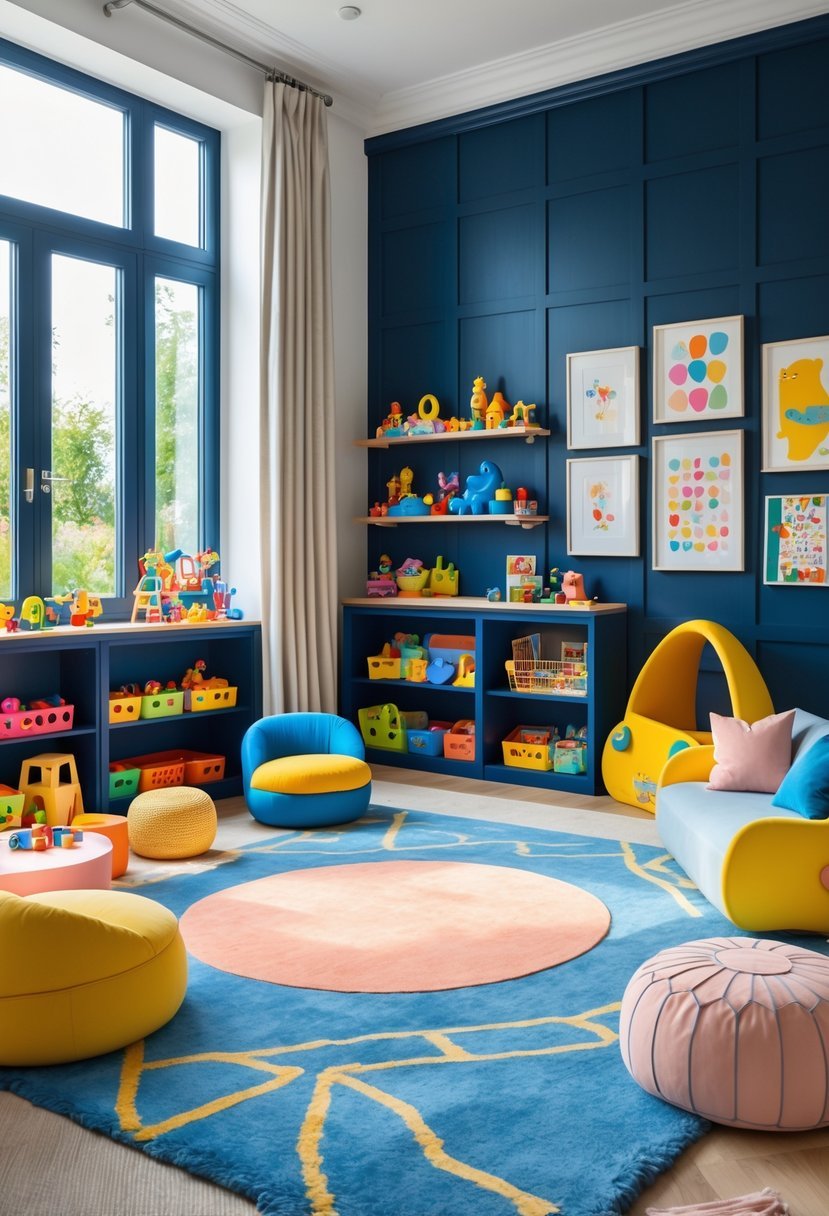
I find deep navy to be an excellent choice for grounding a playroom’s vibrant colors. It provides balance without overpowering the space.
Using navy as an accent—on one wall or in furniture—adds depth and sophistication. It pairs well with bright whites and punchy hues, helping to keep the room visually calm.
This color also feels timeless, giving the playroom a classic touch while still encouraging creativity and fun.
6. Bright White for Contrast and Brightness
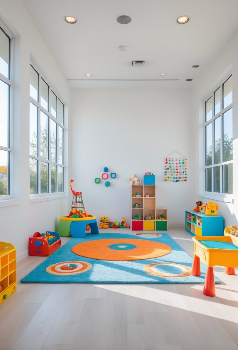
I find bright white paint an excellent choice to enhance playrooms. It creates a clean, open feel that makes the space appear larger and more inviting.
Using varying shades of white can add subtle contrast without overwhelming the room. This approach refreshes the typical playroom palette and pairs well with colorful toys or furniture.
Bright white also reflects natural light effectively, boosting the room’s brightness throughout the day. It serves as a versatile backdrop for any style or color accents I want to introduce.
7. Soft Lavender for A Soothing Atmosphere
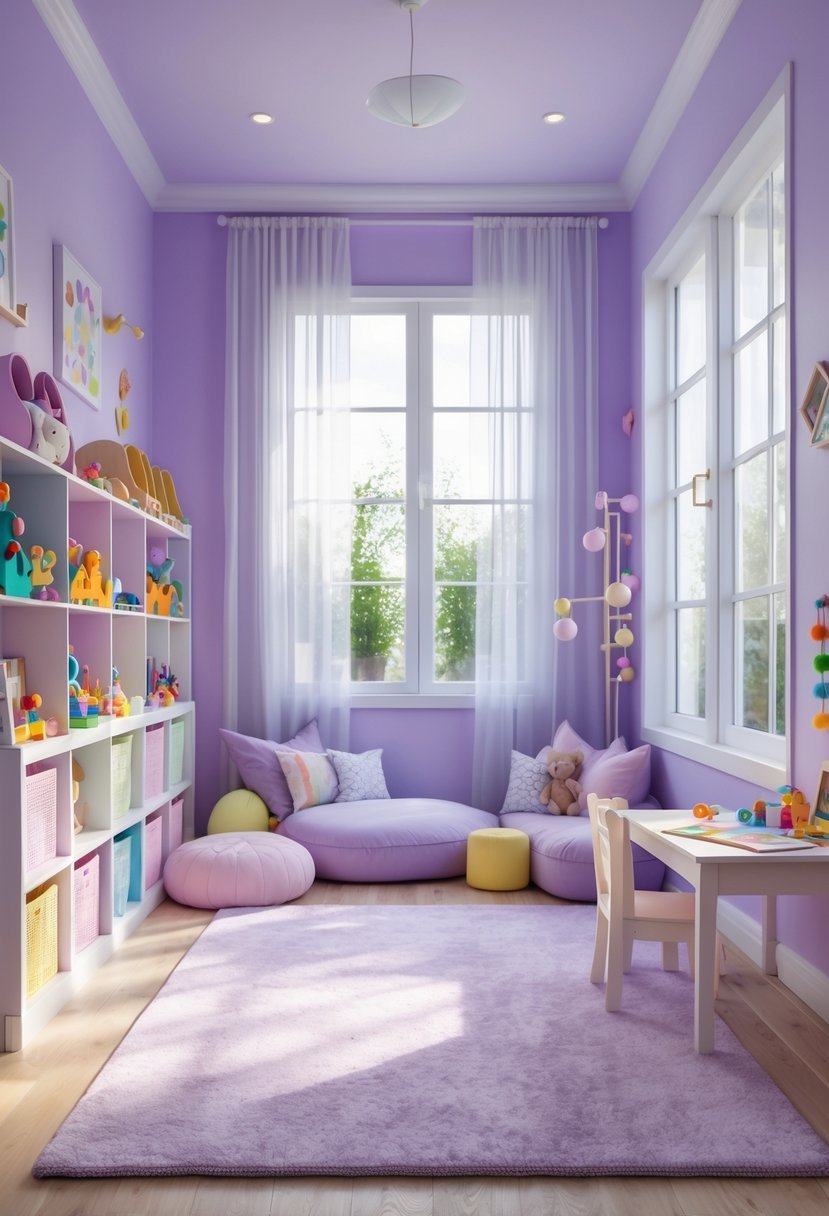
I find soft lavender to be an excellent choice for a playroom when aiming for a calming environment. This gentle hue helps balance energy without overwhelming the space.
The color’s subtle, relaxing quality encourages focus and quiet moments, which can be useful during reading or creative activities. Pairing it with neutral accents keeps the room feeling light and open.
8. Coral Pink to Inspire Enthusiasm
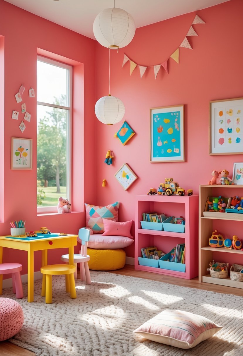
I find coral pink a vibrant choice for playrooms because it combines warmth with energy. This color adds a cheerful atmosphere without overwhelming the space.
Coral pink can brighten walls and blend well with both neutral and bold accents. It’s versatile enough to suit different styles, from modern to playful.
Using coral pink in a playroom encourages creativity and enthusiasm. It’s a lively hue that makes the room feel inviting and fun for kids.
9. Vibrant Red for Active Energy
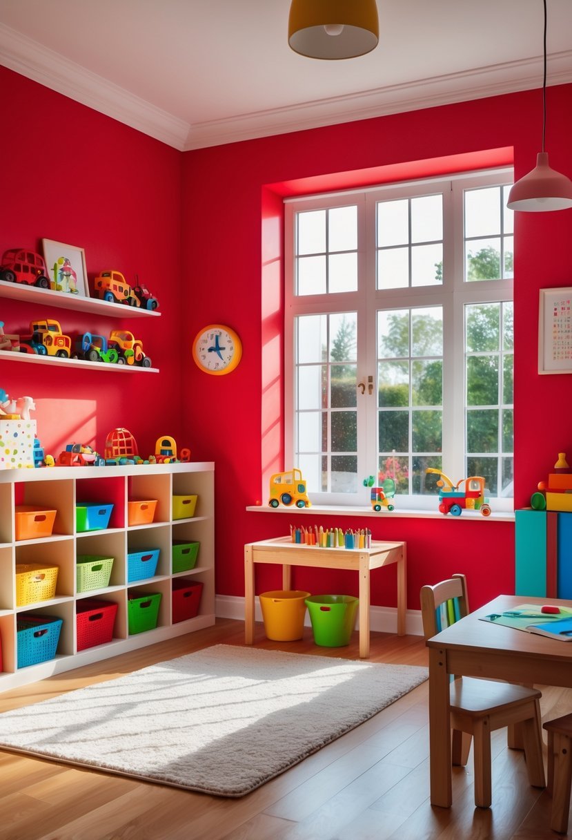
I choose vibrant red when I want to create a playroom filled with energy and enthusiasm. Red stimulates activity and can make a space feel dynamic without being overwhelming when balanced well.
In my experience, pairing red walls with soft textures like plush rugs or bean bags adds comfort while maintaining the room’s lively vibe. Bright red works best in areas designed for active play and creativity.
10. Turquoise to Stimulate Imagination
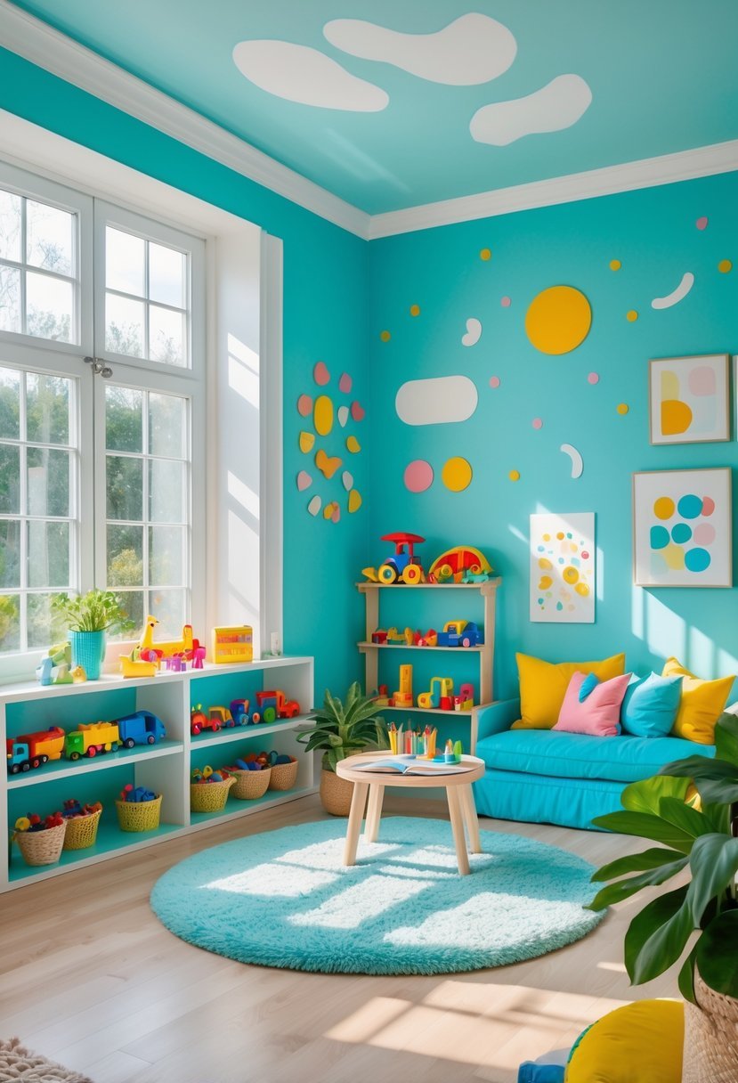
I chose turquoise because it creates a calm yet vibrant atmosphere. Its cheerful tone encourages creativity without overwhelming the senses.
Turquoise works well in playrooms since it feels fresh and inviting. It strikes a balance between energetic and soothing, helping kids stay focused during activities.
Using turquoise also allows for easy pairing with other colors. It complements both bold and neutral accents, giving me flexibility in designing the space.
11. Goldenrod to Add Warmth and Optimism
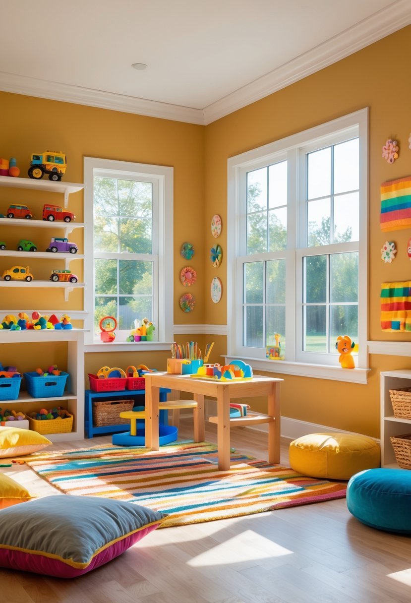
I find Goldenrod to be a strong choice for playrooms because it brings warmth and a sense of optimism. Its deep yellow hue energizes the space without feeling overwhelming.
Using Goldenrod can brighten the room while maintaining a cozy vibe. Pairing it with neutrals balances the color, making the playroom inviting for both kids and adults.
I often recommend Goldenrod for accents, such as on a dresser or wall art, to add personality and vibrancy. It’s a practical option for a fun yet stylish environment.
12. Mint Green for Freshness and Renewal
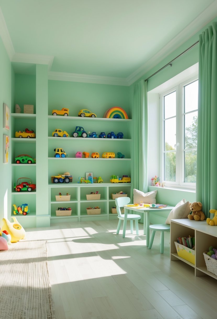
I find mint green to be a versatile choice for playrooms. Its calming, spa-like quality brings a sense of freshness without overwhelming the space.
This color balances green’s natural renewal with a subtle hint of blue, creating a tranquil atmosphere that encourages creativity.
Mint green works well with both soft pastels and brighter accents. It can make a room feel open and airy, perfect for a playful yet peaceful environment.
13. Powder Blue for Tranquility
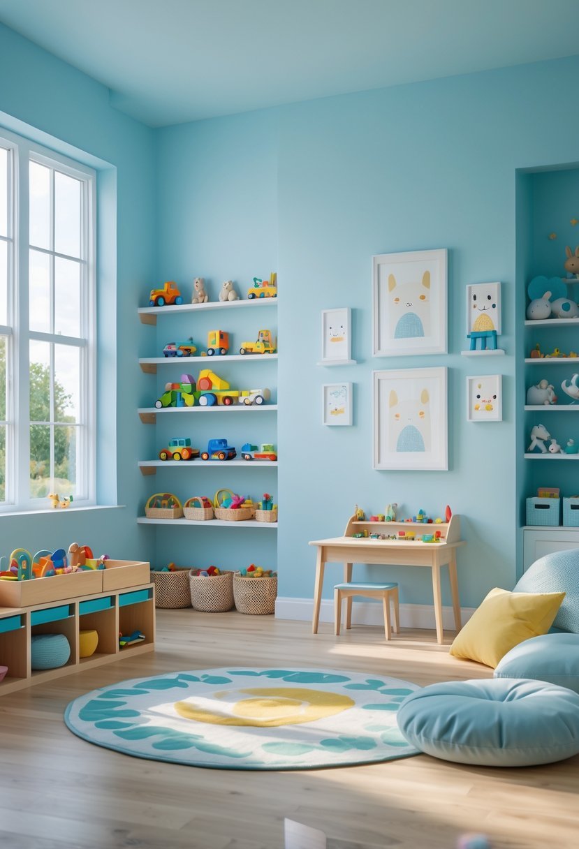
I find powder blue to be one of the best colors for creating a calm environment in a playroom. Its soft, muted tone brings a sense of peace without feeling cold or sterile.
This shade balances well with natural light and helps reduce overstimulation, which is important for kids. It promotes quiet moments while still allowing the room to feel bright and welcoming.
Using powder blue, I often pair it with white or light wood accents to maintain a clean and airy space that encourages both play and relaxation.
14. Bright Orange to Energize the Space
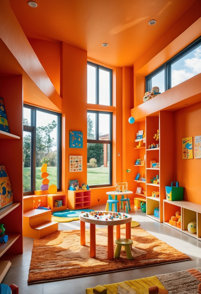
I find bright orange an excellent choice to bring energy into a playroom. It captures attention without overwhelming the senses.
When paired with crisp white or golden yellow accents, the color feels balanced and lively. This combination helps maintain a cheerful atmosphere.
Orange reflects warmth and light, making the room feel inviting. It encourages creativity while keeping the space visually stimulating.
15. Classic White and Brown Base Palette
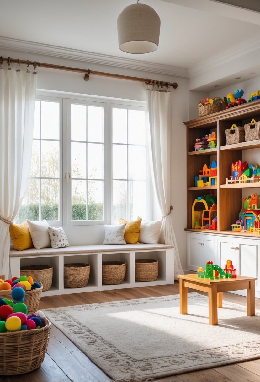
I find the classic white and brown palette offers a balanced and timeless foundation for playrooms. The crisp white walls create a clean, bright backdrop that makes the space feel open.
Adding warm brown accents introduces a natural, grounding element. This combination keeps the room calm while allowing colorful toys and furniture to stand out without clashing.
Using this palette, I can maintain a versatile environment that adapts as children grow and their preferences change. It’s a practical choice with lasting appeal.
16. Graphite Gray for Modern Sophistication
I choose graphite gray when I want a playroom that feels both modern and refined. This deep, charcoal-like shade adds depth without overwhelming the space.
Pairing it with crisp whites or warm neutrals creates a balanced atmosphere, perfect for both play and relaxation. Graphite gray works well with various decor styles, making it a versatile choice. Its timeless quality ensures the room stays stylish as tastes evolve.
17. Cheerful Aqua to Invigorate Play
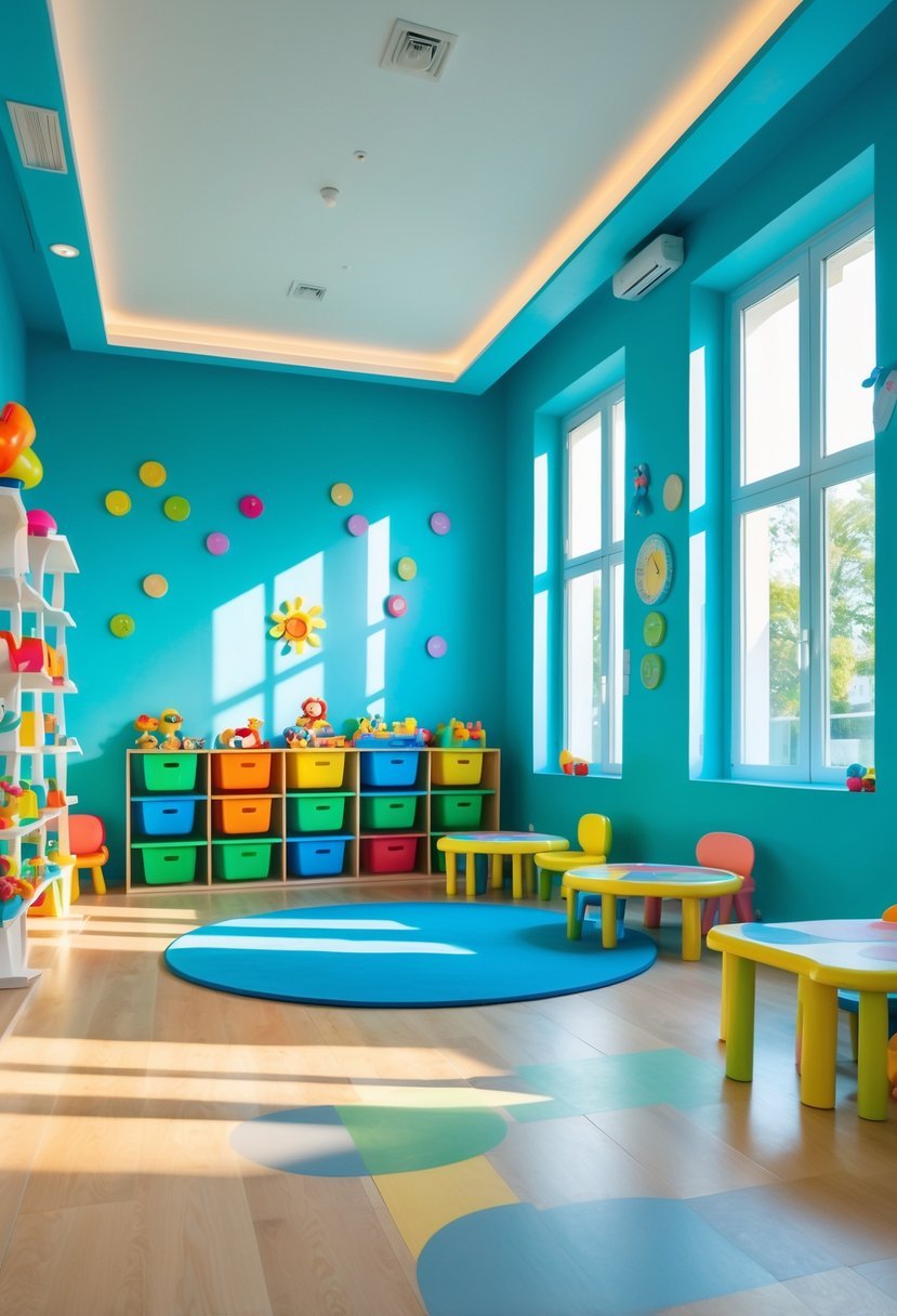
I find cheerful aqua to be an excellent choice for playrooms. This shade strikes a balance between calm and energy, creating a refreshing atmosphere.
Aqua’s cool tones help maintain focus while still feeling lively enough to encourage activity. It brightens the space without overwhelming it, making it suitable for long play sessions.
In my experience, aqua walls also pair well with various colorful accents, enhancing creativity and making the room feel inviting.
How to Choose Playroom Paint Colors Based on Energy and Calm
When I choose playroom paint colors, I always start by deciding how active or calm I want the room to feel. Bright shades like yellow, orange, and red support movement and excitement.
Softer tones like lavender, powder blue, and mint green help balance energy with calm. I use this mix to create a space that works for both play and quiet moments.
Balance Bright Colors With Neutrals
Too many bold shades can overwhelm kids. I always ground strong colors with neutrals.
- Bright walls feel best with white or beige nearby
- Deep tones like navy and graphite need light trim
- Neutral bases allow toys and decor to shine
Match Paint With Playroom Activities
Different activities need different moods.
- Active games work well with warm lively colors
- Reading and crafts feel better with calm cool shades
- Mixed activity rooms need both warm and cool balance
Test Playroom Paint Colors Before Painting
I never skip testing.
- I apply samples on at least two walls
- I watch the color in daylight and evening light
- I choose the shade that feels happy and comfortable
Keep Playroom Paint Colors From Feeling Too Loud
Strong color needs control.
- I limit bold shades to one or two walls
- I repeat bright colors softly in rugs or storage bins
- I use plain ceilings to keep visual balance
FAQs
Why Playroom Paint Colors Shape How Kids Feel and Play
Playroom paint colors strongly influence how children move, focus, and relax in their space. I always choose colors that support both excitement and calm. When the palette matches the activities and lighting, the playroom becomes a place where creativity grows without chaos and comfort exists without boredom.

I am Mindy Medford, a home décor, paint, and design specialist with over a decade of hands-on experience transforming ordinary spaces into cozy, personality-packed havens. Since 2013, I have been helping homeowners discover the art of beautiful yet practical design. I share my love for color, texture, and layout—making stylish interiors & exteriors feel achievable for everyone. Whether it’s picking the perfect paint shade or reimagining a small space, I’m here to guide and inspire.