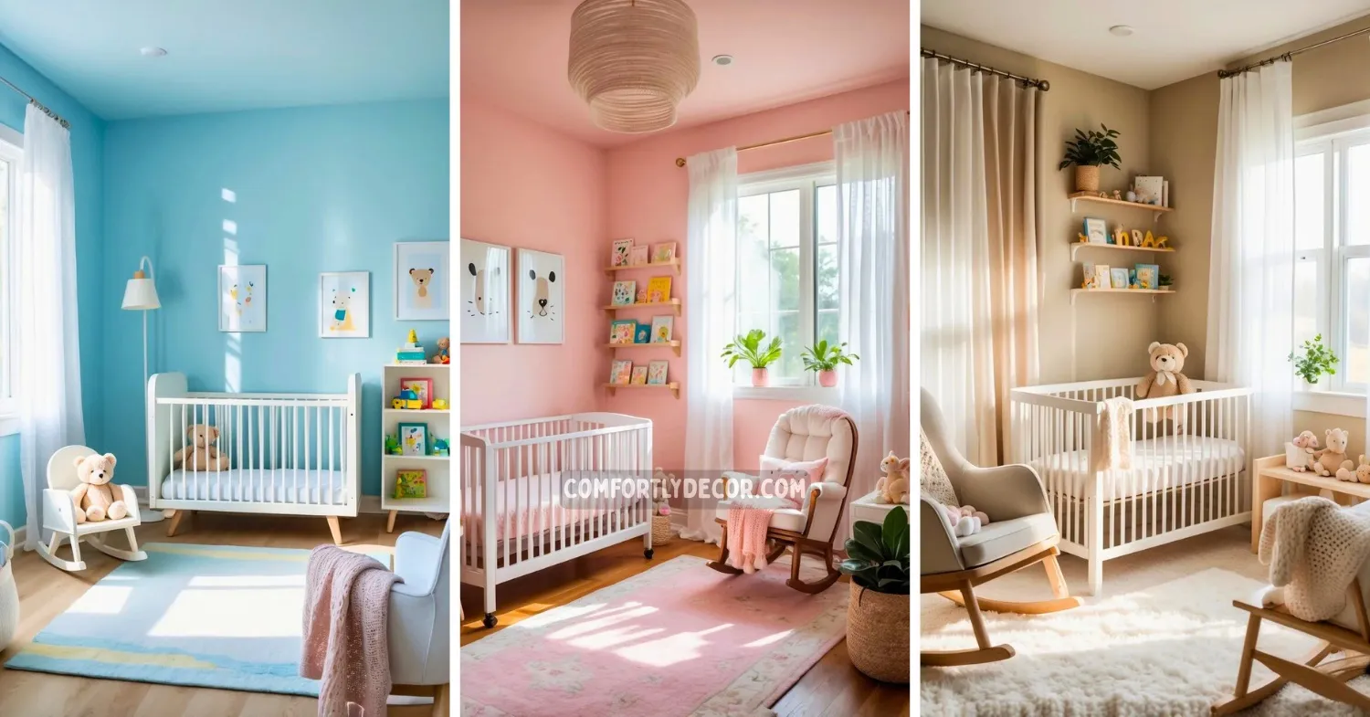
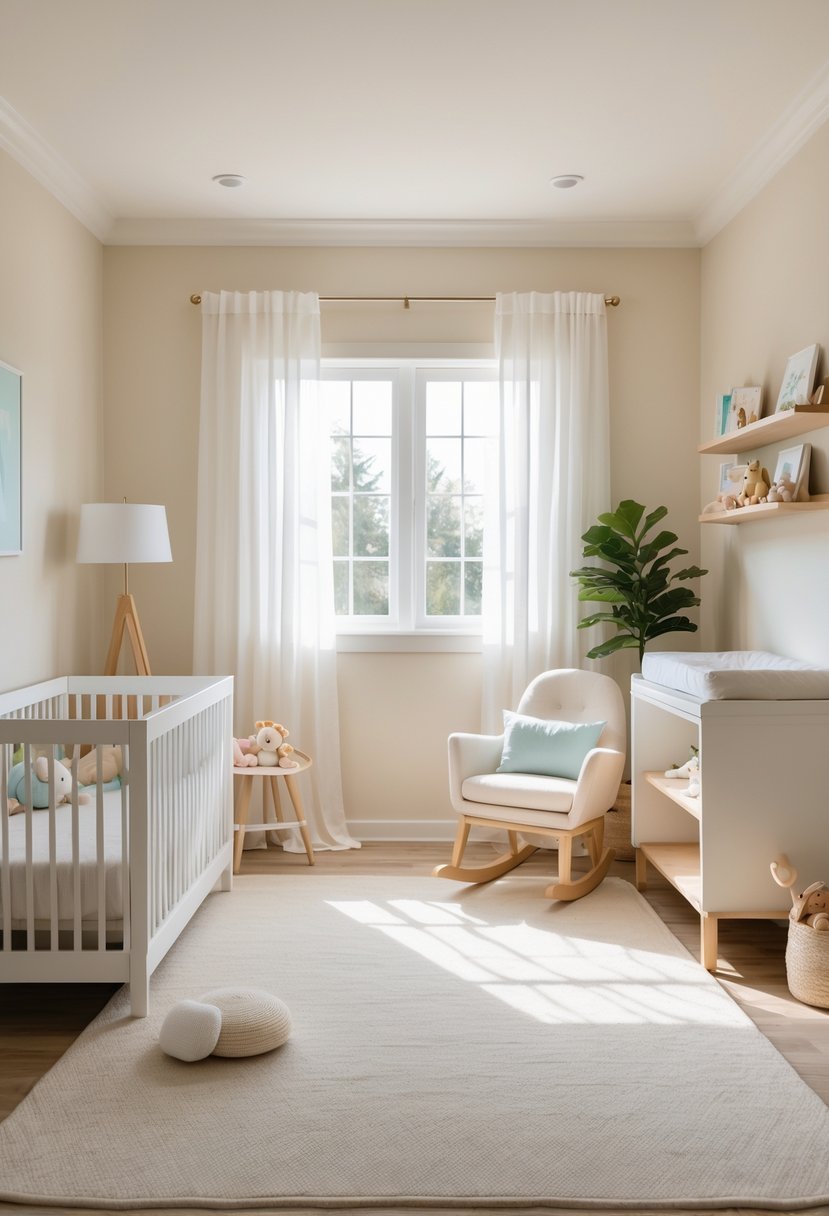
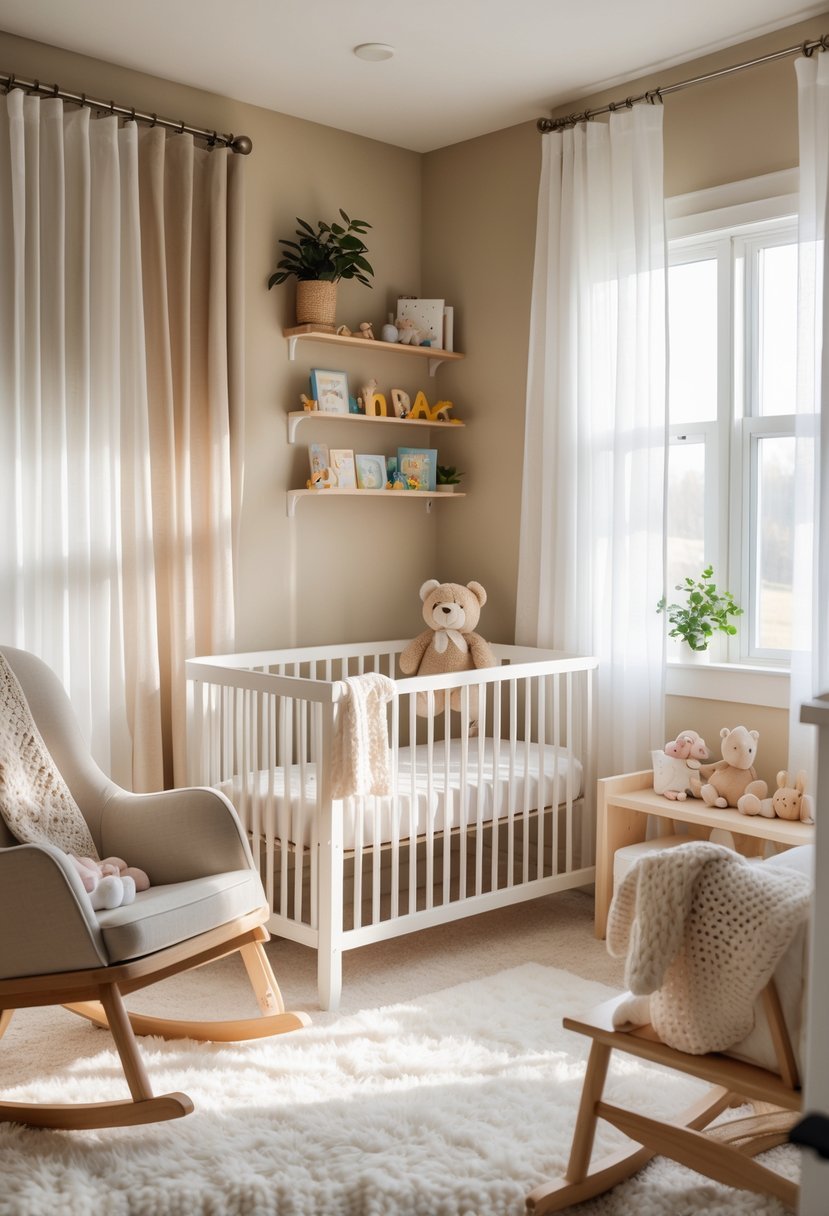
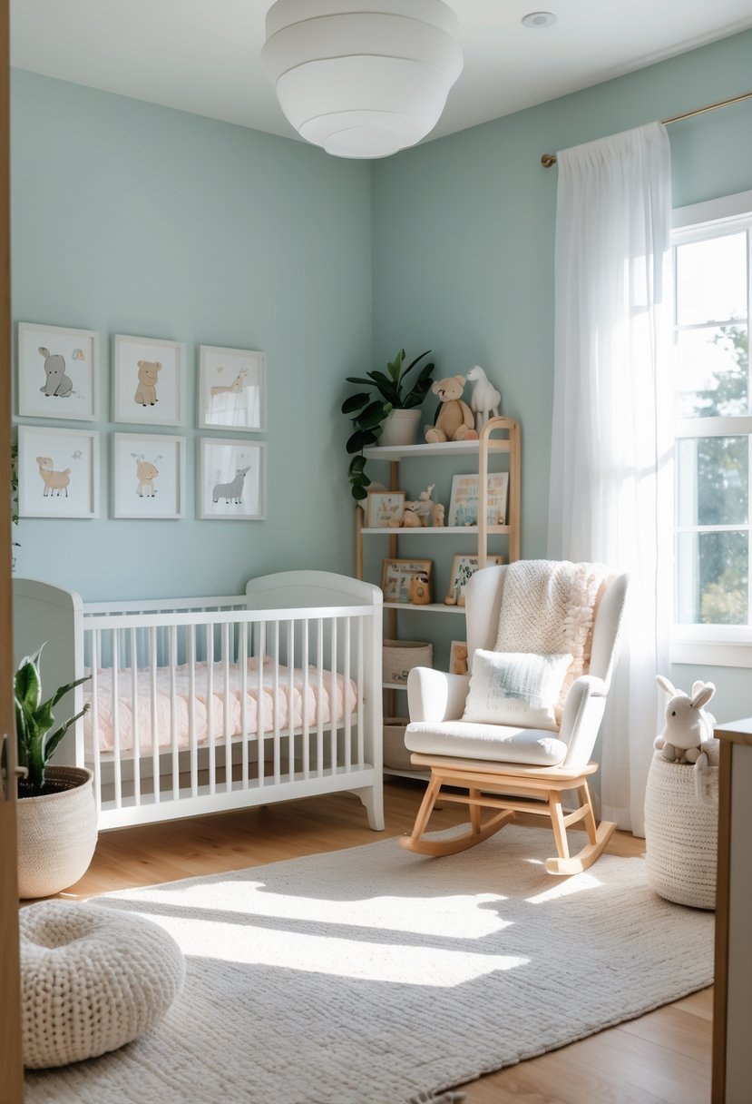
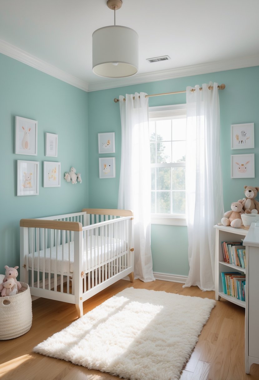
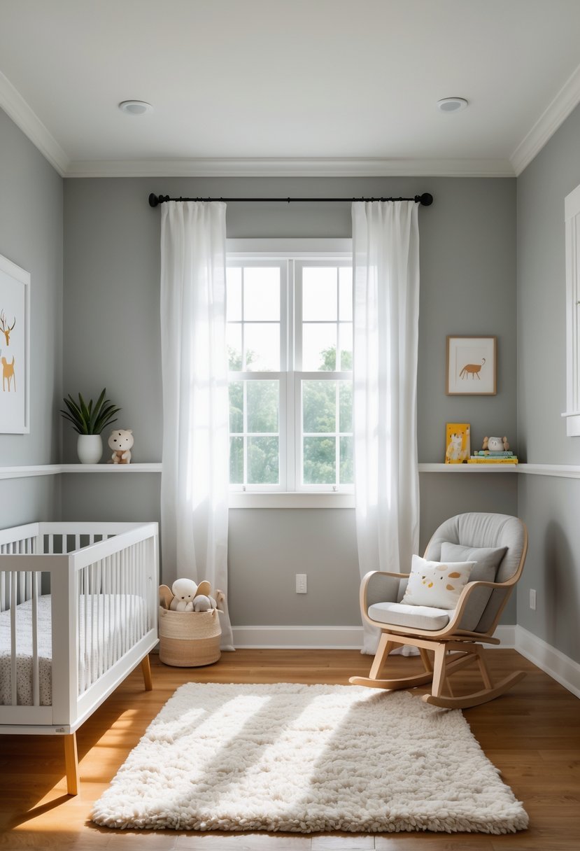
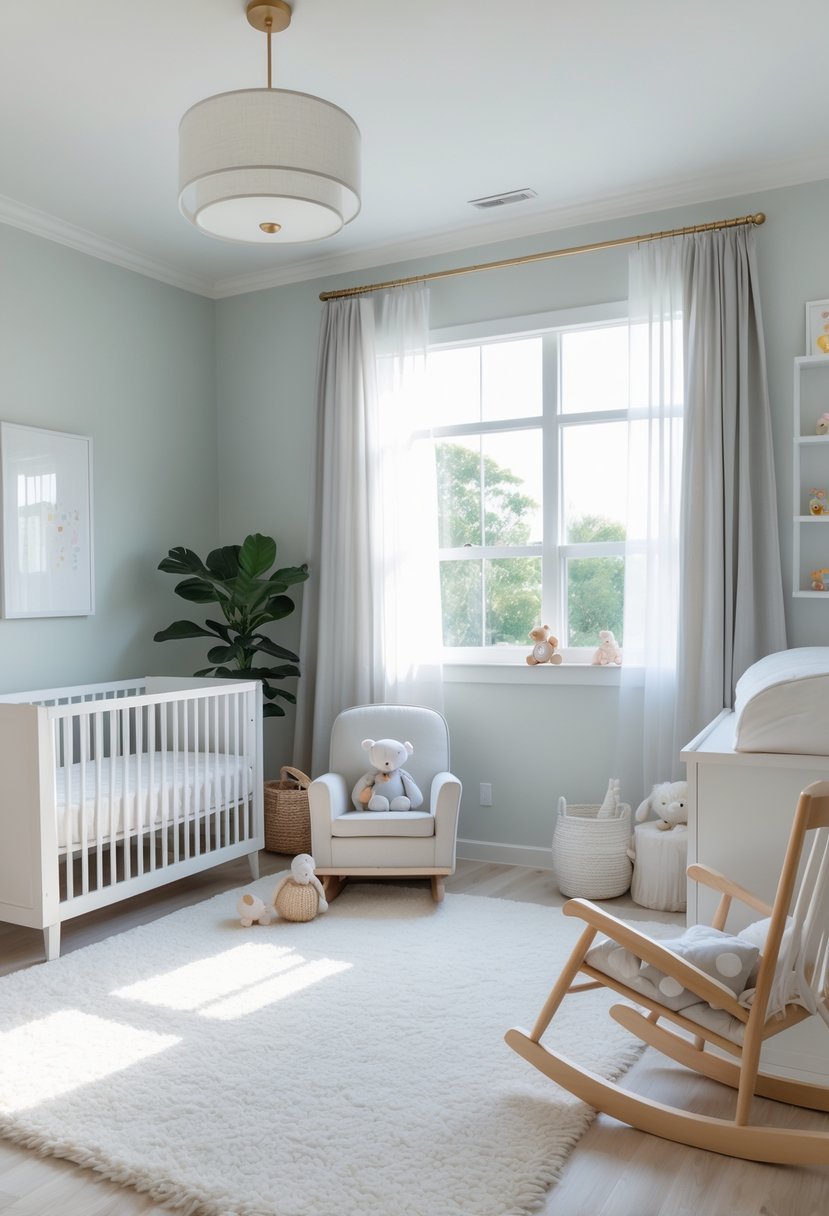
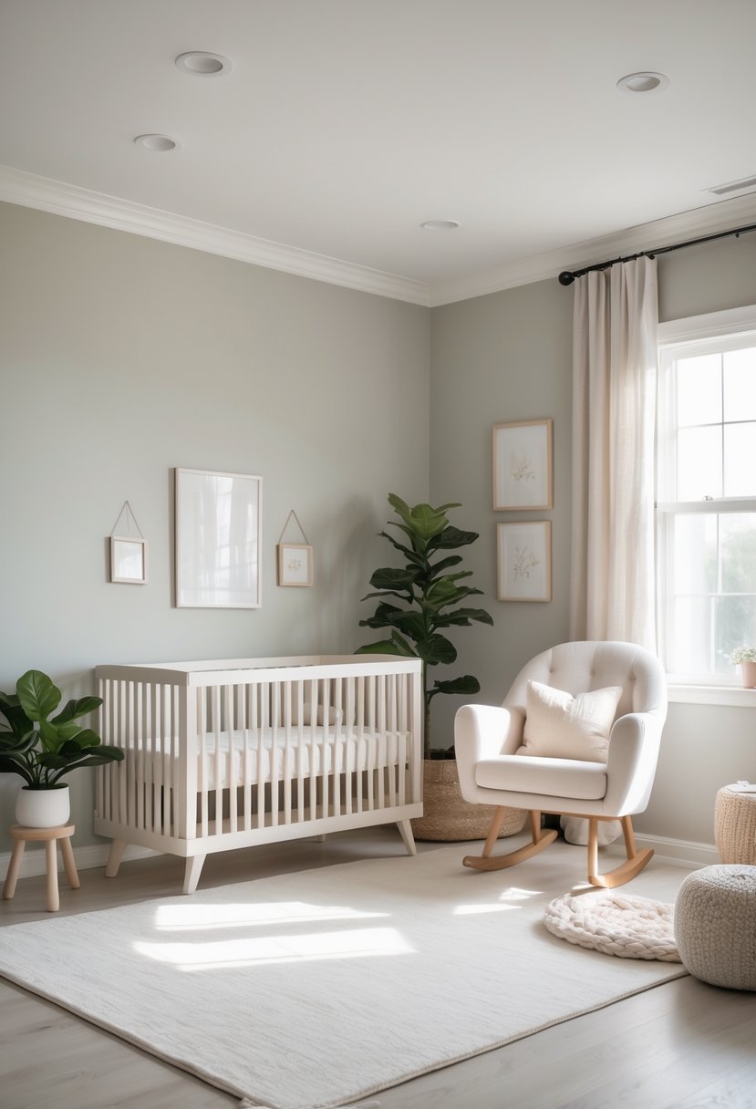
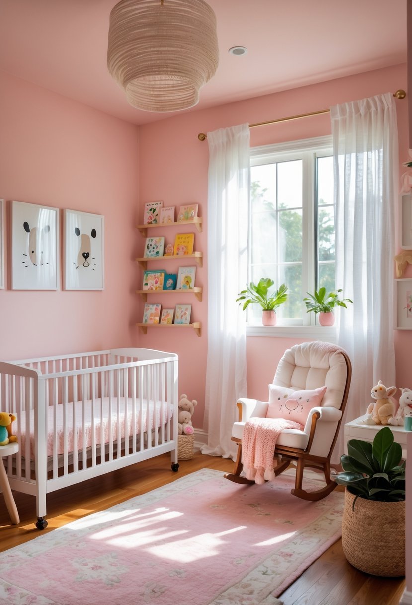
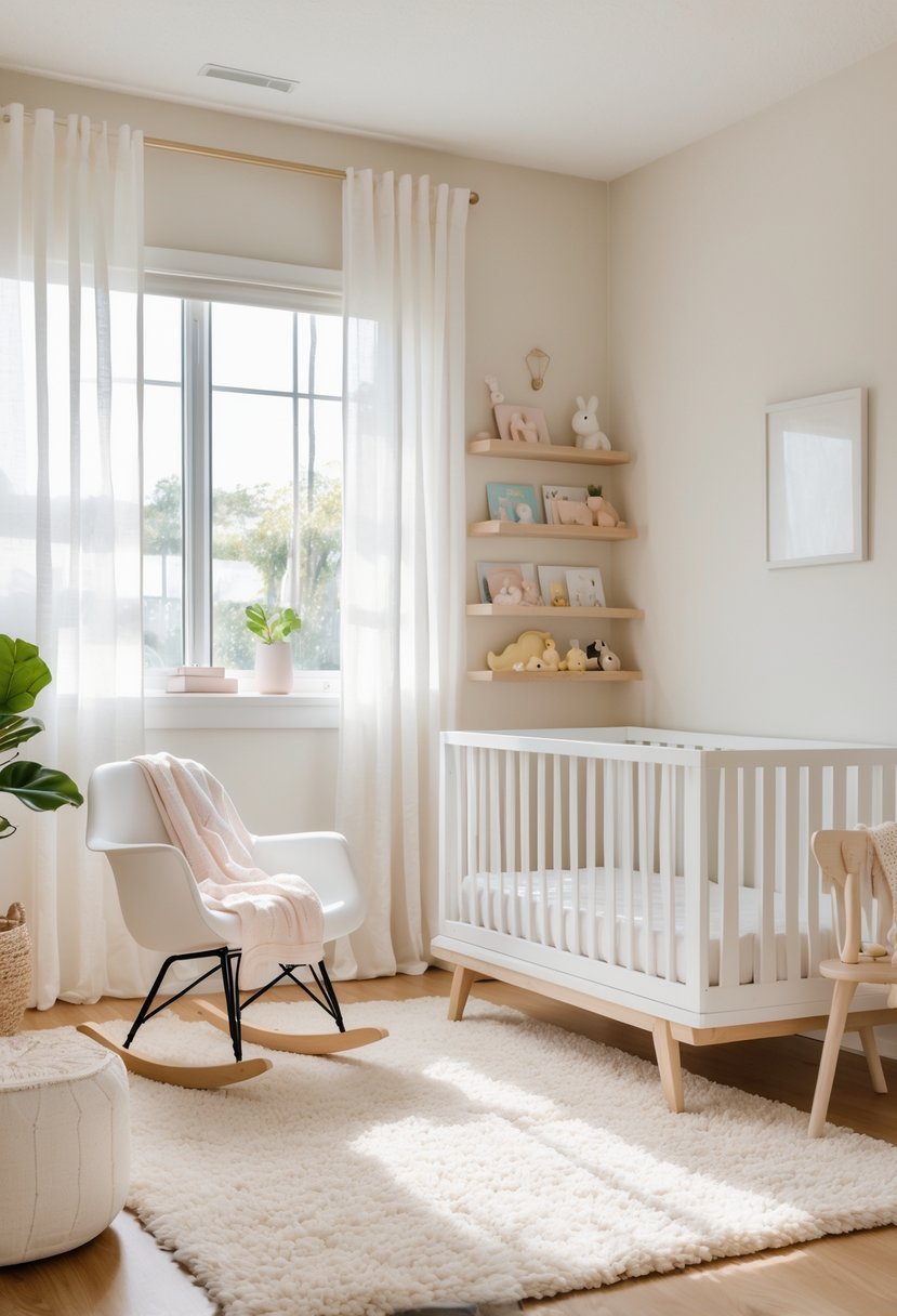
20 Best Paint Colors for Nursery That Create Calm and Cozy Spaces
Choosing paint colors for a nursery is an important step in creating a space that feels welcoming and calming for your baby. The right shades can influence the mood of the room and even affect how your child feels within it. I understand how challenging it can be to find colors that balance softness with style.
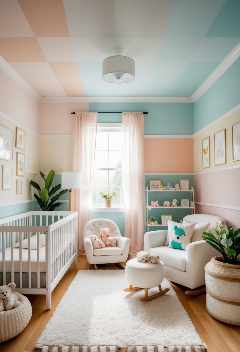
The 20 best paint colors for a nursery offer a range of options to help you create an ideal environment, whether you prefer neutral, earthy, or playful tones.
20 Best Paint Colors for Nursery
My goal is to guide you in selecting colors that enhance your nursery’s atmosphere while being practical and easy to maintain.
1. Benjamin Moore Pale Oak
I find Benjamin Moore Pale Oak to be an excellent choice for a nursery. It’s a soft, neutral greige that balances warm beige with subtle gray undertones. This blend creates a calm and versatile backdrop without feeling too cold or sterile.
The color adapts well to different lighting, maintaining a gentle warmth that feels inviting. Pale Oak works well paired with both muted tones and more vibrant accents, making it easy to personalize a baby’s space.
2. Sherwin-Williams Sea Salt
I chose Sherwin-Williams Sea Salt for its calm and versatile nature. It’s a soft blend of green, blue, and gray, which allows it to adapt well to different lighting conditions.
This color creates a soothing atmosphere, perfect for a nursery where you want a peaceful environment. It pairs easily with both muted and fresh palettes, giving flexibility in decorating.
Sea Salt works beautifully on walls and trim, making the room feel airy without overwhelming. It’s a reliable choice if you want a gentle, timeless color.
3. Benjamin Moore Classic Gray
I find Benjamin Moore Classic Gray to be an excellent choice for a nursery. It offers a soft, light gray tone that brings calmness without feeling cold or sterile.
This color adapts well to different lighting conditions, maintaining a warm and inviting atmosphere throughout the day.
Classic Gray is subtle enough to work as a neutral backdrop, making it easy to pair with colorful accents or natural wood tones in the nursery design.
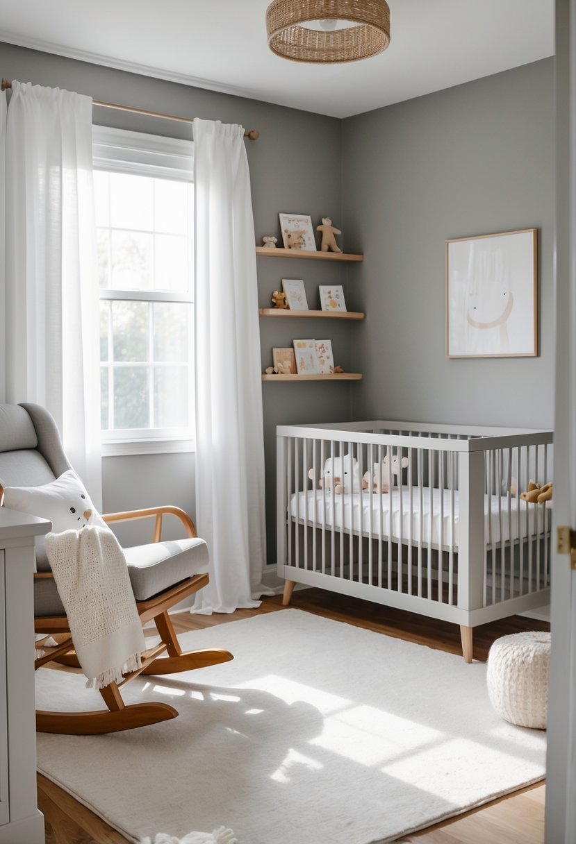
4. Sherwin-Williams Repose Gray
I chose Sherwin-Williams Repose Gray for its balanced, neutral tone that works well in nurseries. It has subtle green and taupe undertones, giving it warmth without feeling cold or sterile.
This color adapts to different lighting, creating a calm and soothing environment. It pairs easily with soft pastels or stronger accent colors, making it versatile as your nursery style evolves.
Repose Gray offers a timeless backdrop that I believe supports both rest and gentle stimulation for a nursery space.
5. Benjamin Moore Soft Chamois
I appreciate Benjamin Moore Soft Chamois for its creamy off-white tone with subtle gray undertones. It feels warm without being overwhelming, making it a versatile choice for a nursery.
This color creates a cozy and inviting atmosphere while staying neutral enough to pair well with various accent colors. Soft Chamois works well in different lighting, which helps maintain a calm, soothing environment.
I often recommend it when someone wants a neutral base that adds warmth beyond plain white. It supports both modern and classic nursery styles effectively.
6. Sherwin-Williams Alabaster
I recommend Sherwin-Williams Alabaster for anyone wanting a warm, inviting white. This shade keeps a cozy feeling without feeling too stark or cold.
Alabaster works well in nurseries because it creates a calm, neutral backdrop that pairs easily with various accent colors. It’s a popular choice because it offers softness while maintaining a clean and fresh look.
I find it especially fitting for those who want a classic, timeless paint color that won’t overpower the room’s other design elements.
7. Benjamin Moore Quiet Moments
I find Benjamin Moore Quiet Moments to be an excellent choice for a nursery. Its soft blue-green tone creates a calm and soothing environment without feeling cold or dull.
This color adapts well to different lighting, showing hints of blue, green, or gray throughout the day. It pairs nicely with neutral and natural wood accents, helping the space feel balanced and serene. Quiet Moments offers a subtle, spa-like ambiance ideal for restful sleep and quiet moments with your baby.
8. Sherwin-Williams Mindful Gray
I appreciate Sherwin-Williams Mindful Gray for its balanced warmth and versatility in nurseries. It’s a soft greige with subtle yellow undertones, making it warmer than many traditional grays but still neutral enough to coordinate well with other colors.
In my experience, this shade pairs nicely with warm neutrals like Accessible Beige and Alabaster. You can use it on walls or cabinetry to create a calm, inviting space without feeling too cold or sterile. It also lends itself well to accent colors if you want a bit of contrast.
9. Benjamin Moore Breath of Fresh Air
I find Benjamin Moore Breath of Fresh Air to be a versatile choice for nurseries. Its soft, muted aqua tone brings a refreshing yet calming atmosphere to the room.
This color works well with both neutral and brighter accents, making it easy to coordinate with various nursery themes. It reflects natural light nicely, which helps keep the space feeling open and airy.
In my experience, it balances warmth and coolness, creating a cozy environment without feeling overpowering or too sterile.
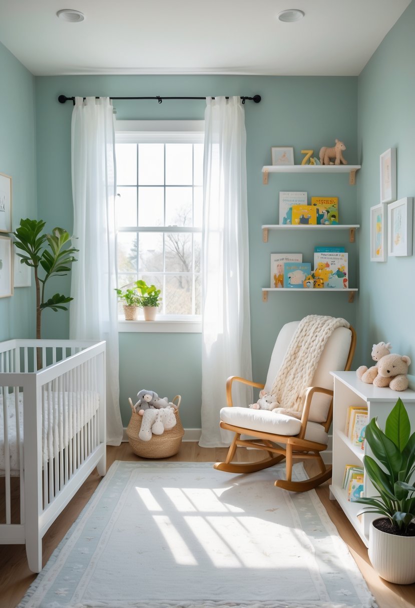
10. Sherwin-Williams Rainwashed
I find Sherwin-Williams Rainwashed to be a soothing blend of green and blue, making it ideal for a nursery. Its calm tone creates a peaceful environment without being too bold or overwhelming.
This color works well with light wood furniture and soft white accents. It also adapts easily if you want to introduce brighter colors later on. For me, it’s a versatile choice that balances tranquility and freshness.
11. Benjamin Moore Gray Owl
I find Benjamin Moore Gray Owl to be a versatile light gray that works well in many nurseries. Its subtle undertones shift between warm and cool depending on the lighting, which adds depth without overwhelming the space.
Gray Owl creates a calm, neutral backdrop that pairs nicely with both soft pastels and brighter accents. This balance makes it a reliable choice when you want a serene environment with a modern touch. I appreciate how adaptable it is across different room styles and lighting conditions.
12. Sherwin-Williams Silverpointe
I find Sherwin-Williams Silverpointe to be an excellent choice for a nursery. Its soft, muted gray has subtle cool undertones that create a calm and serene atmosphere.
This color works well with both neutral and pastel accents, making it versatile for different nursery themes. Silverpointe pairs nicely with natural wood furniture, adding warmth without overpowering the space.
Using this shade, I can easily layer textures and decor while keeping the room feeling light and airy. It’s a practical, stylish option for a gender-neutral nursery.
13. Benjamin Moore Venetian Plaster
I find Benjamin Moore Venetian Plaster to be a wonderfully soft and subtle shade for a nursery. Its gentle gray-beige tone creates a calm, neutral backdrop that works well with a variety of accent colors.
This paint color adds warmth without feeling overwhelming, making it a great choice when you want a sophisticated yet cozy space. I often recommend it for parents seeking a timeless look that can grow with their child.
14. Sherwin-Williams Iceberg
I find Sherwin-Williams Iceberg to be a calm and soothing choice for a nursery. Its soft, muted blue shade evokes a serene atmosphere that feels both fresh and timeless.
This color pairs well with whites and pastel accents, which can brighten the room without overwhelming it. Iceberg offers a gentle backdrop that works whether you want a subtle or more styled nursery space.
15. Benjamin Moore Opal
I find Benjamin Moore Opal to be a soft, muted blue with subtle gray undertones. It creates a calming atmosphere without feeling cold or sterile.
This color works well in nurseries because it is gentle on the eyes and pairs nicely with whites and natural wood tones. I appreciate its versatility, making it suitable for both boys’ and girls’ rooms, as well as gender-neutral spaces.
Opal adapts well to different lighting conditions, maintaining a soothing presence throughout the day. It’s a reliable choice for a serene nursery environment.
16. Sherwin-Williams Comfort Gray
I find Sherwin-Williams Comfort Gray to be a versatile choice for a nursery. It is a soft, subtle gray with warm undertones that create a calming atmosphere without feeling cold.
This color pairs well with both neutral tones and pastel accents, making it easy to style. Comfort Gray provides a gentle backdrop that supports relaxation, which is important in a baby’s room. Its warmth makes it more inviting than cooler grays, in my opinion.
17. Benjamin Moore Pink Damask
I find Benjamin Moore Pink Damask to be a subtle blend of soft pink and off-white, making it versatile for a nursery. It leans toward a gentle blush rather than a strong pink, offering warmth without overwhelming the room.
This color has a high light reflectance value, which helps brighten spaces like bedrooms or nurseries. I appreciate how Pink Damask works well as a neutral base while still adding a hint of color. It creates a calm, inviting atmosphere, perfect for a nursery setting.
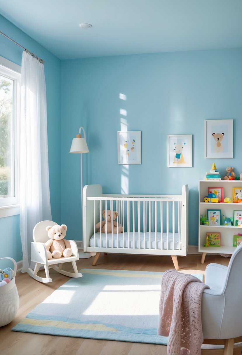
18. Sherwin-Williams Coral Reef
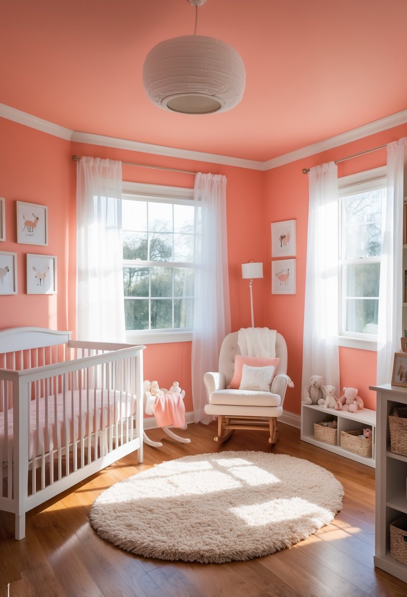
I find Sherwin-Williams Coral Reef (SW 6606) to be a lively and warm choice for a nursery. It balances pink and orange tones, creating a cheerful yet soothing atmosphere.
This color pairs well with neutrals like beige or ivory to keep the room calm. For a more striking look, I like combining it with deeper shades such as navy blue or emerald green. Coral Reef offers versatility without overwhelming the space, making it a strong option for a nursery’s palette.
19. Benjamin Moore Simply White
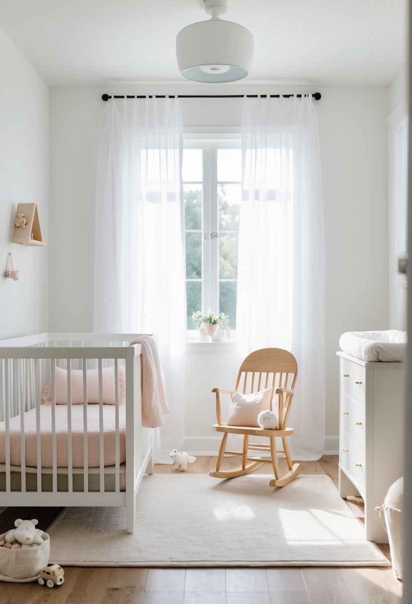
I appreciate Benjamin Moore Simply White for nurseries because it offers a clean, crisp off-white that brightens any room. It’s soft yet fresh, creating a calm environment without feeling stark.
This shade works well in spaces with limited natural light, adding brightness without overwhelming the senses. Its subtle warmth gives the nursery a welcoming and timeless feel.
Simply White pairs easily with other colors, making it versatile for different nursery themes. I find it a reliable choice when aiming for a serene and airy atmosphere.
20. Sherwin-Williams Dove Wing
I appreciate Sherwin-Williams Dove Wing for its soft, neutral tone that works well in nurseries. It offers a gentle warmth without being too bold or overwhelming.
This color pairs nicely with natural wood accents and pastel decor, creating a calm and inviting atmosphere. I find it versatile enough to suit both gender-neutral and more traditional nursery designs.
How to Choose the Best Paint Colors for Nursery Spaces
Focus on Calm and Comfort
When I select nursery paint colors I always prioritize calmness. The room should feel soothing for rest while still feeling warm and welcoming.
- Soft neutrals create a peaceful foundation
- Muted colors support relaxation
- Overly bright shades can feel overstimulating
Consider Lighting and Room Size
Lighting plays a major role in how nursery colors appear so I test samples before committing.
- Natural light allows deeper soft colors
- Low light benefits from lighter shades
- Smaller rooms feel larger with gentle tones
Choose Colors That Grow with the Child
I prefer nursery colors that stay relevant beyond the early years.
- Neutral bases adapt easily over time
- Soft color allows changing decor themes
- Timeless shades reduce repainting later
Balance Color with Furniture and Decor
I always look at cribs rugs and storage before finalizing paint choices.
- Light furniture pairs well with deeper walls
- Wood tones feel warmer with soft neutrals
- Simple decor keeps the room from feeling busy
Keep the Space Easy to Maintain
Practicality matters in a nursery so I choose colors that age well and stay clean looking.
- Mid tone shades hide marks better
- Neutral colors stay visually fresh
- Soft finishes feel comfortable and inviting
FAQs
Creating Calm and Cozy Spaces for Babies
I believe the best paint colors for nursery spaces balance comfort softness and flexibility. With thoughtful color choices lighting awareness and simple decor I can create a nursery that feels peaceful inviting and timeless. A calm color palette supports rest while allowing the room to grow alongside the child.

I am Mindy Medford, a home décor, paint, and design specialist with over a decade of hands-on experience transforming ordinary spaces into cozy, personality-packed havens. Since 2013, I have been helping homeowners discover the art of beautiful yet practical design. I share my love for color, texture, and layout—making stylish interiors & exteriors feel achievable for everyone. Whether it’s picking the perfect paint shade or reimagining a small space, I’m here to guide and inspire.