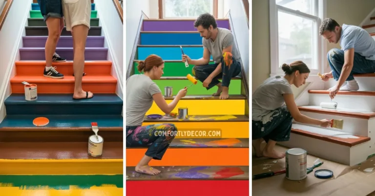
22 Best Interior Paint Color Schemes for Modern and Timeless Home Designs
Choosing the right interior paint color scheme can significantly impact the atmosphere and style of your home. I have seen how carefully selected colors can either enhance a room’s natural light or create a cozy, inviting space. The best color schemes balance aesthetics and function, making your home feel both beautiful and comfortable.
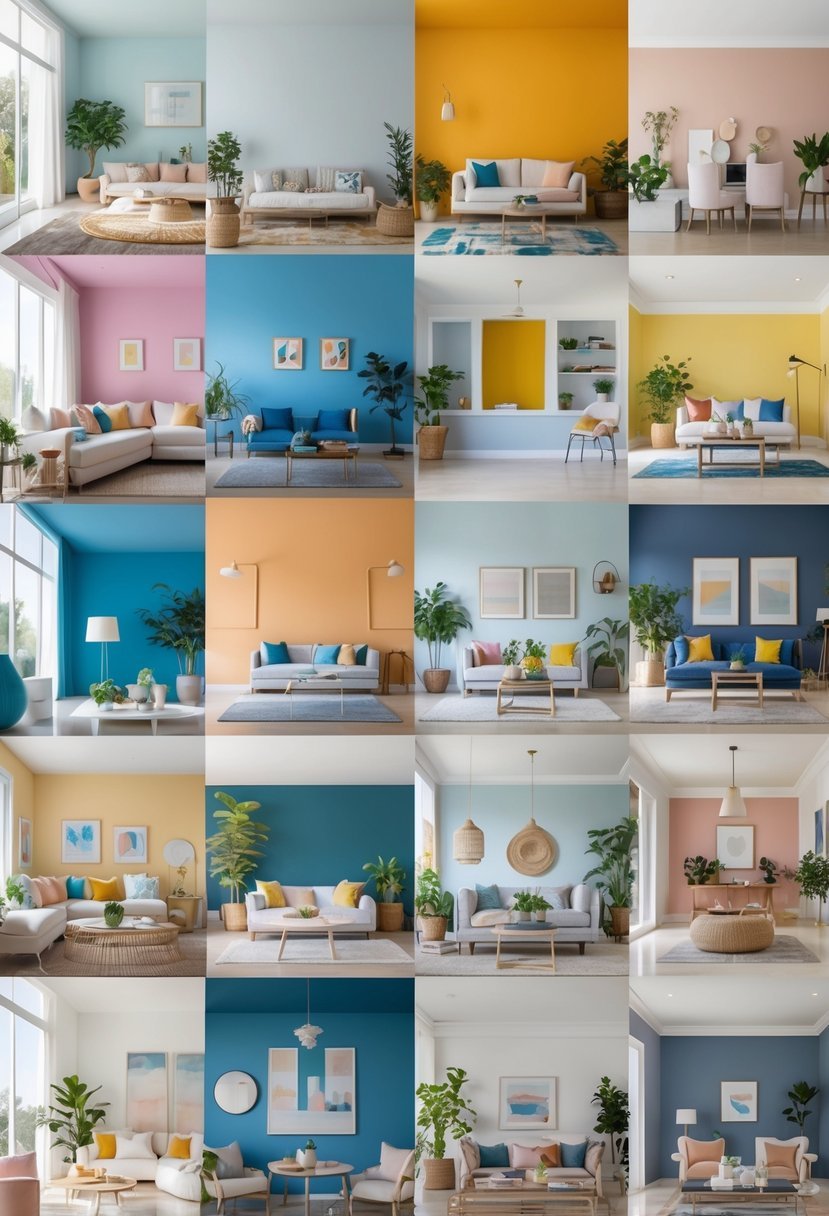
22 Interior Paint Color Schemes
I will guide you through 22 of the best interior paint color schemes. These combinations are designed to suit various tastes and room types, helping you find the right palette for your space without feeling overwhelmed by choice.
1. Classic Navy and Crisp White
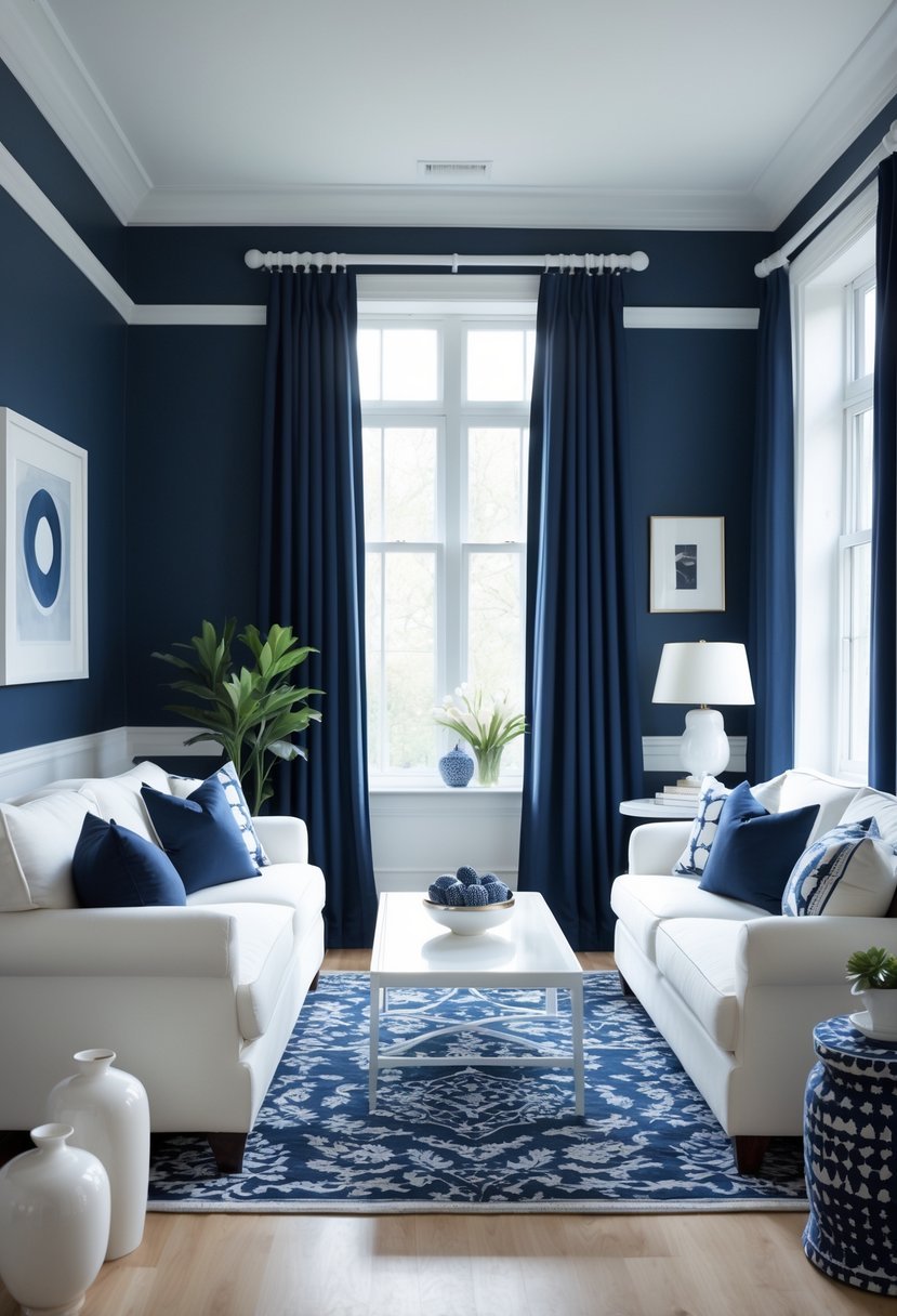
I find navy and crisp white to be a timeless paint combination that suits many interior styles. Navy brings depth and sophistication, while white offers a fresh contrast that brightens the space.
Using navy on walls or built-ins creates a cozy, enveloping atmosphere. I often pair it with white trim or wainscoting to add architectural interest without competing for attention. This pairing works well in both traditional and modern rooms.
2. Warm Taupe with Soft Ivory
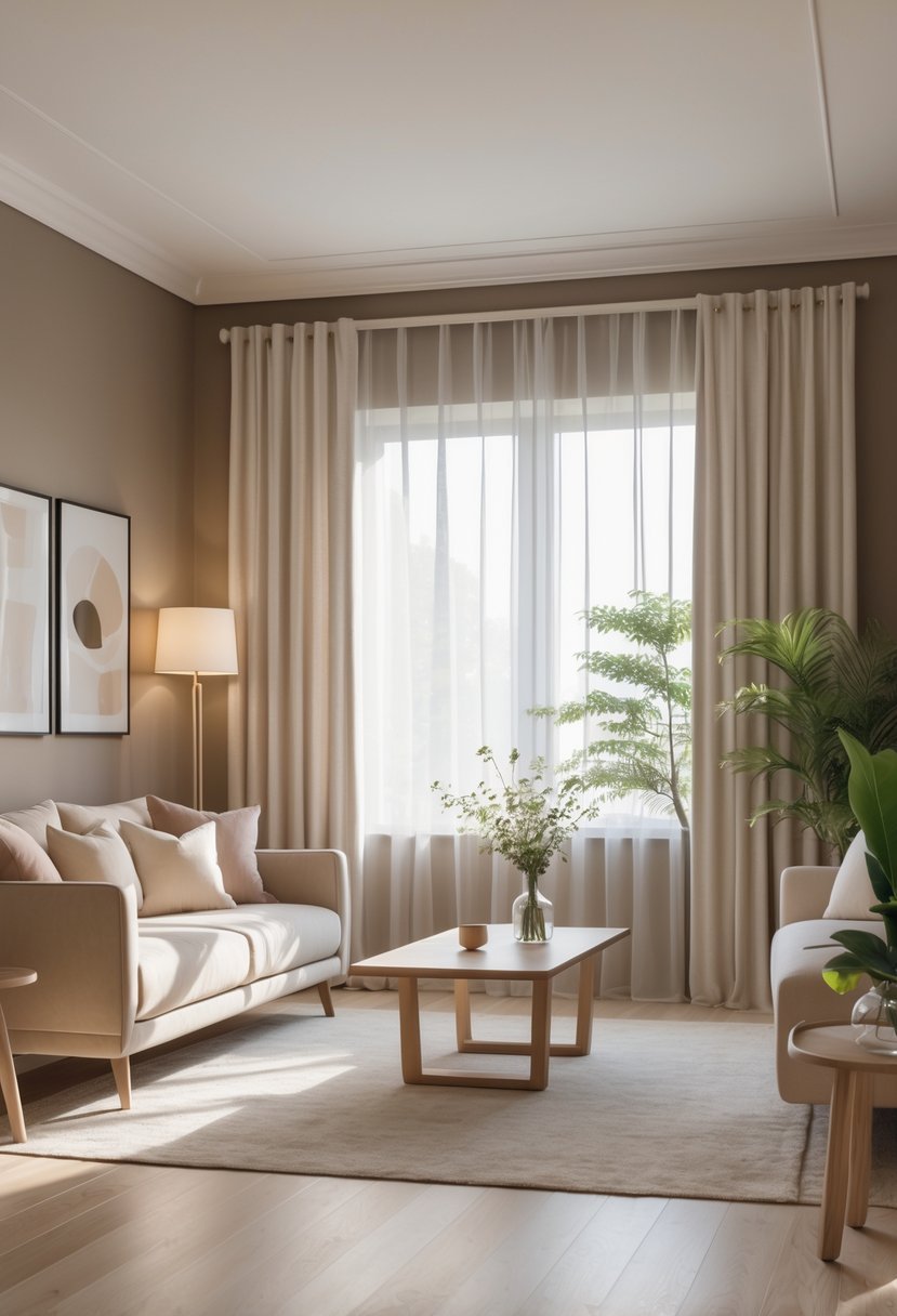
I find that warm taupe paired with soft ivory creates a balanced and inviting space. The taupe brings subtle warmth with its blend of brown and gray, while the ivory adds a clean, light contrast.
This combination works well in living rooms and bedrooms, where you want a neutral backdrop that still feels cozy. It’s timeless and versatile, allowing for flexible accent choices without overwhelming the space.
3. Deep Forest Green and Cream
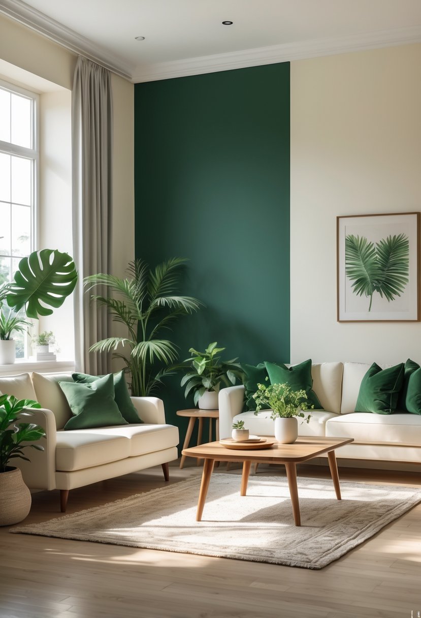
I find the combination of deep forest green and cream particularly soothing. The rich, earthy green brings a grounded, natural feel, while the cream tones add warmth and balance.
This palette works well in living rooms or bedrooms where a calm, inviting atmosphere is desired. The contrast is subtle yet effective, highlighting the depth of the green without overwhelming the space.
4. Bold Charcoal and Bright Yellow
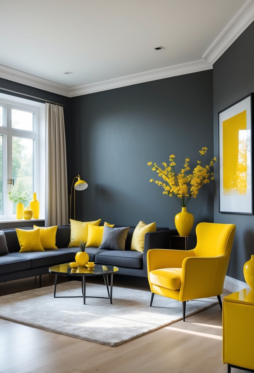
I find the combination of charcoal and bright yellow to be both striking and balanced. Charcoal offers a strong, refined base with its deep, muted tone. It creates a sophisticated backdrop without feeling too harsh.
Adding bright yellow introduces energy and warmth, breaking up the darkness with vibrancy. This contrast works well in living areas or creative spaces where a dynamic yet stylish atmosphere is desired. I appreciate how this pairing brings depth while keeping the room lively.
5. Muted Sage with Dusty Rose
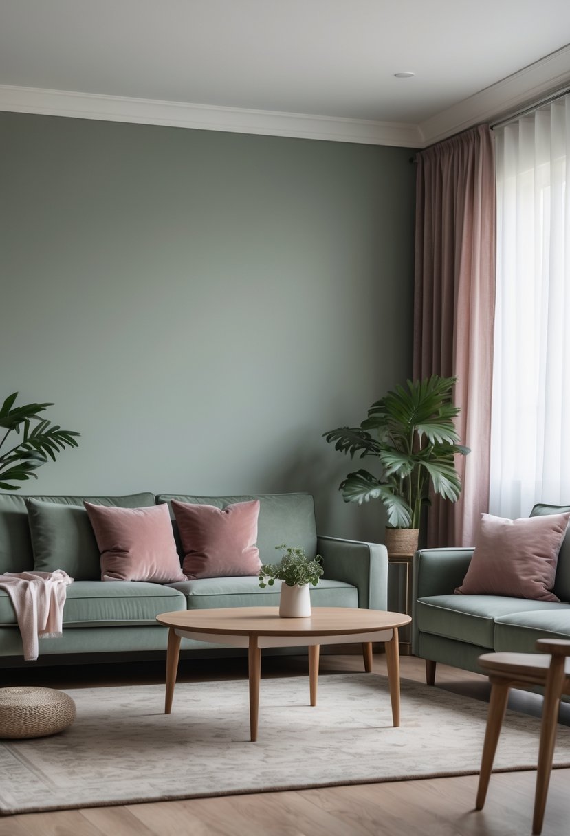
I find muted sage paired with dusty rose creates a balanced, calming palette. The soft green of muted sage complements the warm, gentle tones of dusty rose without overpowering the space.
This combination brings a sense of tranquility and subtle elegance. It works well in bedrooms, living rooms, or any area seeking a sophisticated, muted look.
Together, these colors offer versatility. Both shades have grey undertones, which helps maintain harmony and makes the scheme timeless.
6. Rich Burgundy and Soft Grey
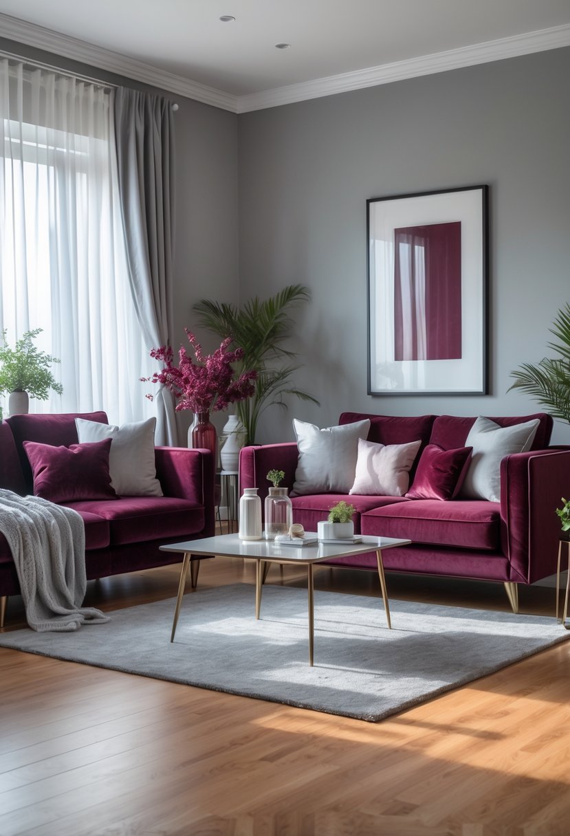
I find the combination of rich burgundy and soft grey to be both elegant and balanced. Burgundy adds deep warmth and sophistication, while soft grey tones calm the space without feeling cold.
This pairing works well in living rooms and bedrooms, creating a cozy yet refined atmosphere. The contrast highlights burgundy’s boldness and allows grey to bring subtlety and light.
In my experience, this scheme adapts easily to modern or traditional interiors, making it a reliable choice when seeking timeless color harmony.
7. Soft Lavender and Pale Blue
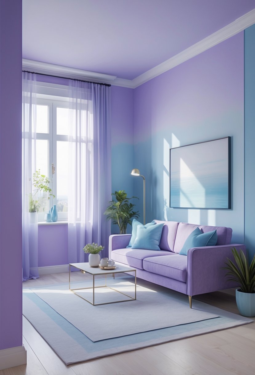
I find the combination of soft lavender and pale blue creates a calm, soothing atmosphere. These colors work well in bedrooms and reading nooks, where relaxation is a priority.
Soft lavender adds a gentle warmth, while pale blue brings freshness and a subtle sense of space. Together, they offer a balanced, airy feel that is both elegant and inviting.
Pairing these shades with soft grays or pale greens can enhance the tranquil effect without overpowering the room. This palette is versatile and timeless in interior design.
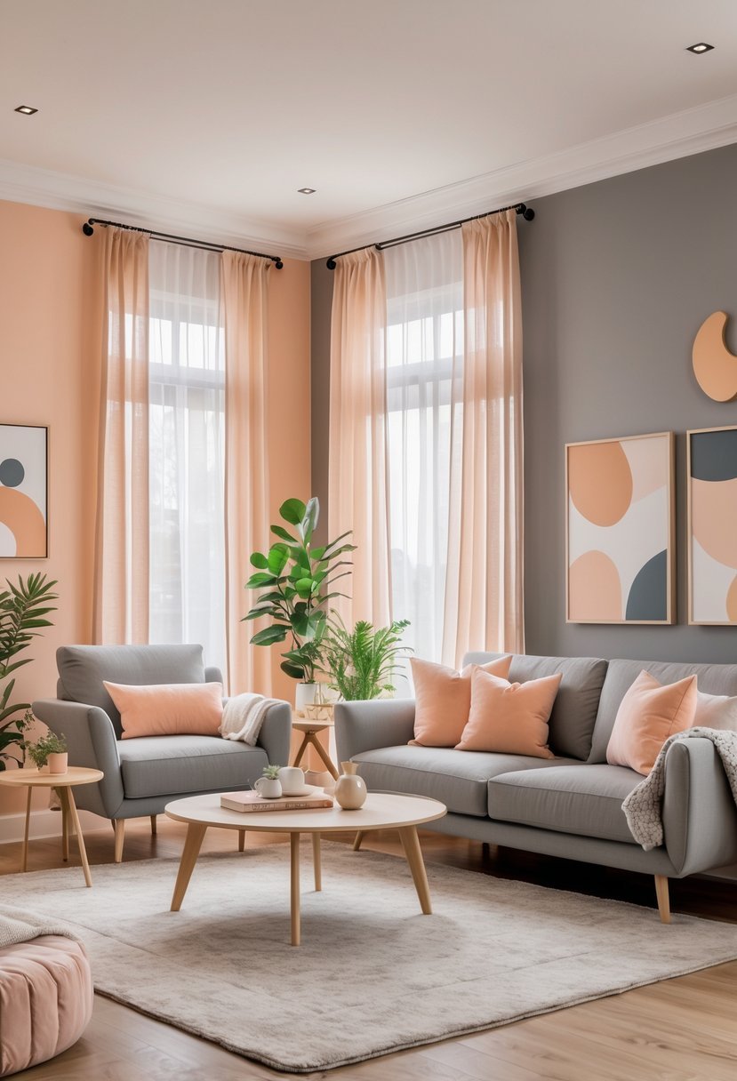
8. Sunset Orange with Neutral Beige
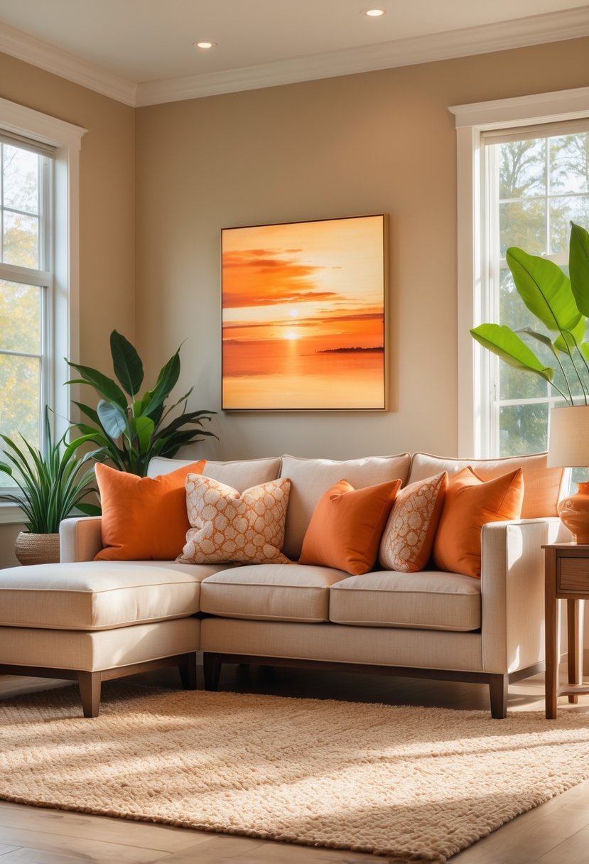
I find sunset orange brings warmth and energy to a space, but it can easily overpower if not balanced well. Pairing it with a neutral beige tones down the intensity, creating a harmonious and inviting atmosphere.
Beige adds depth without competing for attention. This combination works well in living rooms or bedrooms where I want both vibrancy and calm. The neutral beige provides a subtle backdrop, allowing the sunset orange to stand out naturally.
9. Cool Slate Blue and Warm Tan
I find the combination of cool slate blue and warm tan to be both balanced and inviting. Slate blue, with its subtle gray undertones, brings a calm and sophisticated feel to a space.
Pairing it with warm tan adds a cozy contrast that prevents the room from feeling too cold. This mix works well in living rooms and bedrooms where comfort and style matter.
The colors complement each other without competing, creating a grounded yet fresh atmosphere. I often recommend this scheme for a timeless, adaptable look.
10. Elegant Black and Gold Accents
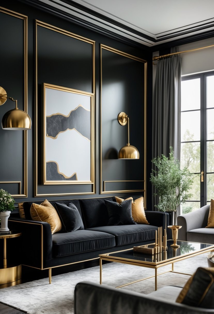
I find black and gold accents create a sophisticated and timeless atmosphere in any room. The deep black provides a bold foundation, while gold introduces warmth and subtle luxury.
Using these colors thoughtfully allows me to add contrast without overwhelming the space. Whether through furniture, lighting, or decorative pieces, black and gold can elevate a simple room into one that feels carefully curated and elegant.
11. Earthy Terracotta and Warm White
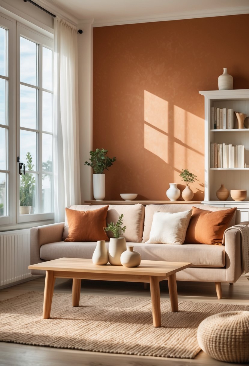
I find the combination of earthy terracotta and warm white to be both inviting and balanced. Terracotta’s natural, rich tones add warmth without overwhelming a space. Pairing it with warm white keeps the look clean and fresh, creating a calm atmosphere.
This palette works well in living areas or kitchens where you want a cozy yet vibrant feel. The contrast between the deep terracotta and soft white also highlights architectural details beautifully. It’s a reliable choice for anyone seeking timeless, grounded color harmony.
12. Serene Aqua and Sandy Beige
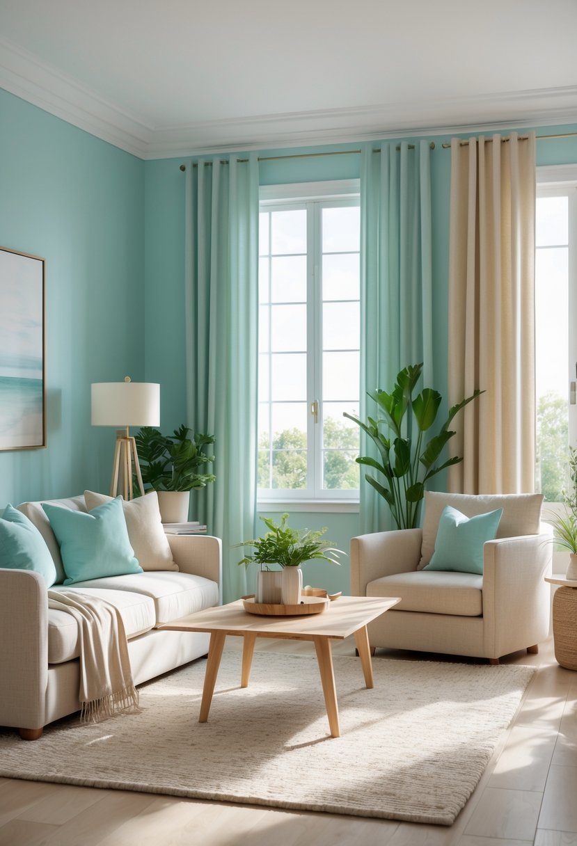
I find that combining serene aqua with sandy beige creates a balanced, calming atmosphere. Aqua brings a fresh, coastal vibe with its blend of blue and green tones.
Sandy beige grounds the space, evoking the warmth of natural beach sands. Together, these colors work well in bedrooms and living areas where relaxation is key.
This palette is versatile and pairs nicely with white or soft gray accents. It’s simple but effective for bringing a subtle coastal charm indoors.
13. Vibrant Coral with Light Grey
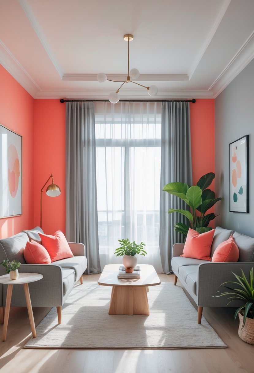
I find vibrant coral paired with light grey to be a balanced, modern choice. The coral adds warmth and energy, while the light grey tones it down with calmness. This combination works well in living rooms or bedrooms where you want both liveliness and relaxation.
Using coral as an accent against grey walls creates a striking contrast without overwhelming the space. It’s versatile, fitting contemporary and eclectic styles alike. For me, this scheme brings both freshness and subtle sophistication to interiors.
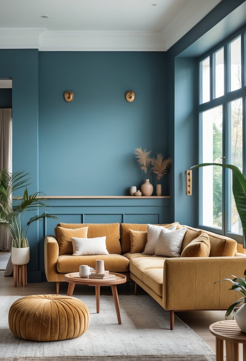
14. Muted Mustard and Soft Olive
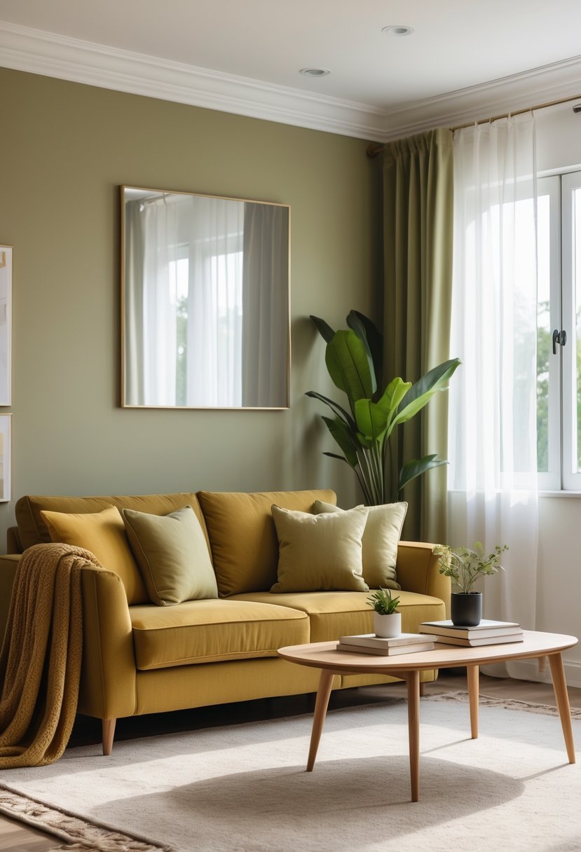
I find muted mustard and soft olive create a grounded, natural palette that feels warm without overpowering a space. Olive green works well on larger surfaces like walls or sofas, providing an earthy foundation.
Muted mustard then adds just the right amount of contrast as an accent. I often use it in cushions, throws, or small decor pieces to gently brighten the room while maintaining a sophisticated look.
Together, these colors strike a balance between warmth and subtlety, making them versatile for various interior styles.
15. Luxurious Plum and Light Taupe
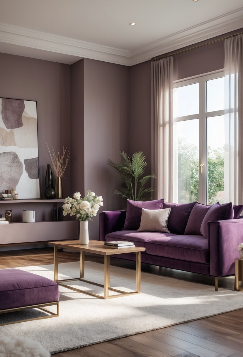
I like combining luxurious plum with light taupe for a balanced interior palette. Plum offers deep, rich tones that add sophistication and warmth.
Light taupe complements plum by bringing softness and neutrality. It blends brown and gray hues, creating a versatile backdrop that doesn’t compete with plum’s intensity.
Together, they create a space that feels both cozy and refined. The mix adds depth without overwhelming the senses, making it suitable for living rooms or bedrooms.
16. Fresh Mint and Crisp White
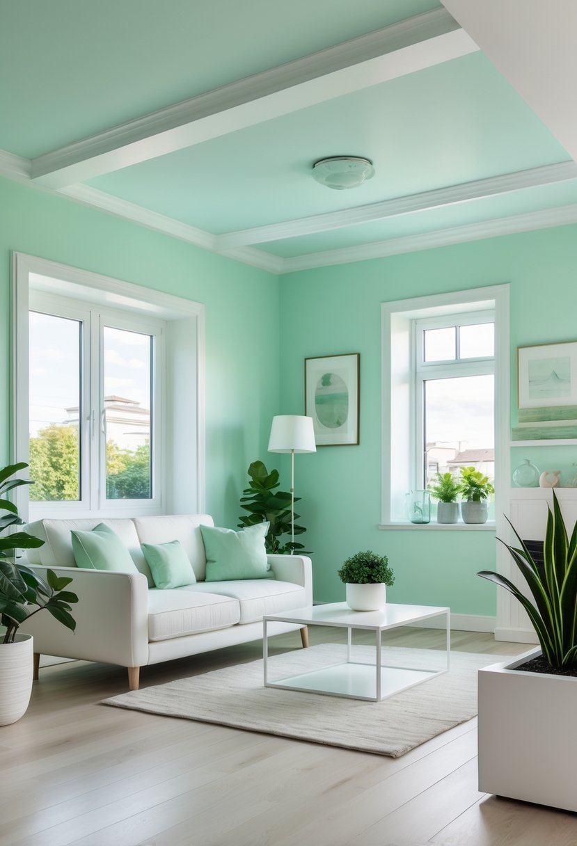
I find that pairing fresh mint with crisp white creates a bright and inviting palette. Mint brings a subtle, playful energy without overwhelming the space.
The crisp white keeps things airy and clean, balancing the mint’s vibrancy. This combination works well in kitchens or children’s rooms where I want to maintain a light, cheerful atmosphere. It’s a straightforward choice for adding freshness without complicating the design.
17. Deep Teal and Soft Blush
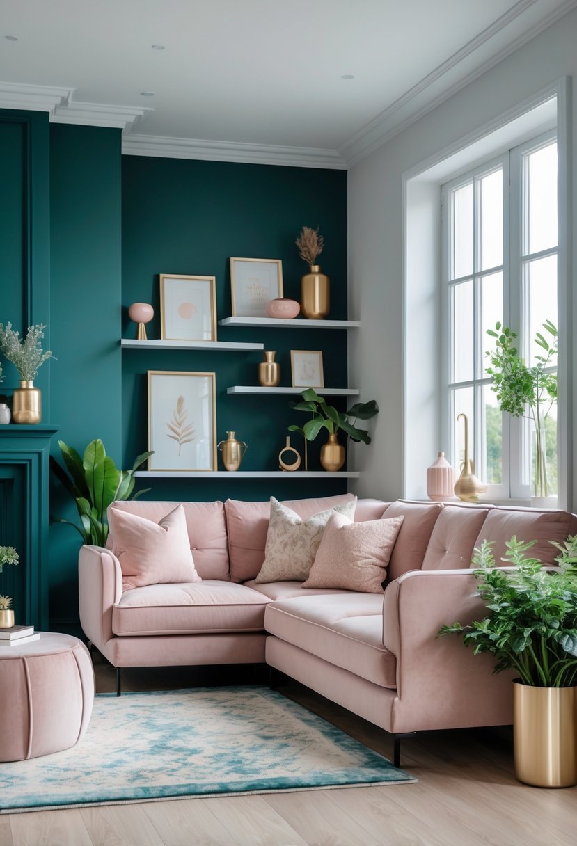
I find the combination of deep teal and soft blush creates a balanced yet striking palette. The richness of deep teal adds depth and sophistication, while soft blush brings a subtle warmth and romance.
Using these colors together offers contrast without overwhelming the space. Deep teal works well on walls or larger elements, and soft blush accents can soften the overall look. This pairing adapts easily from modern to classic interiors.
18. Pale Peach and Warm Grey
I find pale peach combined with warm grey creates a balanced and soothing atmosphere. The softness of peach adds warmth without overwhelming the space.
Warm grey serves as a neutral anchor that complements the gentle peach tones well. This combination works particularly in living rooms and bedrooms, where I want comfort and elegance.
Using these colors together, I achieve a subtle contrast that feels inviting and modern. It’s a reliable scheme when aiming for calm, stylish interiors.
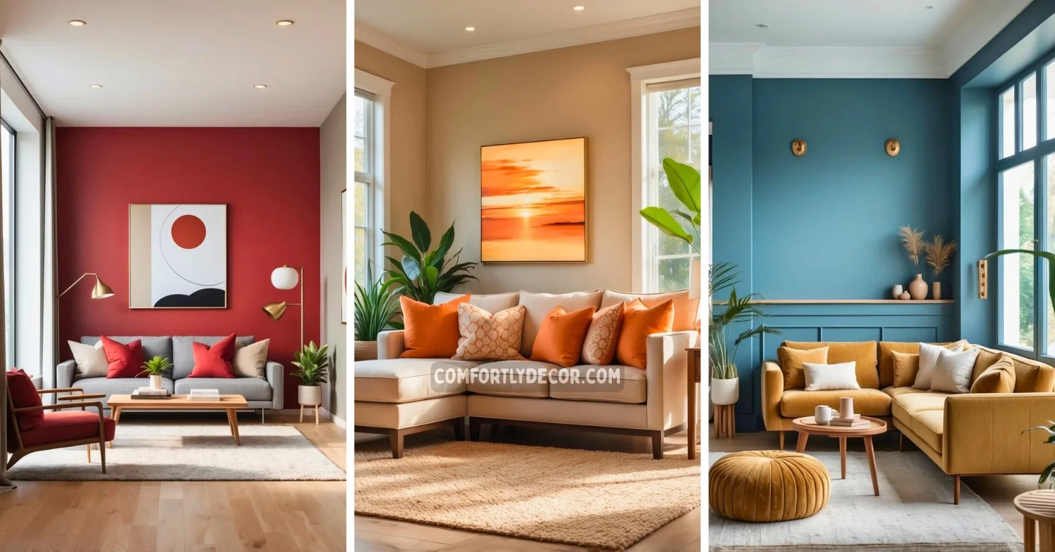
19. Bold Red with Neutral Greige
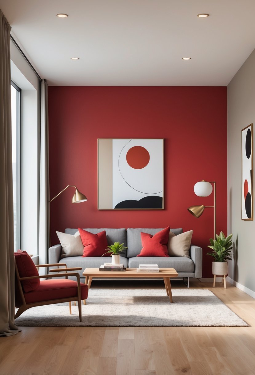
I find that pairing bold red with neutral greige creates a striking balance. The warmth of greige tones softens red’s intensity, making it suitable for living spaces or accent walls.
This combination offers versatility. Greige provides a calming backdrop, while red adds energy without overwhelming the room. It’s a modern approach that feels both sophisticated and inviting.
20. Classic Beige and Rich Brown
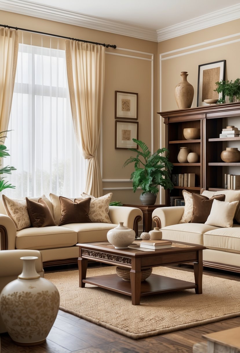
I find the combination of classic beige and rich brown to be a timeless choice for interior spaces. Beige provides a warm, neutral base that can shift between soft and earthy depending on the light.
Pairing it with a deep brown adds contrast and depth without overwhelming the room. This palette creates a balanced, inviting atmosphere that works well in living rooms and bedrooms alike. It’s versatile and can be adjusted with different undertones to suit any style.
21. Soft Sky Blue with White Trim
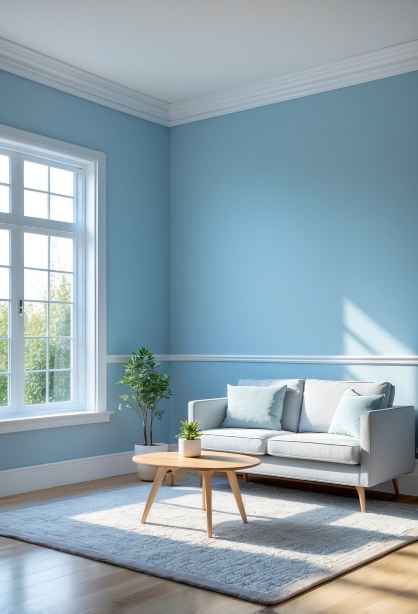
I find soft sky blue to be an excellent choice for creating a calm and airy space. When paired with crisp white trim, it adds a clean, fresh contrast that enhances the room’s brightness.
This color combination works well in bedrooms and living areas, promoting relaxation while keeping the space inviting. The white trim sharpens the edges, making the blue walls stand out without overwhelming the senses.
22. Rustic Copper and Cream
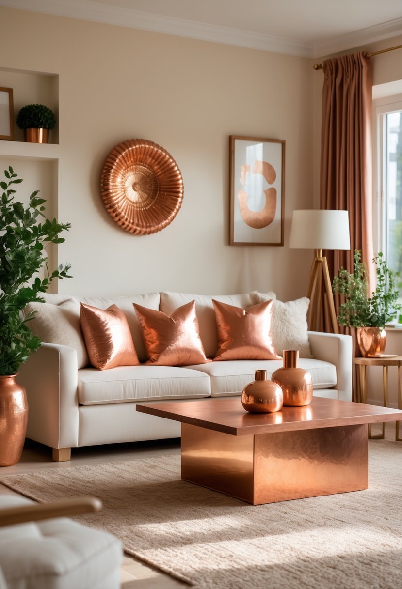
I find that combining rustic copper with soft cream tones creates a balanced and inviting atmosphere. The warm, earthy copper adds depth and character, while the cream provides a clean, neutral backdrop.
This pairing works well in living rooms and kitchens, bringing a natural yet sophisticated feel to the space. It connects well with wooden accents and natural textures, enhancing the rustic aesthetic without overwhelming it.
Choosing Interior Paint Colors Schemes With Confidence
When I work with interior paint colors schemes, I always begin by studying how light moves through the room.
Bright spaces allow me to use deeper shades like navy, teal, and charcoal. Dim rooms feel better with warm white, light beige, peach, or soft gray. Light decides whether a color feels open or heavy.
How I Balance Two Colors Without Overpowering the Room
Every interior paint colors scheme needs contrast but also harmony.
- One color always acts as the main base
- The second color supports it through accents or trim
- I avoid pairing two strong tones on large surfaces
How I Match Color With Furniture and Flooring
I never choose interior paint colors schemes without thinking about what already exists.
- Warm wood pairs well with beige, greige, and cream
- Dark furniture feels lighter with soft walls
- Metal finishes guide my choice between cool and warm tones
Testing Interior Paint Colors Schemes Before Painting
I do not trust sample cards alone.
- I apply both colors on multiple walls
- I observe how they shift during the full day
- I choose based on how the room feels not only how it looks
Keeping Interior Paint Colors Schemes Timeless
Trendy shades fade but balance always works.
- I stay within soft neutral families
- I use bold tones only as controlled highlights
- I focus on long term comfort rather than short term trends
FAQs
Why Interior Paint Colors Schemes Shape the Feeling of Every Room
Interior paint colors schemes decide how a room feels long before furniture is noticed. I rely on balance, lighting, and contrast to create spaces that feel calm, stylish, and welcoming. When colors work together with purpose, the home feels connected and timeless instead of mismatched or overwhelming.

I am Mindy Medford, a home décor, paint, and design specialist with over a decade of hands-on experience transforming ordinary spaces into cozy, personality-packed havens. Since 2013, I have been helping homeowners discover the art of beautiful yet practical design. I share my love for color, texture, and layout—making stylish interiors & exteriors feel achievable for everyone. Whether it’s picking the perfect paint shade or reimagining a small space, I’m here to guide and inspire.