20 Best 2 Tone Wall Paint Ideas for Modern and Stylish Interiors
I’ve found that two-tone wall paint is a simple way to add depth and character to any room. It’s an effective method to transform plain walls into a stylish feature without the need for complex techniques or artwork. Using two colors can create visual interest and help define spaces in a way single colors often cannot.
The best two-tone wall paint ideas combine color harmony and contrast to enhance the look and feel of your home. Whether you prefer bold or subtle shades, this approach offers flexibility to match your personal style and room function.
20 2 Tone Wall Paint Ideas
My goal is to share ideas that make it easy for you to choose the right combinations for your space.
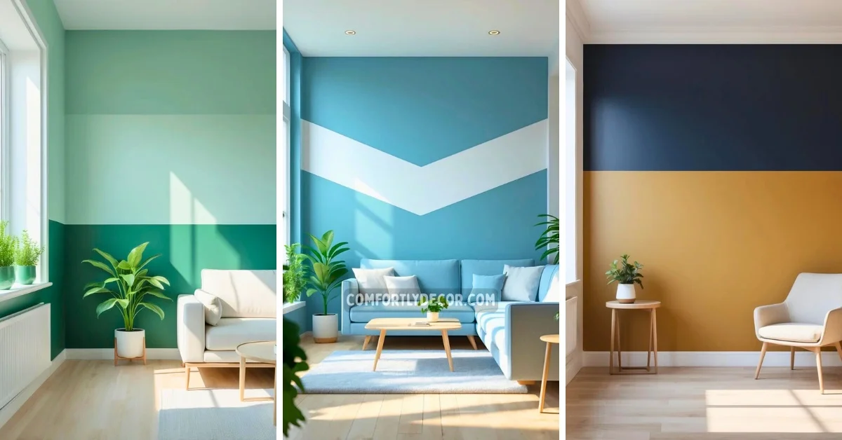
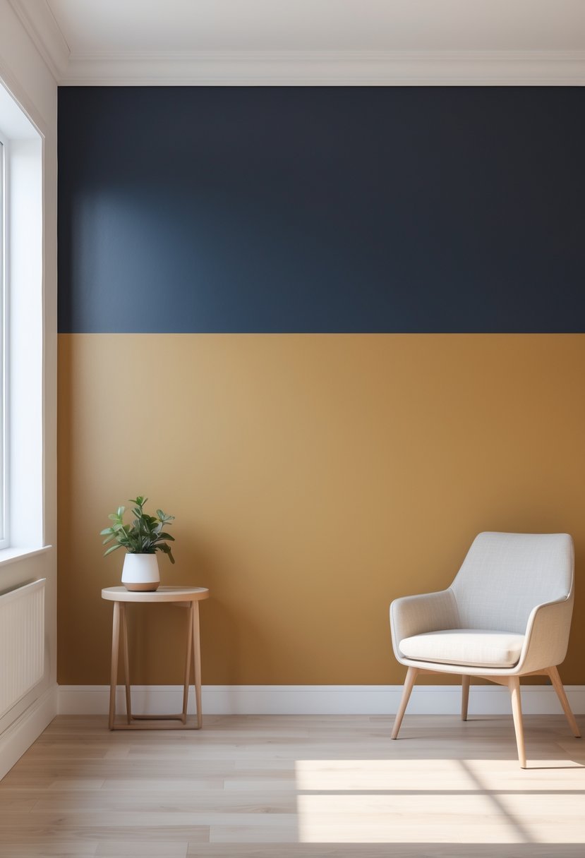
1. Classic Horizontal Split with Light Top and Dark Bottom
I find the classic horizontal split to be one of the most effective two-tone wall designs. Painting the top half in a lighter shade helps draw the eye upward, making ceilings feel higher and the room more open.
The darker color on the bottom grounds the space, giving it a balanced and sophisticated look. This approach works well in nearly any room and offers both visual interest and a subtle sense of dimension.
2. Bold Vertical Divide in Contrasting Colors
I find that a bold vertical divide using contrasting colors creates a striking statement. This technique splits the wall into two distinct sections, often with one vibrant and one neutral tone.
It adds height and drama to the room without overwhelming the space. I like how it frames furniture or architectural details effectively. It’s a simple way to add personality while keeping the design balanced.
3. Soft Pastel Duo for a Calm Bedroom
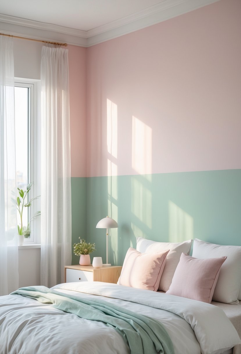
I find that soft pastel combinations create a soothing and peaceful bedroom atmosphere. Using gentle hues like light pinks and blues together adds subtle depth without overwhelming the space.
This pairing works well for anyone wanting a calm retreat. The colors blend smoothly, making the room feel balanced and inviting.
In my experience, pastels are versatile enough to complement many décor styles. They offer a delicate yet modern aesthetic that promotes relaxation and rest.
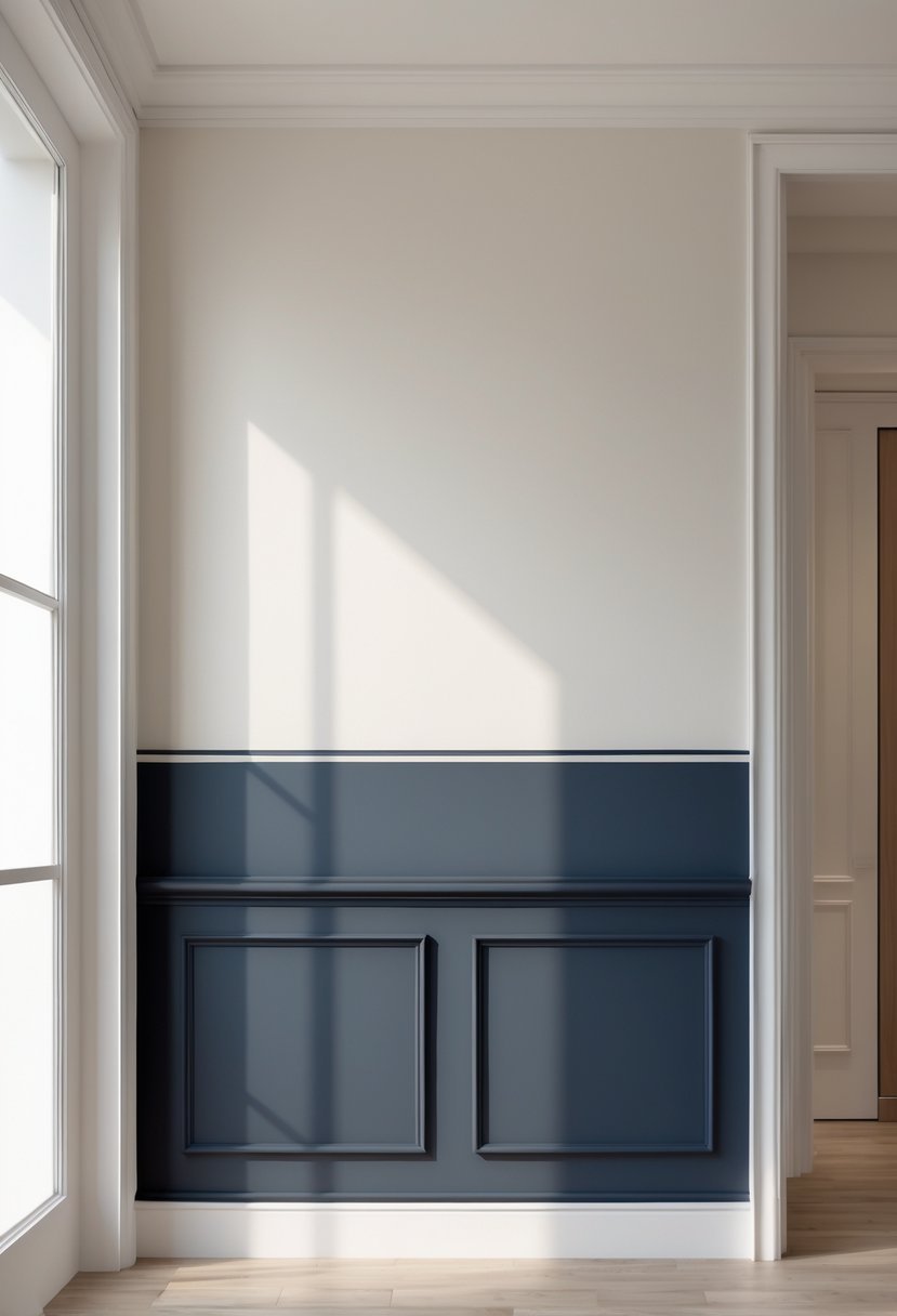
4. Deep Navy and Crisp White Combo
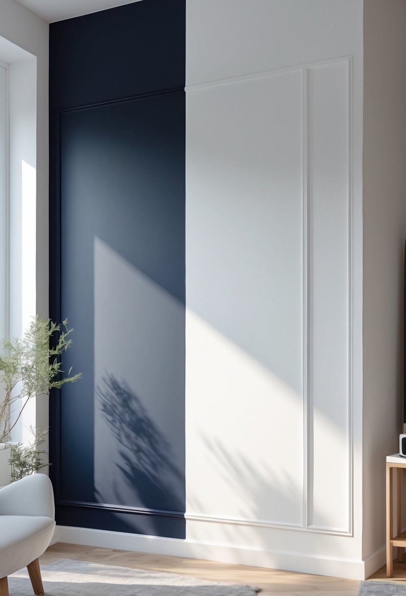
I find the deep navy and crisp white combination both striking and balanced. The navy adds depth and richness, while the white brings brightness and clarity to the space.
This pairing works well in a variety of rooms, from living areas to bedrooms. It creates a classic, timeless look without feeling dull.
I often suggest using the white to highlight architectural features like trims or wainscoting. This contrast adds clean lines and elegance, enhancing the overall design.
5. Warm Taupe Paired with Gentle Cream
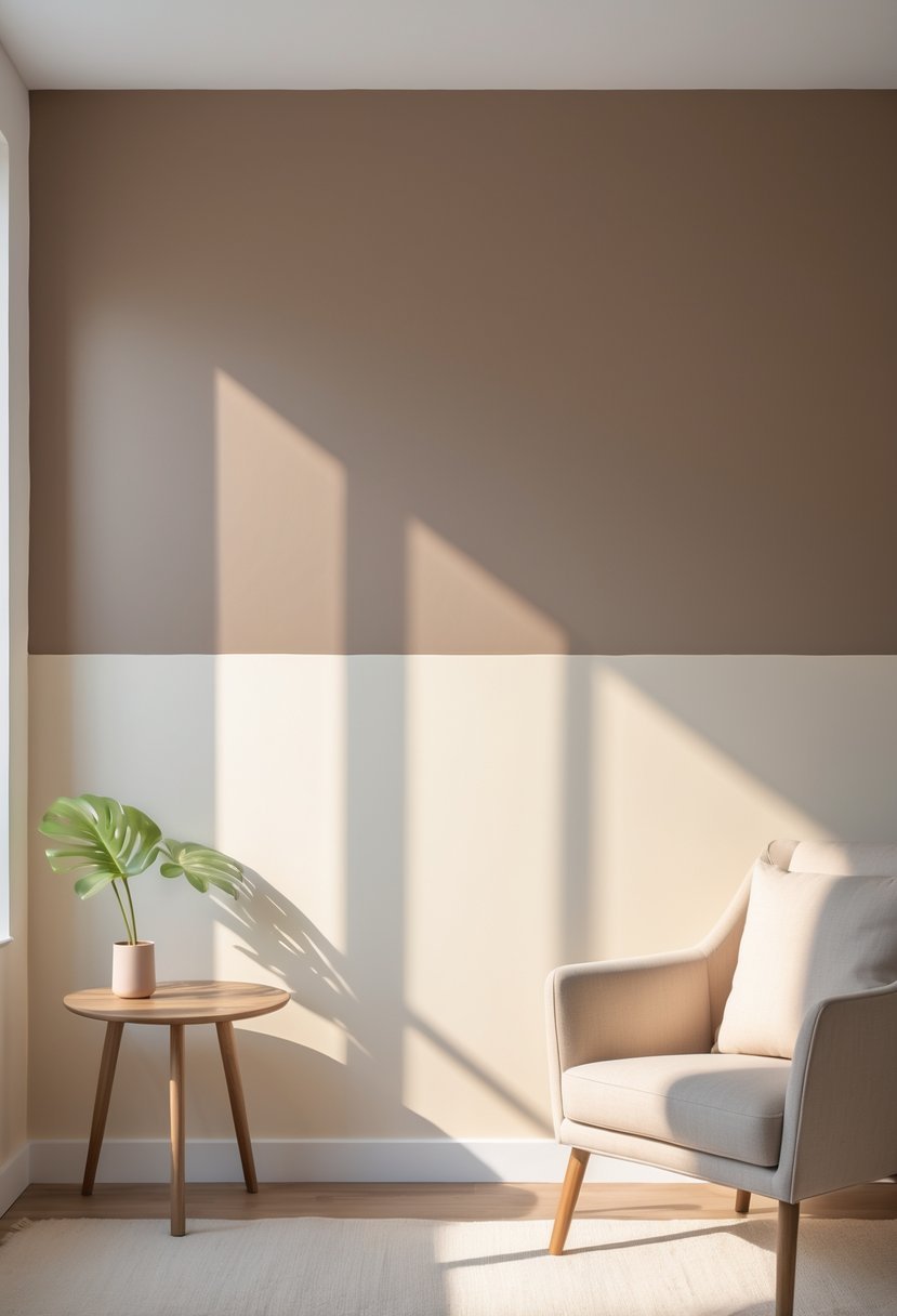
I find warm taupe combined with gentle cream creates a balanced and inviting atmosphere. The taupe provides depth while the cream softens the overall look. This pairing works well in living rooms and bedrooms where a calm, cozy feel is desired.
Using cream on the upper half and warm taupe below adds subtle contrast without overwhelming the space. It’s an elegant yet simple way to refresh a room with neutral tones. Painter’s tape helps achieve clean lines for a polished finish.
6. Charcoal Gray with Muted Blush Accent
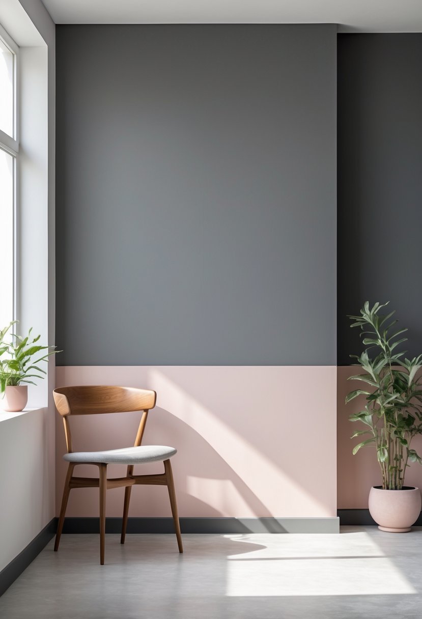
I find charcoal gray paired with muted blush creates a refined contrast. The deep, neutral tone of charcoal grounds the softness of blush, balancing warmth with sophistication.
This combination works well in living rooms or bedrooms where you want subtle elegance without overpowering color. Using matte finishes enhances the smooth, modern feel.
Adding this two-tone mix can refresh a space while keeping it calm and inviting. It’s a simple yet effective way to update walls with understated style.
7. Emerald Green and Pale Mint Blend
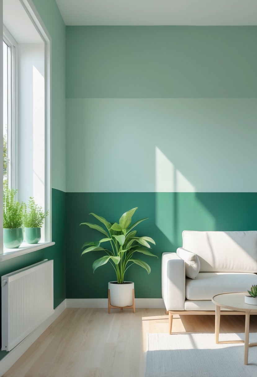
I find the combination of emerald green and pale mint particularly striking. The rich, deep tone of emerald brings sophistication, while pale mint adds a refreshing, light touch.
This blend works well in living rooms or offices where you want a balance of energy and calm. It pairs nicely with natural wood or metallic accents, enhancing the room’s elegance without overwhelming the space.
8. Rich Burgundy and Soft Beige Pair
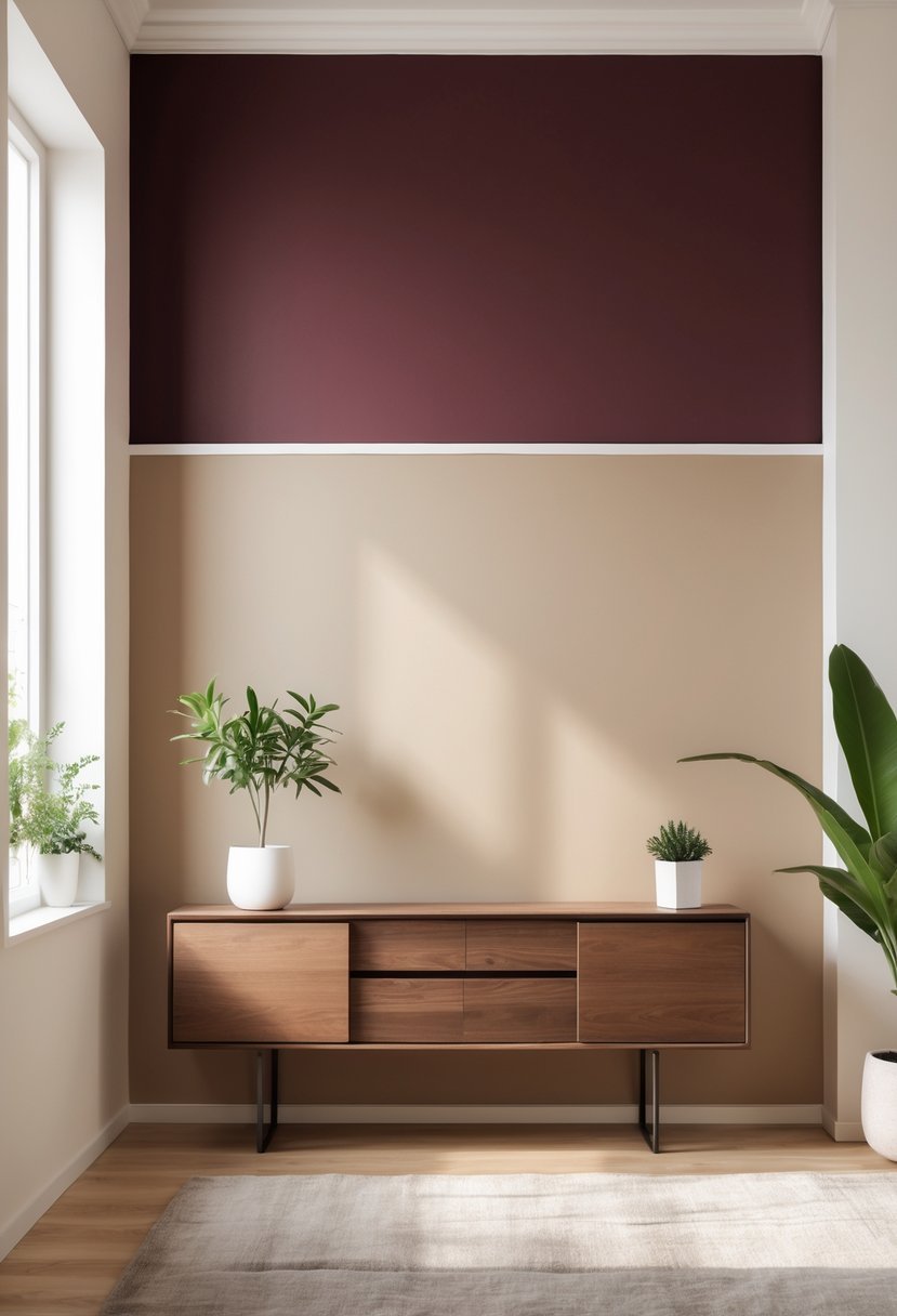
I often choose rich burgundy paired with soft beige for a balanced, inviting look. The deep burgundy adds warmth and depth, while the beige keeps the space feeling light and open.
This combination works well in living rooms and bedrooms. I especially like painting the lower half of a wall burgundy and the upper half beige to create a cozy yet elegant atmosphere.
9. Two-Tone Wall with Textured Paint Accent
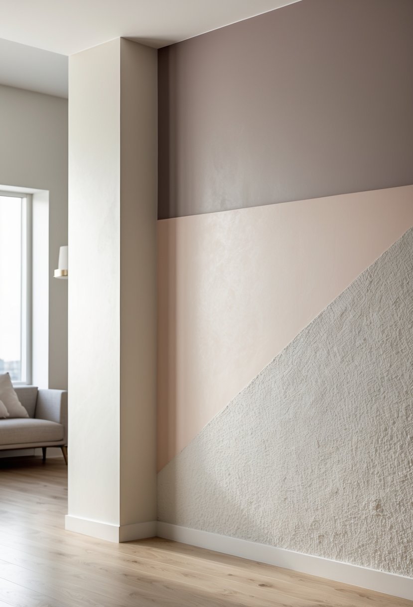
I like how textured paint adds dimension when paired with a smooth two-tone design. It breaks the flatness without overwhelming the space.
Using textured paint on one section creates a subtle focal point. This approach works well in living rooms or bedrooms where you want a bit of visual interest but still keep it calm.
The contrast between matte and textured finishes can highlight architectural features or create a modern look with minimal effort. It’s a smart way to elevate simple color combinations.
10. Sunset Orange with Neutral Gray Balance
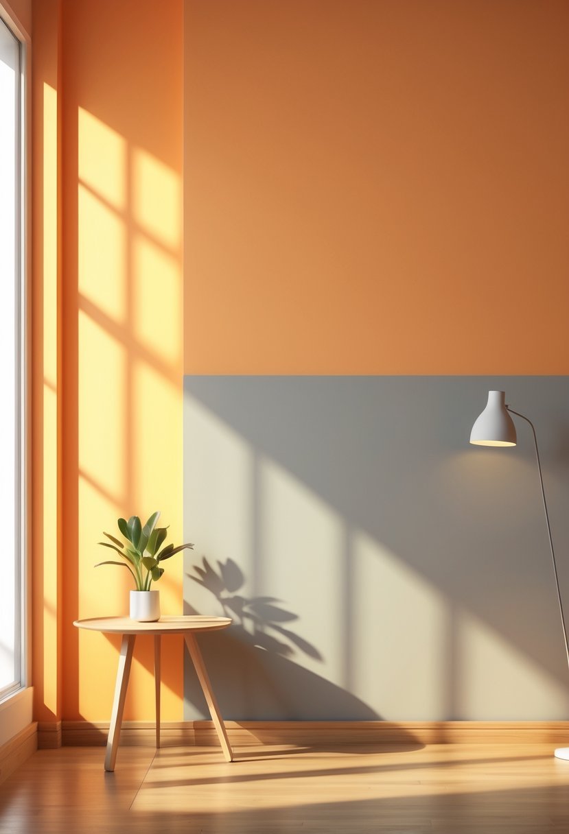
I find that pairing sunset orange with a neutral gray creates a balanced and inviting atmosphere. The warmth of the orange energizes the space without overwhelming it, thanks to the calming effect of gray.
This combination works well in living rooms or kitchens where you want a lively yet sophisticated look. Using matte or satin finishes enhances the colors’ natural contrast, making the walls visually appealing without feeling too bold.
11. Matte Black Lower Wall with Glossy White Upper
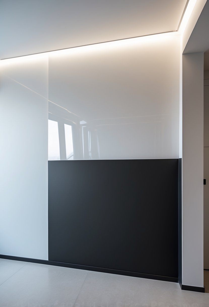
I find that pairing a matte black lower wall with a glossy white upper section creates a striking balance. The black grounds the room, adding depth and drama without overwhelming the space.
The glossy white above reflects light, making the area feel more open and airy. This contrast also adds texture, giving the walls a subtle but impactful visual interest. I recommend this combo for modern interiors seeking a clean yet bold look.
12. Olive Green and Warm Tan Combination
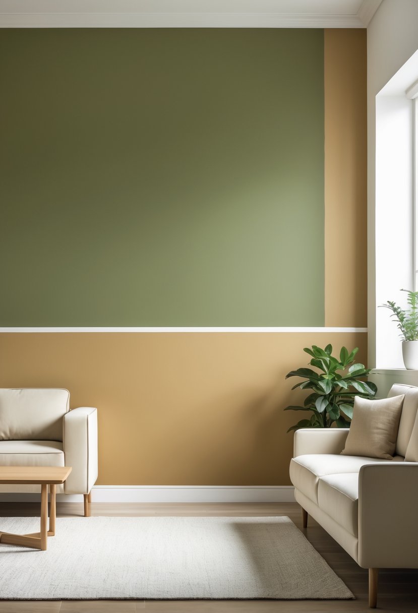
I find the olive green and warm tan pairing creates a balanced, inviting space. The cool, earthy tone of olive green pairs well with the soft, neutral warmth of tan. This combination feels both modern and timeless.
Using olive green on the upper wall and warm tan below adds depth without overpowering the room. It works especially well in living rooms or bedrooms where comfort matters. I often recommend this combo for a soothing yet stylish atmosphere.
13. Powder Blue with White Chevron Accent
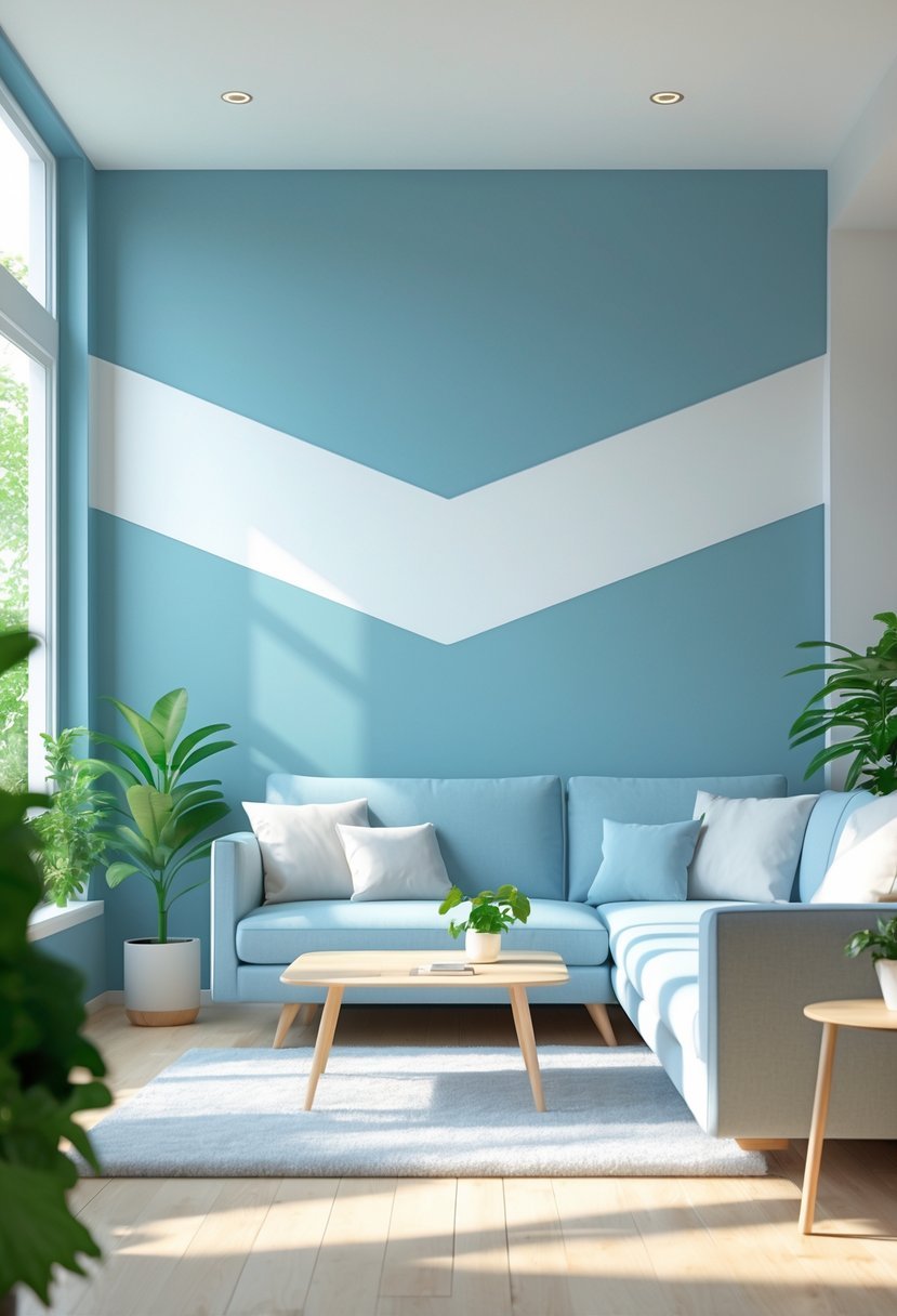
I find that powder blue paired with a white chevron accent creates a calm yet visually interesting wall design. The softness of powder blue sets a serene base, while the sharp chevron pattern adds modern texture and rhythm.
This combination works well in bedrooms or living rooms where a balance of relaxation and style is needed. It also helps break up a plain wall without overwhelming the space, maintaining a fresh and clean appearance. I recommend using crisp white for the chevron to keep the contrast clear and sharp.
14. Warm Terracotta with Cool Stone Above
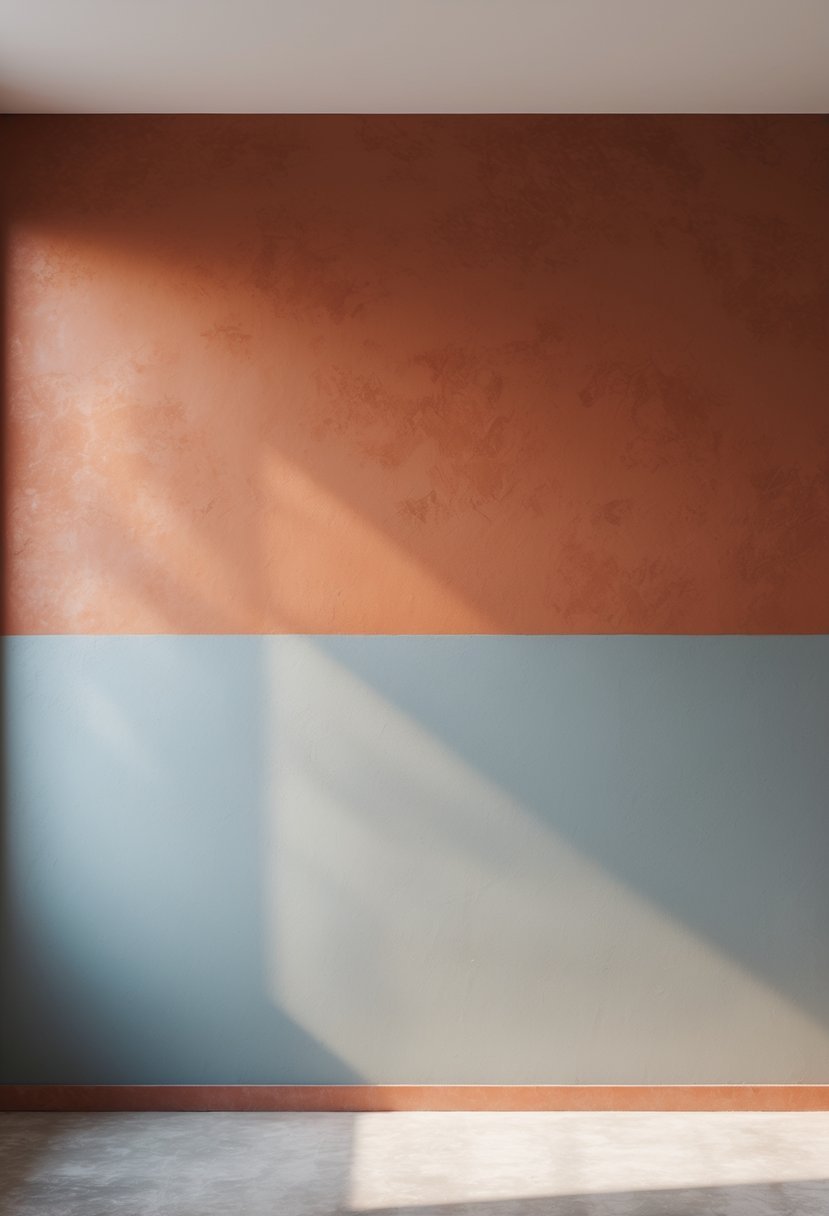
I find the combination of warm terracotta and cool stone incredibly balanced. The terracotta at the bottom brings warmth and coziness, grounding the space with its earthy tone. Above, the cool stone offers a sharp contrast, adding texture and a refreshing coolness that prevents the warm shade from feeling overwhelming.
This pairing works well in living rooms or lounges where you want both comfort and sophistication. It creates depth without being too bold, making the space feel inviting yet modern.
15. Monochromatic Shades of Blue Split Design
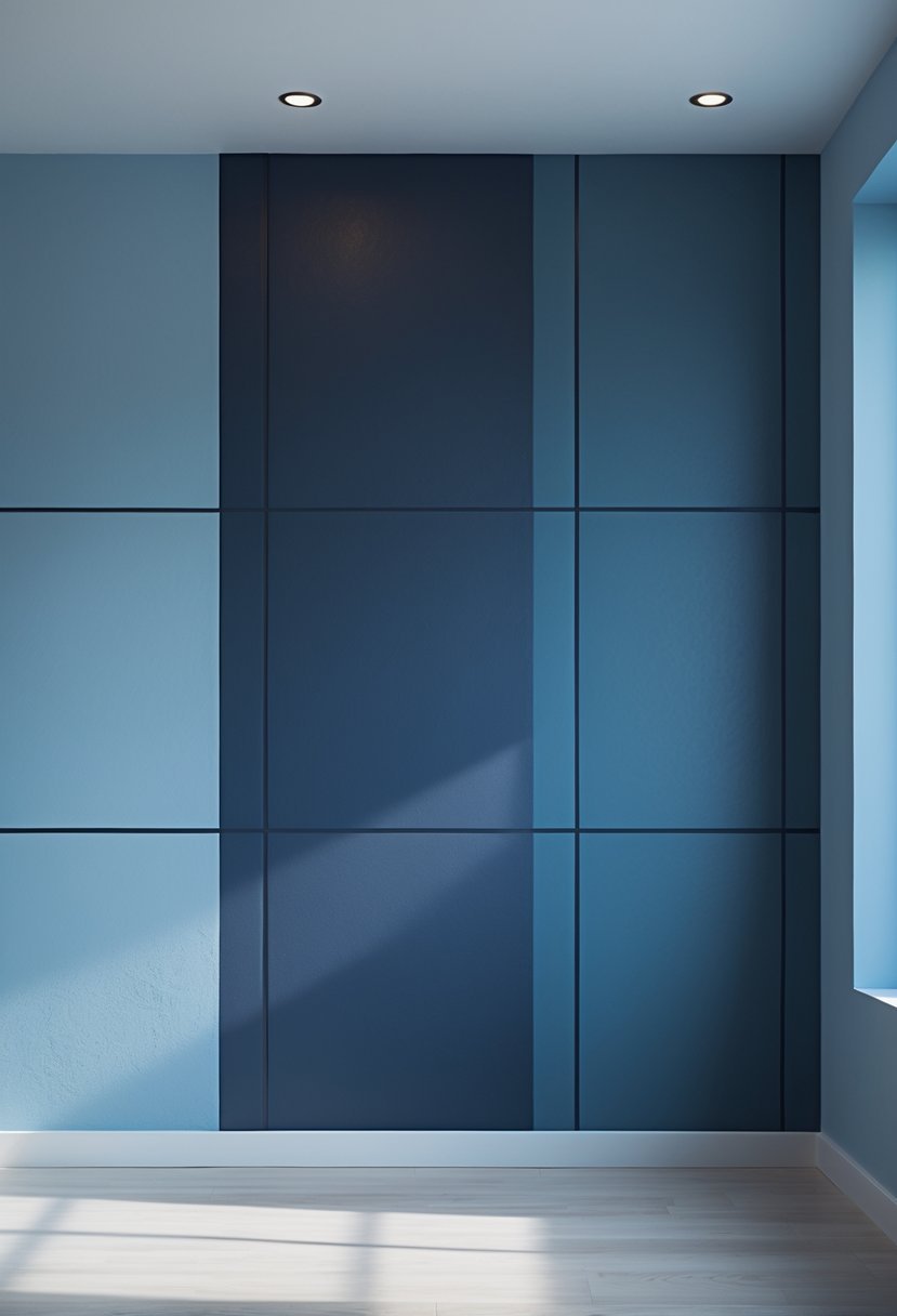
I find the monochromatic blue split design both calming and visually appealing. Using lighter and darker blue shades on separate wall sections creates depth without overwhelming the space. This approach balances subtle contrast with harmony.
In my experience, the lighter blue on top opens the room, while the darker shade on the bottom grounds it. This design works well in bedrooms or living rooms where a peaceful atmosphere is desired. It’s a simple way to add style through color variation within the same hue.
16. Dusty Rose and Light Gray Horizontal Mix
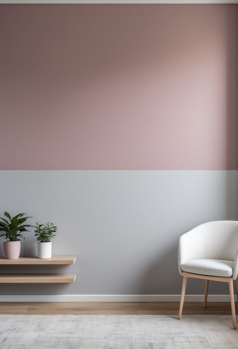
I find the combination of dusty rose and light gray creates a balanced, calming effect. The horizontal divide adds visual interest without overwhelming the space.
This mix works well in bedrooms and living rooms, where a soft yet modern look is desired. The muted tones complement each other, making the room feel warm but subtle.
I like how dusty rose adds warmth, while light gray provides a neutral base. Together, they create depth and a sophisticated, gentle contrast.
17. Classic Navy and Mustard Yellow Contrast
I find the navy and mustard yellow combination timeless and effective. Navy offers a deep, calming base, while mustard injects warmth and energy without overwhelming the space.
Using navy on larger surfaces, like walls, and adding mustard accents creates balance and visual interest. This duo works well in living rooms or bedrooms where you want a bold yet sophisticated look. The contrast feels dynamic but never chaotic.
18. Mocha Brown and Off-White Circular Pattern
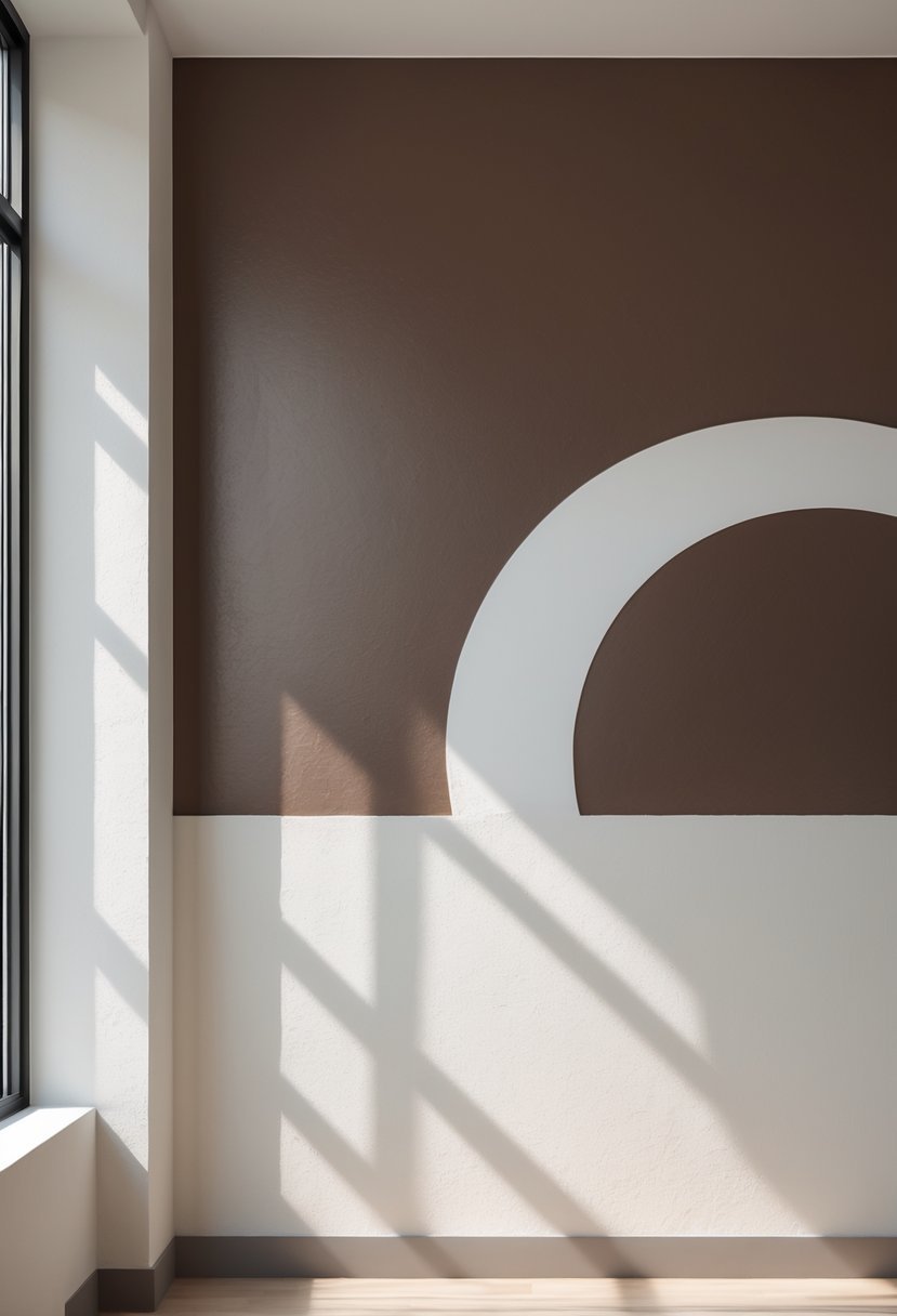
I appreciate how mocha brown pairs beautifully with off-white to create a warm but clean look. Using circular patterns adds an interesting dynamic that breaks away from straight lines and adds subtle movement to the wall.
This combination works well in living rooms or bedrooms, where the soft mocha tones provide coziness and the off-white keeps the space feeling open. The circular design brings a modern touch without being overpowering.
19. Subtle Lavender Paired with Soft Taupe
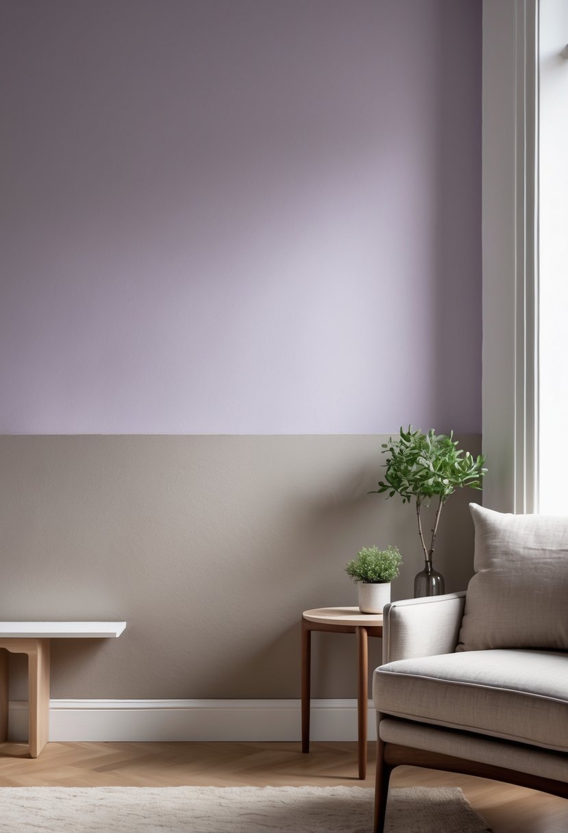
I find the combination of subtle lavender and soft taupe to be both calming and sophisticated. Lavender adds a gentle hint of color that soothes the mind, while taupe grounds the space with its neutral warmth.
This pairing works well in bedrooms or living areas where a relaxed, inviting atmosphere is desired. The colors complement each other without overwhelming the room, creating a balanced and peaceful environment.
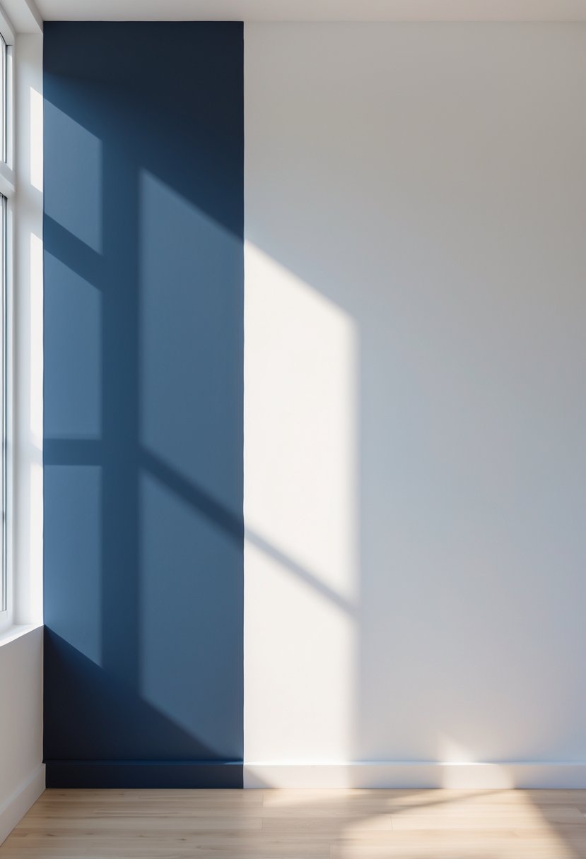
20. Mint Green and Pure White Vertical Stripe

I find the mint green and pure white vertical stripe a fresh and clean choice for any room. The coolness of mint green pairs well with the brightness of white, creating a balanced contrast.
Vertical stripes also add height to the space, making ceilings feel taller. This design works especially well in bedrooms or kitchens where a calm, airy atmosphere is desired. The simplicity of the two colors keeps it modern and versatile.
Planning 2 Tone Wall Paint Ideas Before Painting
When I work with 2 tone wall paint ideas, I always start by deciding which color will be dominant and which will support it. I look at the size of the room and how light enters the space. Large bright rooms allow stronger contrast. Smaller rooms need softer separation so the walls do not feel heavy.
How I Choose the Best Color Balance
Good balance is what makes 2 tone wall paint ideas look intentional instead of random.
- I pair one deep shade with one light shade
- I avoid using two bold colors on large wall areas
- I match the tones with furniture and flooring before painting
How I Create Clean Paint Lines
Sharp separation is what makes two tone walls look professional.
- I measure the split carefully before applying tape
- I press the tape edges firmly to stop paint bleed
- I remove tape only after the second coat becomes slightly set
How I Decide Between Horizontal and Vertical Designs
Layout direction changes how the room feels.
- Horizontal designs make ceilings feel taller
- Vertical designs add drama and visual height
- Patterned splits work best as accent walls
How I Keep 2 Tone Wall Paint Ideas From Feeling Busy
I always simplify the rest of the room to support the wall design.
- I limit strong decor near bold walls
- I repeat one wall color lightly in pillows or art
- I use neutral furniture to keep balance
FAQs
Why 2 Tone Wall Paint Ideas Add Depth Without Complexity
2 tone wall paint ideas allow me to transform simple rooms into modern and stylish spaces without complicated designs. With the right balance of color, layout, and clean separation, the walls become a feature that adds depth and character while still feeling calm and organized.

I am Mindy Medford, a home décor, paint, and design specialist with over a decade of hands-on experience transforming ordinary spaces into cozy, personality-packed havens. Since 2013, I have been helping homeowners discover the art of beautiful yet practical design. I share my love for color, texture, and layout—making stylish interiors & exteriors feel achievable for everyone. Whether it’s picking the perfect paint shade or reimagining a small space, I’m here to guide and inspire.