6 Ways to Choose Wall Art That Actually Matches Your Paint Colors
Picking a paint color is the easy part. The harder part is finding art that looks like it belongs on that wall instead of like it wandered in from a different house. I’ve redone the same gallery wall three times chasing this, and the fix was never a better print, it was a better process for choosing one. Here’s what actually works, in the order I’d tackle it.
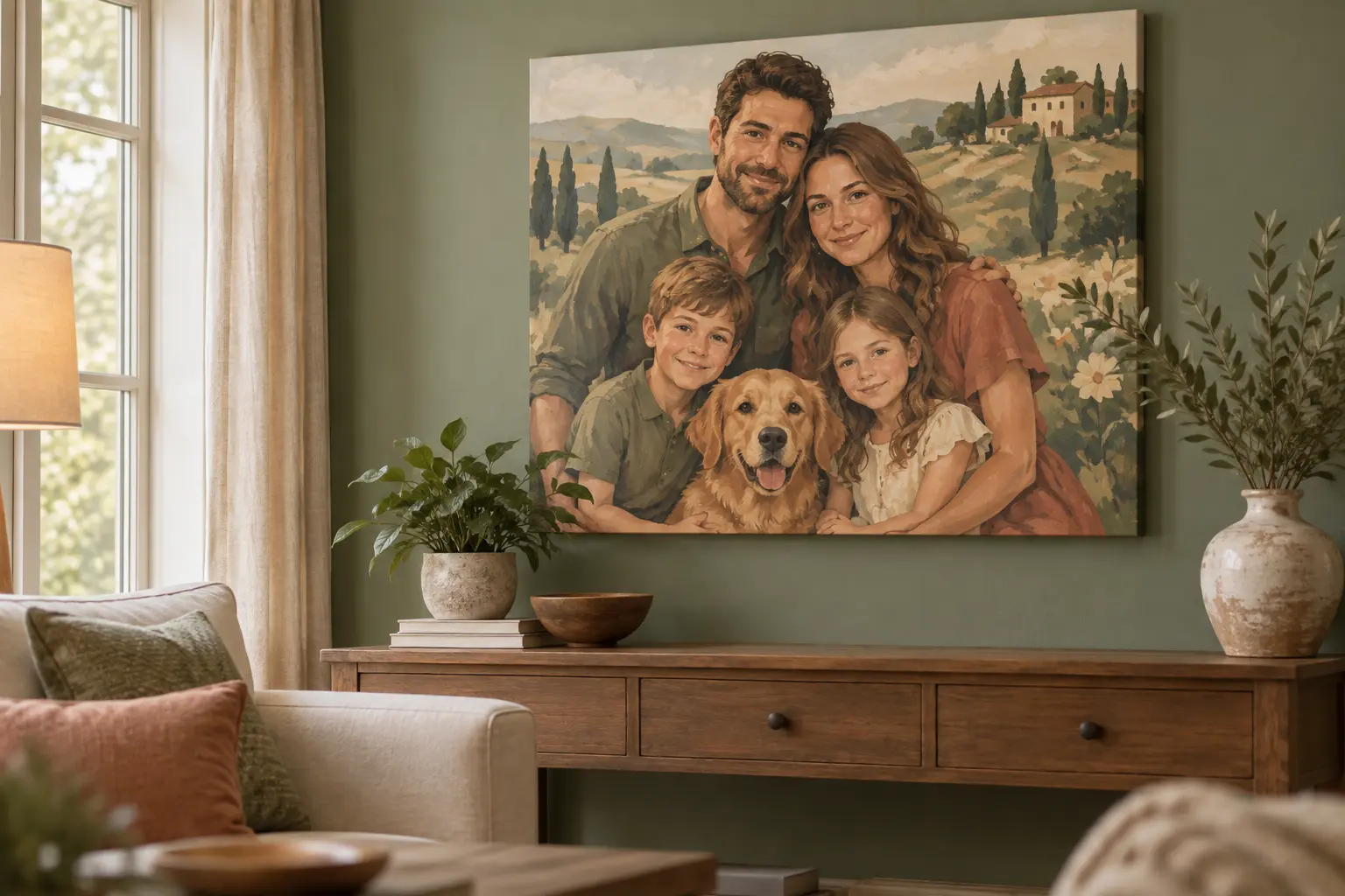
One option I keep coming back to is starting from a photo you already love instead of a print you don’t. Building a custom kit made from your own photo lets you design the art around your wall color instead of hunting for a print that happens to match it, and most versions let you preview the color palette before you order, so you’re not gambling on a canvas that clashes the second it’s hung.
1. Match the undertone, not the paint chip name
Undertone is the secondary hue hiding underneath a paint’s main color, and it’s usually invisible until two similar-looking neutrals are compared side by side in the same light. It’s the undertone, not the paint chip’s printed name, that decides whether your art reads as coordinated or slightly off. Hold the paint chip next to a white sheet of paper in daylight: greige leans green or pink, “warm white” leans yellow or peach, and true gray usually has a blue or violet cast. Once you know the undertone, look for that same undertone somewhere in the art, even in a small accent, rather than trying to match the exact hue.
This is also why two rooms painted the “same” neutral from different brands can feel like they belong to different houses. The undertone shifts even when the paint name sounds identical, so match by eye in the room’s actual light rather than trusting the name on the can.
2. Pull one color from the boldest object already in the room
Instead of shopping for art first, look at the room. A rug, a throw pillow, or even a stack of books usually has one strong color in it already. Pick that color as the anchor and choose or commission art that repeats it somewhere, even in a small patch. It reads as intentional in a way that four unrelated prints from four different stores never quite manage.
Photograph the room and the print side by side on your phone before buying. It sounds like an extra step, but it flattens both colors into the same lighting and screen, which makes a mismatch obvious in a way it never is standing in a bright store aisle. My own anchor color turned out to be a rust-colored throw blanket that had been sitting on the couch for two years before I noticed it was doing most of the work in the room already.
3. Warm palettes and cool palettes don’t mix well as neighbors
Terracotta, mustard, and olive read warm. Sage, dusty blue, and lavender read cool, even though sage has green in it. Hanging a warm-toned piece next to a cool-toned wall usually looks like a mistake rather than a choice, even when the individual colors are pretty. If you’re building a gallery wall across two different paint colors in adjoining rooms, keep the temperature consistent piece to piece, and let the wall color be the thing that shifts.
The easiest way to check this quickly: squint at the wall and the art together. Squinting blurs out detail and leaves mostly color temperature, so a clash that’s subtle at full focus usually jumps out right away.
| Warm wall colors | Pairs well with | Avoid pairing with |
|---|---|---|
| Terracotta, rust, mustard | Warm neutrals, gold frames, cream mats | Cool sage, icy blue, silver frames |
| Olive, warm gold | Earthy browns, warm cream, brass | Cool gray, lavender |
| Cool wall colors | ||
| Sage, eucalyptus green | Dusty blue, warm cream (as relief), black frames | Terracotta, mustard |
| Dusty blue, slate | Cool gray, white, silver frames | Rust, gold-heavy pieces |
4. Use the 60-30-10 rule so the art doesn’t have to do all the work
Interior designers lean on a rough 60-30-10 split: 60% dominant color (usually the walls and big furniture), 30% secondary color, and 10% accent. Your art is almost always part of that 10%, which means it doesn’t need to match the wall exactly.
It needs to echo either the 60% or the 30% somewhere in the piece. Trying to match the wall color one-to-one is actually the mistake; a slightly bolder or slightly muted version of it reads as more finished.
5. Color has a real effect on mood, so pick the room’s job first
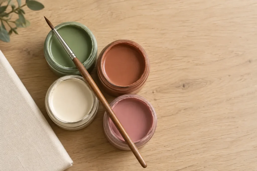
This isn’t just a decorating opinion. A study out of the University of Bologna and University of Pisa, which looked at students living in color-varied dorm rooms, found that blue interiors were linked to a calmer mood and were considered to help with focused studying, while warmer colors read as more energizing (source: PMC, National Library of Medicine). Before you match anything, decide what the room needs to do. A home office probably wants the calmer end of your palette; a dining room can carry more of the energizing end.
It’s worth deciding this before you fall in love with a specific piece of art, not after. A gorgeous bold-red canvas is a much easier “no” in the store than it is once it’s already leaning against your bedroom wall.
6. No photo yet? Start from a ready-made piece in your palette
If you don’t have a photo you’re ready to commit to a wall, you don’t have to wait. Ready-made paint by numbers kits for adults come in more color families than most people expect, from muted earth tones to saturated jewel colors, so it’s worth browsing before assuming you need a custom order. Picking one that already leans into your room’s dominant hue is a fast way to slot in coordinated art without starting a whole photo-selection project first.
While you’re at it, look at the canvas itself and not just the printed colors. Davincified prints its canvases on linen that arrives wrinkle-free, which matters more than it sounds once you’re the one trying to flatten a creased canvas before hanging it.
A Quick Checklist Before You Hang Anything
Identify your wall’s undertone in daylight, not under a lamp. Pick one anchor color already living in the room. Keep warm and cool pieces separated rather than side by side. Let the art echo the 60% or 30% color, not match it exactly. Decide the room’s job (calm vs. energizing) before you commit to a palette. If you’re not ready to commit to a photo, start from a ready-made piece close to your palette and adjust the room around it.
None of this needs to be perfect on the first try. Move one piece, swap one pillow, and the whole wall usually clicks into place faster than you’d think.

I am Mindy Medford, a home décor, paint, and design specialist with over a decade of hands-on experience transforming ordinary spaces into cozy, personality-packed havens. Since 2013, I have been helping homeowners discover the art of beautiful yet practical design. I share my love for color, texture, and layout—making stylish interiors & exteriors feel achievable for everyone. Whether it’s picking the perfect paint shade or reimagining a small space, I’m here to guide and inspire.