25 Best Paint Colors For Front Door That’ll Make Neighbors Stop and Stare
Your front door is basically the first impression your home makes—no pressure, right? 🙂 Whether you’re planning a complete door makeover or just want to refresh your curb appeal, choosing the perfect front door color can feel overwhelming. Trust me, I’ve been there, standing in the paint aisle for what felt like hours, holding up color swatches and second-guessing every choice.
But here’s the thing: the best front door colors aren’t just about following trends (though we’ll cover those too). They’re about finding that perfect shade that complements your home’s style, reflects your personality, and maybe—just maybe—makes you smile every time you come home.
After testing countless colors on my own front door and helping friends with their door makeovers, I’ve compiled this list of 25 show-stopping front door paint colors that actually work in real life.
25 Paint Colors For Front Door
Ready to give your entrance the glow-up it deserves? Let’s jump into these game-changing color choices that’ll transform your front door from “meh” to “wow.”
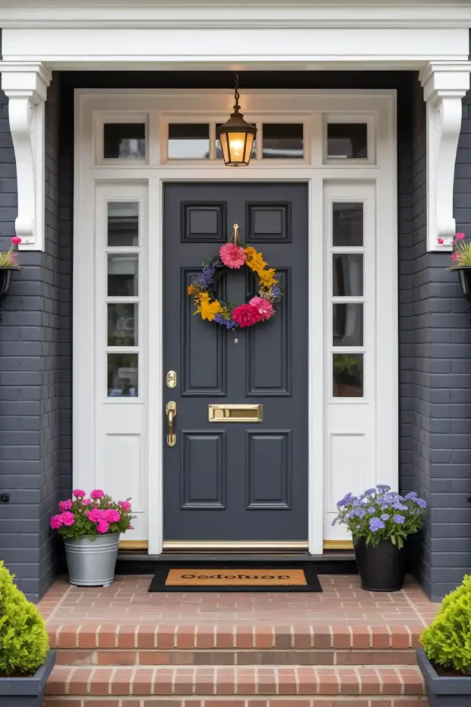
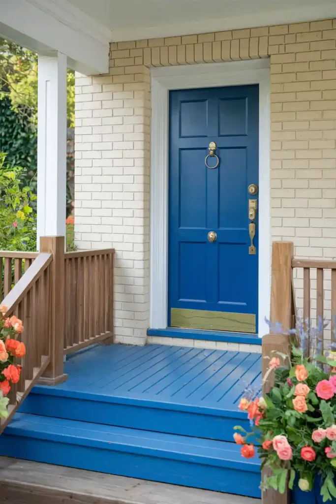
#1. Classic Navy Blue
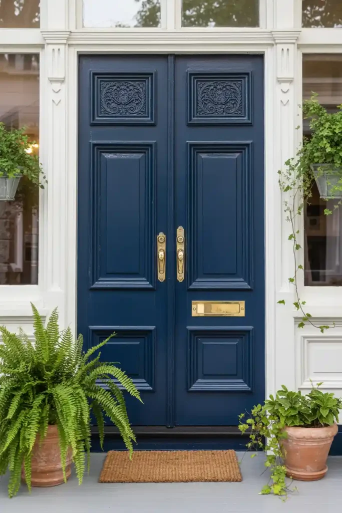
Navy blue remains the undisputed champion of front door colors, and honestly, I get why. This sophisticated shade works with virtually every home style, from traditional colonials to modern farmhouses. Navy creates that perfect balance between bold and timeless—it’s confident without being flashy.
Styling Tips:
- Pair with crisp white trim and brass hardware for a nautical-inspired look
- Add a natural jute doormat and potted greenery for warmth
- Consider matching navy shutters for a cohesive appearance
- Works beautifully with gray, beige, or white exterior walls
Pro Tip: Choose a navy with slight gray undertones rather than pure navy—it photographs better and looks less harsh in direct sunlight. Sherwin Williams Naval is my go-to recommendation.
#2. Deep Forest Green
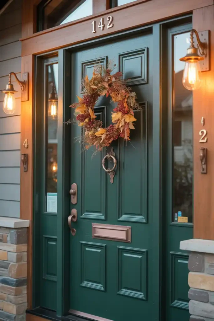
Forest green brings an organic, earthy elegance that never goes out of style. This color literally makes your home feel more connected to nature, which is probably why it’s been climbing the popularity charts lately. I’ve seen this shade transform even the most basic ranch-style homes into something magazine-worthy.
Styling Tips:
- Complement with copper or oil-rubbed bronze hardware
- Add seasonal wreaths—they pop beautifully against the green backdrop
- Pair with warm wood accents or natural stone elements
- Consider cream or warm white for contrasting trim
Bonus Tip: Forest green hides dirt and wear better than lighter colors, making it perfect for busy households. Plus, it looks gorgeous in both summer and winter lighting.
#3. Cheerful Yellow
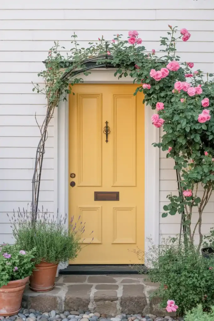
Yellow front doors are like sunshine for your home’s exterior—instant mood boosters that never fail to make people smile. I’ll be honest, yellow can be tricky to pull off, but when done right, it creates the most welcoming entrance imaginable. Think French countryside meets cozy cottage vibes.
Styling Tips:
- Balance with white or light gray exterior walls
- Add black hardware for striking contrast
- Plant purple or blue flowers nearby for complementary color pop
- Use natural wood elements to warm up the overall look
Additional Tip: Go for a muted, buttery yellow rather than neon bright—it’s more sophisticated and won’t clash with seasonal decorations. Benjamin Moore Hawthorne Yellow is absolutely gorgeous.
#4. Bold Black
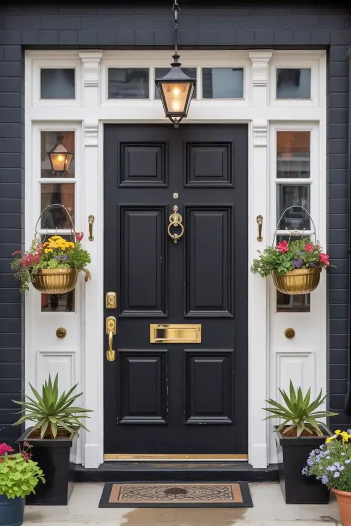
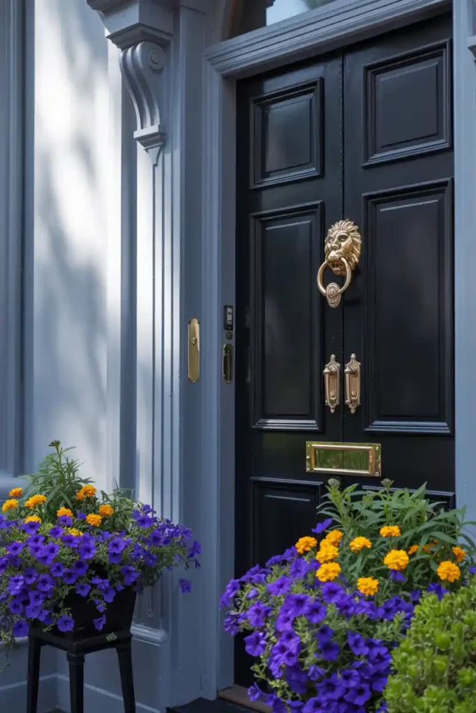
Black doors are the little black dress of home exteriors—elegant, versatile, and always appropriate. This color works especially well if you want to make a statement without going too colorful. FYI, black also makes your entrance feel more formal and sophisticated.
Styling Tips:
- Polish with brass or chrome hardware for maximum impact
- Add colorful planters or seasonal flowers for contrast
- Consider a bold door knocker as a focal point
- Pair with any exterior color—seriously, black goes with everything
Pro Tip: Use high-quality paint with UV protection because black can fade and show wear more easily than other colors. The investment is worth it for that glossy, elegant finish.
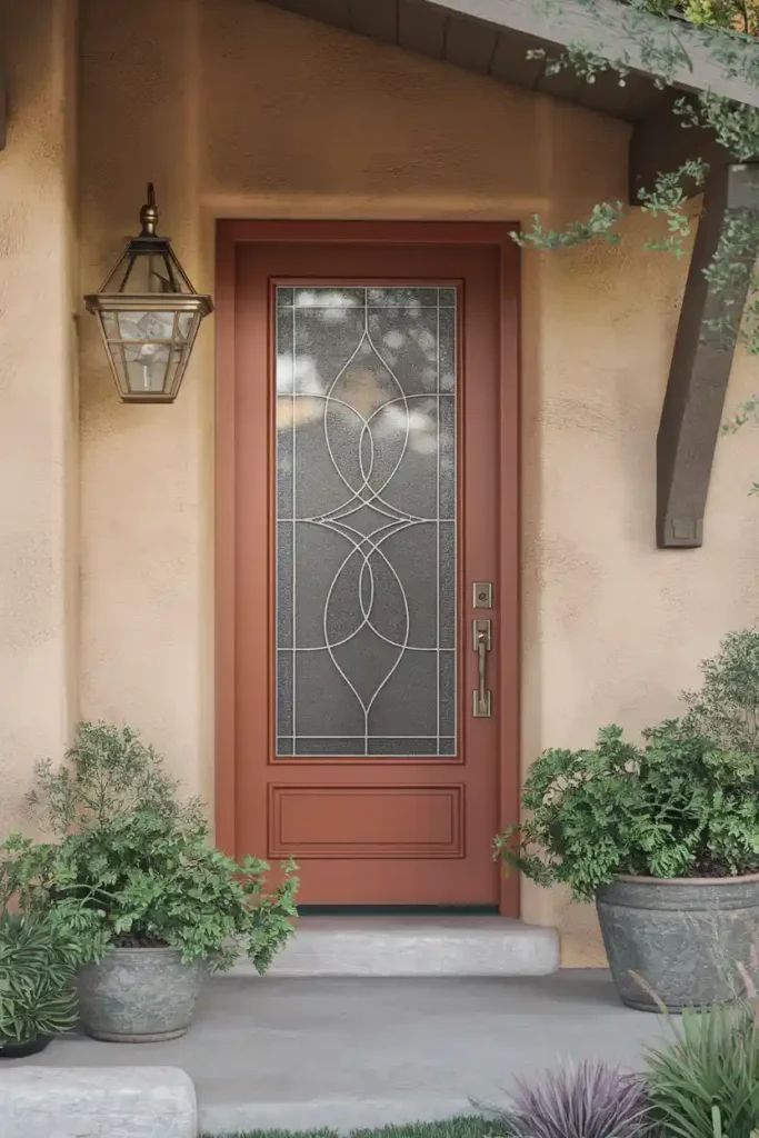
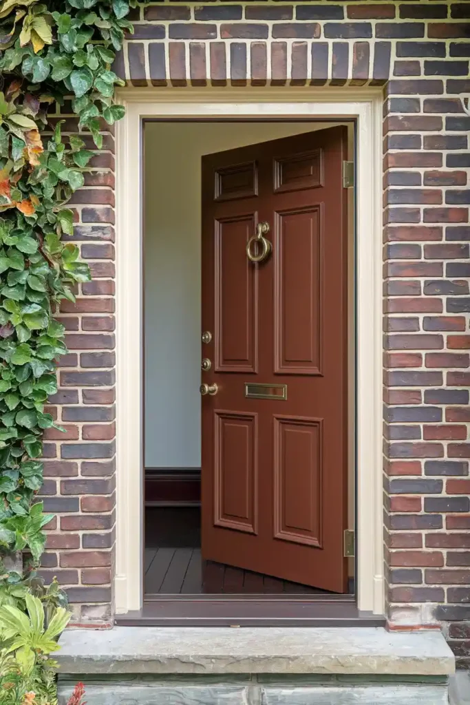
#5. Warm Brick Red
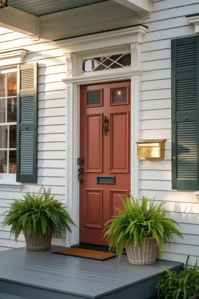
Brick red brings warmth and traditional charm that feels both classic and welcoming. This color has serious staying power—I’ve seen homes with brick red doors that still look fresh and relevant decades later. It’s particularly stunning on colonial and craftsman-style homes.
Styling Tips:
- Complement with black or dark green shutters
- Add brass mailbox and door hardware
- Use natural materials like wicker baskets and wooden planters
- Pair beautifully with white, cream, or gray exterior walls
Bonus Tip: Brick red works year-round with seasonal decorations—pumpkins in fall, evergreen wreaths in winter, and bright flowers in spring all look amazing against this backdrop.
#6. Sophisticated Charcoal Gray
Charcoal gray is having a major moment, and for good reason. It’s modern yet timeless, dramatic yet neutral. This color works particularly well on contemporary homes but can also add a fresh twist to traditional styles.
Styling Tips:
- Add pops of color with bright flowers or accessories
- Use stainless steel or brushed nickel hardware
- Consider a colorful doormat for personality
- Looks stunning with white trim and black accents
Additional Tip: Charcoal gray is incredibly forgiving—it hides fingerprints, scuffs, and dirt while still looking polished and intentional.
#7. Vibrant Turquoise
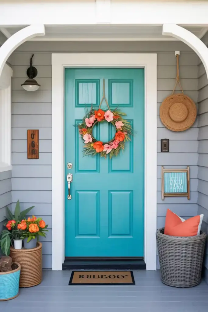
Turquoise doors bring that beachy, vacation vibe right to your front entrance. This color is bold, fun, and guaranteed to make your home stand out in the neighborhood. Perfect if you want to inject some personality and joy into your curb appeal.
Styling Tips:
- Pair with white or light gray exterior walls
- Add coral or orange accents through flowers or accessories
- Use natural textures like rope, rattan, or driftwood
- Consider silver or white hardware to keep it fresh
Pro Tip: Turquoise can look different throughout the day as lighting changes, so test your chosen shade at various times before committing. The payoff is worth the extra effort!
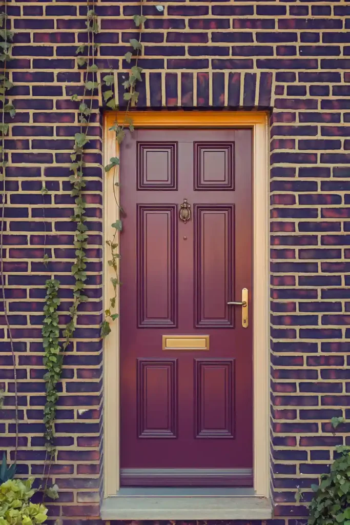
#8. Rich Burgundy
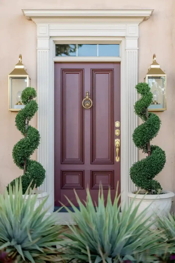
Burgundy doors exude sophistication and warmth, creating an entrance that feels both elegant and inviting. This deep red works beautifully on traditional homes and adds unexpected richness to modern styles too.
Styling Tips:
- Complement with gold or brass hardware
- Add cream or ivory accents through trim or accessories
- Use deep green foliage for a classic color combination
- Consider matching or coordinating window boxes
Bonus Tip: Burgundy pairs beautifully with fall decorations but looks equally stunning with spring flowers—it’s more versatile than you might think.
#9. Crisp White
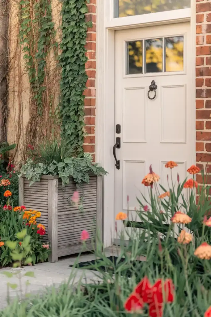
White doors might seem boring, but hear me out—they’re anything but basic when done right. White creates a clean, fresh look that makes your home feel larger and brighter. Plus, it’s the ultimate backdrop for seasonal decorations.
Styling Tips:
- Add colorful flowers and plants for contrast
- Use black or dark bronze hardware for definition
- Consider textured elements like wreaths or planters
- Pair with colorful trim for unexpected personality
Additional Tip: Choose a white with warm undertones rather than stark white—it feels more welcoming and less sterile. Cloud White by Benjamin Moore is perfection.
#10. Sunny Orange
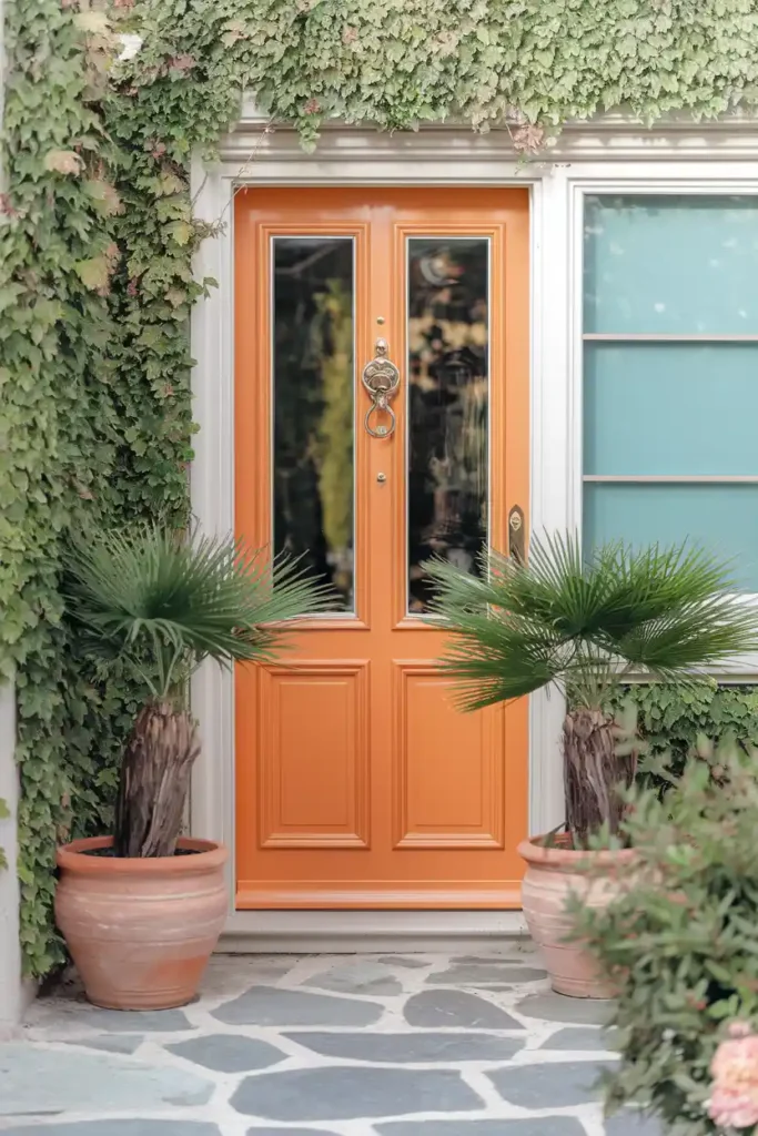
Orange doors are bold, energetic, and undeniably happy. This color choice says you’re confident and fun-loving. While it might seem intimidating, the right shade of orange can be surprisingly sophisticated.
Styling Tips:
- Balance with neutral exterior colors
- Add blue or green accents through plants or accessories
- Use natural materials to ground the brightness
- Consider warm metal hardware like copper or bronze
Pro Tip: Go for a muted, earthy orange rather than neon bright—think terracotta or burnt orange for a more refined look.
#11. Royal Purple
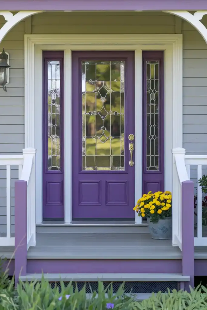
Purple doors are unexpected, regal, and absolutely stunning when done right. This color choice shows serious personality and creates an entrance that’s impossible to ignore. Perfect for those who want to break away from traditional choices.
Styling Tips:
- Pair with white or light gray exterior walls
- Add yellow or green plants for complementary contrast
- Use silver or brushed nickel hardware
- Consider purple flowering plants to tie the look together
Bonus Tip: Purple works beautifully with both warm and cool color palettes, making it more versatile than you might expect.
#12. Soft Sage Green
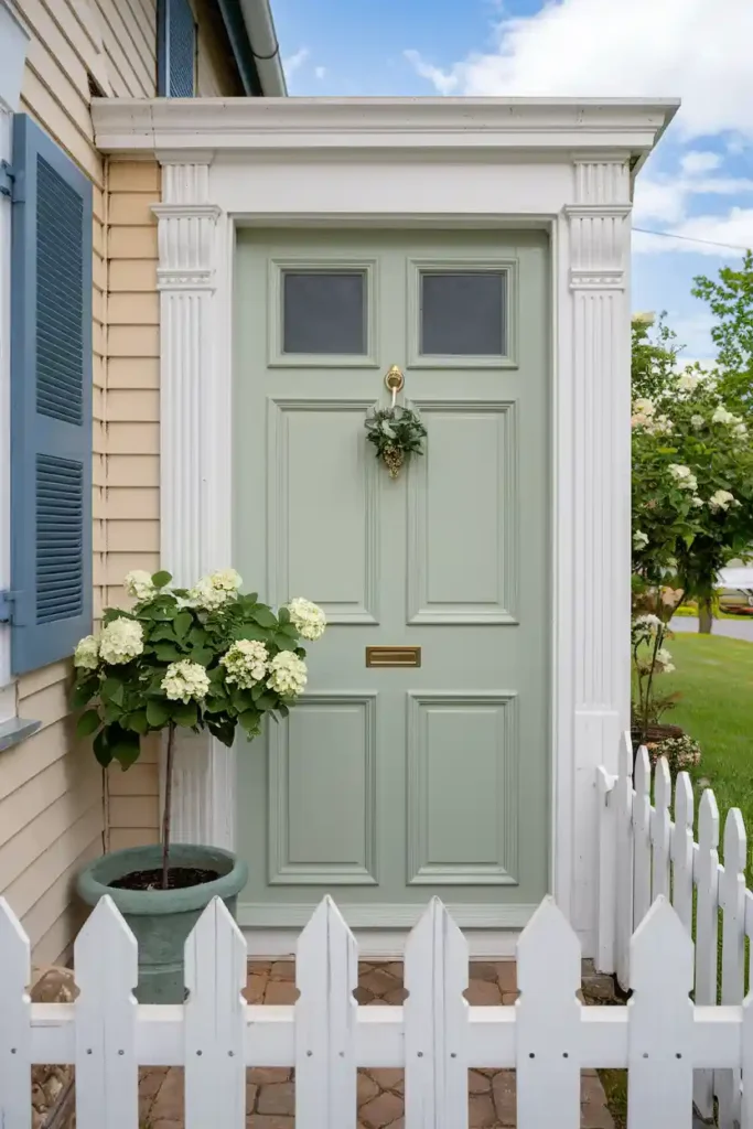
Sage green brings a calming, spa-like quality to your entrance. This muted green feels both contemporary and timeless, working beautifully with farmhouse, traditional, and modern home styles.
Styling Tips:
- Complement with warm wood tones and natural textures
- Add white or cream accents for brightness
- Use copper or brass hardware for warmth
- Pair with neutral exterior colors
Additional Tip: Sage green looks gorgeous in both bright sunlight and overcast conditions—it’s incredibly photogenic and Instagram-worthy.
#13. Deep Teal
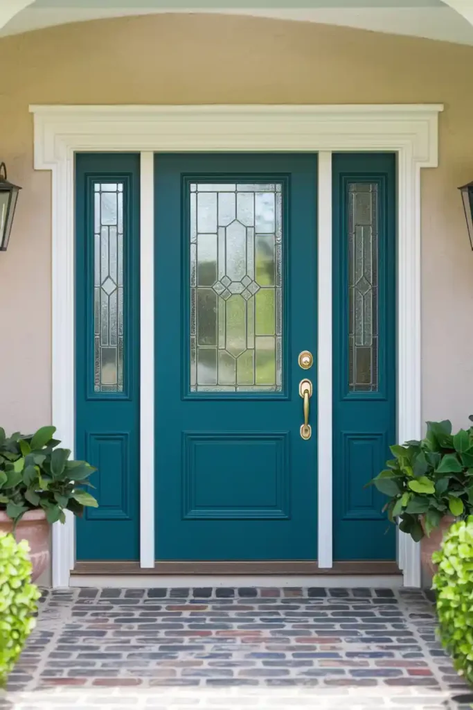
Teal combines the calming qualities of blue with the refreshing aspects of green. It’s bold enough to make a statement but sophisticated enough to work with traditional home styles. This color has serious curb appeal potential.
Styling Tips:
- Pair with white trim and brass accents
- Add warm wood elements or natural textures
- Consider coral or orange flowers for contrast
- Works beautifully with gray or white exterior walls
Pro Tip: Teal can lean more blue or green depending on lighting, so test your chosen shade throughout the day to ensure you love it in all conditions.
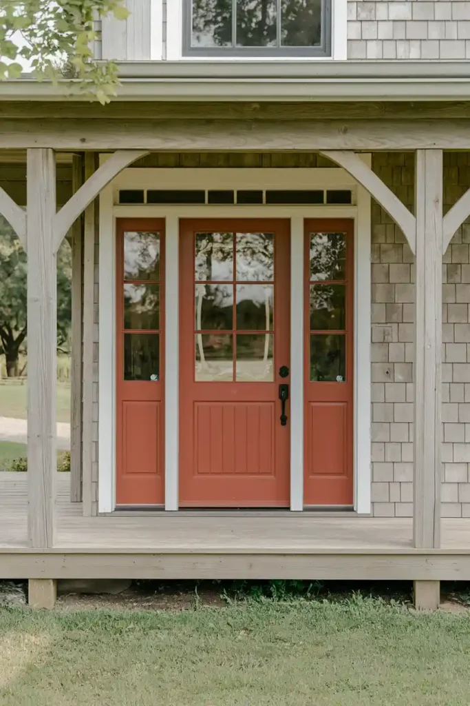
#14. Warm Terracotta
Terracotta brings earthy warmth and Mediterranean vibes to your entrance. This color feels both grounding and sophisticated, working particularly well on southwestern and craftsman-style homes.
Styling Tips:
- Complement with natural stone or stucco exteriors
- Add turquoise or deep blue accents
- Use wrought iron or dark bronze hardware
- Pair with succulents and desert plants
Bonus Tip: Terracotta looks amazing with seasonal decorations and provides a gorgeous backdrop for both warm and cool accent colors.
#15. Classic Barn Red
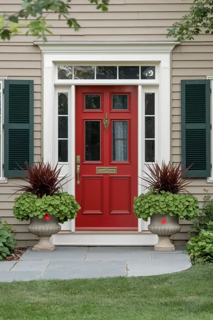
Barn red brings rustic charm and American farmhouse appeal to any home. This traditional color feels both nostalgic and fresh, especially when paired with the right accents and styling.
Styling Tips:
- Pair with white trim for classic contrast
- Add black hardware for definition
- Use natural wood and galvanized metal accents
- Consider matching red shutters for cohesive style
Additional Tip: Barn red hides dirt well and ages beautifully, developing character over time rather than looking worn out.
#16. Soft Coral
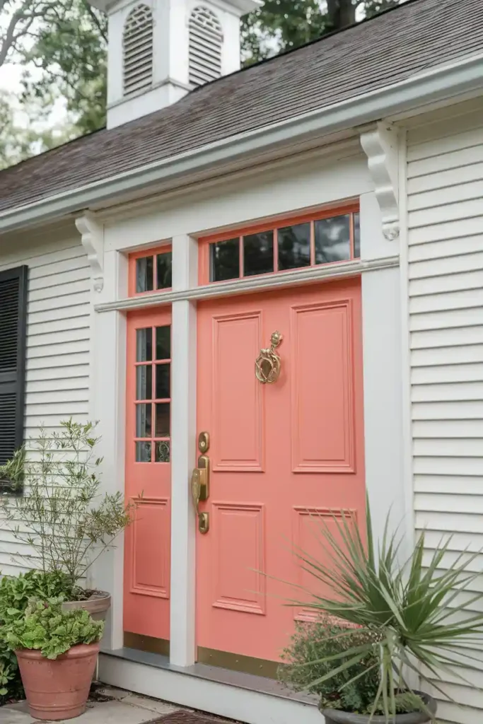
Coral doors bring warmth and femininity without being overly sweet. This peachy-pink shade works surprisingly well with many exterior colors and adds a fresh, modern twist to traditional home styles.
Styling Tips:
- Balance with white or light gray exteriors
- Add green plants for natural contrast
- Use gold or brass hardware for warmth
- Consider blue or turquoise accents for complementary pop
Pro Tip: Coral can look different in various lighting conditions, so test your chosen shade thoroughly—the right coral is absolutely stunning.
#17. Moody Plum
Plum offers deep, rich color that’s both sophisticated and unexpected. This purple-red hybrid works beautifully on traditional homes and adds drama to contemporary styles.
Styling Tips:
- Complement with cream or light gray trim
- Add silver or brushed nickel hardware
- Use green foliage for natural contrast
- Consider warm lighting to enhance the richness
Bonus Tip: Plum doors photograph beautifully and create stunning curb appeal that stands out without being flashy.
#18. Fresh Mint Green
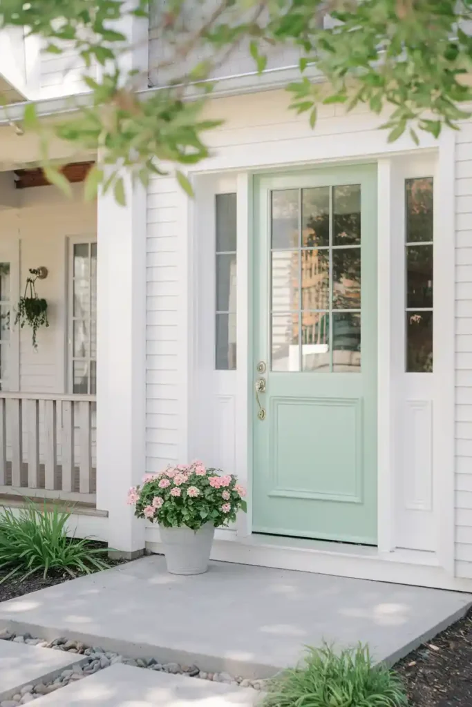
Mint green brings a fresh, youthful energy to your entrance. This light, cheerful color works particularly well on cottage-style homes and adds personality to modern farmhouse designs.
Styling Tips:
- Pair with white or cream exterior walls
- Add warm wood accents and natural textures
- Use brass or copper hardware for warmth
- Consider pink or coral flowers for sweet contrast
Additional Tip: Mint green is perfect for spring and summer but also looks charming with winter evergreen decorations.
#19. Bold Magenta
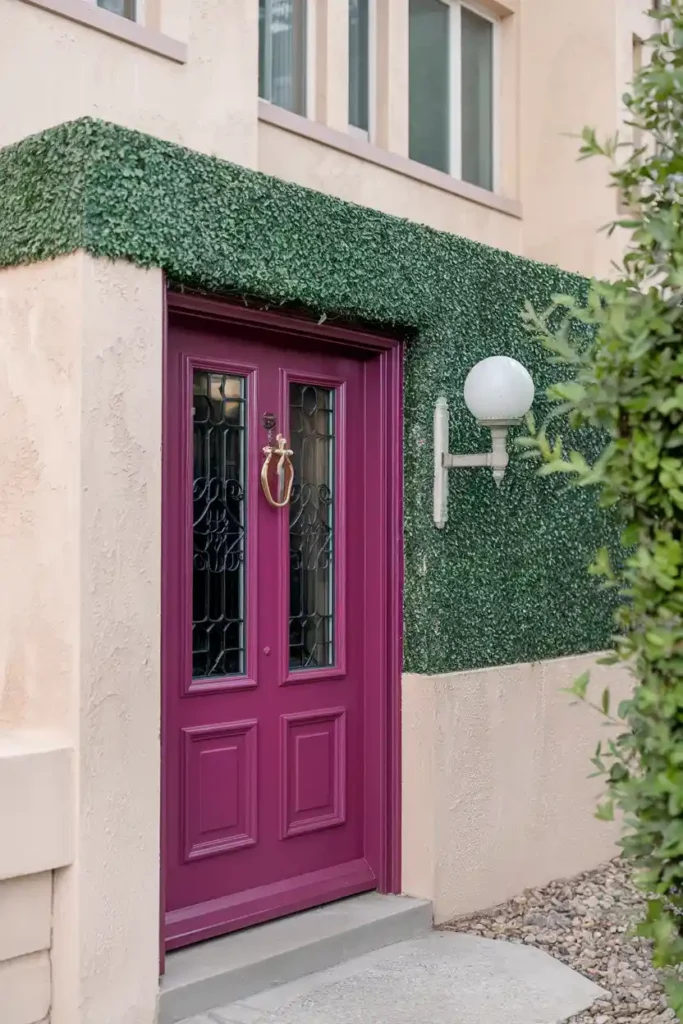
Magenta is for the fearless—this hot pink-purple hybrid makes a serious statement. If you want a door that nobody will forget, magenta delivers personality in spades.
Styling Tips:
- Balance with neutral exterior colors
- Add white or light accents for contrast
- Use silver or chrome hardware
- Consider green plants to ground the boldness
Pro Tip: Magenta can be overwhelming, so use it sparingly and balance with plenty of neutral elements—when done right, it’s absolutely stunning.
#20. Elegant Taupe
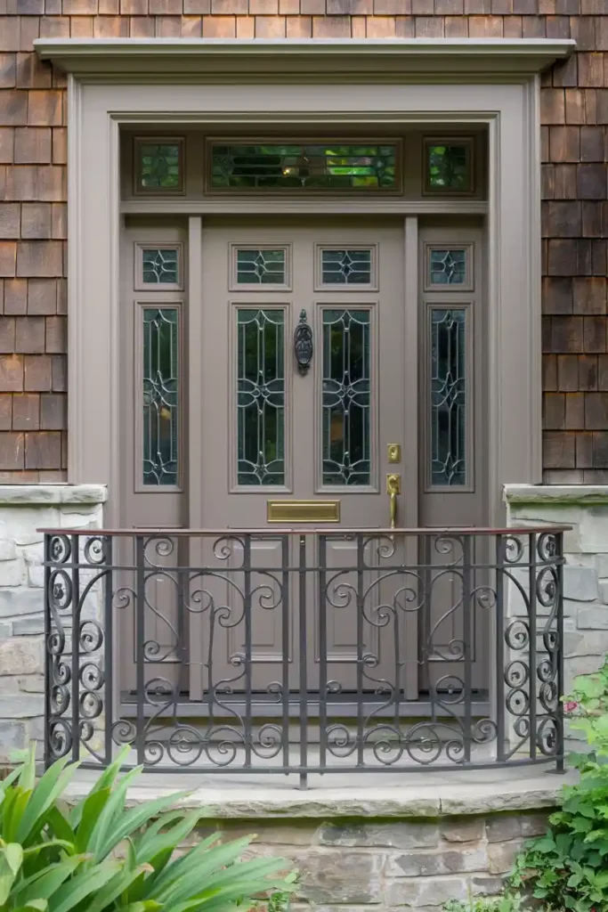
Taupe offers sophisticated neutrality that’s warmer than gray but more refined than beige. This versatile color works with virtually any home style and exterior color scheme.
Styling Tips:
- Add pops of color through flowers and accessories
- Use warm metal hardware like brass or copper
- Consider textured elements for visual interest
- Pair with both warm and cool accent colors
Bonus Tip: Taupe is incredibly practical—it hides wear well and provides the perfect backdrop for seasonal decorating throughout the year.
#21. Sunny Lime Green
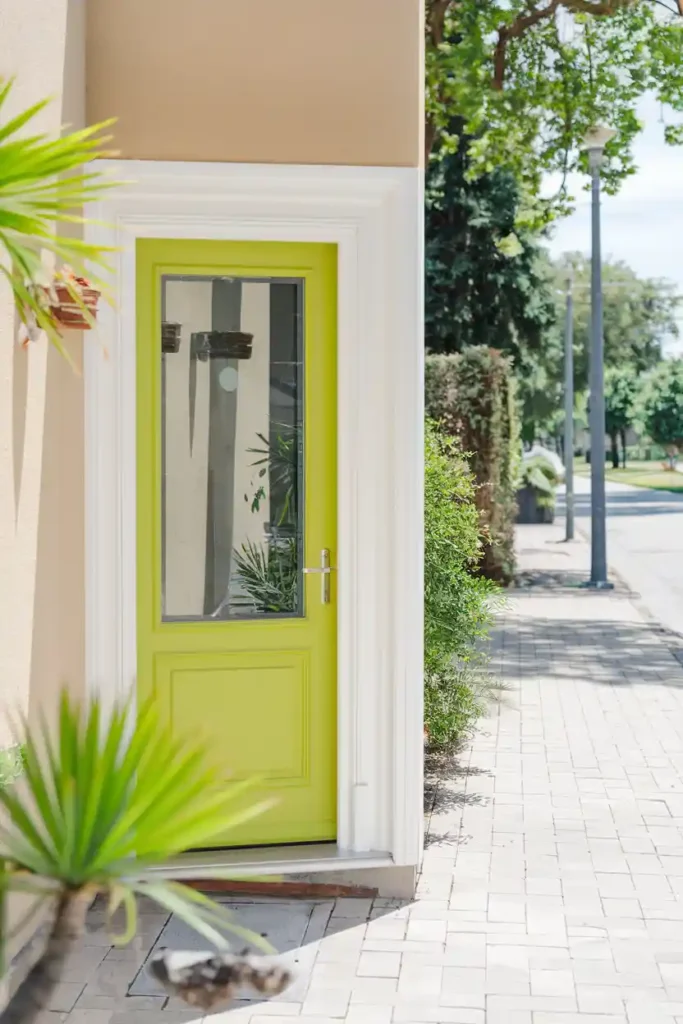
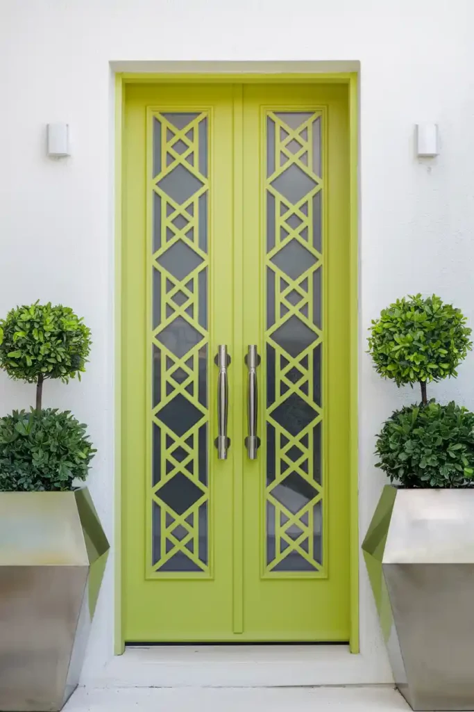
Lime green is energetic, fresh, and guaranteed to make people smile. This bold choice works particularly well on modern and contemporary homes where you want to make a playful statement.
Styling Tips:
- Balance with white or light gray exteriors
- Add purple or pink accents for contrast
- Use stainless steel or chrome hardware
- Consider modern, geometric planters
Additional Tip: Lime green can be intense, so make sure your home’s style can handle this level of boldness—when it works, it really works!
#22. Rich Chocolate Brown
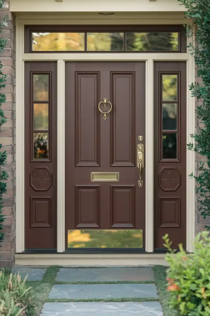
Chocolate brown brings warmth and sophistication without being too bold. This earthy color works beautifully with natural materials and traditional home styles.
Styling Tips:
- Complement with cream or warm white trim
- Add brass or copper hardware for richness
- Use natural textures like wood and stone
- Pair with warm, earthy landscaping
Pro Tip: Brown doors look gorgeous year-round and provide a perfect backdrop for both warm and cool seasonal decorations.
#23. Soft Lavender
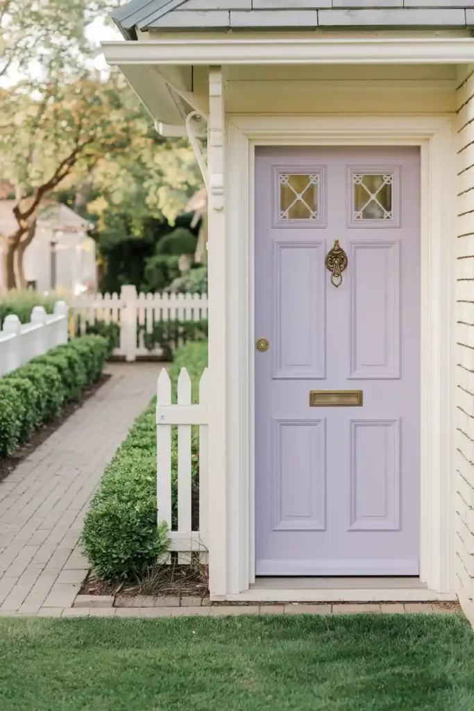
Lavender offers gentle color that’s romantic and calming. This light purple works particularly well on cottage-style homes and adds unexpected charm to traditional designs.
Styling Tips:
- Pair with white or cream exterior walls
- Add silver or white hardware for lightness
- Use green plants for natural contrast
- Consider yellow or cream accents for warmth
Bonus Tip: Lavender photographs beautifully and creates a dreamy, fairy-tale quality that’s perfect for homes with romantic or vintage styling.
#24. Deep Cobalt Blue
Cobalt blue is bold, dramatic, and absolutely gorgeous. This rich blue makes a serious statement while remaining sophisticated enough for traditional home styles.
Styling Tips:
- Complement with white trim and brass hardware
- Add warm wood accents for balance
- Use orange or coral flowers for striking contrast
- Consider matching blue shutters for cohesion
Additional Tip: Cobalt blue looks stunning in all seasons and provides amazing curb appeal that photographs beautifully.
#25. Warm Peach
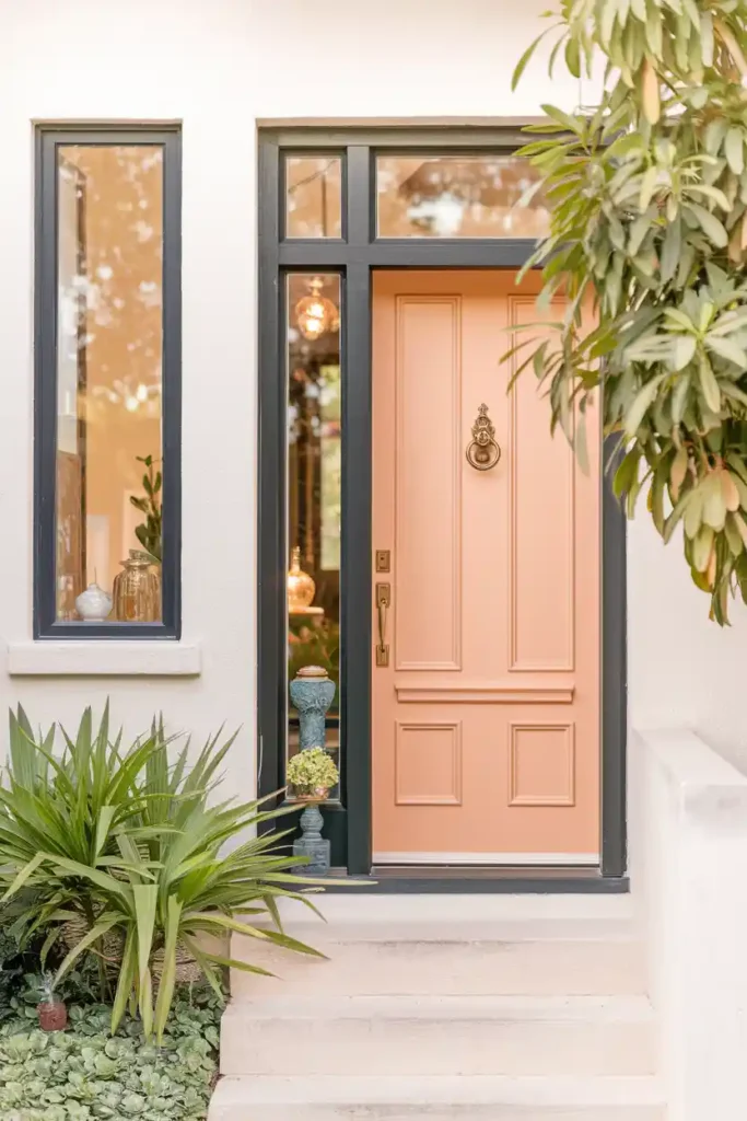
Peach brings sunny warmth and gentle color that’s welcoming without being overwhelming. This soft orange works well with many home styles and exterior colors.
Styling Tips:
- Balance with white or light gray exteriors
- Add green plants for natural contrast
- Use warm metal hardware like brass or copper
- Consider blue or turquoise accents for pop
Pro Tip: Peach can look different throughout the day, so test your chosen shade in various lighting conditions—the right peach is absolutely lovely.
Choose the Perfect Paint Color for Your Front Door
Choosing the right color for your front door can enhance your home’s curb appeal and set the tone for your entryway. Here are a few key factors to consider:
- Consider Your Home’s Style: Match the door color with your home’s architecture. Traditional homes look great with rich colors like navy, red, or black, while modern homes may benefit from bold or minimalistic colors.
- Neighborhood Vibes: Choose a color that complements the surrounding homes, ensuring your front door stands out without clashing with the neighborhood’s aesthetic.
- Personal Preference: The front door should reflect your personality. Do you prefer calm, neutral tones, or something more vibrant and daring?
- Climate and Light: Bright colors work well in sunny climates, while deeper tones may be better suited for cooler, shaded areas. Consider the amount of natural light your door gets.
- Complementary Accents: Think about how the door color will interact with other elements, such as the trim, shutters, and landscaping. Ensure they harmonize well together.
- Resale Value: If you plan to sell your home, consider colors that appeal to a broad range of buyers—timeless shades like black, gray, and navy are safe choices.
By taking these factors into account, you’ll find a door color that enhances your home’s look and makes a lasting impression.
FAQs
Making Your Choice: What Works Best for Your Home
Choosing the perfect front door color isn’t just about following trends—it’s about finding the shade that makes your home feel uniquely yours. Consider your home’s architectural style, existing exterior colors, and your personal preferences. IMO, the best front door colors are the ones that make you happy every time you see them.
Remember, paint is relatively inexpensive and changeable, so don’t be afraid to take some risks. Your front door is a small space that can handle bold color choices that might feel overwhelming on larger surfaces. Whether you go classic with navy blue or bold with magenta, the key is choosing a color that reflects your personality and complements your home’s overall style.
The perfect front door makeover is waiting for you—now get out there and make it happen! 🙂

I am Mindy Medford, a home décor, paint, and design specialist with over a decade of hands-on experience transforming ordinary spaces into cozy, personality-packed havens. Since 2013, I have been helping homeowners discover the art of beautiful yet practical design. I share my love for color, texture, and layout—making stylish interiors & exteriors feel achievable for everyone. Whether it’s picking the perfect paint shade or reimagining a small space, I’m here to guide and inspire.