10 Best Gray Paint Color Ideas For Living Room
Are you ready to upgrade your cozy corner with the timeless elegance of gray? Choosing the right gray paint can make your living room feel chic, cozy, or anything in between. But with so many shades out there (seriously, why are there 50+?), it can get overwhelming. Don’t sweat it—I’ve rounded up the 10 best gray paint colors that can transform your living room into a design masterpiece. Oh, and I’ve tossed in some style tips too, because why not?
Why Gray Rocks in Living Rooms
Before we get into the fun stuff, let’s take a moment to talk about why gray is such a winner. Gray is a chameleon. It can be warm or cool, bold or subtle, modern or classic. Whether you’re going for a minimalist vibe or something effortlessly cozy, there’s a shade of gray that fits the bill. Long story short? Gray equals versatility.
Now, onto the list.
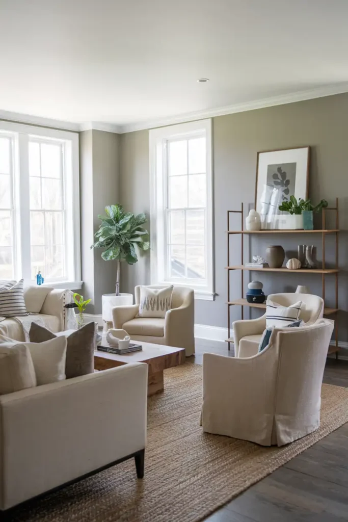
#1. Agreeable Gray (Sherwin-Williams)
The Color: Agreeable Gray is a light, warm gray that leans towards beige, giving you the best of both worlds. This shade creates a calm, inviting atmosphere, making it perfect for spaces where people love to gather.
Pro Tips for Styling:
- Pair Agreeable Gray with soft white trim for a crisp, clean look.
- Add textured throws and rugs in cream or taupe to amp up the coziness.
- Think warm metallics like gold or brass for light fixtures and decor.
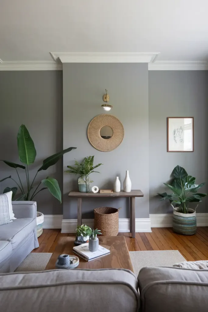
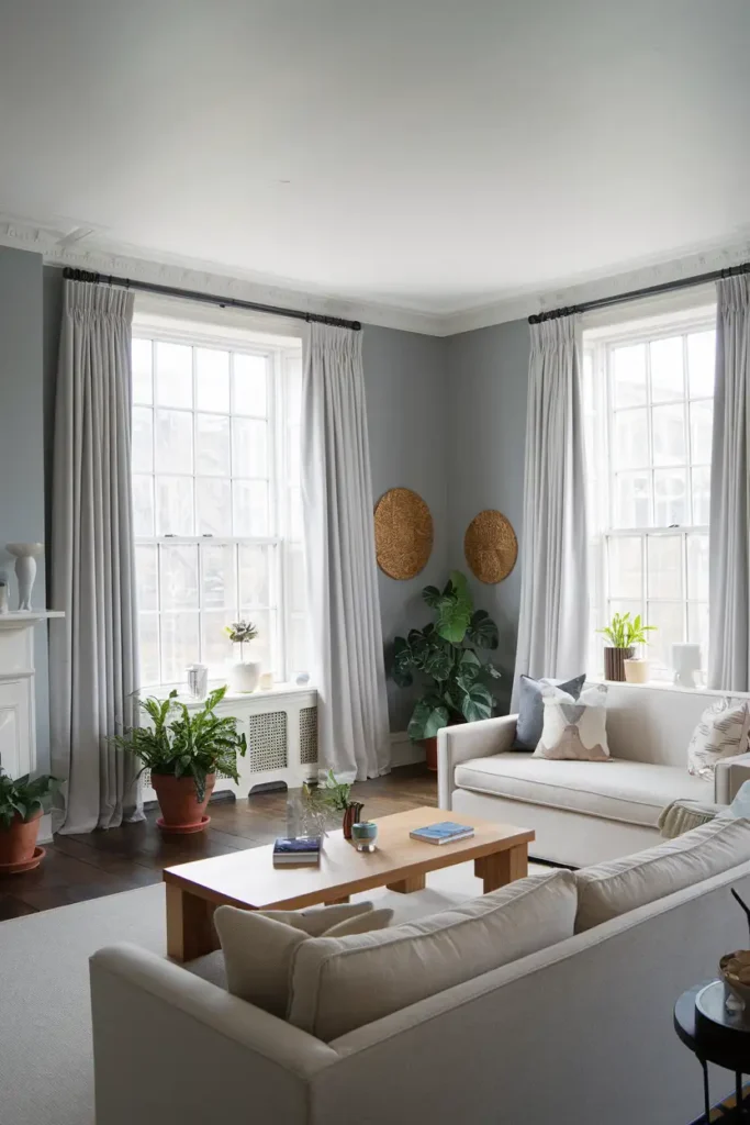
#2. Benjamin Moore Gray Owl
The Color: Gray Owl is a versatile soft gray with subtle green and blue undertones. It feels both fresh and clean, perfect for rooms with plenty of natural light.
Pro Tips for Styling:
- Pair it with furniture in deep blues for a serene, coastal look.
- Use natural wood accents or a jute rug for those chill earthy vibes.
- Consider modern décor pieces with clean lines to maintain an airy feel.
#3. Repose Gray (Sherwin-Williams)
The Color: This is like the gray equivalent of “the little black dress.” Repose Gray offers a perfect balance of light and depth, with faint hints of warmth. It’s ideal for creating a neutral canvas without feeling cold.
Pro Tips for Styling:
- Highlight with pops of color like vibrant yellows or greens in your pillows.
- Keep it classy with black-framed wall art for contrast.
- A sleek velvet sofa (in navy, anyone?) works wonders against this tone.
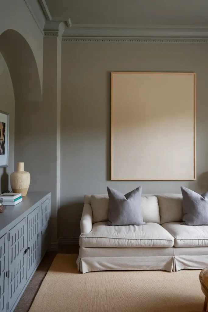
#4. Classic Gray (Benjamin Moore)
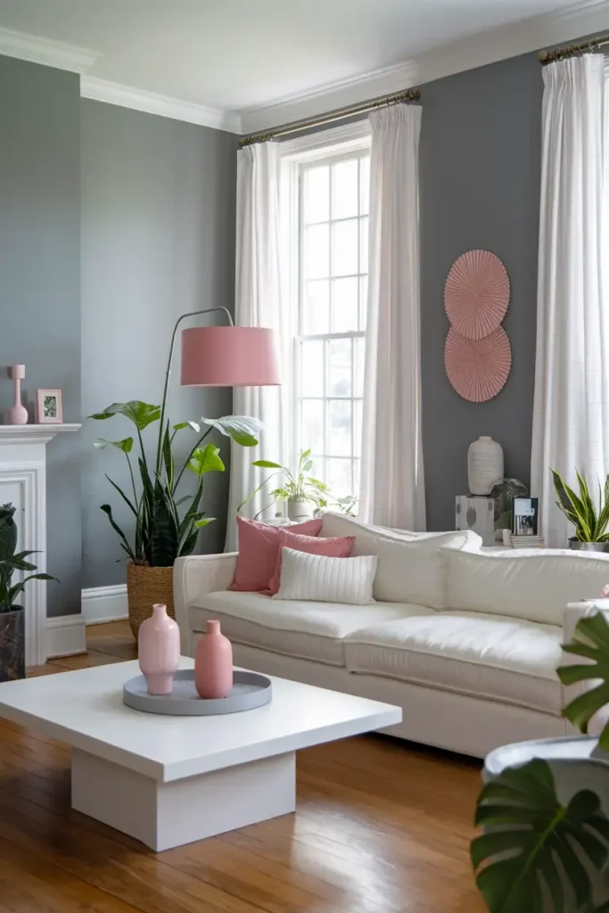
The Color: Don’t be fooled by the name! Classic Gray is more of a warm white with just enough gray to add depth. It’s perfect if you want a subtle, barely-there gray.
Pro Tips for Styling:
- Pair with white trim for an ultra-fresh, clean vibe.
- Incorporate muted tones like blush pink or dusty lavender in accents.
- Add feathery or light-textured decor for a dreamy aesthetic.
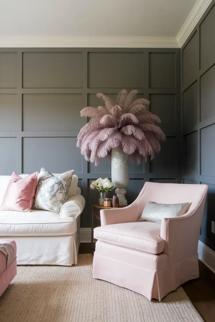
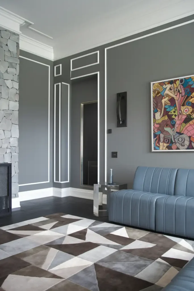
#5. Peppercorn (Sherwin-Williams)
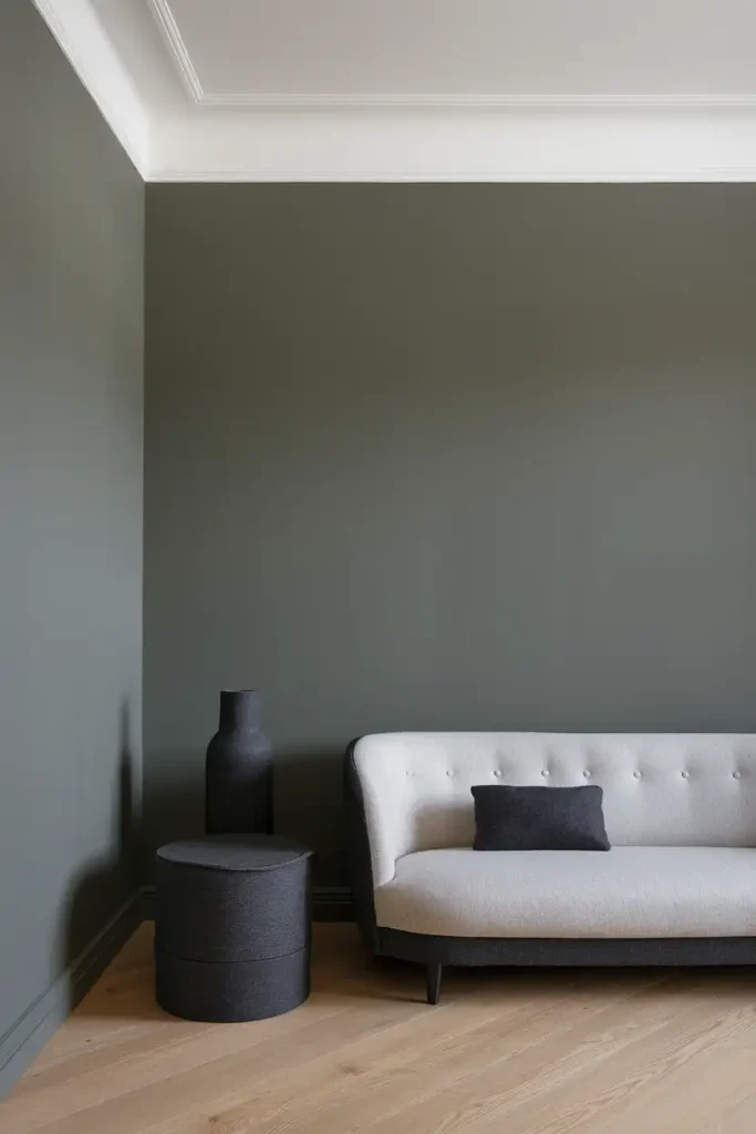
The Color: Feeling bold? Peppercorn is a dramatic, deep gray that’s almost charcoal. It’s moody and luxurious, making it perfect for accent walls or cozier living rooms.
Pro Tips for Styling:
- Use Peppercorn on a single accent wall to avoid overpowering the space.
- Pair with industrial-style furniture and metallic (think silver or black) highlights.
- Contrast with a light-colored sofa for balance.
#6. Ammonite (Farrow & Ball)
The Color: Say hello to elegance. Ammonite is a pale gray with a light, powdery quality that radiates sophistication. It adapts beautifully to mixed lighting, making it a safe go-to for any living room.
Pro Tips for Styling:
- Complement with pale pastels like soft blues or blush pink.
- Add coastal vibes with linen-covered furniture and driftwood accents.
- Use brass candle holders for a bit of glam.
#7. Stonington Gray (Benjamin Moore)
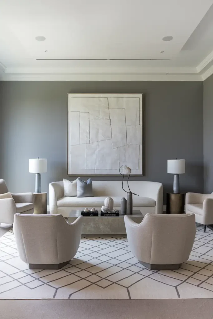
The Color: Stonington Gray is a true neutral gray with a slightly cool undertone. It works particularly well in modern or contemporary interiors.
Pro Tips for Styling:
- Pair it with cool white trim and silver metallics for a sleek aesthetic.
- Add a geometric rug for a sharp, modern touch.
- Use colorful abstract art to pop against this neutral backdrop.
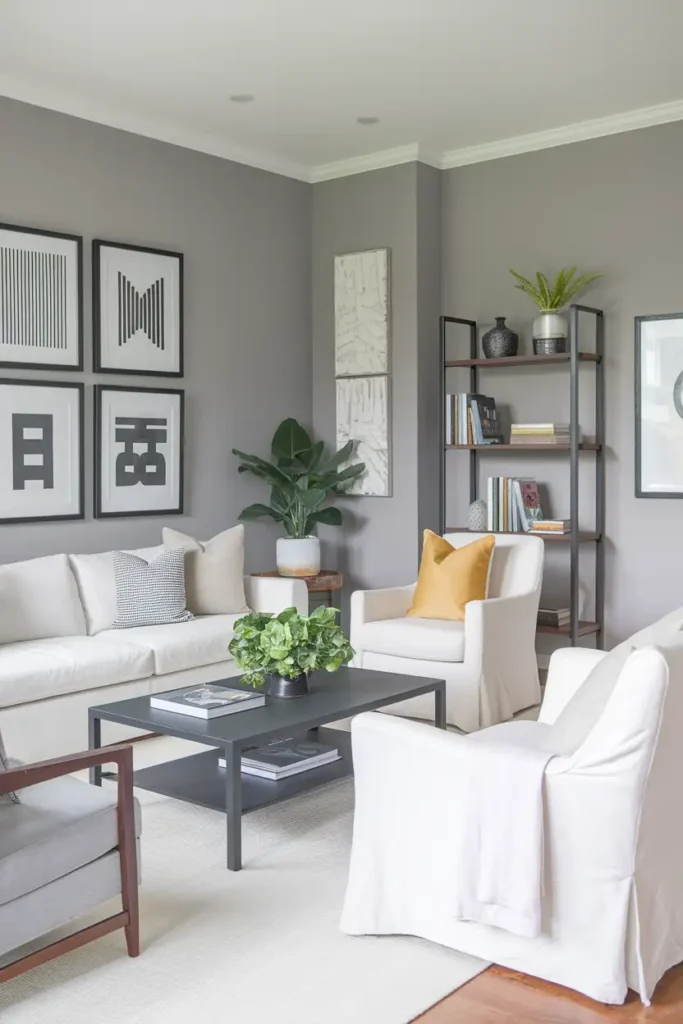
#8. Mindful Gray (Sherwin-Williams)
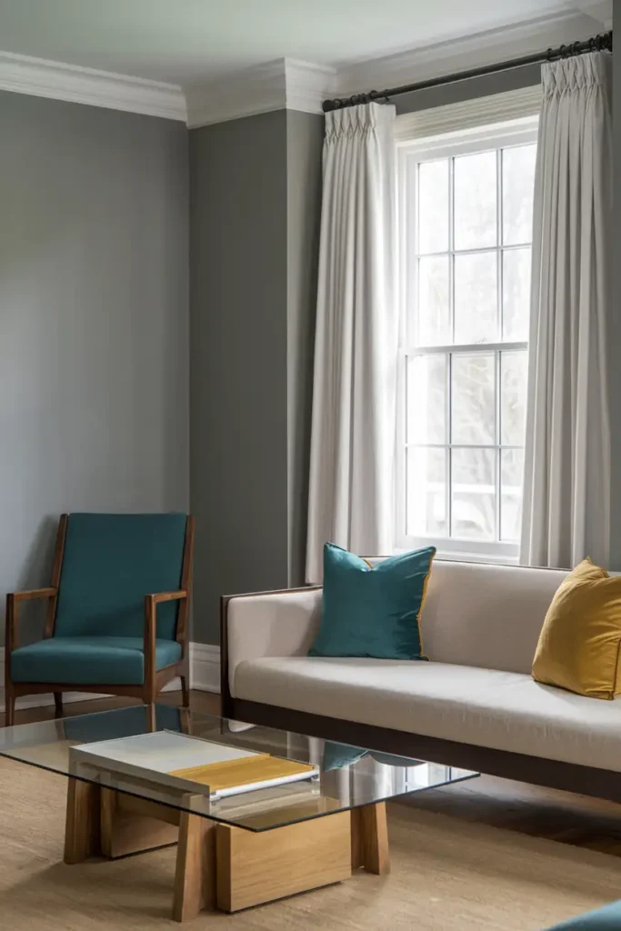
The Color: Mindful Gray is the Swiss Army knife of grays. It’s neither too warm nor too cool, making it crazy versatile.
Pro Tips for Styling:
- Use it in transitional spaces, pairing it with creamy whites.
- Add reclaimed wood furniture for a cozy, lived-in vibe.
- Sprinkle in pops of color through cushions or throws in teal or mustard.
#9. Pavilion Gray (Farrow & Ball)
The Color: This mid-tone gray has a touch of blue that gives it a fresh, breezy quality. It’s stylish without trying too hard.
Pro Tips for Styling:
- Pair with crisp white ceilings for a clean, airy feel.
- Bring in some greenery with large potted plants or succulents.
- Use natural materials like rattan or seagrass to balance the cool tones.
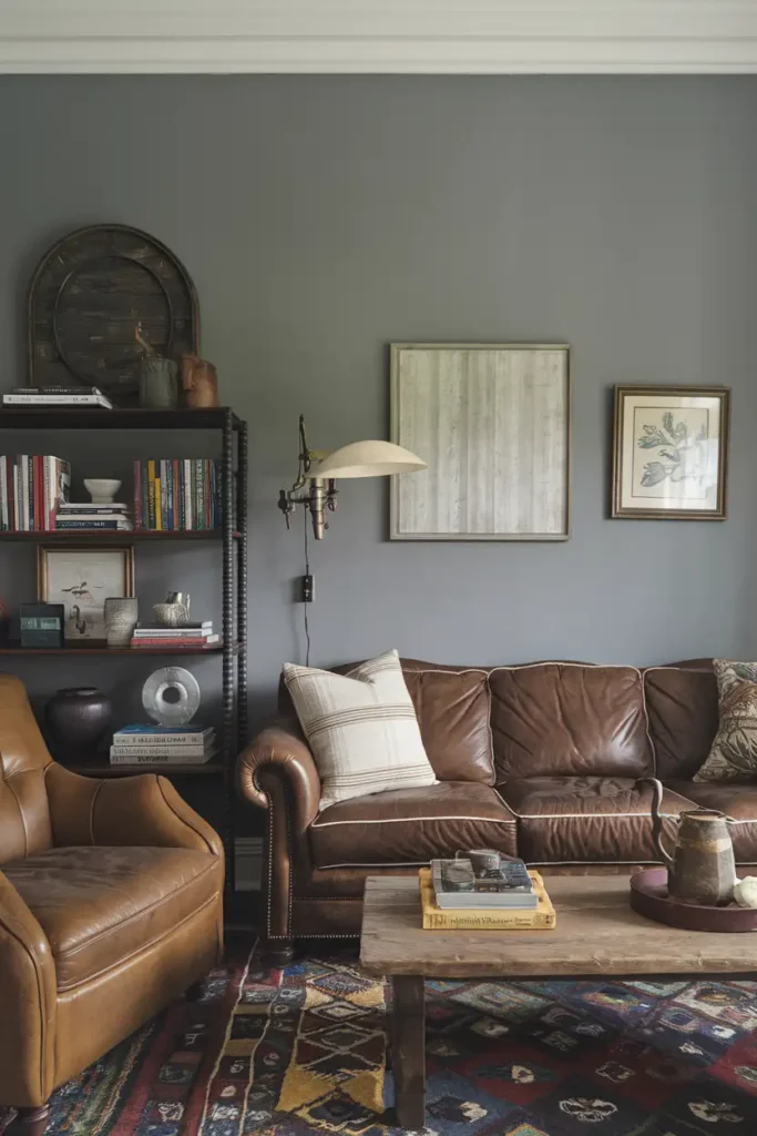
#10. Dorian Gray (Sherwin-Williams)
The Color: Classy and adaptable, Dorian Gray is a medium gray with warm undertones that make it feel grounding and cozy.
Pro Tips for Styling:
- Amplify warmth with caramel or rust-colored accents.
- Pair with rich wooden furniture for extra depth.
- Use warm lighting (like Edison bulbs) for an inviting glow.
How to Choose the Right Gray
Okay, so I’ve given you loads of options here, but how do you actually pick the right shade? Here are some tips:
- Consider Your Lighting: Natural light? Warm gray. North-facing room? Go cool gray.
- Test It Out: Grab some samples and paint swatches on your wall. Trust me, gray can look SO different depending on your space.
- Think About Contrast: Balance is everything. If your furniture is dark, go lighter with your walls (and vice versa).
FAQs
Time for A Makeover?
And there you have it! Whether you want to create cozy vibes, achieve modern minimalism, or go bold and dramatic, these gray shades have got you covered. But don’t just take my word for it. Grab a brush, sample a few, and watch your living room transform into a space you’ll love to spend time in.
Now, which one’s going on your wall first?
Vibe Up Your Space With Comfort & Color — your go-to destination for stylish home decor that blends comfort with color. Create cozy corners and vibrant vibes in every room and space at your home!