25+ Best Paint Colors For A Kitchen (That You’ll Actually Love)
Your kitchen isn’t just a space for cooking; it’s the heart of your home. And what better way to reflect its personality than with the perfect paint color? Whether you’re looking to brighten things up, create a cozy vibe, or just bring some life back into tired walls, the right shade can do wonders.
But with so many options out there, where do you even start? Don’t worry—I’ve got you covered. Here’s a list of 26 stunning paint colors (with some unexpected gems) to inspire your next kitchen makeover.
Why Does Kitchen Paint Color Matter?
First things first, why should you care about your kitchen color? Your chosen shade does more than just cover your walls. It sets the mood, complements your furniture, and can even make your space feel larger or more inviting. Plus, the kitchen is where family and friends gather. You want it to feel like a happy place, right?
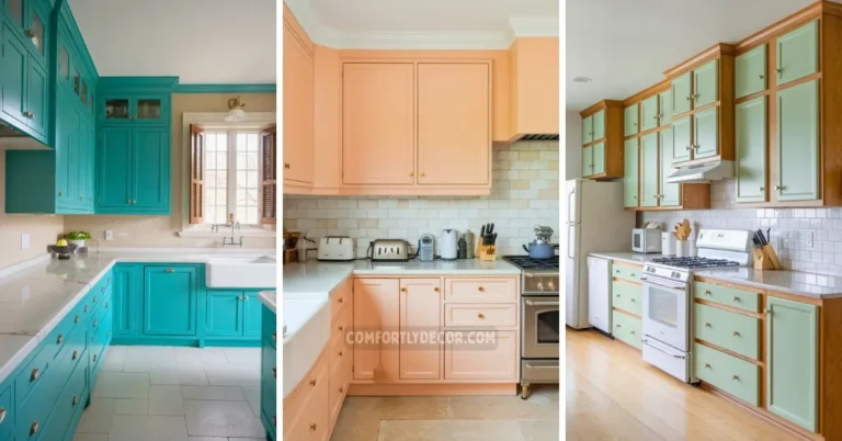
The 26 Best Paint Colors for Kitchens
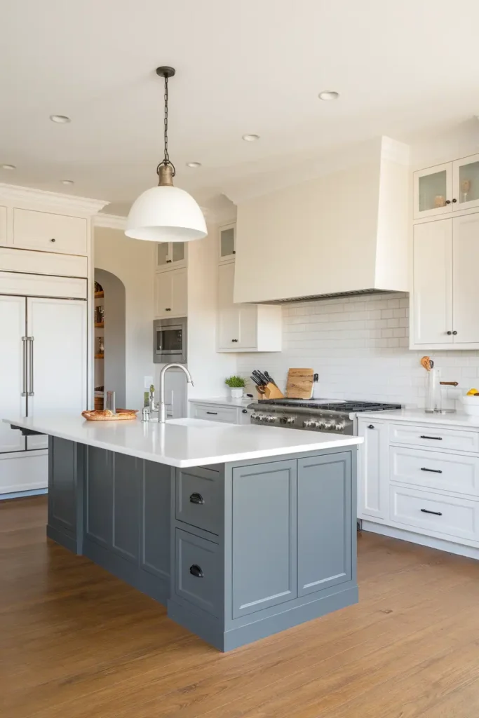
#1. White Dove by Benjamin Moore
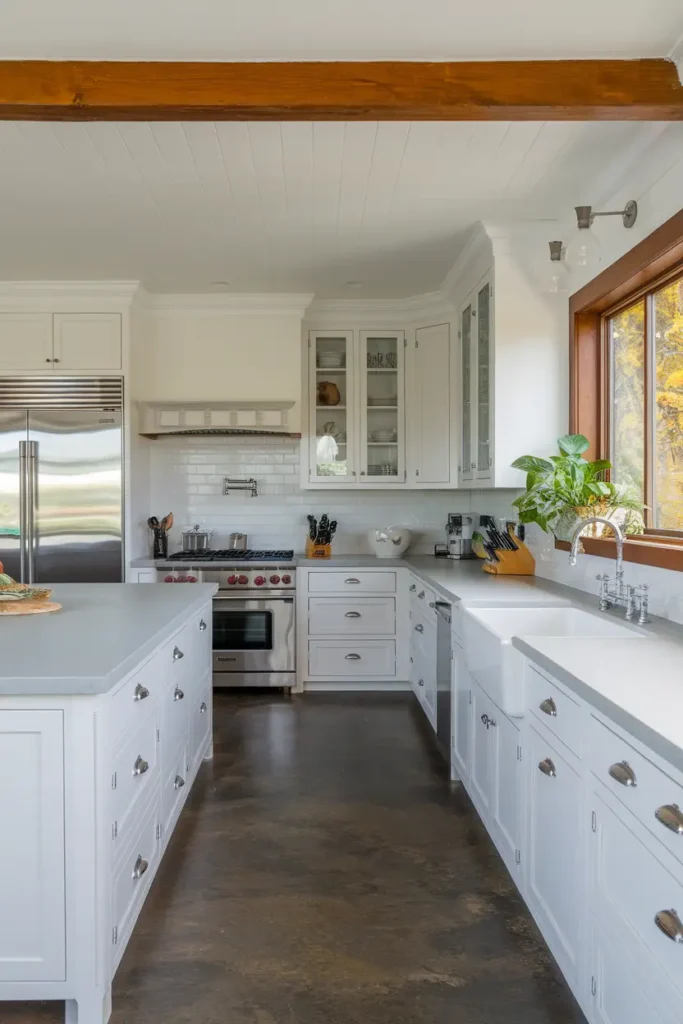
This warm white is ultra-versatile and perfect for creating a bright, open-feeling kitchen. It reflects light beautifully, making smaller spaces feel larger and more inviting. It works wonders for walls, cabinets, or trim, and its creamy undertones add a touch of warmth.
Pairing Tip: Bonus? It pairs beautifully with wood accents, creating a timeless and cozy aesthetic.
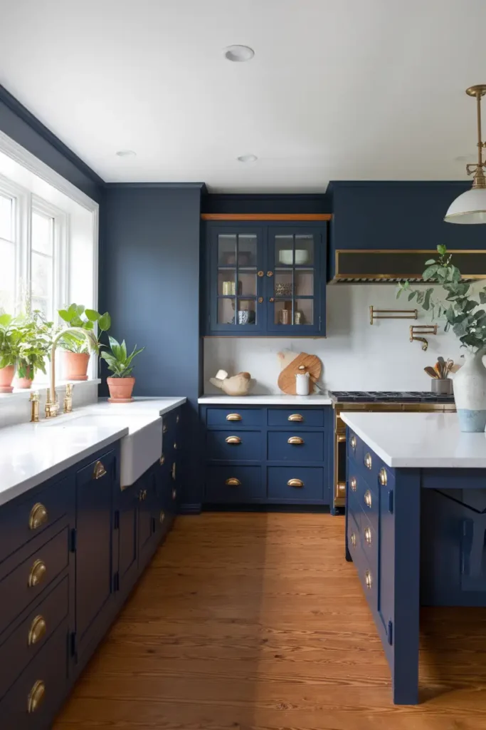
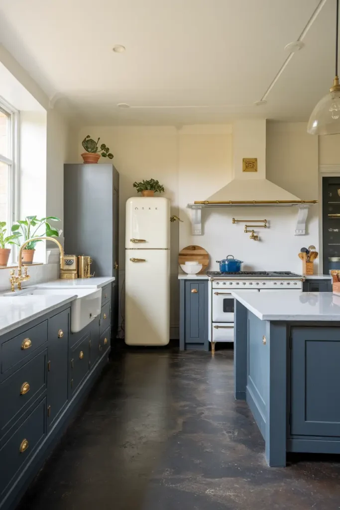
#2. Hale Navy by Benjamin Moore
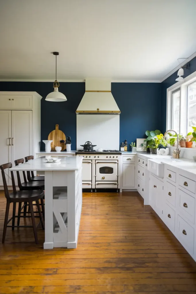
Looking to make a statement? This deep, rich blue exudes sophistication and elegance, instantly elevating your kitchen.
Combination Tip: It pairs seamlessly with white countertops or warm-toned floors, offering a dramatic contrast.
Whether you’re going modern or traditional, Hale Navy adds depth and character to your space.
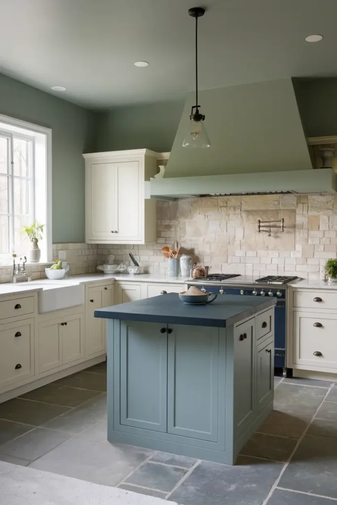
#3. Sea Salt by Sherwin-Williams
Soft, serene, and effortlessly calming, this green-gray shade is perfect for evoking coastal vibes in your kitchen. It feels like a spa day for your walls, creating a relaxing and airy atmosphere.
Pairing Tip: Pair it with white cabinetry or light wood tones for a breezy, beach-inspired look.
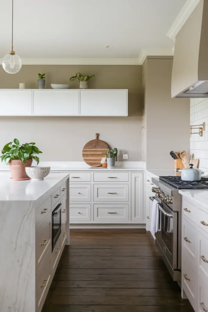
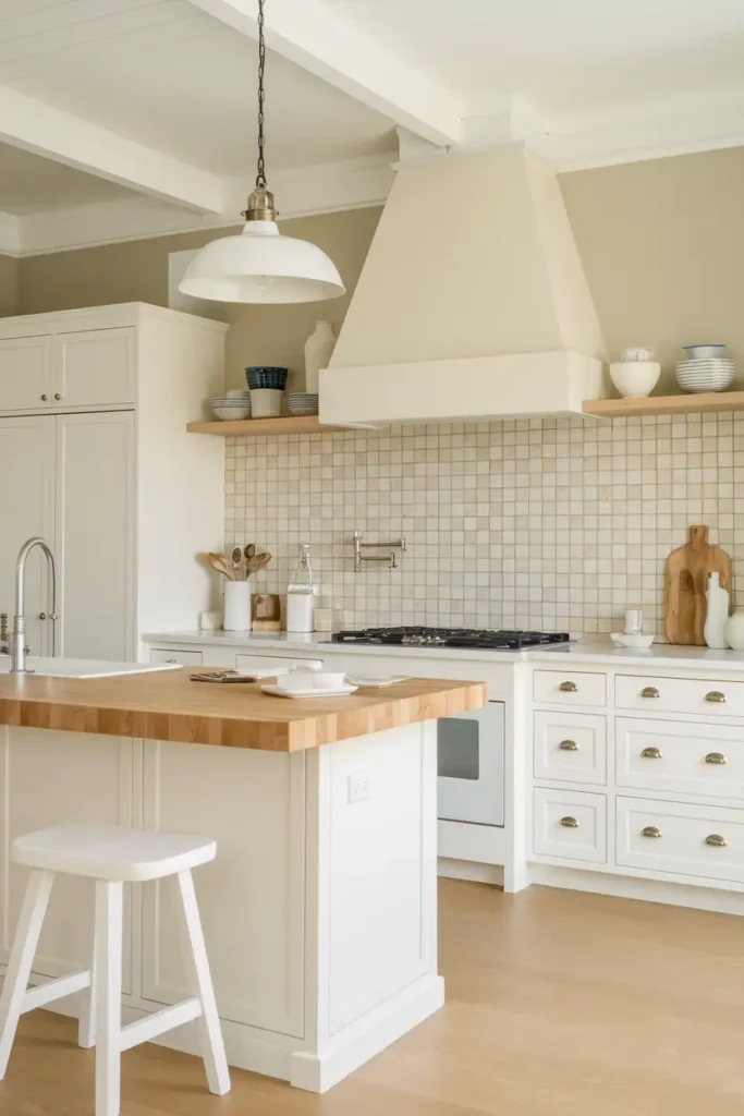
#4. Simply White by Benjamin Moore
It’s white, but cozy. With its slight creaminess, Simply White avoids feeling sterile or cold. It’s a subtle yet impactful choice for cabinets, walls, or even trim, adding brightness while maintaining warmth. Perfect for those who want a crisp, clean look with a touch of softness.
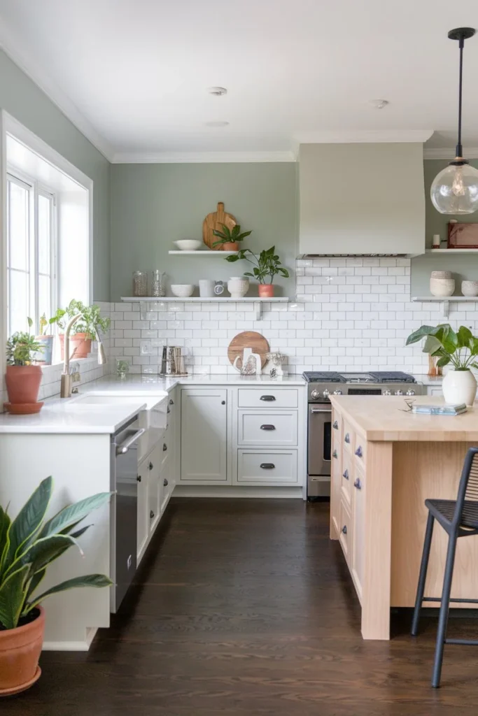
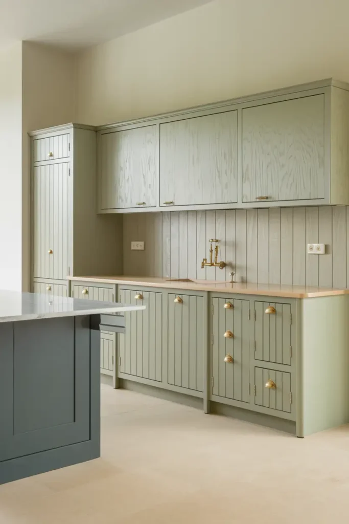
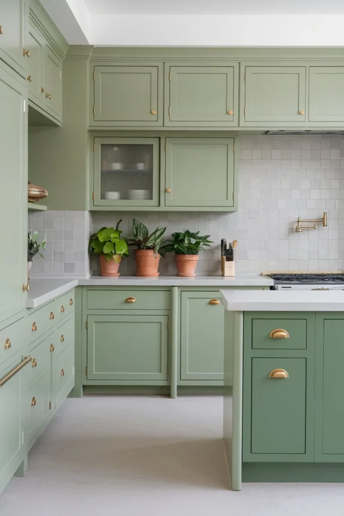
#5. Sage Green by Farrow & Ball (Lichen)
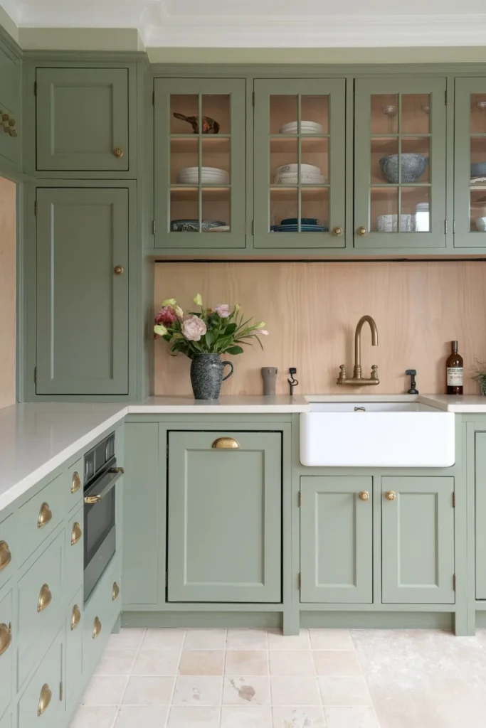
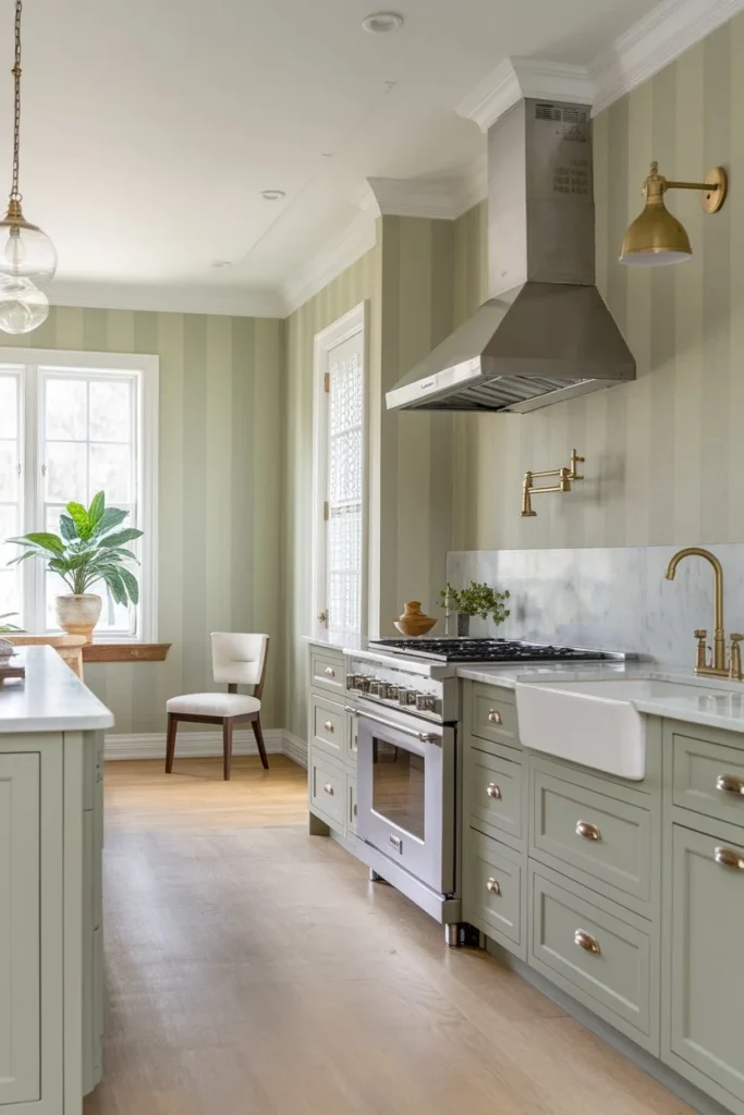
Sage green is the ultimate blend of neutral and color, offering a soft, earthy tone that feels modern and timeless.
Combination Tip: It pairs beautifully with
- Brass hardware and
- Light wood finishes, creating a classic yet contemporary look that’s both inviting and chic.
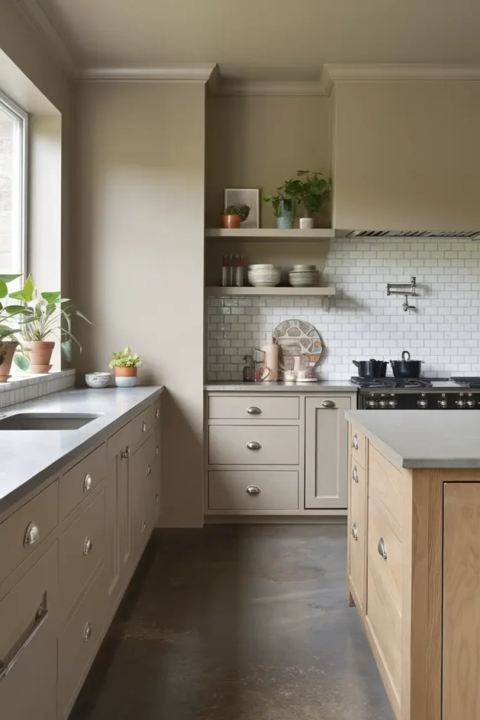
#6. Agreeable Gray by Sherwin-Williams
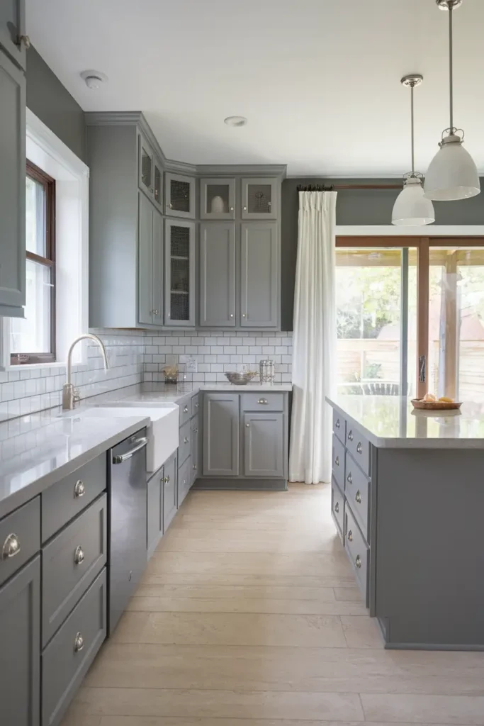
This popular “greige” (gray + beige) is the ultimate crowd-pleaser. Its balanced tone works well with a variety of styles, from modern to farmhouse.
Pairing Tip: Pair it with
- Crisp white accents and
- Natural wood for a fresh, clean palette that feels both stylish and approachable.
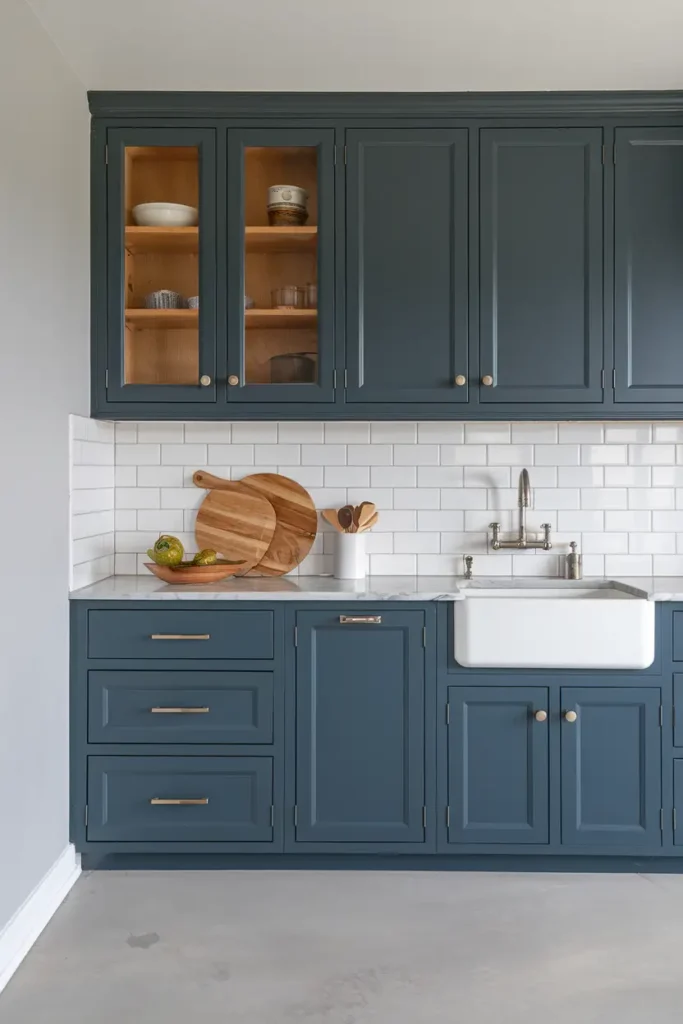
#7. Aegean Teal by Benjamin Moore
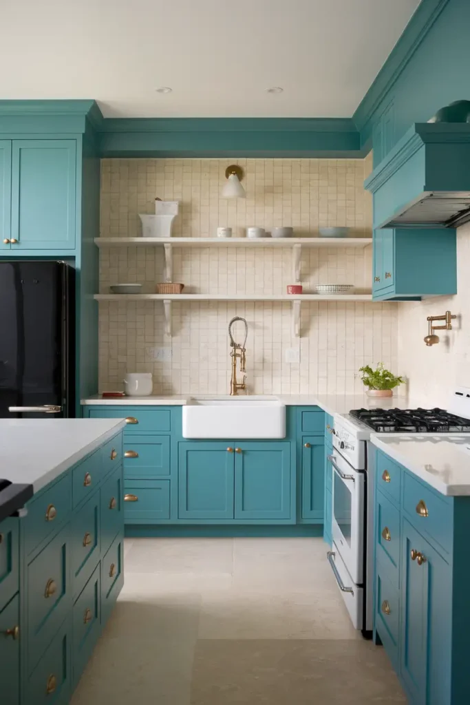
This calming blue-green shade is incredibly versatile and sophisticated. It’s the kind of color that makes everything else in your kitchen pop, from white countertops to brass fixtures.
Whether you use it on walls or cabinetry, Aegean Teal is sure to add a serene yet dynamic touch.
#8. Pale Oak by Benjamin Moore

This warm off-white shade adapts beautifully to different lighting conditions, offering a subtle sophistication that works in both bright and dim spaces.
Combination Tip: It pairs effortlessly with moody blues or light greens, creating a harmonious and inviting look.
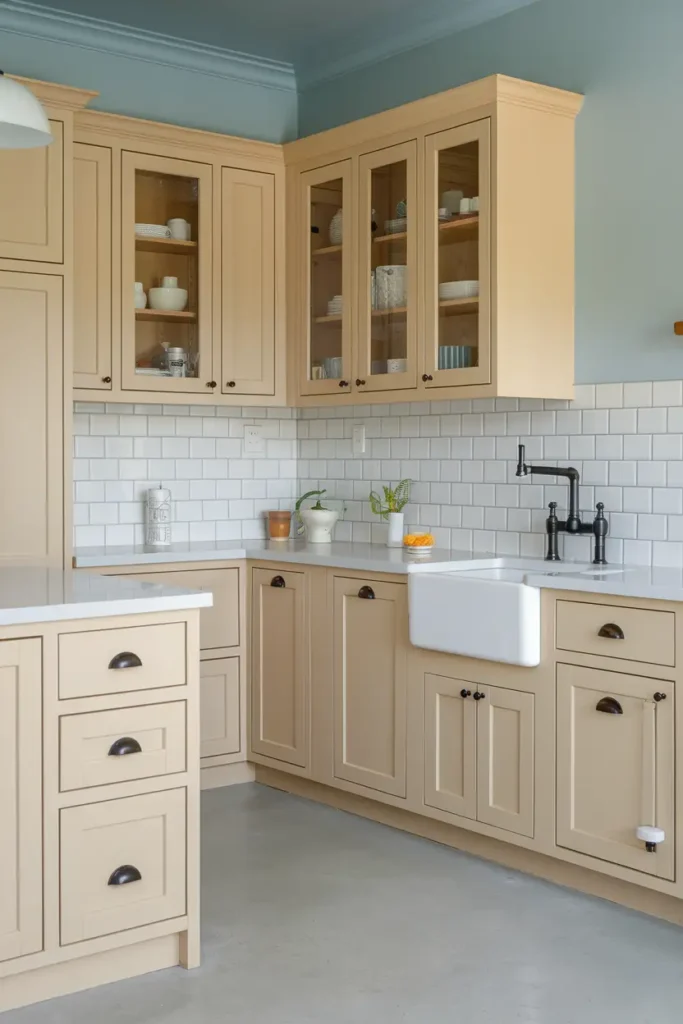
#9. Windsor Greige by Sherwin-Williams
Not quite white, not quite beige, and not quite gray—Windsor Greige strikes the perfect balance.
Why it works: It’s a versatile, neutral shade that works well with almost any color scheme, making it ideal for those who want a flexible backdrop for their kitchen.
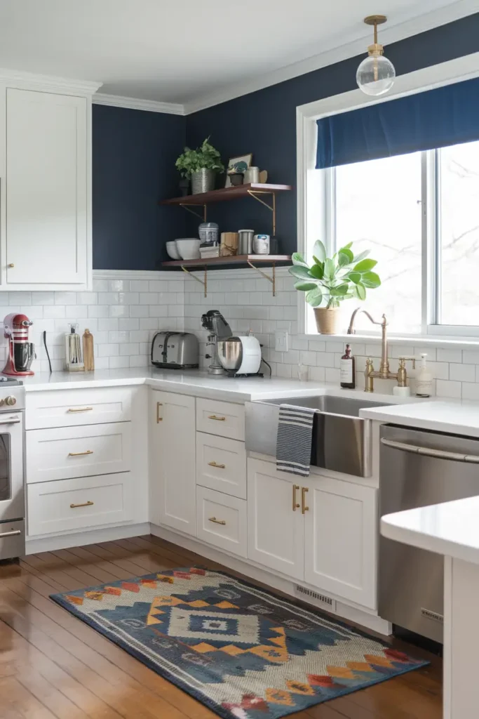
#10. Naval by Sherwin-Williams
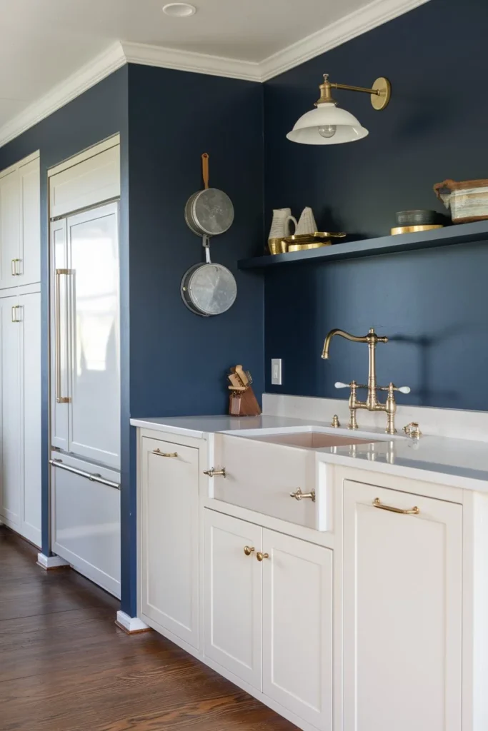
Bring boldness to your kitchen with this rich, deep navy blue.
Pairing Tip: Surprisingly versatile, Naval can act as a striking neutral, pairing beautifully with
- White countertops,
- Brass hardware, or warm wood tones.
It’s perfect for creating a dramatic, high-end look.
#11. French Beret by Benjamin Moore
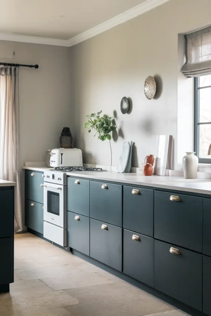
This deep gray with subtle navy undertones is moody in all the right ways. Ideal for kitchen cabinets or an accent wall, French Beret adds depth and drama while maintaining a sophisticated feel.
Combination Tip: Pair it with lighter colors for a balanced and elegant look.
#12. Black Fox by Sherwin-Williams
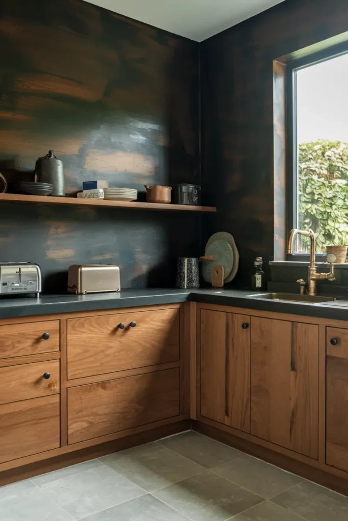
A rich black-brown hybrid, Black Fox is perfect for creating a modern or rustic vibe in your kitchen.
Combination Tip: It pairs brilliantly with
- Warm wood tones and
- Brass accents, adding a touch of coziness and sophistication to your space.
#13. Warm White by Farrow & Ball (French Gray)
This warm white reflects light beautifully, creating a bright and airy feel. It has a subtle charm that works well for those looking to keep things simple yet elegant.
Pairing Tip: Pair it with natural textures for a timeless, understated look.
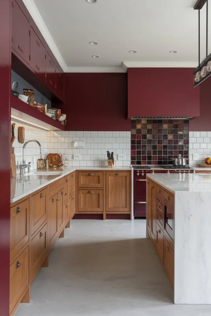
#14. Dusty Red by Benjamin Moore (Dinner Party)
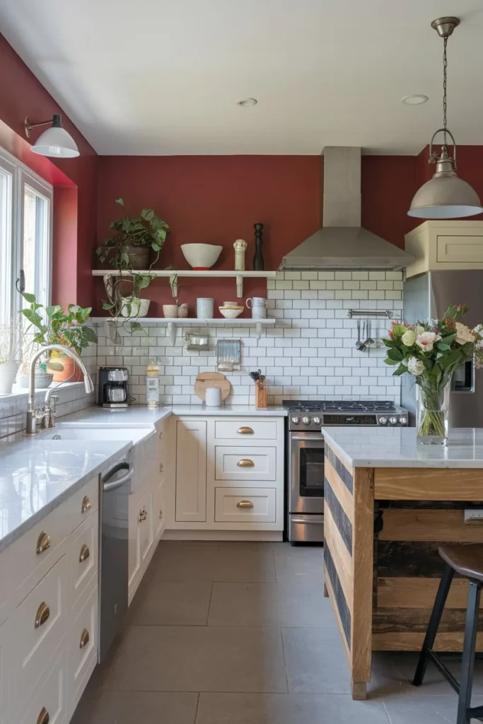

Looking for a bold pop of color? This dusty red is unique and daring, adding warmth and character to your kitchen.
Combination Tip: It pairs beautifully with white countertops and subtle metallic accents, creating a striking yet sophisticated space.
#15. Gray Owl by Benjamin Moore
This cooler-toned gray features subtle blue and green undertones, making it perfect for a modern yet welcoming kitchen. It’s a versatile shade that works well with both bright and muted accents, giving you a range of design options.
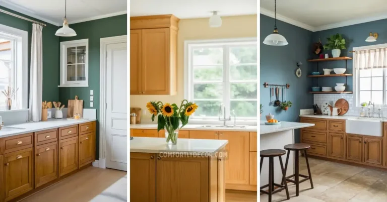
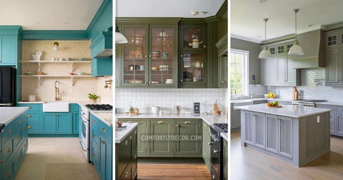
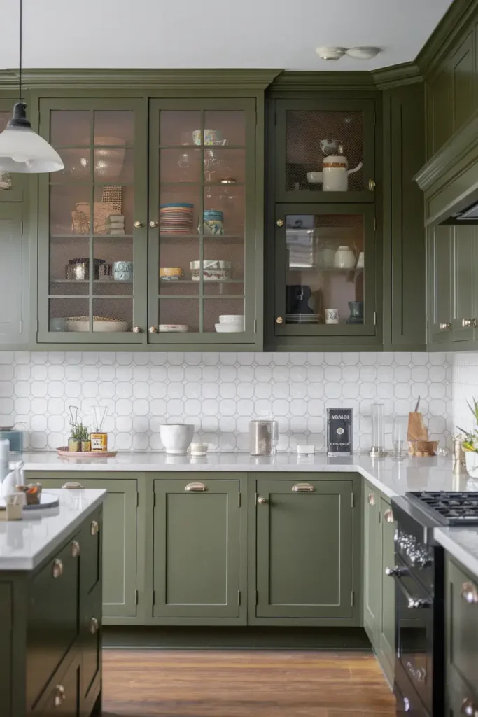
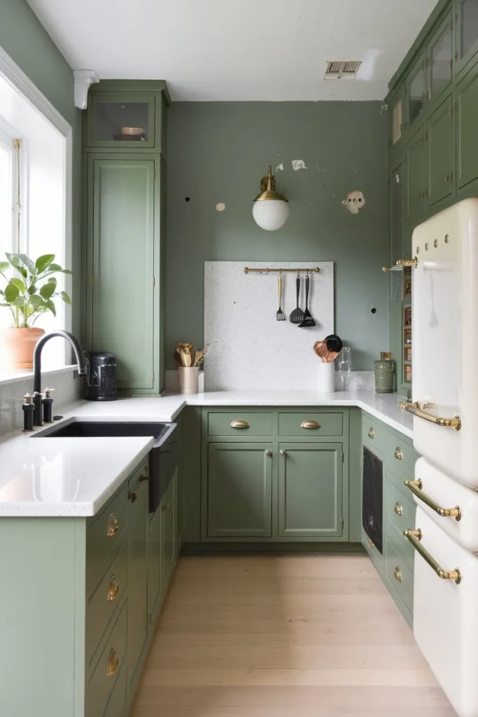
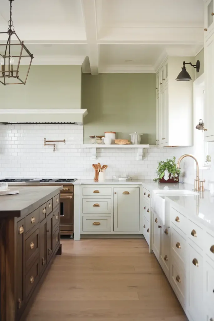
#16. Deep Olive Green by Sherwin-Williams (Ripe Olive)
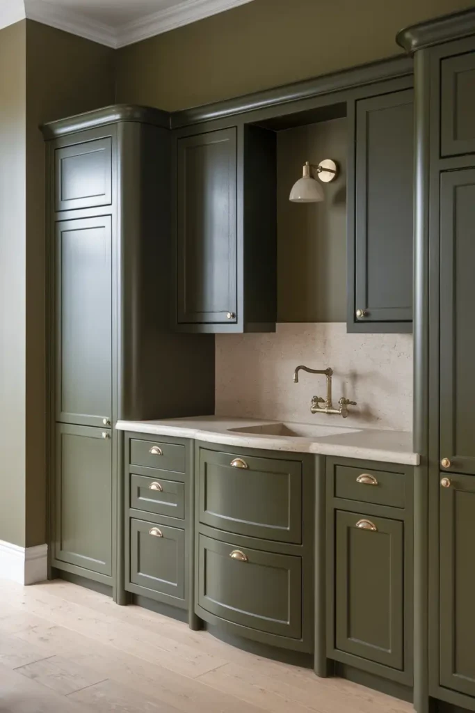
Dark, dramatic, and undeniably dreamy, this deep green makes a bold statement in any kitchen. Its rich tone evokes sophistication and warmth, making it perfect for creating a cozy yet luxurious space.
Pairing Tip: Pair it with light wood tones or brass hardware to keep the look balanced and elegant. It’s also a great choice for accent walls or cabinetry, adding depth and character to your kitchen design.
#17. Cobalt Blue by Sherwin-Williams (Naval)
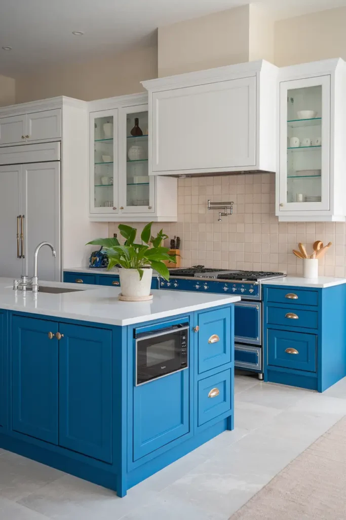
This glossy, bold blue is both timeless and striking, making it ideal for those who want to infuse their kitchen with personality and flair. Perfect for kitchen islands, lower cabinets, or statement pieces, cobalt blue adds energy and vibrancy without feeling overwhelming.
Combination Tip: Pair it with white countertops, metallic finishes, or soft lighting to let this color truly shine while maintaining a cohesive look.
#18. Quiet Rain by Glidden
For a touch of elegance with a hint of sparkle, Quiet Rain is an excellent choice. This soft, subtle shade of gray with a slight shimmer complements metallic accents beautifully, creating a refined and sophisticated finish. It works well for walls, ceilings, or trims, offering a neutral base that allows other colors and textures in the kitchen to stand out.
Pairing Tip: Pair it with modern fixtures for a polished look.
#19. Chatroom by Sherwin-Williams

This subtle green-gray shade offers a seamless and soothing backdrop for your kitchen, making it versatile for a variety of styles. Whether your kitchen leans modern, farmhouse, or traditional, Chatroom adds a neutral yet fresh touch to the space.
Combination Tip: It pairs particularly well with white cabinetry, light-colored countertops, or even stone textures, offering a clean, understated aesthetic that feels inviting and timeless.
#20. Puerto Rico Sunshine by ECOS
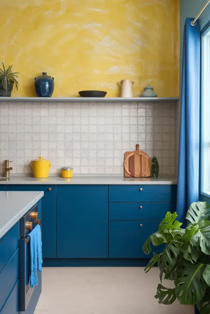
Inject a burst of tropical energy into your kitchen with this cheerful, vibrant yellow. This bold and sunny hue is ideal for accent walls, backsplashes, or even open shelving, instantly adding warmth and positivity to your space. Use it sparingly for a playful pop of color or go bold with larger applications to create a bright, energizing atmosphere.
Pairing Tip: Pair it with natural wood elements for a harmonious feel.
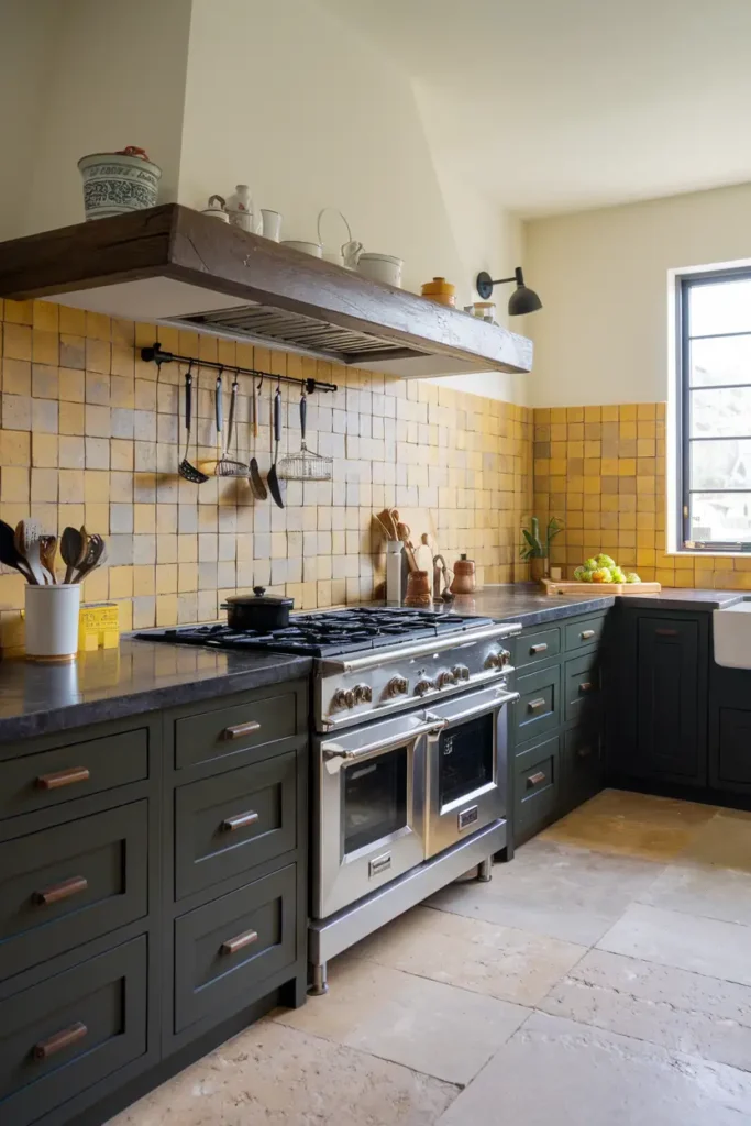
#21. Chocolate Brown by Benjamin Moore
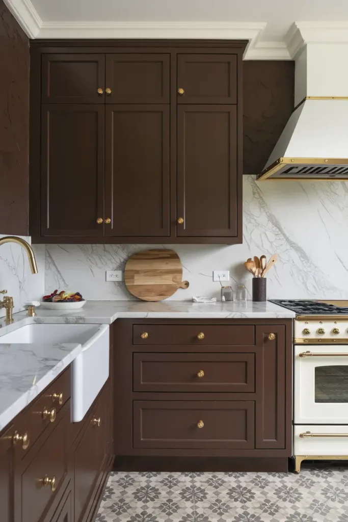
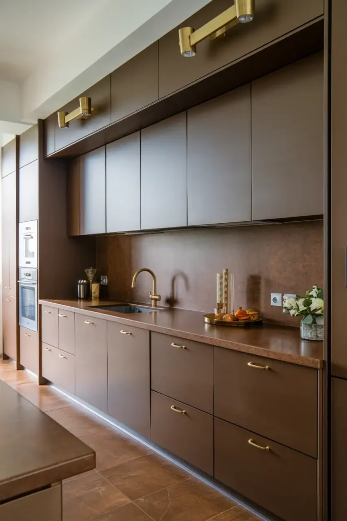
This rich mocha color creates an inviting, cozy vibe in any kitchen, reminiscent of a warm cup of coffee in the morning.
Combination Tip: Chocolate Brown pairs beautifully with gold accents, natural materials, or textured finishes like stone or brick.
Use it for cabinetry, walls, or even flooring to create depth and sophistication. This timeless color brings a sense of grounded luxury to both rustic and modern designs.
#22. Deep Maroon by Farrow & Ball (Brinjal)
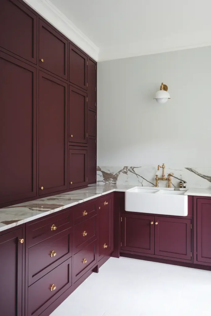
This warm, burgundy tone is bold yet elegant, adding character and depth to your kitchen. Its deep, jewel-like hue exudes richness and pairs wonderfully with white or cream accents to create a striking, balanced look.
Deep Maroon is perfect for feature walls, cabinetry, or even as a bold backsplash color, making your kitchen feel both unique and stylish with a nod to classic design.
#23. Classic White by Benjamin Moore (White Heron)
Timeless and versatile, Classic White offers a clean yet cozy feel that never goes out of style. This crisp white shade complements almost any kitchen aesthetic, from traditional to modern.
Pairing Tip: Pair it with wood tones, subtle pastel accents, or dark countertops to create contrast and interest. Whether used for walls, cabinetry, or ceilings, Classic White provides a bright and welcoming foundation for your kitchen.
#24. Sky Blue by Backdrop (Skywalker)
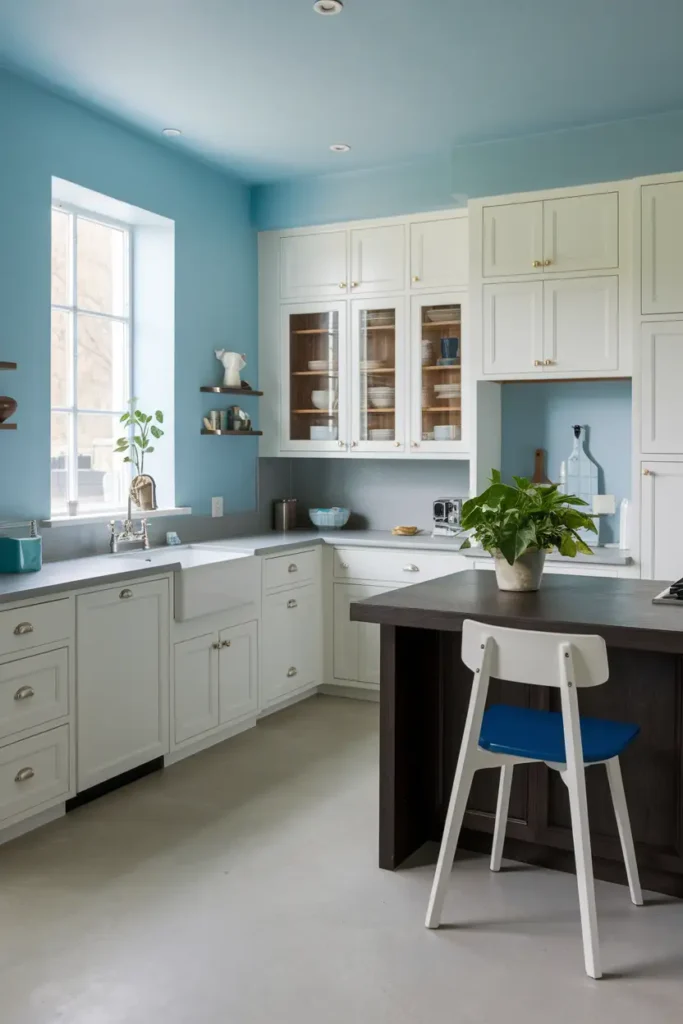
Fresh, light, and cheerful, this soft blue shade feels like a breath of fresh air in your kitchen. Its calming tone creates a serene and uplifting atmosphere, making it an excellent choice for walls, cabinets, or even small decorative details.
Combination Tip: Pair it with cream, light gray, or dark wood accents to complete the look and maintain a sense of balance in your space. Sky Blue brings a touch of charm and tranquility to any kitchen.
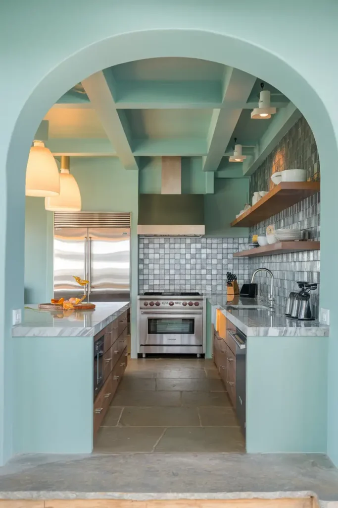
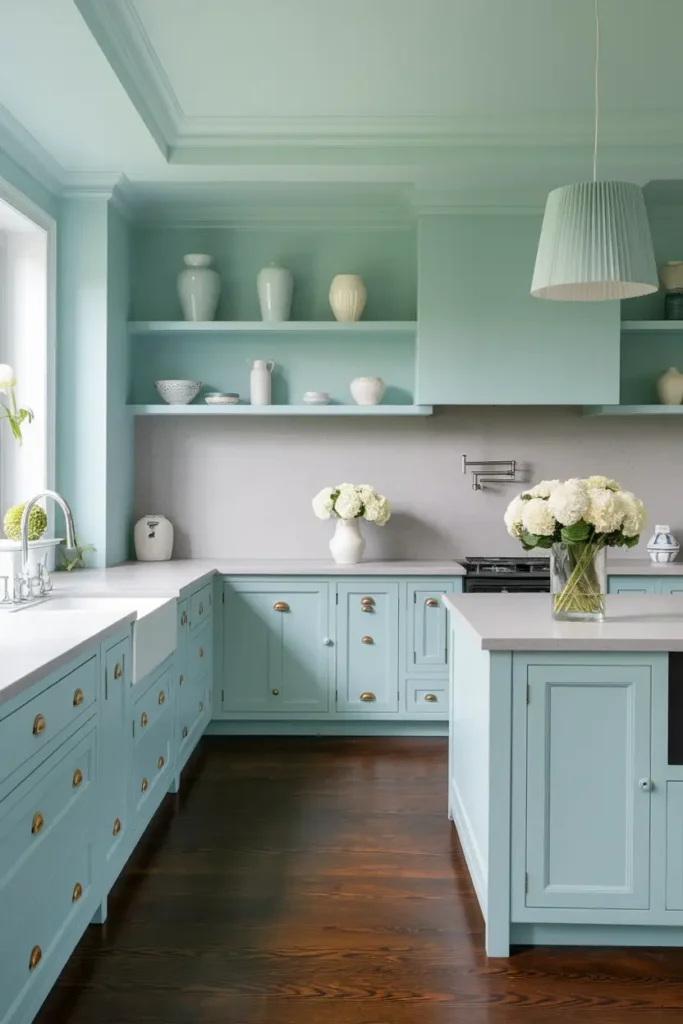
#25. Halcyon Green by Sherwin-Williams
This sage-green-meets-pine shade strikes the perfect balance between bold and understated. Its natural, earthy vibe makes it ideal for creating a serene, harmonious atmosphere in your kitchen.
Pairing Tip: Halcyon Green works beautifully on walls, cabinets, or even trim and pairs well with warm wood tones, matte black fixtures, or brass accents.
It’s a versatile color that can enhance any kitchen style, from rustic to contemporary.
#26. Villa Green by Sherwin-Williams
This unique, custom green hue is subtle yet lively, bringing personality and a fresh touch to your kitchen. Villa Green offers a soft, natural vibe that works well for walls, cabinetry, or even furniture pieces within your space.
Combination Tip: Pair it with brass hardware, light wood tones, or white countertops to create a modern, airy look. Its understated charm makes it a standout choice for both small and large kitchens alike..
Tips for Choosing the Perfect Kitchen Paint Color
Consider the Lighting
Natural light can make or break a paint color. For example, darker colors may feel too heavy in a dimly lit kitchen, while whites and lighter shades help reflect light and create a more open feeling.
Test Your Colors
Always, always test your paint choices before committing. Colors can look wildly different based on the time of day and the type of artificial lighting in your home.
Think Long-Term
Invest in a color you’ll still love years from now. Neutral palettes are generally safer bets, but don’t be afraid to go bold if that’s your style.
Understanding Kitchen Paint Colors
The colors you choose for your kitchen go beyond mere aesthetics—they set the tone for how the space feels and functions. A thoughtfully selected palette can transform the atmosphere, enhance the room’s functionality, and even influence your mood.
Impact of Color on Mood
Colors have a profound psychological effect on mood and ambiance. For instance, warm colors like yellow and red can evoke feelings of energy and appetite, while cooler tones like blue and green tend to be calming and serene. Understanding how colors affect the mind can help you select shades that align with the vibe you want in your kitchen.
Choosing the Right Shade
When selecting the ideal shade, consider the size of your kitchen, the amount of natural light it receives, and how the color complements cabinets, countertops, and flooring. Sampling colors in your kitchen area during different times of the day ensures the shade you choose looks as intended.
Maintenance and Practicality
The kitchen is one of the most high-traffic areas in any home, so practicality is key when choosing paint colors and finishes. You’ll want something both durable and easy to maintain.
Durability of Paint Finishes
Not all paint finishes are created equal, especially for kitchens. Semi-gloss and satin finishes are popular choices because they’re more resistant to stains, moisture, and wear, making them perfect for areas near stoves and sinks.
Easy-to-Clean Options
Kitchen walls are prone to messes and splatters, so opting for paint that’s easy to clean is a practical decision. Look for washable or scrubbable paints that allow you to quickly wipe away grease, food stains, or fingerprints without leaving a mark.
FAQs
Transform Your Kitchen with Color
Choosing the right paint color for your kitchen doesn’t have to be overwhelming. Hopefully, this list has sparked some inspiration and narrowed down your options. Whether you’re drawn to timeless neutrals, vibrant pops of color, or something bold and moody, there’s a shade here that’s perfect for you.
Planning your next kitchen refresh? Share your favorite paint colors in the comments below, or send me a pic of your updated space—I’d love to see it! 🖌️
Vibe Up Your Space With Comfort & Color — your go-to destination for stylish home decor that blends comfort with color. Create cozy corners and vibrant vibes in every room and space at your home!